14  Mapping with R

Published

October 23, 2025

Keywords

geospatial, sf simple features, tidycensus, tmap, leaflet, rnatural earth, usmap

14.1 Introduction

14.1.1 Learning Outcomes

  • Develop strategies for geospatial analysis based on constructs such as vectors vs raster maps, simple features, and Coordinate Reference Systems (CRS).
  • Use {sf} package functions to identify and convert the CRS for geospatial data.
  • Create static choropleth maps using {ggplot2} with Census Bureau data and other data.
  • Create interactive maps in R using {leaflet}.
  • Create raster and vector maps using {tmaps}, {rnaturalearth}, and {maps}.
  • Create choropleth maps of US States and Counties, with Alaska and Hawaii re-positioned, with {usmap}.

14.1.2 References:

14.1.2.1 Other References

14.2 Key Constructs in Geospatial Analysis

14.2.1 Open Geospatial Information

Geospatial information is about things and their location in the world.

  • Humans have been interested in geospatial information for millenia, even before the “geometers” of Egypt used ropes and data to recreate the boundaries of farmland after Nile river would flood.
  • Geospatial information allows us to make maps.

There are many different standards and systems for creating, organizing, and sharing geospatial information.

Our focus is on open-source standards and data as promulgated by the Open Geospatial Consortium (OGC).

14.2.2 Vector versus Raster Models/Data

There are two main models for representing the world: Vector and Raster.

  • The vector data model represents the world using points, lines, and polygons.
    • These have discrete, well-defined borders.
    • Vector data tends to dominate the social sciences because human settlements tend to have discrete borders.
  • The raster data model divides the surface up into cells of constant size.
    • Raster datasets are the basis of background images used in web-mapping.
    • Raster models aggregate spatially specific features to a given resolution.
    • Raster dominates many environmental sciences because of the reliance on remote sensing data.

These two models are fundamentally different in how they represent the world so they use different methods and tools.

  • They can work together though, e.g., place a raster background under a vector map.

We will focus on vector models with a few examples of raster data.

14.2.3 Geospatial Features

We use maps to display information about features (things or objects) of, or in, our world.

  • Features can be stand alone or composed of other features, e.g. a state can be composed of counties, or a forest could be composed of individual trees.

Features have two kinds of attributes.

  • Spatial attributes describe the geometry of the feature.
    • This includes the location and shape of the feature.
    • The geometry is described based on a reference point of the feature, e.g., a point, a point on an edge, or the center point.
  • Non-spatial attributes describe other information about or associated with the feature.
    • These could be physical such as color, material, or more abstract concepts such as its population or average vaccination rate.

14.2.4 Simple Features

The OGC maintains a multi-part standard for “Simple Features” to provide a precise and consistent set of definitions and methods for representing and manipulating data about features.

This set of standards defines a Simple Feature as having “both spatial and non-spatial attributes.

  • Spatial attributes are geometry valued, and simple features are based on 2D geometry with linear interpolation between vertices.
  • This definition has been extended to 3D/4D features so there is lots of flexibility.

14.2.4.1 SF Points

“Geometry-valued” means simple feature geometries are described using points specified as coordinates in 2, 3, or even 4-dimensional space.

  • The point coordinates are defined as X, Y, Z, and sometimes the data may have an M.
    • X specifies “easting” or “longitude” and Y specifies “northing” or “latitude”. Together they are XY.
    • Z specifies altitude, if present for XYZ.
    • M specifies some other dimension just for that point, e.g., time or temperature.

14.2.4.2 SF Geometry Types

Geometry Type Description
POINT zero-dimensional geometry containing a single point
LINESTRING sequence of points connected by straight, non-self intersecting line pieces; one-dimensional geometry
POLYGON geometry with a positive area (two-dimensional); sequence of points form a closed, non-self intersecting ring; the first ring denotes the exterior ring, zero or more subsequent rings denote holes in this exterior ring
MULTIPOINT set of points; a MULTIPOINT is simple if no two Points in the MULTIPOINT are equal
MULTILINESTRING set of linestrings
MULTIPOLYGON set of polygons
GEOMETRYCOLLECTION set of geometries of any type except GEOMETRYCOLLECTION

Figure 14.1 shows various types of simple features. Lovelace, Nowosad, and Muenchow (2023)

Figure 14.1: Simple Features

14.2.5 Coordinate Projections

Working with mapping data can involve a lot of complex math to ensure different data sources are using the same methods for identifying location and/or shape.

  • Fortunately, you don’t have to do the math!

Many mapping or Geospatial Information Systems (GIS), regardless of programming language, use three open-source libraries to access standard functions or data to manipulate SF data.

  • The GEOS or Geometry Engine, Open Source library. This contains fundamental algorithms for processing linear geometry on the 2-d Cartesian plane. Functions include shifting, rotating, expanding, measuring distances, areas, etc..
  • The GDAL (goo-dal) library. This contains functions for reading or writing vector or raster files and a translator library for converting between raster and vector geospatial data formats.
  • The PROJ library. This provides generic functions to transform geospatial coordinates from one coordinate reference system (CRS) to another. This is to help you ensure all data sources in a map are using the same CRS.

14.2.6 Datums, CRS, and Projections

The underlying Math is broken out into three different sets of information: a Datum, a Coordinate Reference System, and a Projection.

A Datum is a mathematical model of a 3D object that creates an underlying reference model, e.g., a sphere, that allows us to use coordinates to identify points in each dimension of the model, typically x, y, z.

  • Unfortunately, the earth is not close to a perfect sphere or ellipsoid (it’s an irregular squashed ellipsoid).
  • The surface of the earth is also rough, so no model is equally accurate everywhere.
  • A more complex mathematical model called a geoid is used to represent the earth.
  • The parameters of the geoid model can “be”tweaked” to accommodate a portion of the earth more accurately.
  • The “tweaked” version of the geoid is known as a datum.
  • Since a geoid and datum are representing a sphere, there are infinitely many ways for choosing an origin, the point where x=0, y=0, and z=0 (you identify every other point with respect to the origin). Thus we need a Coordinate Reference System.

Given a datum, a Coordinate Reference System (CRS) starts with a chosen datum and then defines a specific point in that datum as the origin.

  • A CRS may use angular measures for x and y (longitude and latitude) and define a point from the “center” in terms of angles relative to the origin.
  • Think of the origin as a point of the surface of the datum, e.g., where longitude is 0, latitude is 0, and elevation is 0.
  • The origin is the “reference value” for 0,0,0 and all other points are defined relative to that origin.

A Projection takes the coordinates for a point in a given 3-D CRS and mathematically converts them to identify a point on a 2D Cartesian surface.

  • Each projection chooses its own origin for x, y on a 2D plane.
  • This is often the lower, left-hand corner of the plane for the areas of interest.
  • A projection uses the terms Easting and Northing to describe the x and y values from its own origin for the plane.

Datums, CRSs, and Projections are constantly being updated as new data comes in from satellites, as the earth’s shape changes, and the tectonic plates move affecting surface heights.

14.2.6.1 Coordinate Reference Systems (CRS)

A Coordinate Reference System (CRS) defines how the spatial elements of a feature relate to the surface of the Earth.

  • The CRS uses a mathematical model (datum) for representing a 3D location/shape on a 3D or 2d planar surface.
Important

A CRS can get quite complicated as the earth is Not a perfect sphere and is Not perfectly smooth.

  • This means there are accuracy/precision trade offs among attributes such as location, linear distances, direction, and areas, as well as the interpretability of the visual representation.

  • Any CRS has to make choices about which aspects of a feature or a set of features to make most accurate while sacrificing accuracy on others.

  • There are two types of CRS, geographic or projected,which make different trade offs across the measurement attributes.

14.2.6.1.1 Geographic CRS use Angular Measures to locate a Feature on a 3-D “Sphere”

Geographic CRS identify any location on the Earth’s surface using two values: longitude and latitude which are angular measurements from a fixed point on the globe (0,0).

  • Remember a Geographic CRS as “G stands for Globe”.

A common geocentric datum is WGS84 (World Geodetic System 1984).

  • WGS 84 tries to provide a global perspective. It uses the Earth’s center of gravity as its (0,0) center so the accuracy of projections is not optimized for a specific location.
  • Local datum, such as NAD83 (North American Datum 1983), shift the ellipsoidal surface to better align with the surface at a particular location (e.g., North America).
    • NAD83 is what is used by the Global Positioning System (GPS).

Hundreds of datum have been developed over the last few centuries but with the advent of better satellite-enabled measurements, countries and organizations are focusing on updating common standards like WGS84, NAD83, or other local datum, e.g., the British isles Ordnance Survey National Grid.

Important

Geographic (or geocentric) CRS use angular measurements (Long, Lat) so they are not accurate in measuring distances using linear measures such as meters.

14.2.6.2 Projected CRS transform the Angular Measures from a Geographic CRS to Linear Measures on a Plane

Projected CRSs transform the measures of long, lat from a 3-D globe (as defined by a geographic CRS) into 2-D Cartesian Coordinates on an implicitly flat plane, like a map.

  • Remember a projected CRS as “P stands for Plane”.
  • Think of drawing a triangle on an orange and then what happens when you smash the orange flat on the table.

Each projected CRS has its own (0,0) origin, x and y axes, and a linear unit of measurement such as meters.

Important

Converting the 3-D surface of the Earth into 2-D Easting and Northing (x and y) values always causes some distortion in other metrics such as area, direction, distance, and shape.

If you need to do measurements using linear distance, distance between points, or display a linear or radial distance from a feature or point, use a projected CRS.

Depending upon the analysis, there are different types of projections designed to preserve accuracy for (at most) one or two of the attributes.

  • All projected CRSs are either equal-area, equidistant, conformal (with shapes remaining unchanged), or some combination of compromises of those.

A popular projected CRS is the Universal Transverse Mercator (UTM).

The UTM is actually a set of CRSs. The UTM divides the Earth into 60 longitudinal wedges and 20 latitudinal segments.

  • Each has its own CRS to provide the best accuracy for that region.

Every place on Earth (other than the polar regions) has a UTM code to identify the wedge and segment.

  • “60H” refers to northern New Zealand.

To find the UTM code for a given longitude and latitude, write a short function as shown below.

  • You can then use sf::st_crs(my_utm_code) to look up the CRS for the UTM code and the output tells you the type of CRS and the underlying datum.
# https://stackoverflow.com/questions/9186496/determining-utm-zone-to-convert-from-longitude-latitude/9188972#9188972

lonlat2UTM <- function(lonlat) {
  utm <- (floor((lonlat[1] + 180) / 6) %% 60) + 1
  if (lonlat[2] > 0) {
    utm + 32600
  } else {
    utm + 32700
  }
}
## Source the function and then use it on a longitude and latitude of your choice
    utm_au <- lonlat2UTM(c( -77.0888, 38.9375)) ## Long, Lat for AU
## Look up the EPSG Code
    sf::st_crs(utm_au) ## get the EPSG code and check https://epsg.io/32618
Coordinate Reference System:
  User input: EPSG:32618 
  wkt:
PROJCRS["WGS 84 / UTM zone 18N",
    BASEGEOGCRS["WGS 84",
        ENSEMBLE["World Geodetic System 1984 ensemble",
            MEMBER["World Geodetic System 1984 (Transit)"],
            MEMBER["World Geodetic System 1984 (G730)"],
            MEMBER["World Geodetic System 1984 (G873)"],
            MEMBER["World Geodetic System 1984 (G1150)"],
            MEMBER["World Geodetic System 1984 (G1674)"],
            MEMBER["World Geodetic System 1984 (G1762)"],
            MEMBER["World Geodetic System 1984 (G2139)"],
            MEMBER["World Geodetic System 1984 (G2296)"],
            ELLIPSOID["WGS 84",6378137,298.257223563,
                LENGTHUNIT["metre",1]],
            ENSEMBLEACCURACY[2.0]],
        PRIMEM["Greenwich",0,
            ANGLEUNIT["degree",0.0174532925199433]],
        ID["EPSG",4326]],
    CONVERSION["UTM zone 18N",
        METHOD["Transverse Mercator",
            ID["EPSG",9807]],
        PARAMETER["Latitude of natural origin",0,
            ANGLEUNIT["degree",0.0174532925199433],
            ID["EPSG",8801]],
        PARAMETER["Longitude of natural origin",-75,
            ANGLEUNIT["degree",0.0174532925199433],
            ID["EPSG",8802]],
        PARAMETER["Scale factor at natural origin",0.9996,
            SCALEUNIT["unity",1],
            ID["EPSG",8805]],
        PARAMETER["False easting",500000,
            LENGTHUNIT["metre",1],
            ID["EPSG",8806]],
        PARAMETER["False northing",0,
            LENGTHUNIT["metre",1],
            ID["EPSG",8807]]],
    CS[Cartesian,2],
        AXIS["(E)",east,
            ORDER[1],
            LENGTHUNIT["metre",1]],
        AXIS["(N)",north,
            ORDER[2],
            LENGTHUNIT["metre",1]],
    USAGE[
        SCOPE["Navigation and medium accuracy spatial referencing."],
        AREA["Between 78°W and 72°W, northern hemisphere between equator and 84°N, onshore and offshore. Bahamas. Canada - Nunavut; Ontario; Quebec. Colombia. Cuba. Ecuador. Greenland. Haiti. Jamaica. Panama. Turks and Caicos Islands. United States (USA). Venezuela."],
        BBOX[0,-78,84,-72]],
    ID["EPSG",32618]]

14.2.6.3 Specifying the CRS

Each CRS can be identified by an EPSG code for a standard CRS, or a proj4string definition for a customized CRS.

  • An EPSG code refers to one specific projection out of the PROJ library.
  • The EPSG stands for the European Petroleum Survey Group which first created the data set in 1985.
  • There are over 6,700 CRS available in R PROJ library through the {sf} package depending upon the version including all EPSG codes.

14.2.6.4 Some Common CRS EPSG Codes for North America

See EPSG Geodetic Parameter Dataset for info on any CRS.

  • 4326 is the WGS84.

    • Geographic with Lat and Long.
    • The WGS84 is the most common CRS in the world so is a convenient baseline for transforming other data to to be consistent.
    • Commonly used by organizations that provide GIS data for the entire globe or across many countries.
    • It is the CRS used by Google Earth as the default.
  • 4269 is NAD83 (North American Datum 1983).

    • Geographic with Lat and Long.
      • Most commonly used by U.S. federal agencies, e.g., GPS.
      • Although WGS84 and NAD83 are not exactly the same they are generally considered equivalent.
      • Don’t bother to transform between NAD83 and WGS84 unless you require extremely high precision (rare).
  • 8255 NAD83(CSRS)v7 is a geographic CRS used in Canada.

  • 26915 is a projected CRS used in North America

    • UTM zone 15N.
    • It is based on the NAD83 datum and as a projected CRS uses Easting and Northing.
    • Last updated on 3/14/2020.
  • 3857 or 900913: 3857 is a Mercator projection (also available in Google Earth).

    • 900913 is the “unofficial” code used by the open source projects.
    • Google Mercator projection is used by Google Maps.
    • Mercator preserves direction so is useful for navigation.

14.3 The {sf} Package

The R {sf} package provides a class system for working with geographic vector data (for raster data see the {terra} package).

  • {sf} supersedes the older {sp} package. Many packages may still use {sp} which stores GIS data in a “Spatial” class. You can covert data from those packages to the newer {sf} format using st_as_sf().

The {sf} package can represent all common vector geometry types: points, lines, polygons and their respective ‘multi’ versions (which group together features of the same type into a single feature).

{sf} provides a unified interface to the GEOS library for geometry operations, the GDAL library for reading and writing geographic data files, and the PROJ library for representing and transforming data between projected coordinate reference systems.

Simple feature objects in R are stored in a data frame, with geographic data occupying a special list column, usually named geom or geometry.

  • The addition of simple features data to a data frame changes the class of the data frame to a simple features object.

{sf} stores data for a single simple feature geometry in an sfg object.

  • The geometry column in an {sf} data frame (a simple feature geometry column (sfc)) is a list of sfg objects.
  • The sf object contains information about the underlying CRS. Like adding a Time Zone to a date time.
Important

All geometries in a simple features (sfc) object must have the same CRS.

14.3.1 Transforming SF Data From One CRS to Another CRS

Most data sets loaded from open data will have a CRS specified in the geometry column.

Use sf::st_crs(my_sf_data_frame$geometry) to get the CRS of the data.

  • If the data does not have a CRS associated with it, you can add one using st_set_crs(). Check documentation to see if tells you what it is.

If you want to add points or combine data from different sources, all the data must be in the same CRS to create meaningful maps.

  • If you want to do some spatial transformations or measurements, you will want the data in a projected CRS.

Vector geometries are made-up of points, and how points form the basis of more complex objects such as lines and polygons.

Reprojecting vectors (transforming from one projection to another) thus consists of transforming the coordinates of these points.

  • Use st_transform(my_sf_data, new_epsg) to reproject (using the PROJ library) a simple features tibble geometry.
  • When plotting with ggplot() and sf::geom_sf(), you can use argument sf_crs = to adjust the CRS for the plot.

14.3.2 Sources of Mapping Data

The US Census Bureau has a wide variety of map data for different geographic entities in the United States.

  • It uses vector model data stored in a format known as a “shapefile”.

Many state and local governments also use their open data sources to make their own shapefiles available if they are not available at the Census Bureau.

When searching for data, look for the term “shapefile”.

  • Shapefiles are often downloadable as a Zip file. When unzipped there is a series of folders with the specific information.
  • They can be very large (hundreds of MB) so be careful about uploading to a cloud repository.

14.4 Creating Maps with {ggplot2} and Census Bureau Data

14.4.1 Census Bureau Demographic Data

Two main sources of interest for us:

  • The decennial census (every 10 years) and
  • The American Community Survey (ACS) which is updated every year and covers the past five years.
  • See Comparison of census and ACS

Data is compiled into many different tables to include products known as summary files.

  • Census Summary File 1 (sf1) contains data from the “100%” census down to the Census Block level. It has information on age, sex, race, Hispanic/Latino origin, household relationship, whether residence is owned or rented.
  • Census Summary File 3 (sf3) contains data from a 1-in-6 sample who get the longer version of the census from. It has data for the population, down to the Census Block Group level (less resolution than SF1 and SF2). It presents detailed population and housing data (such as place of birth, education, employment status, income, value of housing unit).

The ACS has data from an ongoing survey that provides data every year for areas of over 65,000 population.

  • The ACS covers a broad range of topics about social, economic, demographic, and housing characteristics of the U.S. population.
  • Much of the ACS data are available separately by age group, race, Hispanic origin, and sex.
    • Select data are available for the nation, all 50 states, the District of Columbia, Puerto Rico, every congressional district, every metropolitan area, and all counties and places with populations of 65,000 or more.
  • There are several versions - a 1 year version (acs1), a five year version (acs5), and extended details which are released at different times of the year - typically the one year in September and the 5 year in December.

Each of the many thousands of variables in the Census data has its own unique identifier - an alpha-numeric “name”.

  • These can change over time so each product also has a table listing the available names along with the descriptors known as Label and Concept

The census bureau data is collected at one level and aggregated at different levels as seen in Figure 14.2.

Census Block -> Census Block Group -> Census Tract -> County -> State -> National >

  • It is also organized into other geographic entities such as congressional districts and major metropolitan areas that may be available depending upon the source. See the Glossary on geographies.
  • Depending upon the entity, the Census Bureau makes geometry shape files available which are useful for mapping at various levels.
Figure 14.2: The hierarchy of Census Bureau geographic entities shows how data from census tract level is aggregated and then disaggregated.
  • We can use this data to create choropleth maps where we can represent one or more attributes of a geographic feature by color coding the shape of the feature on a 2D map.

14.4.2 The {tidycensus} Package

Note

This sections is for readers who have not used the {tidycensus} package before.

  • There are multiple R packages for working with the Census Bureau’s 300+ APIs.
  • The {tidycensus} package allows users to interface with the US Census Bureau’s decennial Census and five-year American Community Survey APIs and return tidyverse-ready data frames, with the option for including simple feature geometry at various levels.
  • Install the {tidycensus} package using the console.
  • Load the packages.
library(tidycensus)
library(tidyverse)
14.4.2.0.1 Your Census API Key
  • If you don’t have one already, you need an “API Key” to access the Census Bureau APIs.
  • Request a key from the census bureau: https://api.census.gov/data/key_signup.html
  • You should get an email in a few seconds. Click on the link in the email to activate your key.
  • Copy the key from the email - it will be long….
14.4.2.0.2 Set up your key using the {keyring} package
  • Install the {keyring} package using the console.
  • Use key_set() to store your key in your computer’s password manager.
  • Do not run with INSTALL = TRUE as it will put our key in plain text in your Renviron file.
library(keyring)
# key_set("API_KEY_CENSUS")
14.4.2.0.3 Accessing your key
  • When an API function asks for a password or credential, use your new key
  • Use key_get() to put your key value into a variable you can reuse or, to be even more secure, just use it inside the API call each time.
# my_census_key <- key_get("API_KEY_CENSUS")
14.4.2.0.4 {tidycensus} Functions for the Decennial Census and the American Community Survey
  • There are two major functions implemented in {tidycensus}:

  • get_decennial() grants access to the 1990, 2000, 2010, and 2020 decennial US Census APIs, and

    • Unfortunately, as of 21 Sep, 2020, the U.S. Census Bureau identified a problem with tract numbers in the 1990 API endpoints so that data is temporarily unavailable
    • The 2020 decennial census has a limited release of data.
  • get_acs() grants access to the 5-year American Community Survey APIs.

  • Example: let’s get the decennial census data for median age by state in 2010, the variable name is “P013001”

age10 <- get_decennial(
  geography = "state",
  variables = "P013001",
  year = 2010,
  key = key_get("API_KEY_CENSUS")
)
head(age10)
# A tibble: 6 × 4
  GEOID NAME       variable value
  <chr> <chr>      <chr>    <dbl>
1 01    Alabama    P013001   37.9
2 02    Alaska     P013001   33.8
3 04    Arizona    P013001   35.9
4 05    Arkansas   P013001   37.4
5 06    California P013001   35.2
6 22    Louisiana  P013001   35.8
nrow(age10)
[1] 52
  • Plot the data and reorder the states, on the y axis, by value.
age10 |>
  ggplot(aes(x = value, y = fct_reorder(NAME, value))) +
  geom_point()

14.4.2.0.5 Searching for Variable Identifiers
  • Getting variables from the Census or ACS requires knowing the variable name - and there are thousands of these names across the different products.
  • To rapidly search for variables, use the load_variables() function.
  • Two required arguments:
    • the year of the Census or end year of the ACS sample, and
    • the dataset: “sf1”, “sf3”, “acs1”, “acs5” etc…
  • For efficiency, assign the result to a variable, setting cache = TRUE to store the result on your computer for future access.
  • You can view and filter or use stringr to search the labels and concepts for data of interest
  • Example: Let’s use load_variables() to get the variables for the concept median age by sex.
acs18_5_vars <- load_variables(2018, "acs5", cache = TRUE)
acs18_5_vars |>
  filter(str_detect(concept, "MEDIAN AGE BY SEX")) |>
  head()
# A tibble: 6 × 4
  name        label                           concept                  geography
  <chr>       <chr>                           <chr>                    <chr>    
1 B01002A_001 Estimate!!Median age --!!Total  MEDIAN AGE BY SEX (WHIT… block gr…
2 B01002A_002 Estimate!!Median age --!!Male   MEDIAN AGE BY SEX (WHIT… block gr…
3 B01002A_003 Estimate!!Median age --!!Female MEDIAN AGE BY SEX (WHIT… block gr…
4 B01002B_001 Estimate!!Median age --!!Total  MEDIAN AGE BY SEX (BLAC… block gr…
5 B01002B_002 Estimate!!Median age --!!Male   MEDIAN AGE BY SEX (BLAC… block gr…
6 B01002B_003 Estimate!!Median age --!!Female MEDIAN AGE BY SEX (BLAC… block gr…
acs20_5_vars <- load_variables(2020, "acs5", cache = TRUE)
acs21_1_vars <- load_variables(2021, "acs1", cache = TRUE)
acs21_1_vars |>
  filter(str_detect(concept, "MEDIAN AGE BY SEX")) |>
  head()
# A tibble: 6 × 3
  name        label                           concept                           
  <chr>       <chr>                           <chr>                             
1 B01002A_001 Estimate!!Median age --!!Total: MEDIAN AGE BY SEX (WHITE ALONE)   
2 B01002A_002 Estimate!!Median age --!!Male   MEDIAN AGE BY SEX (WHITE ALONE)   
3 B01002A_003 Estimate!!Median age --!!Female MEDIAN AGE BY SEX (WHITE ALONE)   
4 B01002B_001 Estimate!!Median age --!!Total: MEDIAN AGE BY SEX (BLACK OR AFRIC…
5 B01002B_002 Estimate!!Median age --!!Male   MEDIAN AGE BY SEX (BLACK OR AFRIC…
6 B01002B_003 Estimate!!Median age --!!Female MEDIAN AGE BY SEX (BLACK OR AFRIC…

14.4.3 Making Choropleth Maps with Census Data

14.4.3.1 Set up Your Environment with the Required Libraries

The {tidycensus} package makes it easier to work with census data.

The SimpleFeatures {sf} package provides a standardized way to encode spatial vector data in data frames.

  • The {tigris} package works with Census bureau “TIGER/Line” shapefiles for use in data frames.
    • To save the census data between sessions set the option: options(tigris_use_cache = TRUE)
  • The {viridis} package has color palettes that are perceptually uniform and legible to colorblind individuals and in black and white
    • These are popular for data visualization, including for choropleth mapping.
## install.packages for the following
library(tidyverse)
library(tidycensus)
library(sf) # https://r-spatial.github.io/sf/
library(tigris) # https://cran.r-project.org/web/packages/tigris/tigris.pdf
options(tigris_use_cache = TRUE)
library(viridis) # a color palette

14.4.3.2 Download Census Data with Geography (SF) Objects

The following example gets median household income from the 2016-2020 ACS for census tracts for Baltimore City.

  • Note the FIPS code is an older system of identification for geographic entities in the United States.
  • The current standard is to use GEOIDs
  • You will often see both to facilitate translation.
acs20_5_vars <- load_variables(2020, "acs5", cache = TRUE)

acs20_5_vars |>
  filter(str_detect(concept, "MEDIAN HOUSEHOLD")) |>
  head()
# A tibble: 6 × 4
  name        label                                            concept geography
  <chr>       <chr>                                            <chr>   <chr>    
1 B19013A_001 Estimate!!Median household income in the past 1… MEDIAN… tract    
2 B19013B_001 Estimate!!Median household income in the past 1… MEDIAN… tract    
3 B19013C_001 Estimate!!Median household income in the past 1… MEDIAN… tract    
4 B19013D_001 Estimate!!Median household income in the past 1… MEDIAN… tract    
5 B19013E_001 Estimate!!Median household income in the past 1… MEDIAN… county   
6 B19013F_001 Estimate!!Median household income in the past 1… MEDIAN… tract    
baltimore <- get_acs(
  state = "MD",
  county = "Baltimore City",
  geography = "tract",
  year = 2020,
  variables = "B19013_001",
  geometry = TRUE,
  key = Sys.getenv("API_KEY_CENSUS")
)
glimpse(baltimore)
Rows: 199
Columns: 6
$ GEOID    <chr> "24510151200", "24510271200", "24510140100", "24510090600", "…
$ NAME     <chr> "Census Tract 1512, Baltimore city, Maryland", "Census Tract …
$ variable <chr> "B19013_001", "B19013_001", "B19013_001", "B19013_001", "B190…
$ estimate <dbl> 22632, 195353, 57292, 50048, 53543, 151389, 84318, 46250, 375…
$ moe      <dbl> 5206, 28079, 26401, 16043, 4417, 22844, 16213, 14519, 11730, …
$ geometry <MULTIPOLYGON [°]> MULTIPOLYGON (((-76.66589 3..., MULTIPOLYGON (((…

Let’s check the CRS for the geographic data.

st_crs(baltimore$geometry)
Coordinate Reference System:
  User input: NAD83 
  wkt:
GEOGCRS["NAD83",
    DATUM["North American Datum 1983",
        ELLIPSOID["GRS 1980",6378137,298.257222101,
            LENGTHUNIT["metre",1]]],
    PRIMEM["Greenwich",0,
        ANGLEUNIT["degree",0.0174532925199433]],
    CS[ellipsoidal,2],
        AXIS["latitude",north,
            ORDER[1],
            ANGLEUNIT["degree",0.0174532925199433]],
        AXIS["longitude",east,
            ORDER[2],
            ANGLEUNIT["degree",0.0174532925199433]],
    ID["EPSG",4269]]
  • GEOGCRS means geographic CRS.
  • The datum is NAD83 and you can see the model parameters.
  • The EPSG is 4269.

We could convert to a Projected Mercator (EPSG 3857) using the below or do directly in the plot.

st_crs(st_transform(baltimore, 3857))
Coordinate Reference System:
  User input: EPSG:3857 
  wkt:
PROJCRS["WGS 84 / Pseudo-Mercator",
    BASEGEOGCRS["WGS 84",
        ENSEMBLE["World Geodetic System 1984 ensemble",
            MEMBER["World Geodetic System 1984 (Transit)"],
            MEMBER["World Geodetic System 1984 (G730)"],
            MEMBER["World Geodetic System 1984 (G873)"],
            MEMBER["World Geodetic System 1984 (G1150)"],
            MEMBER["World Geodetic System 1984 (G1674)"],
            MEMBER["World Geodetic System 1984 (G1762)"],
            MEMBER["World Geodetic System 1984 (G2139)"],
            MEMBER["World Geodetic System 1984 (G2296)"],
            ELLIPSOID["WGS 84",6378137,298.257223563,
                LENGTHUNIT["metre",1]],
            ENSEMBLEACCURACY[2.0]],
        PRIMEM["Greenwich",0,
            ANGLEUNIT["degree",0.0174532925199433]],
        ID["EPSG",4326]],
    CONVERSION["Popular Visualisation Pseudo-Mercator",
        METHOD["Popular Visualisation Pseudo Mercator",
            ID["EPSG",1024]],
        PARAMETER["Latitude of natural origin",0,
            ANGLEUNIT["degree",0.0174532925199433],
            ID["EPSG",8801]],
        PARAMETER["Longitude of natural origin",0,
            ANGLEUNIT["degree",0.0174532925199433],
            ID["EPSG",8802]],
        PARAMETER["False easting",0,
            LENGTHUNIT["metre",1],
            ID["EPSG",8806]],
        PARAMETER["False northing",0,
            LENGTHUNIT["metre",1],
            ID["EPSG",8807]]],
    CS[Cartesian,2],
        AXIS["easting (X)",east,
            ORDER[1],
            LENGTHUNIT["metre",1]],
        AXIS["northing (Y)",north,
            ORDER[2],
            LENGTHUNIT["metre",1]],
    USAGE[
        SCOPE["Web mapping and visualisation."],
        AREA["World between 85.06°S and 85.06°N."],
        BBOX[-85.06,-180,85.06,180]],
    ID["EPSG",3857]]
  • PROJCRS means a planar projected CRS - based on the geographic BASEGEOGCRS WGS84.

We can quickly turn into a plot.

  • Try the different CRS values in the coord_sf() line.
  • Check out on epsg.io to see the different centers and for projections the accuracy.
    • 4269. NAD83 for North America - Geographic
    • 4326: WGS84 GPS
    • 3857: Pseudo-Mercator projected coordinate system for Google Maps
    • 26915: NAD83/UTM zone 15N of the projected Universal Transverse Mercator coordinate system
baltimore |>
  ggplot(aes(fill = estimate)) +
  geom_sf(color = NA) +
  coord_sf(crs = 4269) + 
  scale_fill_viridis_c(option = "magma")

14.4.3.3 Faceted Mapping

{ggplot2}’s support for small multiples works very well with the tidy data format returned by {tidycensus}.

  • However, many Census and ACS variables return counts, which are generally inappropriate for choropleth mapping.
  • To overcome this, get_decennial() and get_acs() have an optional argument, summary_var, that can work as a multi-group denominator.

Let’s get Baltimore City’s population count data for single race non-Hispanic whites, non-Hispanic blacks, non-Hispanic Asians, and Hispanic_Latinos of all races by Census tract for the 2020 Census, and specify total population as the summary variable.

You can compare the data for 2020 and 2010 but there are different summary files and variable names.

  • Get the list of variable names and review the hierarchy to choose the ones of interest.
dec20_var <- load_variables(2020, "pl", cache = TRUE)


racevars_20 <- c(
  White = "P2_005N",
  Black = "P2_006N",
  Asian = "P2_008N",
  Hispanic_Latino = "P2_002N"
)

baltimore_race_20 <- get_decennial(
  state = "MD", county = "Baltimore City",
  geography = "tract",
  year = "2020",
  variables = racevars_20, geometry = TRUE,
  summary_var = "P2_001N",
  key = Sys.getenv("API_KEY_CENSUS")
)
glimpse(baltimore_race_20)
Rows: 796
Columns: 6
$ GEOID         <chr> "24510151200", "24510151200", "24510151200", "2451015120…
$ NAME          <chr> "Census Tract 1512, Baltimore city, Maryland", "Census T…
$ variable      <chr> "White", "Black", "Asian", "Hispanic_Latino", "White", "…
$ value         <dbl> 159, 2995, 9, 66, 4626, 686, 222, 275, 2353, 1494, 596, …
$ summary_value <dbl> 3340, 3340, 3340, 3340, 6121, 6121, 6121, 6121, 5034, 50…
$ geometry      <MULTIPOLYGON [°]> MULTIPOLYGON (((-76.66589 3..., MULTIPOLYGO…

Note the 2010 census uses different variable names for the Summary File 1 data.

dec10_var <- load_variables(2010, "sf1", cache = TRUE)

racevars_10 <- c(
  White = "P005003",
  Black = "P005004",
  Asian = "P005006",
  Hispanic = "P005010"
)

baltimore_race_10 <- get_decennial(
  state = "MD", county = "Baltimore City",
  geography = "tract",
  year = "2010",
  variables = racevars_10, geometry = TRUE,
  summary_var = "P001001",
  key = Sys.getenv("API_KEY_CENSUS")
)
# glimpse(baltimore_race_10)

Plot percent by Tract.

baltimore_race_20 |>
  mutate(pct = 100 * (value / summary_value)) |>
  ggplot(aes(fill = pct)) +
  facet_wrap(~ variable) +
  geom_sf(color = NA) +
  # coord_sf(crs = 26915) + # un-comment to see shift in map
  scale_fill_viridis_c()

baltimore_race_10 |>
  mutate(pct = 100 * (value / summary_value)) |>
  ggplot(aes(fill = pct)) +
  facet_wrap(~variable) +
  geom_sf(color = NA) +
  # coord_sf(crs = 26915) + # un-comment to see shift in map
  scale_fill_viridis_c()

2020 Census

2010 Census

Percentage of Race for single race non-hispanic-latino and all race hispanic-latino by census tract.

14.4.4 Create an Interactive Map (only in HTML) with the {mapview} Package

The {mapview} package is for quick interactive analysis of spatial data.

  • It creates a leaflet widget which allows you to interact e.g., scroll and zoom.
  • With the update to version 2.90 need to set fgb = FALSE to be able to create a self-contained or embedded HTML.
  • For a development version of mapview remotes::install_github("r-spatial/mapview").
library(mapview)
mapviewOptions(fgb = FALSE)
mapview(baltimore, zcol = "estimate")

14.4.5 DC Example with Census and Non-Census Data

14.4.5.1 Get the Census Data

Download the median household income for DC from the most recent ACS at the census tract level with geography objects.

Add an explicit variable for CENSUS_TRACT, extracted from the GEOID.

dc_median <- get_acs(
  state = "DC", county = "District of Columbia",
  geography = "tract",
  variables = "B19013_001",
  geometry = TRUE,
  key = Sys.getenv("API_KEY_CENSUS")
)
Getting data from the 2019-2023 5-year ACS
glimpse(dc_median)
Rows: 206
Columns: 6
$ GEOID    <chr> "11001000201", "11001010300", "11001002801", "11001004002", "…
$ NAME     <chr> "Census Tract 2.01; District of Columbia; District of Columbi…
$ variable <chr> "B19013_001", "B19013_001", "B19013_001", "B19013_001", "B190…
$ estimate <dbl> NA, 112778, 86029, 167102, 166250, 59512, 91317, 106364, 1166…
$ moe      <dbl> NA, 40979, 16177, 45557, 29702, 32728, 14597, 29915, 28202, 1…
$ geometry <POLYGON [°]> POLYGON ((-77.07902 38.9126..., POLYGON ((-77.03636 3…
dc_median |>
  mutate(CENSUS_TRACT = str_sub(GEOID, 6, 11)) ->
dc_median
glimpse(dc_median)
Rows: 206
Columns: 7
$ GEOID        <chr> "11001000201", "11001010300", "11001002801", "11001004002…
$ NAME         <chr> "Census Tract 2.01; District of Columbia; District of Col…
$ variable     <chr> "B19013_001", "B19013_001", "B19013_001", "B19013_001", "…
$ estimate     <dbl> NA, 112778, 86029, 167102, 166250, 59512, 91317, 106364, …
$ moe          <dbl> NA, 40979, 16177, 45557, 29702, 32728, 14597, 29915, 2820…
$ geometry     <POLYGON [°]> POLYGON ((-77.07902 38.9126..., POLYGON ((-77.036…
$ CENSUS_TRACT <chr> "000201", "010300", "002801", "004002", "006700", "007707…

14.4.5.2 Plot the Median Household Income

The variable is estimate.

dc_median |>
  ggplot(aes(fill = estimate)) +
  geom_sf(aes(geometry = geometry), color = NA) +
  scale_fill_viridis_c(option = "inferno")

Check the CRS.

st_crs(dc_median)
Coordinate Reference System:
  User input: NAD83 
  wkt:
GEOGCRS["NAD83",
    DATUM["North American Datum 1983",
        ELLIPSOID["GRS 1980",6378137,298.257222101,
            LENGTHUNIT["metre",1]]],
    PRIMEM["Greenwich",0,
        ANGLEUNIT["degree",0.0174532925199433]],
    CS[ellipsoidal,2],
        AXIS["latitude",north,
            ORDER[1],
            ANGLEUNIT["degree",0.0174532925199433]],
        AXIS["longitude",east,
            ORDER[2],
            ANGLEUNIT["degree",0.0174532925199433]],
    ID["EPSG",4269]]

14.4.5.3 Get Non-Census Crime data

Go to DC Open Data Crime Incidents for 2022.

  • Click on Download and then select CSV Download options and download the “file previously generated”.
  • Save to a data directory beneath your working directory for your .qmd file.
crime <- read_csv("./data/Crime_Incidents_in_2022.csv",
  col_types = cols(
    DISTRICT = col_factor(),
    WARD = col_factor(),
    PSA = col_factor(),
     METHOD = col_factor()
  )
)

14.4.5.4 Plot Crimes by Census Tract

Plot the total number of crimes in each tract.

  • Filter to METHOD that are not OTHERS which means GUN and KNIFE.
  • Note: we have to explicitly identify the geometry given the join with the census data frame to get the geometry.
crime |>
  filter(METHOD != "OTHERS") |>
  group_by(CENSUS_TRACT, METHOD) |>
  count() |>
  left_join(dc_median, by = "CENSUS_TRACT") |>
  ggplot(aes(fill = n)) +
  geom_sf(aes(geometry = geometry), color = NA) +
  scale_fill_viridis_c(option = "B") +
  facet_wrap(~METHOD)

14.4.5.5 Now Get Shapefiles for the Wards

Go to DC open data and download the Shapefile for data for the wards

  • This will be a zip file as it has multiple files in a folder.
  • It includes the data you in the CSV plus the geometry data for the wards.

Unzip into the data directory.

Use the sf::read_sf() to load using the directory name (not a file name).

  • Check the names of the data.
  • Convert WARD from integer to a factor.
  • We don’t need all the census bureau data so we can remove columns that start with P00.
  • Check the class.
wards <- read_sf("./data/Wards_from_2022")
#names(wards)
wards |>
  mutate(WARD = as.factor(as.character(WARD))) |>
  select(!(starts_with("P00") | starts_with("H00"))) ->
wards
class(wards)
[1] "sf"         "tbl_df"     "tbl"        "data.frame"
head(wards)
Simple feature collection with 6 features and 24 fields
Geometry type: POLYGON
Dimension:     XY
Bounding box:  xmin: -77.08172 ymin: 38.79164 xmax: -76.90915 ymax: 38.9573
Geodetic CRS:  WGS 84
# A tibble: 6 × 25
  WARD  NAME   REP_NAME     WEB_URL REP_PHONE REP_EMAIL REP_OFFICE WARD_ID LABEL
  <fct> <chr>  <chr>        <chr>   <chr>     <chr>     <chr>      <chr>   <chr>
1 8     Ward 8 Trayon Whit… https:… (202) 72… twhite@d… 1350 Penn… 8       Ward…
2 6     Ward 6 Charles All… https:… (202) 72… callen@d… 1350 Penn… 6       Ward…
3 7     Ward 7 Vincent Gray https:… (202) 72… vgray@dc… 1350 Penn… 7       Ward…
4 2     Ward 2 Brooke Pinto https:… (202) 72… bpinto@d… 1350 Penn… 2       Ward…
5 1     Ward 1 Brianne Nad… https:… (202) 72… bnadeau@… 1350 Penn… 1       Ward…
6 5     Ward 5 Zachary Par… https:… (202) 72… kmcduffi… 1350 Penn… 5       Ward…
# ℹ 16 more variables: STUSAB <chr>, SUMLEV <chr>, GEOID <chr>, GEOCODE <chr>,
#   STATE <chr>, POP100 <int>, HU100 <int>, OBJECTID <int>, GLOBALID <chr>,
#   CREATED_US <chr>, CREATED_DA <chr>, LAST_EDITE <chr>, LAST_EDI_1 <date>,
#   SHAPEAREA <int>, SHAPELEN <int>, geometry <POLYGON [°]>

Check the CRS for the data.

st_crs(wards)
Coordinate Reference System:
  User input: WGS 84 
  wkt:
GEOGCRS["WGS 84",
    DATUM["World Geodetic System 1984",
        ELLIPSOID["WGS 84",6378137,298.257223563,
            LENGTHUNIT["metre",1]]],
    PRIMEM["Greenwich",0,
        ANGLEUNIT["degree",0.0174532925199433]],
    CS[ellipsoidal,2],
        AXIS["latitude",north,
            ORDER[1],
            ANGLEUNIT["degree",0.0174532925199433]],
        AXIS["longitude",east,
            ORDER[2],
            ANGLEUNIT["degree",0.0174532925199433]],
    ID["EPSG",4326]]

This is WGS84 which is different than what we had from the census bureau which was NAD83.

  • However, we are not combining the two geometery columns so that is okay.

Now plot at the Ward Level.

crime |>
  filter(METHOD != "OTHERS") |>
  group_by(WARD, METHOD) |>
  count() |>
  left_join(wards, by = "WARD") |>  #glimpse()
  ggplot(aes(fill = n)) +
  geom_sf(aes(geometry = geometry), color = NA) +
  scale_fill_viridis_c(option = "B") +
  facet_wrap(~ METHOD) +
  geom_sf_label(aes(label = WARD, geometry = geometry),
    color = "red", label.size = 0
  )

Compare totals by ward.

crime |>
  filter(METHOD != "OTHERS") |>
  group_by(WARD, METHOD) |>
  count() |>
  ggplot(aes(x = WARD, y = n, color = METHOD)) +
  geom_point()

Some wards have more than one census tract so the census data does not exactly line up but you could approximate.

crime |>
  select(CENSUS_TRACT, WARD) |>
  group_by(CENSUS_TRACT) |>
  unique() |>
  count() |>
  filter(n > 1) |>
  arrange(desc(n))
# A tibble: 20 × 2
# Groups:   CENSUS_TRACT [20]
   CENSUS_TRACT     n
   <chr>        <int>
 1 000300           2
 2 001401           2
 3 001402           2
 4 002900           2
 5 003400           2
 6 004201           2
 7 004300           2
 8 004402           2
 9 004704           2
10 004801           2
11 004901           2
12 005001           2
13 006802           2
14 006804           2
15 007601           2
16 007903           2
17 008002           2
18 010601           2
19 980000           2
20 <NA>             2

14.4.6 Add Points of Interest to the Maps

Get and set the Longitude and Latitude for AU as an sf object.

au_latlong <- tibble(longitude = -77.0869, latitude = 38.9370)
au_latlong <- st_as_sf(au_latlong,
  coords = c("longitude", "latitude"),
  crs = 4326, ## same as the DC Wards shapefile WGS84 Geo
  agr = "constant"
)

Add to the crime plot.

crime |>
  filter(METHOD != "OTHERS") |>
  group_by(WARD, METHOD) |>
  count() |>
  left_join(wards, by = "WARD") |>
  ggplot(aes(fill = n)) +
  geom_sf(aes(geometry = geometry), color = NA) +
  scale_fill_viridis_c(option = "inferno") +
  facet_wrap(~ METHOD) +
  geom_sf(data = au_latlong, size = 3, shape = 23, fill = "red")

Add to the median household income plot.

dc_median |>
  ggplot(aes(fill = estimate)) +
  geom_sf(aes(geometry = geometry), color = NA) +
  scale_fill_viridis_c() +
  geom_sf(data = au_latlong, size = 2, shape = 23, fill = "red")

Noe that we did not convert the AU location from WGS84 back to NAD83 because we did not need that much accuracy, but we could have using st_as_sf().

14.4.7 Density Plots

  • Plot the points for gun and knife crimes using Latitude and Longitude as numeric values, not simple features.
crime |>
  filter(METHOD != "OTHERS") |>
  ggplot(aes(x = LONGITUDE, y = LATITUDE, color = METHOD)) +
  geom_point(alpha = .3) +
  scale_color_viridis_d(option = "inferno")

Create a contour 2d density plot.

crime |>
  filter(METHOD != "OTHERS") |>
  ggplot(aes(x = LONGITUDE, y = LATITUDE)) +
  geom_density2d(binwidth = 10) ## adjust binwidth for resolution

Create a filled 2d density plot.

crime |>
  filter(METHOD != "OTHERS") |>
  ggplot(aes(x = LONGITUDE, y = LATITUDE)) +
  geom_density2d_filled(bins = 10) + ## adjust bins for resolution
  theme(legend.position = "bottom") ## + facet_grid(~ METHOD)

Zoom in by filtering the data.

crime |>
  filter(METHOD != "OTHERS", WARD %in% c(7, 8)) |>
  ggplot(aes(x = LONGITUDE, y = LATITUDE)) +
  facet_grid(~METHOD) +
  geom_density2d_filled(bins = 10) +
  theme(legend.position = "top")

Zoom in by adjusting the map limits to see a different view of more data.

crime |>
  filter(METHOD != "OTHERS") |>
  ggplot(aes(x = LONGITUDE, y = LATITUDE)) +
  facet_grid(~METHOD) +
  coord_sf(xlim = c(-77.025, -76.9), ylim = c(38.82, 38.91)) +
  geom_density2d_filled(bins = 10) +
  theme(legend.position = "top")

Combine layers with map.

crime |>
  filter(METHOD != "OTHERS") |> ## 7 minutes to run for all data
  left_join(wards, by = "WARD") |> ## get the sf data for Wards
  ggplot(aes(x = LONGITUDE, y = LATITUDE)) +
  geom_sf(aes(geometry = geometry), color = "green") +
  geom_density2d(bins = 10) +
  geom_sf_label(aes(label = WARD, geometry = geometry),
    color = "red", label.size = 0
  )

Try with filled contour.

crime |>
  filter(METHOD != "OTHERS") |>
  left_join(wards, by = "WARD") |> ## get the sf data for Wards
  ggplot(aes(x = LONGITUDE, y = LATITUDE)) +
  geom_sf(aes(geometry = geometry), color = "black") +
  geom_density2d_filled(bins = 10, alpha = .4) +
  geom_sf_label(aes(label = WARD, geometry = geometry),
    color = "red", label.size = 0
  )

14.5 Color Palettes and Mapping

You may have noticed the maps in Section 14.4.3 and Section 14.4.5 used different colors, i.e., different palettes from the Viridis color palettes.

Color selection represents one of the most critical yet often overlooked decisions in creating maps, as maps increasingly appear in both digital and print media.

A color palette for mapping is a systematically-designed collection of colors used to represent data values, categories, or geographic features on maps in a way that facilitates accurate interpretation and effective visual communication.

Humans perceive and process colors from digital displays differently than from printed materials. That suggests the choice of the best color progressions for intuitive and accurate data interpretation depends upon the medium.

  • Screen-based maps benefit from the full color gamut of modern displays and backlighting, allowing for subtle color progressions and high contrast ratios that enhance data readability.
  • Print media, however, is constrained by limited color reproduction, paper reflectance, and viewing conditions that can render digital palettes ineffective or misleading.
    • For example, viridis palettes that provide perceptually uniform color progressions on digital displays may lose their effectiveness when printed, as the yellow endpoints can become nearly invisible on white paper, distorting the data representation. ColorBrewer palettes like Blues or BuGn maintain better visibility and contrast when printed.

14.5.1 Core Components and Essential Properties

A mapping color palette uses ordered color sequences where each color corresponds to specific data values or categories, with the visual progression designed to match the logical structure of the underlying data.

  • The palette includes defined endpoints that set the range boundaries, intermediate steps that create smooth or appropriately discrete transitions, and specifications for implementation across different media and technologies.

Well-designed palettes are not chosen arbitrarily but are constructed according to cartographic principles that consider human visual perception, data characteristics, cultural color associations, and technical reproduction constraints for the medium.

  • Perceptual ordering ensures colors appear to progress logically from less to more (for sequential data), maintain equal visual weight (for categorical data), or properly emphasize divergence from a central value (for diverging data).
    • Sequential palettes progress from light to dark (or low to high saturation) and are used for ordered data that ranges from low to high values, such as population density, income levels, or temperature measurements.
    • Diverging palettes emphasize a meaningful central value with contrasting colors extending toward both extremes, ideal for data like temperature anomalies (above/below normal), election results (Democratic/Republican), or any measurement with positive and negative deviations from a midpoint.
    • Qualitative palettes use distinct, visually equal colors to represent categorical data without inherent order, such as different land use types, political parties, or species classifications, where no category should appear more important than others.
  • Sufficient contrast guarantees that adjacent colors remain distinguishable under various viewing conditions, while accessibility compliance ensures the palette works for users with different types of color vision.
  • Semantic appropriateness aligns color choices with cultural expectations and intuitive associations, blues for water, greens for vegetation, warm colors for intensity or positive values, cool colors for negative values or calm phenomena.
  • Technical compatibility addresses how colors reproduce across different output formats, from high-resolution screens to basic printing equipment.

A well-designed and carefully selected palette enables map viewers to quickly decode spatial patterns, compare values across geographic areas, and understand data distributions without referring constantly to legends.

  • An effective mapping palette reduces cognitive load while maximizing information transfer, supporting both quick pattern recognition and detailed analytical examination of geographic data.

Recommend using “well-established professional” color palettes for mapping, e.g., the viridis family for digital maps or color-brewer family for print, as they prioritize communication effectiveness over purely aesthetic considerations.

14.5.2 Viridis for Digital Mapping Excellence

The viridis family of color palettes is specifically engineered to address the perceptual uniformity problems that plague traditional color schemes.

  • These palettes ensure human eyes perceive equal spacing between colors across the entire data range, eliminating the false emphasis that occurs when certain portions of a color progression appear more dramatic than others.
  • This perceptual consistency proves especially valuable for HTML choropleth maps where users actively explore data patterns through zooming, panning, and interactive querying.

The R {viridis} package provides access to several carefully designed options, each optimized for different data contexts and aesthetic requirements. The package is an extension to {ggplot2} so the palettes are directly available via scale functions.

  • The core viridis palette (purple to yellow) works exceptionally well for positive-trending data like income, education levels, or population growth, where the bright yellow endpoint intuitively suggests “more” or “better.”
  • Inferno (black to yellow through red) leverages the universal “heat map” metaphor, making it ideal for intensity data, crime rates, or health indicators where higher values represent concerning trends.
  • Plasma offers a warmer alternative with pink-yellow progressions suitable for approachable social data.
  • Cividis provides maximum colorblind accessibility through its blue-yellow progression that remains interpretable even for complete color blindness.
  • You can choose a specific palette with the option argument in functions such as scale_color_viridis_c(option = "plasma").

For HTML choropleth implementation, these palettes offer significant advantages beyond perceptual uniformity.

  • They render consistently across different devices and screen technologies, maintain readability at various zoom levels, and work effectively against both light and dark base map styles.
  • The smooth color progressions reduce cognitive load for map readers while supporting the interactive exploration patterns common in web-based mapping applications.

When selecting between viridis options, consider both the semantic meaning of your data and the emotional tone appropriate for your audience—use viridis for neutral-positive data, inferno when intensity or concern is appropriate, and cividis when accessibility is paramount.

14.5.3 ColorBrewer for Print Applications

ColorBrewer remains the standard for print cartography, precisely because it was designed to address the specific constraints of physical media reproduction.

  • ColorBrewer palettes ensure adequate contrast and distinguishability when colors must rely on reflected rather than emitted light.
  • The site Color Advice for Cartography provides options and guidance for print maps, offering clear indicators of which palettes work effectively with different numbers of data classes, remain distinguishable when photocopied, and maintain accessibility for colorblind readers.

For print choropleth maps, ColorBrewer’s sequential palettes like Blues, BuGn, and OrRd consistently outperform viridis family options because they avoid the yellow visibility problems that plague printed materials.

  • The discrete color classes are specifically spaced to maintain distinction even when printed on lower-quality paper or viewed under poor lighting conditions.
  • While these palettes sacrifice some perceptual uniformity compared to viridis, they gain reliability and robustness across the variable conditions that characterize print media consumption.

14.5.4 Transforming the Palette for Skewed Data

Viridis palettes excel at handling skewed data distributions through their perceptually uniform design, which ensures that equal changes in data values correspond to equal perceived changes in color intensity.

  • Viridis maintains consistent visual differentiation across the entire spectrum, making it particularly valuable when working with right-skewed datasets common in demographic, economic, or environmental data.

However, even with viridis’s superior color perception properties, severely skewed data can still result in most observations clustering in a narrow color range while extreme values dominate the visual space.

To fully leverage viridis’s perceptual advantages, data transformations are useful for redistributing values more evenly across the color spectrum, ensuring the palette’s progression can effectively reveal patterns throughout the entire dataset rather than being overwhelmed by distributional extremes.

These are common transformations that can be used in viridis palettes.

  • Square Root Transformation: (“sqrt”) is effective for moderately right-skewed data and count data with small values.
    • It compresses larger values more than smaller ones, making it ideal for data like population counts, survey responses, or frequency data.
    • The transformation preserves zero values and maintains intuitive interpretation since the relationship between original and transformed values remains relatively straightforward.
    • In leaflet maps, sqrt transformation works well for demographic data, crime counts, or business establishment numbers where you want to reduce the visual dominance of extreme outliers while keeping the data interpretable.
  • Logarithmic Transformation (“log”) is the most powerful tool for highly skewed data, particularly when dealing with several orders of magnitude difference.
    • It’s essential for income data, property values, population density, or any exponentially distributed variables.
    • However, log transformation requires careful handling of zero values (often addressed by adding a small constant like log(x + 1)) and can make interpretation less intuitive for general audiences.
    • The dramatic compression of large values makes log-transformed data ideal for revealing patterns that would otherwise be invisible due to extreme outliers.
  • Other Useful Transformations
    • Inverse Hyperbolic Sine (asinh) offers a middle ground between sqrt and log, handling zero values naturally while providing strong compression for large values.
    • Box-Cox transformations allow data-driven optimization of the transformation parameter, automatically finding the best power transformation for your specific distribution.
    • Quantile-based transformations using colorQuantile() instead of colorNumeric() can be particularly effective, as they ensure equal representation across your data’s distribution regardless of skewness.
    • Winsorizing (capping extreme values at specific percentiles) combined with viridis palettes can preserve meaningful variation while preventing outliers from dominating the color scale, making it especially valuable for mapping economic or health outcome data where extreme values might represent data quality issues rather than meaningful variation.
Note

Importantly, these transformations do not alter the underlying data values themselves, but rather remap how the color progression corresponds to different points in the data distribution, allowing the same dataset to reveal different spatial patterns depending on the transformation applied.

For an example of applying the square root transformation and log transformation see Section 14.10.3.

14.6 Working with Open Data and the {leaflet} package

This section is based on the tutorial by Ryan Reynolds in the references.

14.6.1 Government Open Data Initiatives

Many locales have publicly-available map data (and other data as well)

14.6.2 Example with Affordable Housing Grants

  • The US Department of Housing and Urban Development (HUD) gives grants to local partners to help rebuild and build affordable housing.
  • The data source is the City of New Orleans Open Data Portal.
  • Observational Units: Grants from HUD to help rebuild and build affordable housing in the city.
  • Variables: information about each funding award and the location of the housing development supported by the funding.
  • This example provides insight into how the city is continuing to recover from the long-term impact of Hurricane Katrina.

14.6.3 Set up the Environment with the Required Libraries

  • The SimpleFeatures (sf) R package provides a standardized way to encode spatial vector data.
  • It binds to {GDAL} for reading and writing data, to {GEOS} for geometrical operations, and to {PROJ} for projection conversions and datum transformations.
  • Leaflet is a popular open-source JavaScript library for interactive maps used by many websites and GIS products.
  • The {leaflet} R package makes it easy to integrate and control Leaflet maps in R.
## install.packages for the following if needed
library(tidyverse)
library(sf)
library(leaflet)
library(viridis) #a color palette for digital maps

14.6.4 Download and Load the Data

14.6.4.1 Download the Data

Two different datasets:

  • The main dataset of HUD grants grants .
  • A dataset with a shapefile of New Orleans neighborhoods shapefile.

Select Export, then Download, then CSV format for the first file, and Shapefile for the second (a pre-defined geospatial format managed by ESRI, a commercial GIS provider).

Download the files into your data directory.

Unzip the shapefile into its directory.

14.6.4.2 Load and Convert the data

The Housing_and_Urban_Development__HUD__Grants.csv data has numeric values for the longitude and latitude of each grant.

We want to convert them into simple features points.

The st_as_sf() function converts longitude and latitude into a simple features “POINT” object containing longitude and latitude.

  • WGS84 EPSG 4326 coordinate reference system is a good default for longitude and latitude data.
read_csv("./data/Housing_and_Urban_Development__HUD__Grants.csv") |> 
## note double underlines in the file name

## Convert Latitude and Longitude data in csv to a simple features object
st_as_sf(coords = c("Longitude", "Latitude"), 
               crs = 4326) ->
hud_grants 

glimpse(hud_grants)
Rows: 342
Columns: 5
$ `OCD Program` <chr> "Owner Occupied Rental", "Rental", "Homebuyer", "Rental"…
$ Partnership   <chr> "PRC Rebuilding Together Award", "Gert Town Ent Econ Red…
$ Status        <chr> "Complete", "Complete", "Active", "Active", "Active", "C…
$ Address       <chr> "3915 Marais St", "3235 Fern St", "3229 Washington Ave",…
$ geometry      <POINT [°]> POINT (-90.0357 29.96678), POINT (-90.11209 29.960…
st_crs(hud_grants$geometry)
Coordinate Reference System:
  User input: EPSG:4326 
  wkt:
GEOGCRS["WGS 84",
    ENSEMBLE["World Geodetic System 1984 ensemble",
        MEMBER["World Geodetic System 1984 (Transit)"],
        MEMBER["World Geodetic System 1984 (G730)"],
        MEMBER["World Geodetic System 1984 (G873)"],
        MEMBER["World Geodetic System 1984 (G1150)"],
        MEMBER["World Geodetic System 1984 (G1674)"],
        MEMBER["World Geodetic System 1984 (G1762)"],
        MEMBER["World Geodetic System 1984 (G2139)"],
        MEMBER["World Geodetic System 1984 (G2296)"],
        ELLIPSOID["WGS 84",6378137,298.257223563,
            LENGTHUNIT["metre",1]],
        ENSEMBLEACCURACY[2.0]],
    PRIMEM["Greenwich",0,
        ANGLEUNIT["degree",0.0174532925199433]],
    CS[ellipsoidal,2],
        AXIS["geodetic latitude (Lat)",north,
            ORDER[1],
            ANGLEUNIT["degree",0.0174532925199433]],
        AXIS["geodetic longitude (Lon)",east,
            ORDER[2],
            ANGLEUNIT["degree",0.0174532925199433]],
    USAGE[
        SCOPE["Horizontal component of 3D system."],
        AREA["World."],
        BBOX[-90,-180,90,180]],
    ID["EPSG",4326]]

Load the shapes for the neighborhoods and check the CRS.

neighborhoods <- read_sf("./data/Neighborhood Statistical Areas Demographics 2020")
glimpse(neighborhoods)
Rows: 72
Columns: 45
$ objectid   <dbl> 4, 26, 33, 16, 25, 34, 72, 10, 63, 2, 19, 65, 46, 39, 42, 5…
$ gnocdc_lab <chr> "AUDUBON", "FRERET", "IBERVILLE", "DILLARD", "FLORIDA DEV",…
$ lup_lab    <chr> "AUDUBON - UNIVERSITY", "FRERET", "IBERVILLE HOUSING DEV", …
$ neigh_id   <chr> "10A", "11B", "6C", "3D", "8C", "13B", "13A", "11A", "13F",…
$ cnt_lup_la <dbl> 17, 3, 2, 6, 1, 5, 6, 7, 5, 3, 4, 3, 4, 2, 8, 3, 11, 7, 4, …
$ sum_pop100 <dbl> 17054, 1643, 1122, 5413, 160, 3104, 4742, 6039, 2295, 2289,…
$ sum_hu100  <dbl> 5862, 931, 647, 2483, 52, 1922, 2740, 3056, 1269, 1414, 153…
$ sum_totpop <dbl> 17054, 1643, 1122, 5413, 160, 3104, 4742, 6039, 2295, 2289,…
$ sum_white  <dbl> 13466, 793, 87, 447, 2, 2069, 3470, 2491, 624, 1664, 1633, …
$ sum_black  <dbl> 434, 627, 967, 4593, 154, 620, 682, 2735, 1457, 348, 618, 3…
$ sum_amer_i <dbl> 70, 14, 7, 16, 0, 9, 11, 33, 4, 13, 8, 9, 3, 3, 21, 16, 12,…
$ sum_asian  <dbl> 500, 34, 8, 28, 0, 51, 109, 95, 38, 18, 45, 64, 17, 40, 250…
$ sum_pac_is <dbl> 29, 0, 0, 2, 1, 0, 4, 0, 1, 4, 2, 1, 0, 0, 0, 2, 6, 0, 2, 0…
$ sum_other_ <dbl> 322, 47, 10, 94, 0, 84, 83, 242, 20, 29, 63, 59, 37, 32, 17…
$ sum_multi_ <dbl> 2233, 128, 43, 233, 3, 271, 383, 443, 151, 213, 232, 225, 1…
$ sum_totp_2 <dbl> 17054, 1643, 1122, 5413, 160, 3104, 4742, 6039, 2295, 2289,…
$ sum_hisp_l <dbl> 3057, 162, 34, 174, 2, 274, 367, 631, 110, 165, 209, 262, 9…
$ sum_non_hi <dbl> 13997, 1481, 1088, 5239, 158, 2830, 4375, 5408, 2185, 2124,…
$ sum_totp_3 <dbl> 15066, 1408, 816, 4582, 107, 2716, 3927, 4889, 1769, 1897, …
$ sum_white_ <dbl> 11894, 695, 73, 385, 2, 1821, 2888, 2094, 571, 1422, 1423, …
$ sum_black_ <dbl> 384, 534, 688, 3912, 102, 547, 585, 2198, 1027, 272, 522, 3…
$ sum_amerin <dbl> 63, 12, 7, 13, 0, 9, 10, 22, 3, 13, 0, 4, 2, 2, 18, 11, 4, …
$ sum_asian_ <dbl> 427, 30, 6, 28, 0, 46, 85, 89, 38, 17, 32, 59, 16, 33, 241,…
$ sum_pacisl <dbl> 29, 0, 0, 2, 1, 0, 4, 0, 1, 2, 2, 1, 0, 0, 0, 2, 6, 0, 2, 0…
$ sum_othe_2 <dbl> 298, 34, 9, 74, 0, 67, 78, 165, 17, 25, 51, 45, 25, 18, 162…
$ sum_mult_2 <dbl> 1971, 103, 33, 168, 2, 226, 277, 321, 112, 146, 165, 186, 6…
$ sum_totp_4 <dbl> 15066, 1408, 816, 4582, 107, 2716, 3927, 4889, 1769, 1897, …
$ sum_hisp_2 <dbl> 2877, 117, 31, 112, 1, 226, 299, 442, 84, 115, 148, 203, 56…
$ sum_non__2 <dbl> 12189, 1291, 785, 4470, 106, 2490, 3628, 4447, 1685, 1782, …
$ sum_total_ <dbl> 5862, 931, 647, 2483, 52, 1922, 2740, 3056, 1269, 1414, 153…
$ sum_occ_hu <dbl> 4923, 782, 604, 2175, 51, 1650, 2389, 2643, 1156, 1162, 132…
$ sum_vacant <dbl> 939, 149, 43, 308, 1, 272, 351, 413, 113, 252, 209, 322, 26…
$ sum_totp_5 <dbl> 5536, 30, 0, 709, 0, 0, 120, 9, 0, 7, 0, 365, 20, 0, 7, 7, …
$ sum_instgq <dbl> 162, 0, 0, 0, 0, 0, 108, 0, 0, 0, 0, 327, 0, 0, 0, 7, 0, 0,…
$ sum_adulco <dbl> 0, 0, 0, 0, 0, 0, 0, 0, 0, 0, 0, 0, 0, 0, 0, 0, 0, 0, 0, 0,…
$ sum_juvcor <dbl> 0, 0, 0, 0, 0, 0, 18, 0, 0, 0, 0, 0, 0, 0, 0, 7, 0, 0, 0, 0…
$ sum_nursho <dbl> 162, 0, 0, 0, 0, 0, 90, 0, 0, 0, 0, 295, 0, 0, 0, 0, 0, 0, …
$ sum_othins <dbl> 0, 0, 0, 0, 0, 0, 0, 0, 0, 0, 0, 32, 0, 0, 0, 0, 0, 0, 0, 0…
$ sum_nonins <dbl> 5374, 30, 0, 709, 0, 0, 12, 9, 0, 7, 0, 38, 20, 0, 7, 0, 10…
$ sum_col_do <dbl> 5344, 0, 0, 707, 0, 0, 0, 0, 0, 0, 0, 0, 0, 0, 0, 0, 0, 0, …
$ sum_milita <dbl> 0, 0, 0, 0, 0, 0, 0, 0, 0, 0, 0, 0, 0, 0, 0, 0, 0, 0, 0, 0,…
$ sum_othnon <dbl> 30, 30, 0, 2, 0, 0, 12, 9, 0, 7, 0, 38, 20, 0, 7, 0, 10, 5,…
$ shape_star <dbl> 63257823, 5464058, 1747063, 26475756, 1540363, 23457801, 38…
$ shape_stle <dbl> 39015.654, 9710.452, 5408.459, 20830.352, 5959.030, 26507.6…
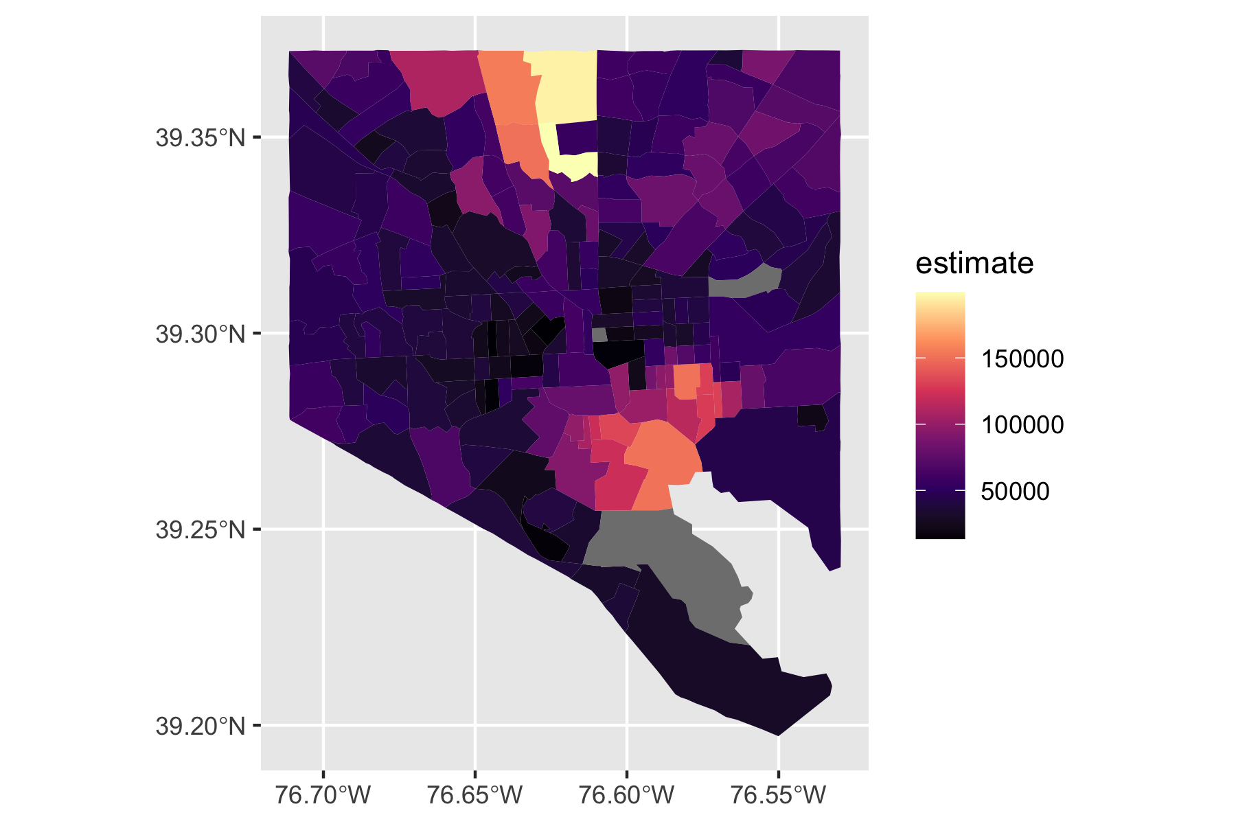
$ geometry   <POLYGON [°]> POLYGON ((-90.10964 29.9413..., POLYGON ((-90.10331…
st_crs(neighborhoods)
Coordinate Reference System:
  User input: WGS84(DD) 
  wkt:
GEOGCRS["WGS84(DD)",
    DATUM["WGS84",
        ELLIPSOID["WGS84",6378137,298.257223563,
            LENGTHUNIT["metre",1,
                ID["EPSG",9001]]]],
    PRIMEM["Greenwich",0,
        ANGLEUNIT["degree",0.0174532925199433]],
    CS[ellipsoidal,2],
        AXIS["longitude",east,
            ORDER[1],
            ANGLEUNIT["degree",0.0174532925199433]],
        AXIS["latitude",north,
            ORDER[2],
            ANGLEUNIT["degree",0.0174532925199433]]]

The WGS84(DD) means decimal degrees. This says the EPSG code is 9001 which is a projected CRS.

14.6.5 Clean the Data

When doing geospatial mapping make sure all your spatial datasets are in the same projection system. In this case let’s use the WGS84 EPSG 4326 as a geographic CRS.

  • We are interested in locations, not measuring areas or distances, so area distortion is okay on this city scale.

The function sf::st_transform(4326) takes the neighborhoods dataset and transforms it into the chosen CRS.

We will also add labels and use raw HTML to bold the word “Neighborhood” and then {stringr} to convert to title case.

neighborhoods_clean <- neighborhoods |> 
st_transform(4326) |> ## transform to WGS 84
## Add label formatted with html and Title case
mutate(neighborhood_label = str_c('<b>Neighborhood:</b> ',
                                  str_to_title(gnocdc_lab)))

Clean up variable names in hud_grants, filter out rows with no program data, and add a label.

  • Note the addition of some html to create line breaks.
hud_grants_clean <- hud_grants |> 
  rename(OCD_Program = `OCD Program`) |> 
  filter(OCD_Program != "None") |> 
  mutate(popup_label = paste(paste0('<b>Partner: ', Partnership, '</b>'),
                         paste0('Address: ', Address), 
                         sep = '<br/>')) ## HTML line break

14.6.6 The {leaflet} Package

Leaflet builds maps in a fashion similar to how {ggplot2} builds graphics, one layer at a time.

  • First create the map.
  • Add neighborhood areas.
  • Add grant project markers.

Each piece is layered on top of each other, physically, in the displayed map, and virtually, in your code.

Let’s walk piece-by-piece through making the map, with images of the map along the way.

{leaflet} has a number of functions for adding controls or layers to the map to create a new map object.

  1. First create the base layer map.
  • Leaflet supports base maps using map tiles, popularized by Google Maps and now used by many interactive web maps.
  • The easiest way to add tiles is by calling addTiles() with no arguments.
  • The default is to use OpenStreetMap tiles.

A vector tile is a lightweight data format for storing geospatial vector data, such as points, lines, and polygons.

  • Vector tiles are used to create vector tilesets.

  • Vector tiles encode geographic information according to the Vector tile specification.

  • They can be accessed with styles (rules) that define how to display the tiles.

  • leaflet() creates the underlying interactive map widget.

  • addTiles() adds the vector tiles as the tile layer of the map.

leaflet() |> 
    addTiles() -> p
p
  1. Add the neighborhood polygons to the map.
p |> 
addPolygons(data = neighborhoods_clean, color = 'white', weight = 1.5,
            opacity = 1, fillColor = "#e8e8e8", fillOpacity = .8,
            highlightOptions = highlightOptions(color = "#FFF1BE", weight = 5),
            popup = ~ neighborhood_label) ->
  p
p
  1. Add the Grants

colorFactor() is function from {scales} that Leaflet uses to map factor levels (not continuous data) to colors according to a given palette.

  • Leaflet has functions to handle numeric, factor, or character data values.

viridis_pal() defines the palette.

  • begin = .4: Start at 40% along the viridis color scale instead of starting at the very beginning (dark purple).

  • end = .95: End at 95% along the viridis color scale to stop just before the brightest yellow, ending at a yellow-green

  • option = 'A': Specifies the viridis palette to use: (‘A’ = viridis (purple → blue → green → yellow), ‘B’ = inferno (black → red → yellow), ‘C’ = plasma (purple → pink → yellow), ‘D’ = magma (black → purple → pink)

  • (3): Generate exactly 3 discrete colors for the palette (there are three grant types).

  • The domain is the possible values that can be mapped (from the data).

addCircleMarkers() is another leaflet layer function.

pal <- colorFactor(
  palette = viridis_pal(begin = .4, end = .95, option = 'A')(3),
  domain = hud_grants_clean$OCD_Program
)

p |> 
  addCircleMarkers(data = hud_grants_clean, popup = ~popup_label,
                   stroke = F, radius = 4,
                   fillColor = ~ pal(OCD_Program), fillOpacity = 1) ->
  p
p
Important

The viridis_pal() function returns a function (to generate a palette)!

  • The function has an argument for the number of discrete levels to be generated.
  • It is compatible with {ggplot2} discrete_scale() function.

Thus the syntax viridis_pal(begin = .4, end = .95, option = 'A')(3) should be read in two steps:

  1. viridis_pal(begin = .4, end = .95, option = 'A'): Create the palette generator function for a discrete viridis palette ((purple -> blue -> green -> yellow) that cuts off the extreme colors at the end.
  2. (3): The ( operator invokes/calls the function to the left of ( (the created generator function) using the value 3 as the argument.

This returns the vector of three colors to be the palette argument of colorFactor() which maps these three colors to the unique factor levels in the domain data.

If one does not specify the (3), then the code returns the generator function object instead of a vector which will cause an error when it is called later.

When using colorNumeric() to map a palette for a continuous variable, you have more choices for the number of colors you want viridis_pal() to generate. colorNumeric() uses the data to interpolate between the colors provided in the palette argument.

  • Some Practical considerations:
    • Fewer colors (3-5): Faster processing and sufficient for smooth gradients but may show slight banding in very large datasets or wide ranges of values.
    • More colors (10-20): Smoother interpolation with better color fidelity to the original viridis scale with negligible performance difference for most use cases
    • Too many colors (50+): Creates too many colors that can be difficult for users to distinguish so usually not helpful.
  • 5-10 colors is the sweet spot as it generally gives smooth interpolation without unnecessary complexity.
  1. addLegend() uses the colorFactor values to map the colors to the programs.

Your map is complete.

p |> 
  addLegend(data = hud_grants_clean, pal = pal, values = ~ OCD_Program,
            title = "HUD Grant Program") ->
  p
p

14.6.7 Leaflet in Shiny

Leaflet Maps also work in Shiny.

One can track events associated with the map and use reactive events to update the data used for other displays.

As an example, assume your Shiny app is using a leaflet map of the United States by state.

You can react to input$map_shape_click in a reactive environment and use the response to filter data to the chosen state.

# not complete working code

      ggplot_data <- reactive({
        state_click <- input$map_shape_click
        df_state_plot[df_state_plot$State %in% state_click,]
      })

    output$stateLoanRangePlot <- renderPlot({
       if (nrow(ggplot_data()) > 0) { # filter the data using the clicked state
        my_data <- ggplot_data()
      } else { # set a default for California
        my_data <- df_state_plot[df_state_plot$State %in% "CA",]
      }
        ggplot(data = my_data, aes(x = x)) +
          etc...
    })

For an additional Leaflet examples see Section 14.11.

14.7 Making Thematic Maps in R using the {tmap} Package

14.7.1 The {tmap} Package

The {tmap} package helps one create more complicated “thematic” maps (choropleth, bubble, etc.) using R.

  • {tmap} was designed to work like {ggplot2} by building up the layers of a map.
  • It works with spatial objects from the {sf} packages.
  • It can make static maps or interactive maps (using the {leaflet} package).

{tmap} can be used in two modes:

  • plot: static maps, shown in the window which can be exported in different formats.
  • view: interactive maps, shown in the viewing window or in the browser, which can be exported to standalone HTML files.

The fundamental object in tmap is a tmap_element or “shape” based on a {sf} shape.

All {tmap} functions for working with elements begin with tm_(). Other functions often begin with tmap_.

This section follows the “tmap: get started” vignette from the references.

  • Use the console to install the {tmap} package and then use library(tmap) to load and attach it.
library(tidyverse)
library(tmap)

To get started, let’s load a world map.

  • Load the World spatial object (a data frame with geographic data).
  • tm_shape() creates a tm_element of class tm_shape1.
data("World")
tm_shape(World) |> str()
List of 1
 $ :List of 7
  ..$ shp     :Classes 'sf' and 'data.frame':   177 obs. of  18 variables:
  .. ..$ iso_a3      : chr [1:177] "AFG" "ALB" "DZA" "AGO" ...
  .. ..$ name        : chr [1:177] "Afghanistan" "Albania" "Algeria" "Angola" ...
  .. ..$ sovereignt  : chr [1:177] "Afghanistan" "Albania" "Algeria" "Angola" ...
  .. ..$ continent   : Factor w/ 8 levels "Africa","Antarctica",..: 3 4 1 1 2 8 3 6 4 3 ...
  .. ..$ area        : Units: [km^2] num [1:177] 642393 28298 2312303 1249442 12258325 ...
  .. ..$ pop_est     : num [1:177] 38041754 2854191 43053054 31825295 4490 ...
  .. ..$ pop_est_dens: num [1:177] 5.92e+01 1.01e+02 1.86e+01 2.55e+01 3.66e-04 ...
  .. ..$ economy     : Factor w/ 7 levels "1. Developed region: G7",..: 7 6 6 7 6 5 6 2 2 6 ...
  .. ..$ income_grp  : Factor w/ 5 levels "1. High income: OECD",..: 5 4 3 3 2 3 4 1 1 3 ...
  .. ..$ gdp_cap_est : num [1:177] 507 5353 3974 2791 200000 ...
  .. ..$ life_exp    : num [1:177] 62 76.5 76.4 NA NA ...
  .. ..$ well_being  : num [1:177] 2.44 5.26 5.22 NA NA ...
  .. ..$ footprint   : num [1:177] 1.14 3.67 3.11 NA NA ...
  .. ..$ HPI         : num [1:177] 16.2 46.3 47.4 NA NA ...
  .. ..$ inequality  : num [1:177] NA 29.4 27.6 51.3 NA 40.7 27.9 34.3 30.7 26.6 ...
  .. .. ..- attr(*, "label")= chr "Gini index"
  .. ..$ gender      : num [1:177] 0.665 0.116 0.46 0.52 NA 0.292 0.198 0.063 0.048 0.329 ...
  .. ..$ press       : num [1:177] 19.1 54.1 42 52.4 NA ...
  .. ..$ geometry    :sfc_MULTIPOLYGON of length 177; first list element: List of 1
  .. .. ..$ :List of 1
  .. .. .. ..$ : num [1:69, 1:2] 66.2 66.5 67.1 67.8 68.1 ...
  .. .. ..- attr(*, "class")= chr [1:3] "XY" "MULTIPOLYGON" "sfg"
  .. ..- attr(*, "sf_column")= chr "geometry"
  .. ..- attr(*, "agr")= Factor w/ 3 levels "constant","aggregate",..: 3 3 1 1 2 2 2 1 1 1 ...
  .. .. ..- attr(*, "names")= chr [1:17] "iso_a3" "name" "sovereignt" "continent" ...
  ..$ is.main : logi NA
  ..$ crs     : NULL
  ..$ bbox    :List of 1
  .. ..$ x: NULL
  ..$ unit    : NULL
  ..$ filter  : NULL
  ..$ shp_name: chr "World"
  ..- attr(*, "class")= chr [1:3] "tm_shape" "tm_element" "list"
 - attr(*, "class")= chr "tmap"

Now we can add map layer polygons with tm_polygons() by putting a numeric variable as the color argument col=.

tm_shape(World) +
  tm_polygons(
    fill = "HPI",
    fill.scale = tm_scale_continuous(values = "viridis"))

14.7.2 Changing Mode from plot to view

To change the mode from plot to view, use tmap_mode().

  • This invokes the {leaflet} package for interactivity (HTML output only).
tmap_mode("view")
tm_shape(World) +
  tm_polygons("life_exp",
    fill.scale = tm_scale_continuous(values = "viridis"))

We can go back to “plot” as well.

tmap_mode("plot")
tm_shape(World) +
  tm_polygons("life_exp",
    fill.scale = tm_scale_continuous(values = "viridis"))

14.7.3 Combining Objects as Layers

Let’s load different kinds of objects and see how {tmap} can easily combine them.

Use data() to access the built-in data for metro, rivers, and land.

  • The metro data is an old-style CRS object so we will get a warning to update it when we check its CRS.
  • Use sf::st_crs(metro$geometry) <- "EPSG:4326" to update to WGS84.
  • Remove errors in land data.
data(metro, rivers, land)
#sf::st_crs(metro$geometry)
sf::st_crs(metro$geometry) <- "EPSG:4326" # fix old style CRS for metro
land_clean <- land
min_elevation <- min(land$elevation, na.rm = TRUE)
land_shifted <- land
land_shifted$elevation <- land$elevation - min_elevation + 1  #

Now we can create a map with a combination of raster data and vector features data.

  • Use tm_shape(land) and then add a raster map with elevation.
  • Add vector shapes for rivers, colored in blue.
tm_shape(land_shifted) + # create an element from class stars
  tm_raster("elevation",
            col.scale = tm_scale_intervals(values = "viridis", 
                                          style = "log10_pretty"))  +
  tm_shape(World_rivers) + #
  tm_lines(col = "blue") -> map_land_rivers
map_land_rivers

Add a shape for the world country borders (in white) and country names

map_land_rivers +
tm_shape(World) + # create an element
    tm_borders("white", lwd = .5) + # draw polygon borders only
    tm_text("iso_a3", size = "AREA") -> # add text labels
map_with_country_borders

  • Add data for metropolitan areas as symbols.
  • Move the legend outside the map.
map_with_country_borders +
tm_shape(metro) + #create an element
    tm_symbols(col = "red", size = "pop2020", scale = .5) +
tm_legend(legend.outside = TRUE) # move legend

14.7.4 Facetting

One can facet maps in three ways

  1. Facet by a variable by adding multiple variables to the aesthetic in tm_polygons().
tmap_mode("view")
tm_shape(World) +
  tm_polygons(
    fill = c("HPI", "economy"),
    fill.scale = list(
      tm_scale_continuous(values = "viridis"),      # For HPI (continuous)
      tm_scale_categorical(values = "plasma")       # For economy (categorical)
    )) +
  tm_facets(sync = TRUE, ncol = 2)
  1. Facet by using the by argument of the tm_facets().
  • Should be a factor/character with a “small” number of distinct values.
tmap_mode("plot")

World |> 
  filter(!continent %in% c("Antarctica", "Seven seas (open ocean)")) |> 
  tm_shape() +
  tm_polygons(
    fill = "HPI", 
    fill.scale = tm_scale_continuous(values = "viridis")) +
  tm_facets(by = "continent", ncol = 3)

  1. Creating multiple maps and using tm_arrange() to manually create the facets.
# Add geographic context with viridis
tm1_context <- tm_shape(World) + 
  tm_polygons(
    fill = "pop_est", 
    fill.scale = tm_scale_continuous(values = "viridis", 
                                   trans = "log10",
                                   midpoint = 50000000),
    convert2density = TRUE,
    stroke = "white",
    lwd = 0.5) +
  tm_legend(legend.outside = TRUE) +
  tm_layout(title = "Population Density",
            bg.color = "#f8f9fa")

tm2_context <- tm_shape(World) +
  tm_polygons(fill = "lightgray", stroke = "white") +  # Background countries
  tm_bubbles(
    size = "pop_est",
    fill = "pop_est",
    fill.scale = tm_scale_continuous(values = "plasma", trans = "log10"),
    alpha = 0.8,
    stroke = "white") +
  tm_legend(legend.outside = TRUE) +
  tm_layout(title = "Population Bubbles",
            bg.color = "#f8f9fa")

tm3_context <- tm_shape(World) +
  tm_polygons(fill = "lightgray", stroke = "white") +  # Background countries
  tm_shape(metro) +
  tm_symbols(
    size = "pop2030", 
    fill = "pop2030",
    fill.scale = tm_scale_continuous(values = "inferno", trans = "sqrt"),
    stroke = "white",
    stroke_lwd = 0.5) +
  tm_legend(legend.outside = TRUE) +
  tm_layout(title = "Metro Areas 2030",
            bg.color = "#f8f9fa")

tmap_arrange(tm1_context, tm2_context, tm3_context)

14.7.5 Exporting Maps

You can save images using tm_save().

tm <- tm_shape(World) +
    tm_polygons("HPI", legend.title = "Happy Planet Index")

## save an image ("plot" mode)
tmap_save(tm, filename = "./output/world_map.png")

## save as stand-alone HTML file ("view" mode)
tmap_save(tm, filename = "./output/world_map.html")

14.7.6 Shiny integration

It is possible to use {tmap} in {shiny}.

  • There are special Output and Render functions for {tmap}.
  • In invokes a leaflet widget for display.
library(shiny)
library(tmap)
data(World)

ui <- fluidPage(
  tmapOutput("my_tmap")
)

server <- function(input, output, session) {
  output$my_tmap = renderTmap({
    tm_shape(World) + 
      tm_polygons("HPI", 
                  legend.title = "Happy Planet Index")
})
}
shinyApp(ui, server)

14.8 Using Natural Earth Data for Mapping in R.

This section is based on the rspatial tutorial.

Natural Earth is a public domain map dataset including vector country and other administrative boundaries.” rnaturalearth is designed to provide data allowing creation of more elaborate maps in other visualisation packages (e.g. ggplot2, tmap and choroplethr). South (2023)

14.8.2 Country Names and Other Names (geom_text and annotate)

The world df contains country names and the coordinates of the centroid of each country.

Use geom_text() to add a layer of text to a map using geographic coordinates.

We have a very flexible control to adjust the text:

  • The size (argument size);
  • The alignment, which is centered by default on the coordinates provided.
    • Adjust horizontally or vertically using the arguments hjust and vjust, (a number between 0 (right/bottom) and 1 (top/left) or a character (“left”, “middle”, “right”, “bottom”, “center”, “top”).
    • Offset horizontally or vertically with the argument nudge_x and nudge_y;
  • Set text color with color or the type of font, fontface.
  • To control the overlap of labels, use check_overlap, which removes overlapping text.

For the text labels, define the centroid of the counties with sf::st_centroid().

Finally, the annotate() function can be used to add a single character string at a specific location, as shown here to add the “Gulf of Mexico”.

sf_use_s2(FALSE)

world_points <- st_centroid(worldhires)
world_points <- cbind(world, st_coordinates(st_centroid(world$geometry)))

ggplot(data = worldhires) +
  geom_sf() +
  geom_text(
    data = world_points, aes(x = X, y = Y, label = name),
    color = "darkblue", fontface = "bold", check_overlap = FALSE
  ) +
  annotate(
    geom = "text", x = -90, y = 26, label = "Gulf of Mexico",
    fontface = "italic", color = "grey22", size = 6
  ) +
  coord_sf(xlim = c(-97.15, -70.12), ylim = c(7.65, 30.97), expand = FALSE)

14.8.3 Set the Theme

The theme of the map can be edited to make the map more appealing.

  • The theme_bw is a good default but there are many possible themes.

Specific theme elements can be tweaked to get to the final outcome:

  • Adjust grid lines (graticules) on the map using panel.grid.major and panel.grid.minor; here set to a gray color and dashed line type.
  • Color the map background with panel.background; here set the ocean to light blue.
  • See help for the function theme().
ggplot(data = worldhires) +
  geom_sf(fill = "antiquewhite") +
  geom_text(
    data = world_points, aes(x = X, y = Y, label = name),
    color = "darkblue", fontface = "bold", check_overlap = FALSE
  ) +
  annotate(
    geom = "text", x = -90, y = 26, label = "Gulf of Mexico",
    fontface = "italic", color = "grey22", size = 6
  ) +
  annotation_scale(location = "bl", width_hint = 0.5) +
  annotation_north_arrow(
    location = "bl", which_north = "true",
    pad_x = unit(0.75, "in"), pad_y = unit(0.5, "in"),
    style = north_arrow_fancy_orienteering
  ) +
  coord_sf(xlim = c(-102.15, -74.12), ylim = c(7.65, 33.97), expand = FALSE) +
  xlab("Longitude") +
  ylab("Latitude") +
  ggtitle("Map of the Gulf of Mexico and the Caribbean Sea") +
  theme(
    panel.grid.major = element_line(
      color = gray(.5),
      linetype = "dashed", linewidth = 0.5
    ),
    panel.background = element_rect(fill = "aliceblue")
  )

14.8.4 Save the Map with ggsave()

ggsave() allows a graphic to be saved in a variety of formats, including the most common PNG (raster bitmap) and PDF (vector graphics), with control over the size and resolution of the outcome.

Here we save a PDF version of the map, which keeps the best quality, and a PNG version of it for web purposes.

ggsave("./output/map.pdf")
ggsave("./output/map_web.png", width = 6, height = 6, dpi = "screen")

14.8.5 Adding Data to a Map

14.8.6 Individual Points

We start by defining two study sites, according to their longitude and latitude, stored in a regular data frame.

sites <- data.frame(
  longitude = c(-80.144005, -80.109),
  latitude = c(26.479005, 26.83)
)
sites
  longitude latitude
1 -80.14401   26.479
2 -80.10900   26.830

You could use geom_point() to adds points but that works on the X, Y scale of the plot, not the map.

The recommended approach is to use functions from the {sf} package to convert locations to sf objects which can handle conversions between projections.

  • That requires entering the projection of the original points as part of the conversion function.

Then you can plot using the map information so the points remain in the right place, even if you change the limits of the map.

sites <- st_as_sf(sites,
  coords = c("longitude", "latitude"),
  crs = 4326, agr = "constant"
) ## WGS84

ggplot(data = worldhires) +
  geom_sf() +
  geom_sf(data = sites, size = 4, shape = 23, fill = "darkred") +
  coord_sf(xlim = c(-88, -78), ylim = c(24.5, 33), expand = FALSE)
## Note points stay in the right location when zoomed in
ggplot(data = worldhires) +
  geom_sf() +
  geom_sf(data = sites, size = 4, shape = 23, fill = "darkred") +
  coord_sf(xlim = c(-82, -78), ylim = c(24.5, 28), expand = FALSE)

  • Note that coord_sf()has to be called after all geom_sf() calls, as to supersede any former input.

14.9 Using the {maps} Package with State, County, and City Data

The {maps} package is another option for working with {ggplot2}.

It is based on naturalearth data and adds additional information about US states and counties.

  • Install the package using the console.
  • Note when you load it, it masks the purrr::map() function
  • If you want to use purrr::map() then you have to specify using purrr::map() or detach the maps package.
library(maps)
states <- st_as_sf(map("state", plot = FALSE, fill = TRUE))
head(states)
Simple feature collection with 6 features and 1 field
Geometry type: MULTIPOLYGON
Dimension:     XY
Bounding box:  xmin: -124.3834 ymin: 30.24071 xmax: -71.78015 ymax: 42.04937
Geodetic CRS:  +proj=longlat +ellps=clrk66 +no_defs +type=crs
                     ID                           geom
alabama         alabama MULTIPOLYGON (((-87.46201 3...
arizona         arizona MULTIPOLYGON (((-114.6374 3...
arkansas       arkansas MULTIPOLYGON (((-94.05103 3...
california   california MULTIPOLYGON (((-120.006 42...
colorado       colorado MULTIPOLYGON (((-102.0552 4...
connecticut connecticut MULTIPOLYGON (((-73.49902 4...

State names are part of this data, as the ID variable.

A simple (but not necessarily optimal) way to add state name is to compute the centroid of each state polygon as the coordinates where to draw their names.

  • Centroids are computed with the function st_centroid, their coordinates extracted with st_coordinates, and attached to the state object.
states <- bind_cols(states, as_tibble(st_coordinates(st_centroid(states))))
states$ID <- str_to_title(states$ID)

State data is directly plotted as an additional sf layer using geom_sf for simple features.

  • State names can be added using geom_text(), declaring coordinates on the X-axis and Y-axis, as well as the label (from ID), and a relatively big font size.
ggplot(data = worldhires) +
  geom_sf() +
  geom_sf(data = states, fill = NA) +
  geom_text(data = states, aes(X, Y, label = ID), size = 5) +
  coord_sf(xlim = c(-88, -78), ylim = c(24.5, 33), expand = FALSE)

  • Use nudge_* to adjust names as desired.
states$nudge_y <- -1
states$nudge_y[states$ID == "Florida"] <- 1.1
states$nudge_y[states$ID == "South Carolina"] <- .1

ggplot(data = worldhires) +
  geom_sf() +
  geom_sf(data = states, fill = NA) +
  coord_sf(xlim = c(-88, -78), ylim = c(24.5, 33), expand = FALSE) +
  geom_text(
    data = states, aes(X, Y, label = ID), size = 5, fontface = "bold",
    nudge_y = states$nudge_y
  )

We can also get County data from maps.

counties <- st_as_sf(map("county", plot = FALSE, fill = TRUE))
counties  |> 
  filter(str_detect(ID, "florida")) ->
counties
counties$area <- as.numeric(st_area(counties))
head(counties)
Simple feature collection with 6 features and 2 fields
Geometry type: MULTIPOLYGON
Dimension:     XY
Bounding box:  xmin: -85.98951 ymin: 25.94926 xmax: -80.08804 ymax: 30.57303
Geodetic CRS:  +proj=longlat +ellps=clrk66 +no_defs +type=crs
                               ID                           geom       area
florida,alachua   florida,alachua MULTIPOLYGON (((-82.66062 2... 2498821972
florida,baker       florida,baker MULTIPOLYGON (((-82.04182 3... 1542442788
florida,bay           florida,bay MULTIPOLYGON (((-85.40509 3... 1946558057
florida,bradford florida,bradford MULTIPOLYGON (((-82.4257 29...  818885030
florida,brevard   florida,brevard MULTIPOLYGON (((-80.94747 2... 2189639534
florida,broward   florida,broward MULTIPOLYGON (((-80.89018 2... 3167310672

Create a choropleth map of the total area in each County in Florida.

  • use a square root transformation for the palette to highligh differences in the middle.
ggplot(data = worldhires) +
  geom_sf() +
  geom_sf(data = states, fill = NA) +
  geom_text(
    data = states, aes(X, Y, label = ID), size = 5, fontface = "bold",
    nudge_y = states$nudge_y
  ) +
  geom_sf(data = counties, aes(fill = area)) +
  scale_fill_viridis_c(trans = "sqrt", alpha = .4) +
  coord_sf(xlim = c(-88, -78), ylim = c(24.5, 33), expand = FALSE)

You can add cities if you know their latitude and longitude.

  • If you have a GoogleMaps API you can use googleway::geocode() to find them.

Add the five largest cities in Florida to a data frame and convert it to an sf object.

flcities <- tibble(
  state = rep("Florida", 5),
  city = c("Miami", "Tampa", "Orlando", "Jacksonville", "Sarasota"),
  lat = c(25.7616798, 27.950575, 28.5383355, 30.3321838, 27.3364347),
  lng = c(-80.1917902, -82.4571776, -81.3792365, -81.655651, -82.5306527)
)

flcities <- st_as_sf(flcities,
  coords = c("lng", "lat"), remove = FALSE,
  crs = 4326, agr = "constant"
)

ggplot(data = worldhires) +
  geom_sf() +
  geom_sf(data = states, fill = NA) +
  geom_text(
    data = states, aes(X, Y, label = ID), size = 5, fontface = "bold",
    nudge_y = states$nudge_y
  ) +
  geom_sf(data = counties, aes(fill = area)) +
  scale_fill_viridis_c(trans = "sqrt", alpha = .4) +
  geom_sf(data = flcities) +
  geom_text(
    data = flcities, aes(x = lng, y = lat, label = city),
    size = 3.9, col = "black", fontface = "bold"
  ) +
  coord_sf(xlim = c(-88, -78), ylim = c(24.5, 33), expand = FALSE)

Use {ggrepel} package to fix the city name locations.

library("ggrepel")
ggplot(data = worldhires) +
  geom_sf() +
  geom_sf(data = states, fill = NA) +
  geom_text(
    data = states, aes(X, Y, label = ID), size = 5, fontface = "bold",
    nudge_y = states$nudge_y
  ) +
  geom_sf(data = counties, aes(fill = area)) +
  scale_fill_viridis_c(trans = "sqrt", alpha = .4) +
  geom_text_repel(
    data = flcities, aes(x = lng, y = lat, label = city),
    fontface = "bold", 
    nudge_x = c(1, -1.5, 2, 2, -1), 
    nudge_y = c(0.25, -0.25, 0.5, 0.5, -0.5)) +
  coord_sf(xlim = c(-88, -78), ylim = c(24.5, 33), expand = FALSE)

Combine the data all together with some extra formatting.

ggplot(data = worldhires) +
  geom_sf(fill = "antiquewhite1") +
  geom_sf(data = counties, aes(fill = area)) +
  geom_sf(data = states, fill = NA) +
  geom_sf(data = sites, size = 4, shape = 23, fill = "darkred") +
  geom_sf(data = flcities) +
  geom_text_repel(
    data = flcities, aes(x = lng, y = lat, label = city),
    fontface = "bold", nudge_x = c(1, -1.5, 2, 2, -1), nudge_y = c(
      0.25,
      -0.25, 0.5, 0.5, -0.5
    )
  ) +
  geom_label(
    data = states, aes(X, Y, label = ID), size = 5, fontface = "bold",
    nudge_y = states$nudge_y
  ) +
  scale_fill_viridis_c(trans = "sqrt", alpha = .4) +
  annotation_scale(location = "bl", width_hint = 0.4) +
  annotation_north_arrow(
    location = "bl", which_north = "true",
    pad_x = unit(0.75, "in"), pad_y = unit(0.5, "in"),
    style = north_arrow_fancy_orienteering
  ) +
  coord_sf(xlim = c(-88, -78), ylim = c(24.5, 33), expand = FALSE) +
  xlab("Longitude") +
  ylab("Latitude") +
  ggtitle("Observation Sites", subtitle = "(2 sites in Palm Beach County, Florida)") +
  theme(panel.grid.major = element_line(
    color = gray(0.5), linetype = "dashed",
    linewidth = 0.5
  ), panel.background = element_rect(fill = "aliceblue"))

14.10 Mapping the US with the {usmap} Package

The {usmap} package allows create choropleth maps of the United States with Alaska and Hawaii “moved” so they fit in the bottom left hand corner of the map.

  • It is difficult to create nice US choropleths that include Alaska and Hawaii given their distance from the other 48 states.
  • The {usmap} data frames have Alaska and Hawaii conveniently placed to the bottom left.

The {usmap} package has convenience functions for plotting choropleths and working with FIPS codes.

  • usmap::plot_usmap() returns a ggplot object, which means we can add {ggplot2} layers to the plot right out of the box.

Let’s load several libraries and the {usmap} data set for state populations.

library(tidyverse)
library(usmap)
data(statepop)
head(statepop)
# A tibble: 6 × 4
  fips  abbr  full       pop_2022
  <chr> <chr> <chr>         <dbl>
1 01    AL    Alabama     5074296
2 02    AK    Alaska       733583
3 04    AZ    Arizona     7359197
4 05    AR    Arkansas    3045637
5 06    CA    California 39029342
6 08    CO    Colorado    5839926

Note the column fips for Federal Information Processing System (FIPS) codes.

  • These are an older US government standard for using numbers to uniquely identify geographic areas.
  • The number of digits in FIPS codes vary depending on the level of geography.
    • State-level FIPS codes have two digits and county-level FIPS codes have five digits of which the first two are the FIPS code of the state to which the county belongs.
  • The US Census Bureau often provides FIPS codes with the data.
Important

Functions in {usmap} are built around the FIPS code identification system.

14.10.1 Create Maps of the Country, Regions and States

Let’s load some data saved from the Census Bureau at https://raw.githubusercontent.com/AU-datascience/data/main/413-613/state_geo_data.csv.

states <- read_csv("https://raw.githubusercontent.com/AU-datascience/data/main/413-613/state_geo_data.csv", col_types = cols(OID = col_character()))

Create an Empty map with a colored background and labels for states.

plot_usmap(regions = "states", labels = TRUE) +
  labs(
    title = "US States",
    subtitle = "This is a blank map of the states of the United States."
  ) +
  theme(panel.background = element_rect(color = "black", fill = "lightblue"))

Note the locations of Alaska and Hawaii are not geographically correct but they are convenient for display.

14.10.1.1 Create a map of the South Atlantic region

The packages uses pre-defined Census Regions.

plot_usmap(include = .south_atlantic, labels = TRUE) +
  labs(
    title = "US South Atlantic States",
    subtitle = "This is a blank map of the states in the South Atlantic Census Region"
  ) +
  theme(panel.background = element_rect(color = "black", fill = "lightblue"))

14.10.1.2 Create a map of the Counties

Map with just the borders.

plot_usmap(regions = "counties") +
  labs(
    title = "US Counties",
    subtitle = "This is a blank map of the counties of the United States."
  ) +
  theme(panel.background = element_rect(color = "black", fill = "lightblue"))

14.10.1.3 Create a map of the Counties in Specific States

Use include = with a character vector of state abbreviations.

plot_usmap("counties", include = c("VA", "MD", "DC")) +
  labs(
    title = "Custom DMV Area",
    subtitle = "These are the counties in MD, DC, and VA."
  ) +
  theme(panel.background = element_rect(color = "blue", fill = "lightblue"))

14.10.1.4 Create a Map of Specific Counties in a Custom Region

Select by FIPS (five digit code)

  • You could read in the data from the referenced FIP site to create a data frame you could search.
dmv_county_fips <- c(
  "11001", "24003", "24009", "24017", "24021", "24027", "24031",
  "24033", "51013", "51059", "51061", "51107", "51153", "51179",
  "51510", "51600", "51610", "51630", "51683", "51685"
)
plot_usmap("counties", include = dmv_county_fips, labels = TRUE) +
  labs(
    title = "Greater DMV Area",
    subtitle = "These are the Counties/Cities in the Greater DMV area."
  ) +
  theme(panel.background = element_rect(color = "blue", fill = "lightblue"))

14.10.2 Add COVID Data to Maps

14.10.2.1 Load COVID Data from Johns Hopkins

COVID-19 Data Repository by the Center for Systems Science and Engineering (CSSE) at Johns Hopkins University

On March 10, 2023, the Johns Hopkins Coronavirus Resource Center ceased its collecting and reporting of global COVID-19 data.

Download the data at https://raw.githubusercontent.com/AU-datascience/data/main/413-613/JHU_covid_us_23_03_09_clean.rds using the following and glimpse the data.

df_all <- read_rds("https://raw.githubusercontent.com/AU-datascience/data/main/413-613/JHU_covid_us_23_03_09_clean.rds")
glimpse(df_all)
Rows: 7,365,492
Columns: 9
$ case_type          <fct> confirmed_US, confirmed_US, confirmed_US, confirmed…
$ cFIPS              <chr> "01001", "01001", "01001", "01001", "01001", "01001…
$ sFIPS              <chr> "01", "01", "01", "01", "01", "01", "01", "01", "01…
$ County             <chr> "Autauga", "Autauga", "Autauga", "Autauga", "Autaug…
$ Province_State     <chr> "Alabama", "Alabama", "Alabama", "Alabama", "Alabam…
$ Population         <dbl> 55869, 55869, 55869, 55869, 55869, 55869, 55869, 55…
$ Date               <date> 2020-01-22, 2020-01-23, 2020-01-24, 2020-01-25, 20…
$ Daily_Total        <dbl> 0, 0, 0, 0, 0, 0, 0, 0, 0, 0, 0, 0, 0, 0, 0, 0, 0, …
$ Daily_Total_percap <dbl> 0, 0, 0, 0, 0, 0, 0, 0, 0, 0, 0, 0, 0, 0, 0, 0, 0, …

14.10.3 State-Level Data

Calculate Totals by State.

df_all |>
  filter(Date == max(Date), Population > 0, !is.na(sFIPS)) |>
  group_by(sFIPS, case_type, Date) |>
  summarise(
    Current_Total = sum(Daily_Total),
    Current_Total_percap = sum(Current_Total) / sum(Population),
    .groups = "drop"
  ) ->
state_totals


state_totals |>
  group_by(case_type) |>
  summarize(sumc = sum(Current_Total), n = n())
# A tibble: 2 × 3
  case_type         sumc     n
  <fct>            <dbl> <int>
1 confirmed_US 102548185    52
2 deaths_US      1102336    52

Create Maps with Absolute Totals.

Show code
state_totals |>
  filter(case_type == "confirmed_US") |>
  rename(fips = sFIPS) ->
state_cases

plot_usmap(data = state_cases, values = "Current_Total", color = "white") +
 scale_fill_viridis_c(
    name = "Cases", 
    labels = scales::comma,
    option = "inferno"
  ) +
  labs(
    title = "US States",
    subtitle = paste0(
      "Total Cases by State as of ",
      max(state_cases$Date)
    )
  ) +
  theme(panel.background = element_rect(color = "black", fill = "white")) +
  theme(legend.position = "right") 
state_totals |>
  filter(case_type == "deaths_US") |>
  rename(fips = sFIPS) ->
state_cases
plot_usmap(data = state_cases, values = "Current_Total", color = "white") +
  scale_fill_viridis_c(
    name = "Deaths", 
    labels = scales::comma,
    option = "inferno"
  ) +
  labs(
    title = "US States",
    subtitle = paste0("Total Deaths by State as of ", max(state_cases$Date))
  ) +
  theme(panel.background = element_rect(color = "black", fill = "white")) +
  theme(legend.position = "right")

Create Maps with Per Capita Totals.

Show code
state_totals |>
  filter(case_type == "confirmed_US") |>
  rename(fips = sFIPS) ->
state_cases

plot_usmap(
  data = state_cases, values = "Current_Total_percap",
  color = "white"
) +
   scale_fill_viridis_c(
    name = "Cases per Capita", 
    labels = scales::comma,
    option = "inferno"
  ) +
  labs(
    title = "US States",
    subtitle = paste0(
      "Cases per Capita by State as of ",
      max(state_cases$Date)
    )
  ) +
  theme(panel.background = element_rect(color = "black", fill = "white")) +
  theme(legend.position = "right")
state_totals |>
  filter(case_type == "deaths_US") |>
  rename(fips = sFIPS) ->
state_cases

plot_usmap(
  data = state_cases, values = "Current_Total_percap",
  color = "white"
) +
   scale_fill_viridis_c(
    name = "Deaths per Capita", 
    labels = scales::comma,
    option = "inferno"
  ) +
  labs(
    title = "US States",
    subtitle = paste0("Deaths per Capita by State as of ",
      ... = max(state_cases$Date)
    )
  ) +
  theme(panel.background = element_rect(color = "black", fill = "white")) +
  theme(legend.position = "right")

The Absolute Totals appears highly skewed.

  • This may mean the highly skewed numbers put more states at the same level and that may hide your desired analytical purpose.
  • Lets compare the original for deaths with two transformations for skewed data.
Show code
state_totals |>
  filter(case_type == "deaths_US") |>
  rename(fips = sFIPS) ->
state_cases
plot_usmap(data = state_cases, values = "Current_Total", color = "white") +
  labs(
    title = "US States",
    subtitle = paste0("Total Deaths by State as of ", max(state_cases$Date))
  ) +
  theme(panel.background = element_rect(color = "black", fill = "white")) +
  theme(legend.position = "right") -> plot_base
plot_base +
  scale_fill_viridis_c(
    name = "Deaths", 
    labels = scales::comma,
    option = "inferno"
  ) 
  
plot_base +
  scale_fill_viridis_c(
    name = "Deaths", 
    labels = scales::comma,
    option = "inferno",
    trans = "sqrt"
  )

plot_base +
  scale_fill_viridis_c(
    name = "Deaths", 
    labels = scales::comma,
    option = "inferno",
    trans = "log"
  )

No transformation

Square Root transformation

Log transformation

Total Deaths: no transformation, square root, and log.

Note

Transformations within the palette do not change the data, they adjust the color scale mapping so the numbers on the axes and in the legend remain consistent with original data.

  • Linear scale (no transformation)
    • Raw values mapped directly to colors
    • States with highest case counts (CA, TX, FL) dominate visually
    • Most states appear very similar in light colors
    • Extreme values compress the color range for moderate values
  • Square root transformation (trans = “sqrt”):
    • Compresses the range between high and low values
    • Reveals more variation among mid-range states
    • High-population states still stand out but less dramatically
    • Better for showing relative patterns across all states
  • Log transformation (trans = “log10”):
    • Most aggressive compression of extreme values
    • Emphasizes proportional rather than absolute differences
    • Good for highly skewed data where a few states have vastly more cases
    • Can make small differences appear more significant

Interpretations:

  • Without transformation: “California has an overwhelming number of cases”
  • With “sqrt” transformation: “California leads, but several states show concerning levels”
  • With “log” transformation: “States show proportionally similar patterns relative to their baseline”

The key is matching your transformation to your analytical goal; absolute comparison versus relative pattern detection.

For COVID cases, sqrt often works well because it preserves the importance of absolute case counts while revealing meaningful patterns among mid-range states that would otherwise be washed out.

Use a Join to Create Per-Area Maps.

state_cases |>
  left_join(states, by = c("fips" = "STATE")) |>
  mutate(Current_Total_perarea = log10(Current_Total / AREALAND)) ->
state_casesa

plot_usmap(
  data = state_casesa, values = "Current_Total_perarea",
  color = "white"
) +
  scale_fill_viridis_c(
    name = "Deaths", 
    labels = scales::comma,
    option = "inferno"
  ) +
  labs(
    title = "US States",
    subtitle = paste0("Deaths per unit area by State as of ",
      ... = max(state_cases$Date)
    )
  ) +
  theme(panel.background = element_rect(color = "black", fill = "white")) +
  theme(legend.position = "right")

14.10.4 County Level Data

Current Totals Cases by County (using the latest (Max) Date).

df_all |>
  filter(Date == max(Date), Population > 0, !is.na(cFIPS)) |>
  group_by(cFIPS, case_type, Date) |>
  summarise(
    Current_Total = sum(Daily_Total),
    Current_Total_percap = sum(Daily_Total) / sum(Population)
  ) ->
county_totals

Add to a County Map for New York and New Jersey.

county_totals |>
  filter(case_type == "confirmed_US") |>
  mutate(Current_Total_log2 = log2(Current_Total)) |>
  rename(fips = cFIPS) ->
county_cases

plot_usmap(
  data = county_cases, include = c("NY", "NJ"),
  values = "Current_Total", color = "white"
) +
  scale_fill_viridis_c(
    name = "Deaths", 
    labels = scales::comma,
    option = "inferno"#,
    #trans = "sqrt"
  ) +
  labs(
    title = "US States",
    subtitle = paste0(
      "Total Cases by County as of ",
      max(state_cases$Date)
    )
  ) +
  theme(panel.background = element_rect(color = "black", fill = "white")) +
  theme(legend.position = "right")

Add to a County/City Map for DMV.

plot_usmap(
  data = county_cases, include = dmv_county_fips,
  values = "Current_Total", color = "white",
  labels = TRUE,
  label_color = "cyan",
  size = .3 # change font size on labels
) +
  scale_fill_viridis_c(
    name = "Cases", 
    labels = scales::comma,
    option = "inferno"#,
   #trans = "sqrt"
  ) +
  labs(
    title = "DMV Region",
    subtitle = paste0(
      "Cases by County/City as of ",
      max(state_cases$Date)
    )
  ) +
  theme(panel.background = element_rect(color = "black", fill = "white")) +
  theme(legend.position = "right")
county_totals |>
  filter(case_type == "deaths_US") |>
  rename(fips = cFIPS) ->
county_deaths
plot_usmap(
  regions = "counties", data = county_deaths, include = dmv_county_fips,
  values = "Current_Total", color = "white",
  labels = TRUE,
  label_color = "cyan",
  size = .3 # change font size on labels
) +
scale_fill_viridis_c(
    name = "Deaths", 
    labels = scales::comma,
    option = "inferno"#,
    #trans = "sqrt"
  ) +
  labs(
    title = "DMV Region",
    subtitle = paste0(
      "Deaths by County/City as of ",
      max(state_cases$Date)
    )
  ) +
  theme(panel.background = element_rect(color = "black", fill = "white")) +
  theme(legend.position = "right")

Per Capita Cases and Deaths.

Show code
plot_usmap(
  data = county_cases, include = dmv_county_fips,
  values = "Current_Total_percap", color = "white",
  labels = TRUE,
  label_color = "cyan",
  size = .3
) +
  scale_fill_viridis_c(
    name = "Cases", 
    labels = scales::comma,
    option = "inferno"#,
    #trans = "sqrt"
  ) +
  labs(
    title = "DMV Region",
    subtitle = paste0(
      "Cases per Capita by County/City as of ",
      max(state_cases$Date)
    )
  ) +
  theme(panel.background = element_rect(color = "black", fill = "white")) +
  theme(legend.position = "top")
county_totals |>
  filter(case_type == "deaths_US") |>
  rename(fips = cFIPS) ->
county_deaths
plot_usmap(
  data = county_deaths, include = dmv_county_fips,
  values = "Current_Total_percap", color = "white",
  labels = TRUE,
  label_color = "cyan",
  size = .3
) +
 scale_fill_viridis_c(
    name = "Deaths", 
    labels = scales::comma,
    option = "inferno"#,
    #trans = "sqrt"
  ) +
  labs(
    title = "DMV Region",
    subtitle = paste0(
      "Deaths per Capita by County/City as of ",
      max(state_cases$Date)
    )
  ) +
  theme(panel.background = element_rect(color = "black", fill = "white")) +
  theme(legend.position = "right")

14.10.5 Create Daily Change Data from Cumulative Totals

Need to convert the daily totals to differences

  • Gets a bit complicated as there may be days when corrections lead to reductions in the totals so the max of the daily total day may not be correct for some geographies.
  • Have to arrange the data.
df_all |>
  filter(!Daily_Total == 0) |>
  select(Province_State, County, cFIPS, Date, case_type, Daily_Total) |>
  pivot_wider(names_from = case_type, values_from = Daily_Total, values_fill = 0) |>
  rename("cases" = confirmed_US, "deaths" = deaths_US, "fips" = cFIPS) |>
  arrange(Province_State, County, Date) |>
  group_by(Province_State, County) |>
  mutate(
    first_date = min(Date),
    first_cases = cases[Date == first_date],
    first_deaths = deaths[Date == first_date],
    daily_cases = c(min(first_cases), diff(cases)),
    daily_deaths = c(min(first_deaths), diff(deaths))
  ) |>
  select(Date, County, Province_State, fips, cases, daily_cases, deaths, daily_deaths) ->
df_daily_data

Map the maximum case count for each county at any time.

dmv_county_fips <- c(
  "11001", "24003", "24009", "24017", "24021", "24027", "24031",
  "24033", "51013", "51059", "51061", "51107", "51153", "51179",
  "51510", "51600", "51610", "51630", "51683", "51685"
)
df_daily_data |>
  group_by(Province_State, County, fips) |>
  filter(fips %in% dmv_county_fips)  |>
  summarize(max_cases = max(daily_cases), .groups = "drop") ->
max_cases_df

plot_usmap(
  data = max_cases_df, include = dmv_county_fips,
  values = "max_cases", color = "white",
    labels = TRUE,
  label_color = "cyan",
  size = .1
) +
  scale_fill_viridis_c(
    name = "Max Cases in a day", 
    labels = scales::comma,
    option = "inferno",
   trans = "sqrt"
  ) +
  labs(
    title = "DMV Region",
    subtitle = paste0(
      "Maximum Cases in a Day as of ",
      max(df_daily_data$Date)
    )
  ) +
  theme(panel.background = element_rect(color = "black", fill = "white")) +
  theme(legend.position = "right")

To move the labels out of the way, you can use the {ggrepel} package.

  • Use {usmap} data and {sf} functions to get county centroids.
  • Need to convert from a simple features point to x and y values.
library(sf)
us_map(regions = "counties") |>
  filter(fips %in% dmv_county_fips) |>
  group_by(fips, county, abbr) |>
  summarise(geometry = st_union(geom), .groups = "drop") |> # Combine all points 
  st_centroid() |> # Calculate true geometric centroid
  mutate(
    x = st_coordinates(geometry)[, "X"], # extract x
    y = st_coordinates(geometry)[, "Y"]  # extract y
  ) |>
  st_drop_geometry() ->
county_centroids
  • Turn off plot_usmap()’s built-in labels and add geom_text_repel() with the new centroids.
library(ggplot2)
library(ggrepel)
plot_usmap(
  data = max_cases_df, include = dmv_county_fips,
  values = "max_cases", color = "white",
) +
  scale_fill_viridis_c(
    name = "Max Cases in a day",
    labels = scales::comma,
    option = "inferno",
    trans = "sqrt"
  ) +
  labs(
    title = "DMV Region",
    subtitle = paste0(
      "Maximum Cases in a Day as of ",
      max(df_daily_data$Date)
    )
  ) +
  theme(panel.background = element_rect(color = "black", fill = "white")) +
  theme(legend.position = "right") +
  geom_text_repel(
    data = county_centroids,
    aes(x = x, y = y, label = county),
    color = "cyan",
    size = 3
  )

14.11 Creating Interactive Leaflet Maps using JavaScript or Shiny

Static maps are fixed in their presentation to the user. Leaflet allows for interactivity as it monitors user actions to include clicking on the map. ” This section provides two examples of using interactivity with leaflet to change the presentation of a map by “drilling down” into higher resolution data.

  • Using Leaflet with Javascript to monitor for clicks and change the map in response to a click.
  • Using R Shiny (in a code chunk) to monitor for “events” and change the map in response to a click.

The base map is a choropleth map showing median household income from the 2023 5 year American Community Survey (ACS) for Congressional Districts in the DC-MD-VA (DMV) area.

When a user clicks on a Congressional District, the map changes to show the median household income for at the census tract level for tracts associated with the District (and to add a legend).

  • Thee map also presents a “pop-up” with a summary of the data for the district and tracts.

Both approaches require obtaining the two sets of data from the Census Bureau (using {tidycensus}) with the appropriate geography level.

  • The data is cleaned to limit the data to the Congressional Districts of interest.
  • Since Census Tracts are not directly aligned to a single Congressional District, {sf} functions are used to find the intersection of districts and tracts and identify the “best” District for each tract based on identifying the district with the largest geographic overlap for each tract.
  • Functions from {rmapshaper} simplify (reduce) the highly detailed geometry coordinates to a subset which reduces file size but is sufficient for web display.
  • The spatial data is also converted to GeoJSON format for JavaScript consumption and saved to disk.

Once the data is prepared, each example is presented with near-identical functionality, with one key difference:

Popup positioning: The JavaScript version calculates district boundaries to position popups at the northwest corner and uses CSS to customize the popup arrow placement. The Shiny version uses a fixed pixel offset from the click location, as it doesn’t have direct access to the geographic bounds within the popup positioning logic.

Deployment considerations: The JavaScript version embeds interactivity directly in the rendered HTML and works in any browser without a server. The Shiny version requires a running R server, so it only works interactively in RStudio or when deployed as a Shiny application.

14.11.1 Setup the Map

  1. Load Libraries
library(tidycensus)
library(dplyr)
library(sf)
  1. Define the variable of interest and the Congressional Districts of interest.
# Variable to map
var <- "B19013_001" # Median Household Income

# The Congressional Districts that touch DC
dmv_cd_geoid <- c(
  "11001",  # DC at-large
  "24008",  # MD-8
  "24004",  # MD-4
  "51008",  # VA-8
  "51011"   # VA-11
)

14.11.2 Get Census Data

  1. Use {tidycensus} to get ACS data and use cache: true to reduce re-downloading data.
# Congressional districts for DMV (DC, MD, VA)
my_districts <- 
    get_acs(
  geography = "congressional district",
  variables = var,
  state = c("DC", "MD", "VA"),
  geometry = TRUE,
  year = 2023,
  key = keyring::key_get("API_KEY_CENSUS")
    )
my_tracts <- 
    get_acs(
  geography = "tract",
  variables = var,
  state = c("DC", "MD", "VA"),
  geometry = TRUE,
  year = 2023,
  key = keyring::key_get("API_KEY_CENSUS")
    )
  1. Get the Districts that touch DC and clean the names.
library(stringr)
my_districts |> 
  mutate(
    GEOID = str_replace(GEOID, "1198", "1101"),
    GEOID = str_replace(GEOID, "(\\d{2})(\\d{1,2})$", "\\10\\2"),
    old_name = NAME,
    NAME = str_replace(NAME, "Congressional ", ""),
    NAME = str_replace(NAME, " \\(118th Congress\\)", ""),
    NAME = str_replace(NAME, "Maryland", "MD"),
    NAME = str_replace(NAME, "Virginia", "VA"),
    NAME = str_replace(NAME, "District of Columbia", "DC")) |> 
  filter(GEOID %in% dmv_cd_geoid) ->
  dmv_districts

14.11.3 Use Geospatial Tools to Connect Districts and Tracts

Census Tracts are not aligned within Congressional Districts so we need to use geospatial tools to create the intersection of tracts and districts and align each tract to the district that has “most” of it.

  1. Transform both geometries to the same CRS.
dmv_districts <- st_transform(dmv_districts, 4326)
my_tracts <- st_transform(my_tracts, 4326)
  1. Create the intersection of the tracts with each district and filter to those that have an intersection.
# Keep only tracts that intersect DMV districts
intersects_matrix <- st_intersects(my_tracts, dmv_districts)

# Filter tracts that intersect at least one DMV district
dmv_tracts <- my_tracts[lengths(intersects_matrix) > 0, ]
  1. Use st_join() with largest=TRUE to assign each tract to one district.
  • This prevents duplicate geometries and make the data set smaller.
dmv_tracts <- st_join(
  dmv_tracts, 
  dmv_districts %>% select(GEOID, NAME), 
  join = st_intersects,
  largest = TRUE  # Assign to district with largest overlap
)

# Verify no duplicates
dmv_tracts |> 
  group_by(GEOID.x) |> 
  filter(n() > 1) |> 
  nrow()  # Should be 0
[1] 0

14.11.4 Plot Districts and Tracts Together

  1. {tmap} allows for a quick plot that overlays the tracts on top of the districts.
library(tmap)
#| message: false
#| warning: false

tm_shape(dmv_districts) +
  tm_polygons("estimate", fill_alpha = 0.5, col = "black", lwd = 2,
              fill.legend = tm_legend(title = "District Median Income")) +
  tm_text("GEOID", size = 0.9, col = "black", 
          options = opt_tm_text(shadow = TRUE)) +
  tm_shape(dmv_tracts) +
  tm_polygons("estimate", fill_alpha = .3, 
              col = "green", lty = "dashed", 
              fill.legend = tm_legend(title = "Tract Median Income")) +
  tm_title("DMV Congressional Districts & Tracts")

14.11.5 Prep the data for Javascript Interactivity

We have data frames dmv_districts which is a simple features object with GEOID, NAME, estimate and dmv_tracts which is also a simple features object with GEOID.x (tract), GEOID.y (district), estimate, geometry

The code in Listing 14.2 prepares geographic data for the interactive drill-down choropleth map by simplifying census tract geometries and exporting them in a web-friendly format.

  • It selects and renames columns - Extracts only the necessary fields from the tract data: tract GEOID, district GEOID, and median household income estimate
  • It transforms coordinate system - Converts to WGS84 (EPSG:4326), the standard for web mapping.
  • It simplifies geometries by using ms_simplify() to reduce the number of coordinate points by 95% while preserving polygon shapes.
    • This dramatically reduces file size (from 1GB+ to ~358KB) without visible quality loss at typical web map zoom levels.
  • It exports the simplified data as GeoJSON so the the simplified tract data is in a standard GeoJSON file that can be loaded by Leaflet in the browser.
  • It creates a color palette by defining a “Blues” color scheme for mapping district-level median incomes.

The original tract geometries contained ~31,000 coordinates per tract (likely from high-resolution source data).

  • For web display, this is excessive and causes performance issues.
  • The keep = 0.05 parameter retains only 5% of vertices, which is more than sufficient for census tracts at typical viewing scales.
Listing 14.1: Prepare the data via simplification
library(sf)           # Spatial data handling and operations
library(rmapshaper)   # Geometry simplification (ms_simplify function)
library(leaflet)      # Interactive web maps
library(geojsonsf)    # Converting sf objects to GeoJSON format
library(htmlwidgets)  # Embedding JavaScript in R (onRender function)

# Create a smaller tract dataset for JSON export

# Simplify geometries BEFORE converting
tracts_simplified <- dmv_tracts |> 
  select(GEOID.x, GEOID.y, estimate) |> 
  rename(
    tract_geoid = GEOID.x,
    district_geoid = GEOID.y
  )  |> 
  st_transform(4326) %>%  # Ensure WGS84
  ms_simplify(keep = 0.05, keep_shapes = TRUE)  # Adjust keep as needed

# Save directly as GeoJSON (no double conversion!)
st_write(tracts_simplified, "data/dmv_tracts.geojson", delete_dsn = TRUE)
Deleting source `data/dmv_tracts.geojson' using driver `GeoJSON'
Writing layer `dmv_tracts' to data source 
  `data/dmv_tracts.geojson' using driver `GeoJSON'
Writing 1020 features with 3 fields and geometry type Polygon.
Listing 14.2: Prepare the data via simplification
# Initial color palette for districts
pal_cd <- colorNumeric("viridis", domain = dmv_districts$estimate)

14.11.6 Calculate summary statistics for each district based on the tracts.

# Calculate within-district variation
district_variation <- tracts_simplified |> 
  st_drop_geometry()  |> 
  group_by(district_geoid)  |> 
  summarise(
    district_median = median(estimate, na.rm = TRUE),
    tract_min = min(estimate, na.rm = TRUE),
    tract_max = max(estimate, na.rm = TRUE),
    tract_range = tract_max - tract_min,
    tract_sd = sd(estimate, na.rm = TRUE),
    n_tracts = n()
  )

# Join variation stats to districts
dmv_districts <- dmv_districts  |> 
  left_join(district_variation, by = c("GEOID" = "district_geoid"))

14.11.7 Create a Bounding Box

The code in Listing 14.3 calculates a “bounding box” (bbox and bbox_list).

  • It extracts the geographic extent (min/max latitude/longitude) of the congressional districts and converts it from a named vector to a list.
  • This is used later to set the initial map view with fitBounds() so it is focused on the elements with data.
Listing 14.3: Creates a bounding box to set the limits for the map.
# Calculate the bounding box and convert to list
bbox <- st_bbox(dmv_districts)
bbox_list <- as.list(bbox)

14.11.8 Clean the Geography Data for Display on the Web

The code in Listing 14.4 loads and cleans tract data (tracts_geojson and tracts_cleaned):

  • It reads the census tract GeoJSON file and removes any tracts that don’t have a district assignment (59 tracts with NA in district_geoid).
  • It establishes a unified color scale (combined_min and combined_max) by finding the minimum and maximum median household income values across both districts and tracts.
    • This ensures when one visualizes both geographies, they use the same color scale, making them directly comparable.
    • This helps reveal the ecological fallacy by enabling one to see individual tracts often have much lower incomes than their parent district’s median, because both are colored on the same scale.
  • It converts the data to JavaScript-ready format (tracts_json) by transforming the cleaned tract data into a GeoJSON string that can be embedded in the JavaScript code within htmlwidgets::onRender() avoiding file path issues in the Quarto/RStudio environment
Listing 14.4: Clean the census tract data, prepare for consistent combined color palette, and convert to GeoJSON for javascript mapping.
# Read and prepare tract data
tracts_geojson <- st_read("data/dmv_tracts.geojson", quiet = TRUE)
tracts_cleaned <- tracts_geojson |> 
  filter(!is.na(district_geoid))

# Use combined min/max from both districts and tracts for consistent scale
combined_min <- min(c(dmv_districts$estimate, tracts_cleaned$estimate),
                    na.rm = TRUE)
combined_max <- max(c(dmv_districts$estimate, tracts_cleaned$estimate), 
                    na.rm = TRUE)

tracts_json <- geojsonsf::sf_geojson(tracts_cleaned)

14.11.9 Interactive Drill-Down Choropleth Map with Javascript

The code in Listing 14.5 does several things to create an interactive Leaflet map showing congressional districts colored by median household income.

  • It is interactive as when users click on a district, it reveals the census tracts within that district, also color-coded by income.
  • This visualization demonstrates the ecological fallacy - how aggregate statistics at the district level can mask significant variation at the tract level.

Getting interactivity without R Shiny requires the use of Javascript to manipulate the widget using the OnRender() function.

  • Key R Components:
    • Uses {leaflet} to create the base map with district polygons.
    • Configures popups to show district statistics and within-district tract variation (range, standard deviation, median).
    • Embeds cleaned tract GeoJSON data directly into the widget to avoid file path issues.
  • Key JavaScript Components:
    • Sets map bounds and zoom restrictions to keep focus on the DMV region
    • Implements click handlers on district polygons to filter and display relevant tracts
    • Dynamically adds/removes a tract-level legend when tracts are shown/hidden
    • Applies custom CSS to re-position the popup arrows to the bottom-right corner
    • Uses the same YlGnBu color palette for both districts and tracts on a unified scale for visual comparison
Listing 14.5: Create the leaflet map and use Javascript to make it interactive to reveal tract-level data.
Show code
1leaflet(dmv_districts, options = leafletOptions(
  closePopupOnClick = FALSE
)) |>
2  addProviderTiles("CartoDB.Positron") |>
3  fitBounds(lng1 = bbox_list$xmin, lat1 = bbox_list$ymin,
            lng2 = bbox_list$xmax, lat2 = bbox_list$ymax) |>
4  addPolygons(
    fillColor = ~pal_cd(estimate),
    color = "black",
    weight = 2,
    fillOpacity = 0.6,
    layerId = ~GEOID,
5    popup = ~paste0(
      "<strong>", NAME, "</strong><br>",
      "District Median: $", round(estimate/1000, 1), "K<br>",
      "<hr style='margin: 5px 0;'>",
      "<strong>Tract Statistics (", n_tracts, " tracts):</strong><br>",
      "Range: $", round(tract_min/1000, 1), "K - $", round(tract_max/1000, 1), "K, ",
      "Std Dev: $", round(tract_sd/1000, 1), "K<br>",
      "Tract Median: $", round(district_median/1000, 1), "K"
    ),
    popupOptions = popupOptions(maxWidth = 300, autoPan = FALSE, closeButton = TRUE)
  ) |>
6  addLegend(
    pal = pal_cd, values = dmv_districts$estimate,
    title = "District Median HH Income",
    position = "bottomright"
  ) |>
7  htmlwidgets::onRender(
    sprintf('
    function(el, x) {
      var map = this;
      
      var bounds = [[%f, %f], [%f, %f]];  // <8>
      map.setMaxBounds(bounds);
      map.options.minZoom = map.getZoom() - 1;
      map.options.maxZoom = 15;
      
      var tractLayers = L.layerGroup().addTo(map);  // <9>
      var data = %s;  // <10>
      
      var tractMin = %f;  // <11>
      var tractMax = %f;
      var tractLegend = null;
      
      var style = document.createElement("style");  // <12>
      style.innerHTML = `
        .leaflet-popup-tip-container {
          left: auto !important;
          right: 20px !important;
          margin-left: 0 !important;
        }
      `;
      document.head.appendChild(style);
      
      function getColor(value) {  // <13>
        var colors = ["#0c2c84", "#225ea8", "#1d91c0", "#41b6c4", "#7fcdbb", "#c7e9b4", "#edf8b1", "#ffffd9"];
        var normalized = (value - tractMin) / (tractMax - tractMin);
        var index = Math.floor(normalized * (colors.length - 1));
        return colors[Math.max(0, Math.min(colors.length - 1, index))];
      }
      
      function addTractLegend() {  // <14>
        if (tractLegend) return;
        
        tractLegend = L.control({position: "topright"});
        tractLegend.onAdd = function(map) {
          var div = L.DomUtil.create("div", "info legend");
          div.style.backgroundColor = "white";
          div.style.padding = "10px";
          div.style.border = "2px solid rgba(0,0,0,0.2)";
          div.style.borderRadius = "5px";
          
          var grades = [tractMin, 
                        tractMin + (tractMax - tractMin) * 0.25,
                        tractMin + (tractMax - tractMin) * 0.5,
                        tractMin + (tractMax - tractMin) * 0.75,
                        tractMax];
          
          div.innerHTML = "<strong>Tract Median HH Income</strong><br>";
          
          for (var i = 0; i < grades.length - 1; i++) {
            // Use the midpoint of each range to get the representative color
            var midpoint = (grades[i] + grades[i + 1]) / 2;
            div.innerHTML +=
              "<i style=\\"background:" + getColor(midpoint) + 
              "; width: 18px; height: 18px; float: left; margin-right: 8px; opacity: 0.7;\\"></i> " +
              "$" + Math.round(grades[i]/1000) + "K &ndash; $" + 
              Math.round(grades[i + 1]/1000) + "K<br>";
          }
          
          return div;
        };
        tractLegend.addTo(map);
      }
      
      function removeTractLegend() {  // <15>
        if (tractLegend) {
          map.removeControl(tractLegend);
          tractLegend = null;
        }
      }
      
      map.eachLayer(function(layer) {  // <16>
        if (layer.options && layer.options.layerId) {
          layer.on("click", function(e) {
            var gid = layer.options.layerId;
            
            var bounds = layer.getBounds();  // <17>
            var north = bounds.getNorth();
            var west = bounds.getWest();
            var popupLatLng = L.latLng(north, west);
            
            L.DomEvent.stopPropagation(e);
            tractLayers.clearLayers();
            
            var filtered = data.features.filter(f =>  // <18>
              f.properties.district_geoid === gid
            );
            
            if (filtered.length > 0) {
              addTractLegend();
              
              filtered.forEach(function(feature) {  // <19>
                try {
                  L.geoJSON(feature, {
                    color: "#666",
                    weight: 0.5,
                    fillColor: getColor(feature.properties.estimate),
                    fillOpacity: 0.7
                  }).bindPopup(
                    "<strong>Tract " + feature.properties.tract_geoid + "</strong><br>" +
                    "Median HH Income: $" + Math.round(feature.properties.estimate/1000) + "K"
                  ).addTo(tractLayers);
                } catch(err) {
                  console.error("Error adding tract:", err.message);
                }
              });
              
              var popup = layer.getPopup();  // <20>
              popup.options.offset = L.point(-40, -0.01);
              popup.setLatLng(popupLatLng);
              popup.openOn(map);
            }
          });
        }
      });
      
      map.on("click", function(e) {  // <21>
        if (!e.layer) {
          tractLayers.clearLayers();
          removeTractLegend();
        }
      });
    }
  ', bbox_list$ymin, bbox_list$xmin, bbox_list$ymax, bbox_list$xmax,
     tracts_json, combined_min, combined_max)
  )
1
Initialize Leaflet map - Creates interactive map with popups that remain open when clicking elsewhere
2
Add basemap tiles - Uses CartoDB Positron light-colored basemap for clean, minimal background
3
Set initial view bounds - Fits map to show all DMV congressional districts using calculated bounding box
4
Render district polygons - Draws congressional districts with YlGnBu color scale based on median income, black borders, and unique layer IDs for click handling
5
Configure district popups - Creates HTML popups displaying district name, median income, and tract-level statistics (count, range, standard deviation, median) in $K format
6
Add district income legend - Places color scale in bottom-right showing district median income ranges
7
Embed JavaScript interactivity - Injects custom JavaScript with sprintf, passing in bounds, tract data, and income range values

14.11.10 Interactive Drill-Down Choropleth Map with RShiny

This Shiny application code chunk creates an interactive drill-down choropleth map demonstrating the ecological fallacy in census data visualization.

Key elements of Listing 14.6 include:

  1. Data Structure:
  • Uses pre-processed dmv_districts (congressional districts) and dmv_tracts (census tracts) spatial data.
  • Both datasets share the same color scale (combined_min, combined_max) for direct visual comparison.
  • Each tract is assigned to one district via GEOID.y field.
  1. User Interface:
  • Simple single-page layout with title and full-width Leaflet map.
  • No sidebars or additional controls - interaction is purely through map clicks.
  1. Reactive Flow:
  • Initial state: Map displays congressional districts colored by median household income.
  • District click: User clicks a district polygon → triggers observeEvent(input$map_shape_click).
  • Tract display: App filters tracts for that district and overlays them on the map with their own color scale.
  • Background click: User clicks empty space → triggers observeEvent(input$map_click) which clears the tracts.
  • Return to initial: Map returns to district-only view.
  1. Technical Features:
  • reactiveVal() tracks selected district state.
  • leafletProxy() enables efficient map updates without full re-rendering.
  • Layer groups (“districts” and “tracts”) manage polygon collections.
  • Dual legends (district in bottom-right, tract in top-right) appear/disappear dynamically.
  • Popups show statistics at both geographic levels formatted in thousands ($K).

This is a pure R/Shiny implementation with no JavaScript required. Key differences from the JavaScript version:

  • Reactivity: Uses Shiny’s reactive values (selected_district) instead of JavaScript variables.
  • Event handling: observeEvent(input$map_shape_click) replaces the JavaScript click handlers.
  • Dynamic updates: leafletProxy() updates the map without redrawing everything.
  • Groups: Uses group parameter to manage layers (districts vs tracts).
  • Legends: Dynamically adds/removes tract legend using layerIdand removeControl().
Listing 14.6: An R shiny implementation of the interactivity between District and Tracts.
1library(shiny)
library(leaflet)
library(sf)
library(dplyr)

2ui <- fluidPage(
  titlePanel("DMV Congressional Districts - Interactive Drill-Down"),
  leafletOutput("map", height = "600px")
)

3server <- function(input, output, session) {
  
4  selected_district <- reactiveVal(NULL)
  
5  tract_pal <- colorNumeric("viridis", domain = c(combined_min, combined_max))
  
6  output$map <- renderLeaflet({
    leaflet(dmv_districts) |> 
7      addProviderTiles("CartoDB.Positron") |>
8      fitBounds(
        lng1 = bbox_list$xmin, lat1 = bbox_list$ymin,
        lng2 = bbox_list$xmax, lat2 = bbox_list$ymax
      ) |> 
9      addPolygons(
        fillColor = ~pal_cd(estimate),
        color = "black",
        weight = 2,
        fillOpacity = 0.6,
        layerId = ~GEOID,
10        popup = ~paste0(
          "<strong>", NAME, "</strong><br>",
          "District Median: $", round(estimate/1000, 1), "K<br>",
          "<hr style='margin: 5px 0;'>",
          "<strong>Tract Statistics (", n_tracts, " tracts):</strong><br>",
          "Range: $", round(tract_min/1000, 1), "K - $", 
                    round(tract_max/1000, 1), "K, ",
          "Std Dev: $", round(tract_sd/1000, 1), "K<br>",
          "Tract Median: $", round(district_median/1000, 1), "K"
        ),
11        popupOptions = popupOptions(
          offset = c(-50, -20),
          maxWidth = 300,
          autoPan = FALSE,
          closeButton = TRUE
        ),
        group = "districts"
      ) |> 
12      addLegend(
        pal = pal_cd,
        values = dmv_districts$estimate,
        title = "District Median HH Income",
        position = "bottomright",
        layerId = "district_legend"
      )
  })
  
13  observeEvent(input$map_shape_click, {
    click <- input$map_shape_click
    
    if (!is.null(click$id)) {
14      selected_district(click$id)
      
15      district_tracts <- dmv_tracts |>
        filter(GEOID.y == click$id)
      
16      leafletProxy("map") |>
        clearGroup("tracts") |> 
17        addPolygons(
          data = district_tracts,
          fillColor = ~tract_pal(estimate),
          color = "#666",
          weight = 0.5,
          fillOpacity = 0.7,
          layerId = ~GEOID.x,
          popup = ~paste0(
            "<strong>Tract ", GEOID.x, "</strong><br>",
            "Median HH Income: $", round(estimate/1000), "K"
          ),
          group = "tracts"
        ) |> 
18        addLegend(
          pal = tract_pal,
          values = district_tracts$estimate,
          title = "Tract Median HH Income",
          position = "topright",
          layerId = "tract_legend"
        )
    }
  })
  
19  observeEvent(input$map_click, {
    click <- input$map_click
    
20    if (is.null(input$map_shape_click$id) ||
        input$map_click$lat != input$map_shape_click$lat) {
      selected_district(NULL)
      
21      leafletProxy("map") |>
        clearGroup("tracts") |> 
        removeControl("tract_legend")
    }
  })
}

22shinyApp(ui, server)
1
Load required libraries - Imports Shiny for reactive web apps, Leaflet for interactive maps, sf for spatial data, and dplyr for data manipulation
2
Define user interface - Creates a simple single-page layout with a title and a full-width Leaflet map output set to 600px height
3
Define server logic - Establishes the reactive server function that handles user interactions and map rendering
4
Initialize reactive value - Creates a reactive variable to track which congressional district is currently selected by the user
5
Create tract color palette - Defines a YlGnBu color scale for census tracts using the same min/max range as districts for consistent comparison
6
Render base map - Creates the initial Leaflet map with district polygons that will be displayed when the app loads
7
Add basemap tiles - Applies CartoDB Positron light-colored background tiles for clean visualization
8
Set initial map bounds - Fits the map view to show all DMV congressional districts using the calculated bounding box
9
Add district polygons - Renders congressional districts as interactive polygons with YlGnBu colors based on median income, black borders, and unique layer IDs for click detection
10
Configure district popups - Creates HTML popups showing district name, median income, and tract-level summary statistics (count, range, std dev, median) in thousands ($K)
11
Set popup options - Offsets popup 50px left and 20px up from click point, sets max width to 300px, disables auto-panning, and enables close button
12
Add district legend - Places a color scale legend in the bottom-right corner showing district-level median income ranges
13
Handle district polygon clicks - Creates an observer that responds when user clicks on any district polygon
14
Store selected district - Updates the reactive value with the GEOID of the clicked district for state tracking
15
Filter tracts for district - Extracts only census tracts belonging to the clicked district from the full tract dataset
16
Update map with proxy - Uses leafletProxy to efficiently update the existing map without full re-render, first clearing any existing tract layers
17
Add tract polygons - Renders census tracts for the selected district with color coding by income, gray borders, and popups showing tract ID and median income
18
Add tract legend - Dynamically adds a second legend in the top-right showing the tract-level income color scale
19
Handle background map clicks - Creates an observer that responds when user clicks on empty map space (not on polygons)
20
Check if background clicked - Verifies the click was truly on background by comparing click coordinates with any shape click events
21
Clear tracts and legend - Removes all tract polygons and the tract legend from the map, returning to the district-only view
22
Launch Shiny app - Combines the UI and server components and starts the interactive web application