13 List Columns and Models
R list columns, nested data frames, gapminder, broom, purrr, linear modeling
13.1 Introduction
13.1.1 Learning Outcomes
- Apply nested data frames and list-columns in strategies for working with multiple models at once.
- Use the {broom} package to streamline working with list-columns of model outputs.
- Manipulate (nested) data frames using {tidyr}
nest()andunest(). - Use
dplyr::nest_by()to generate and operate on row-wise data frames with list-columns.
13.1.2 References:
- R for Data Science 2nd Edition Wickham, Cetinkaya-Rundel, et al. (2023)
- {broom} package Robinson et al. (2023)
- {tidyr}
nest()andunnest()Wickham, Vaughan, et al. (2023) - {gapminder} package Bryan (2023)
- {gganimate} package Pederson and Robinson (2022)
- {glue} package Hester and Bryan (2022)
- {palmerpenguins) package Horst (2020)
- {patchwork} package Pedersen (2022)
13.1.2.1 Other References
13.2 The {broom} Package: tidy(), glance(), and augment()
The {broom} package provides functions for summarizing key information about statistical models in tidy tibbles or data frames.
We will use {broom} to manipulate the outputs from multiple models at once.
The {broom} package provides “generic functions,” that invoke class-specific functions for over 100 classes of model objects to streamline the presentation of output from models in R.
We will focus on three generic functions: tidy(), glance(), and augment().
From the help documents we see:
tidy()summarizes a model’s statistical findings, such as coefficients of a regression in a tibble.glance()provides a one-row tibble with a summary of model-level statistics such as goodness of fit measures or \(p\)-values.augment()accepts a model object and a dataset and adds information about each observation in the dataset.- For linear models, this includes predicted values in the
.fittedcolumn, - residuals in the
.residcolumn, and - standard errors for the fitted values in a
.se.fitcolumn. - New columns always begin with a
.prefix to avoid overwriting columns in the original dataset.
- For linear models, this includes predicted values in the
- Let’s load the {tidyverse} and {broom} packages to explore the Gapminder dataset.
13.3 The Gapminder Foundation
The Gapminder Foundation “identifies systematic misconceptions about important global trends and proportions and uses reliable data to develop easy to understand teaching materials to rid people of their misconceptions.”
One of their specialties is using data to create animated visuals to show how the world has changed over time, leading to outdated misconceptions, which result in bad or misinformed policies.
- For an example, watch the Hans Rosling Video with Gapminder data.
- You can use their free tools vizabi with your own data in a .csv file as seen on Show your own data.
The {gapminder} package contains a curated subset of Gapminder foundation data about countries around the world.
- Load the {gapminder} package (install the package using the console if needed).
- Use
dplyr::glimpse()to get a quick summary.
Rows: 1,704
Columns: 6
$ country   <fct> "Afghanistan", "Afghanistan", "Afghanistan", "Afghanistan", …
$ continent <fct> Asia, Asia, Asia, Asia, Asia, Asia, Asia, Asia, Asia, Asia, …
$ year      <int> 1952, 1957, 1962, 1967, 1972, 1977, 1982, 1987, 1992, 1997, …
$ lifeExp   <dbl> 28.801, 30.332, 31.997, 34.020, 36.088, 38.438, 39.854, 40.8…
$ pop       <int> 8425333, 9240934, 10267083, 11537966, 13079460, 14880372, 12…
$ gdpPercap <dbl> 779.4453, 820.8530, 853.1007, 836.1971, 739.9811, 786.1134, …
We will use this data to create multiple models about the countries in the world.
13.4 Motivation: Analyzing Life Expectancy in Multiple Countries
Suppose we want to look at how life expectancy has changed over time in each country/continent:
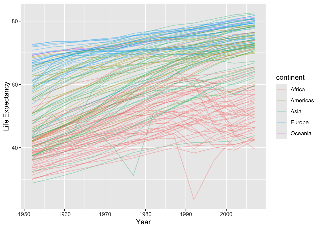
- The general trend is going up, but some countries look quite different.
- We would like to compare by modeling the trend (so we can remove it) and seeing what does not look similar.
- We can do this for a single country using a linear regression model:
gapminder |>
  filter(country == "United States") ->
usdf

ggplot(usdf, aes(x = year, y = lifeExp)) +
  geom_line() +
  geom_smooth(method = "lm", se = FALSE) +
  geom_line(alpha = 1 / 3) +
  xlab("Year") +
  ylab("Life Expectancy")
us_lmout <- lm(lifeExp ~ year, data = usdf)
tidy_uslm <- tidy(us_lmout)
tidy_uslm
plot(us_lmout)
# A tibble: 2 × 5
  term        estimate std.error statistic  p.value
  <chr>          <dbl>     <dbl>     <dbl>    <dbl>
1 (Intercept) -291.     13.8         -21.1 1.25e- 9
2 year           0.184   0.00696      26.5 1.37e-10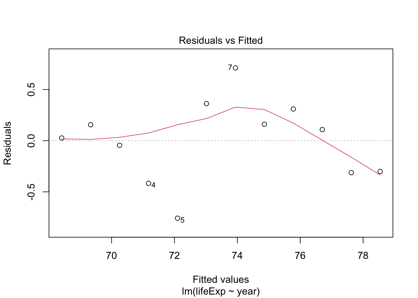
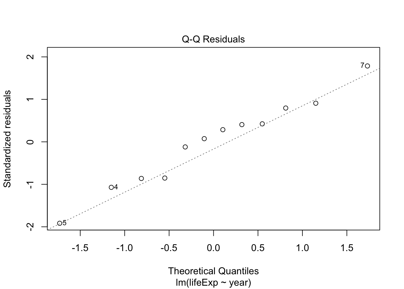
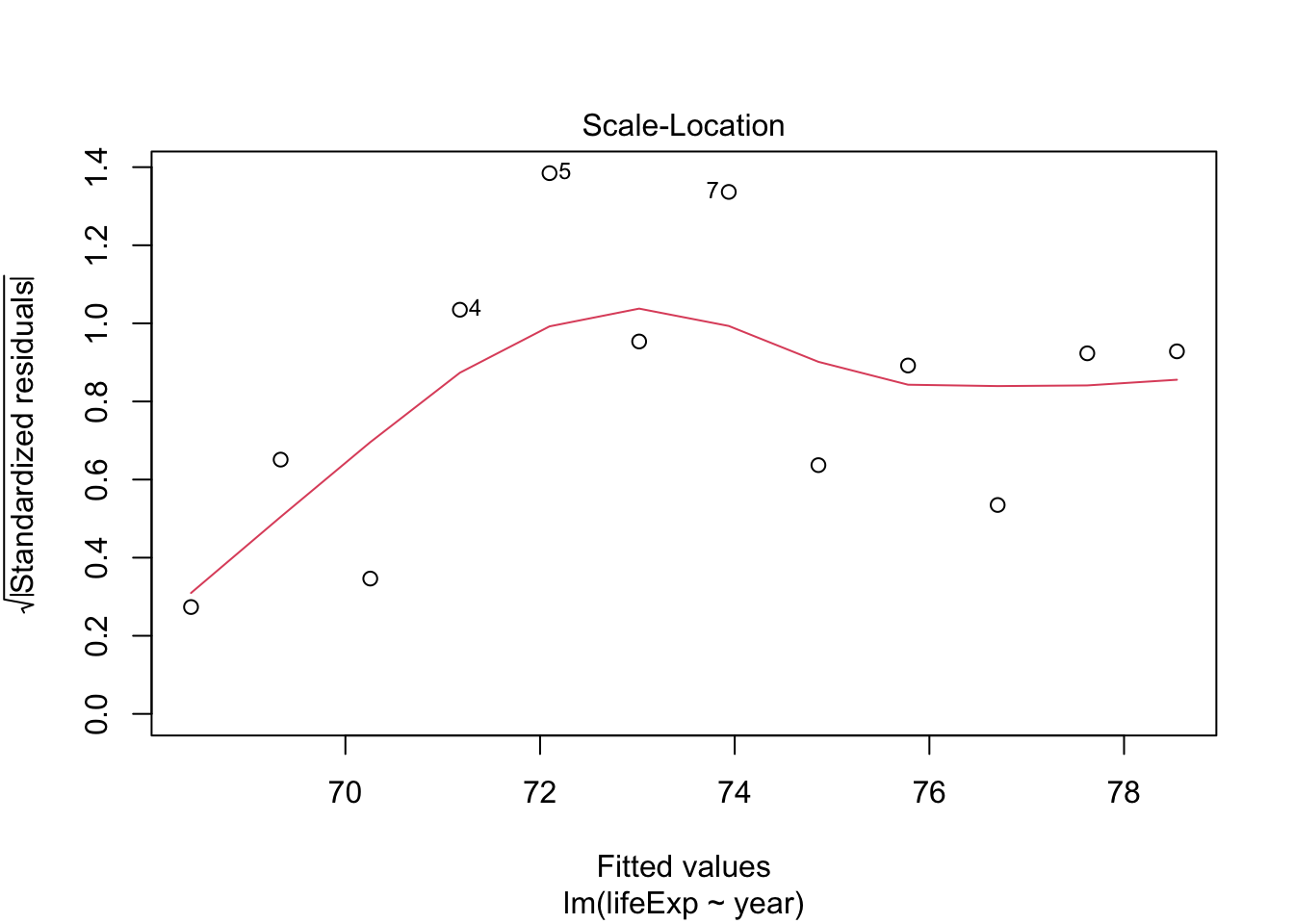
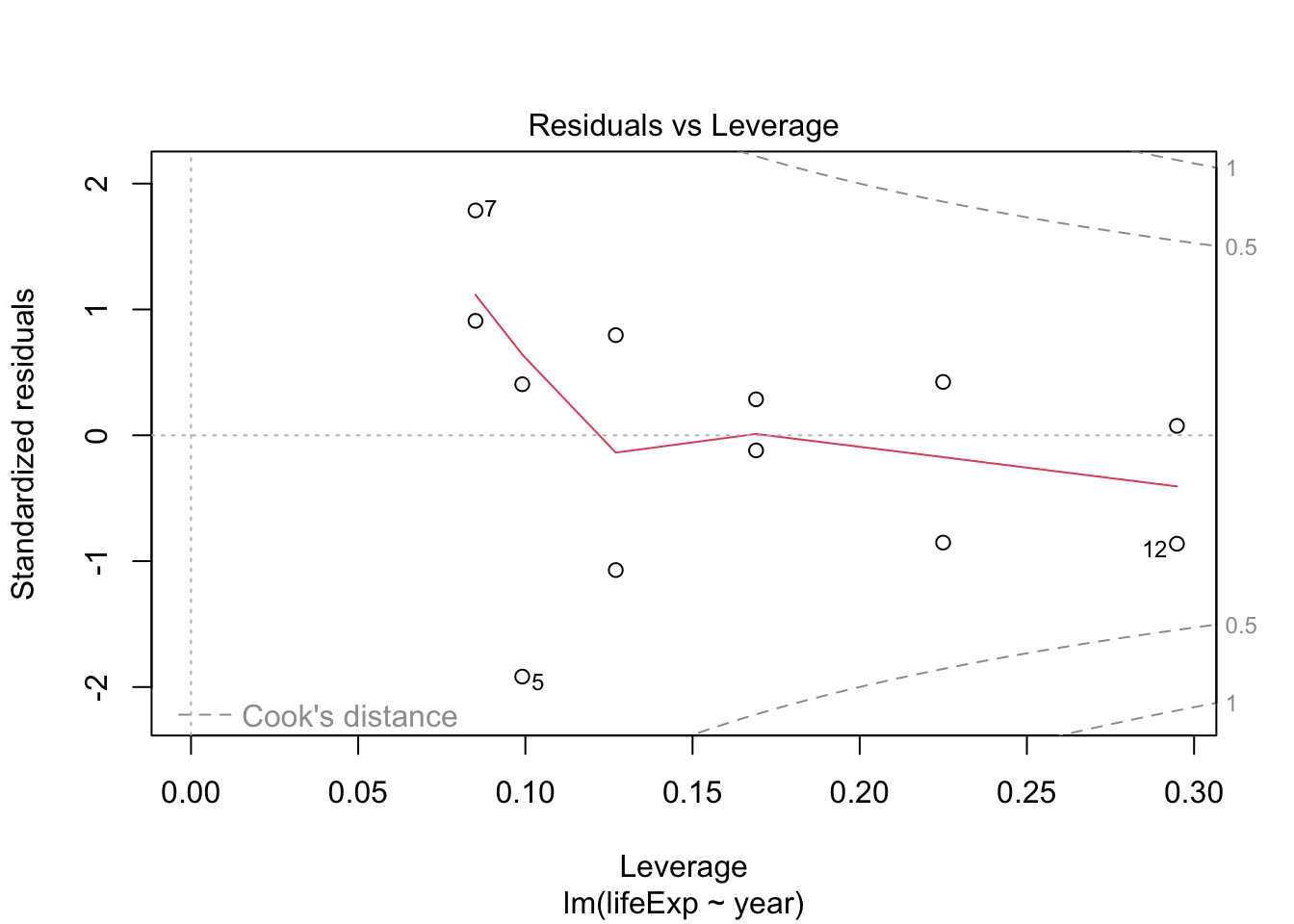
- The residuals don’t look too bad but, there seems to be some non-linearity.
The model suggests that each year, the US has been increasing its average life expectancy by 0.184 years.
- Given the skewness of the population data, log the
popvariable using base 2 and add to the data frame. - Create a line plot for year vs log-population for each country/continent.
- Fit a linear model for log-population on year for just China.
- Check if the assumptions of the linear model are fulfilled.
- Interpret the coefficients.
Show code
- Some curvature caused by non-independence of years.
Run the model.
Show code
- Each year, China grows by a factor of 2^0.0232 = 1.016.
- However, there is more going on than is captured in the linear model.
- Note: “One child” policy enacted in 1980 till 2016.
How can we get these coefficient estimates for each of the 142 countries?
We could use a function inside a for-loop, but there is an easier way ….
13.5 Create a Nested Data Frame Using tidyr:nest()
We really want to get a linear model for every country.
- We know we can use
purrr:map*()to apply a function to each row of a column in a data frame. - Here though, we want to operate on the subsets of rows belonging to each country, where it is not clear every country has the same number of rows.
Solution: Use a nested data frame.
To create a nested data frame, start with a grouped data frame, and “nest” it.
We use group_by() to identify the elements we want to group in our data frame.
- The
nest()function from the {tidyr} package will turn a grouped data frame into a data frame where each group is a row. - All of the observations for each grouping are placed in the
datavariable as a data frame.
Let’s look at an example.
# A tibble: 142 × 3
# Groups:   country, continent [142]
   country     continent data
   <fct>       <fct>     <list>
 1 Afghanistan Asia      <tibble [12 × 4]>
 2 Albania     Europe    <tibble [12 × 4]>
 3 Algeria     Africa    <tibble [12 × 4]>
 4 Angola      Africa    <tibble [12 × 4]>
 5 Argentina   Americas  <tibble [12 × 4]>
 6 Australia   Oceania   <tibble [12 × 4]>
 7 Austria     Europe    <tibble [12 × 4]>
 8 Bahrain     Asia      <tibble [12 × 4]>
 9 Bangladesh  Asia      <tibble [12 × 4]>
10 Belgium     Europe    <tibble [12 × 4]>
# ℹ 132 more rowsRows: 142
Columns: 3
Groups: country, continent [142]
$ country <fct> "Afghanistan", "Albania", "Algeria", "Angola", "Argentina", …
$ continent <fct> Asia, Europe, Africa, Africa, Americas, Oceania, Europe, Asi…
$ data <list> [<tbl_df[12 x 4]>], [<tbl_df[12 x 4]>], [<tbl_df[12 x 4]>],…Note: The data variable is a list, so the data column is known as a list column of the nested_gap_df data frame.
Each element in this list column is a data frame with all of the observations in the group we created by group_by(country, continent).
- We can think of each row as having two elements of meta-data (
countryandcontinent) and then the data frame for that meta-data. - Note the variables in the data variable data frames do Not include
countryandcontinent.
Observations from Afghanistan.
# A tibble: 12 × 4
    year lifeExp      pop gdpPercap
   <int>   <dbl>    <int>     <dbl>
 1  1952    28.8  8425333      779.
 2  1957    30.3  9240934      821.
 3  1962    32.0 10267083      853.
 4  1967    34.0 11537966      836.
 5  1972    36.1 13079460      740.
 6  1977    38.4 14880372      786.
 7  1982    39.9 12881816      978.
 8  1987    40.8 13867957      852.
 9  1992    41.7 16317921      649.
10  1997    41.8 22227415      635.
11  2002    42.1 25268405      727.
12  2007    43.8 31889923      975.
Observations from Albania.
# A tibble: 12 × 4
    year lifeExp     pop gdpPercap
   <int>   <dbl>   <int>     <dbl>
 1  1952    55.2 1282697     1601.
 2  1957    59.3 1476505     1942.
 3  1962    64.8 1728137     2313.
 4  1967    66.2 1984060     2760.
 5  1972    67.7 2263554     3313.
 6  1977    68.9 2509048     3533.
 7  1982    70.4 2780097     3631.
 8  1987    72   3075321     3739.
 9  1992    71.6 3326498     2497.
10  1997    73.0 3428038     3193.
11  2002    75.7 3508512     4604.
12 2007 76.4 3600523 5937.- For China.
# A tibble: 12 × 4
    year lifeExp      pop gdpPercap
   <int>   <dbl>    <int>     <dbl>
 1  1952    54.7  6377619     3940.
 2  1957    56.1  7048426     4316.
 3  1962    57.9  7961258     4519.
 4  1967    60.5  8858908     5107.
 5  1972    63.4  9717524     5494.
 6  1977    67.1 10599793     4757.
 7  1982    70.6 11487112     5096.
 8  1987    72.5 12463354     5547.
 9  1992    74.1 13572994     7596.
10  1997    75.8 14599929    10118.
11  2002    77.9 15497046    10779.
12  2007    78.6 16284741    13172.
Recall we use double brackets to extract (subset) the elements of data as a data frame because data is a list and single brackets will return a list with one element.
- Look at help for Base R
which()and use it to extract the United States data frame fromnested_gap_df. - The code should be general so the row location of the US in the data frame does not matter.
13.6 Fit Many Models with a Nested Data Frame Using purrr::map()
We can now use {purrr} to fit a model on all of the elements (rows) of data since the elements (rows) are data frames.
Let’s look at the results with our new column lmout.
- It is also a list column where the elements of the list are of class
lm. - Note: S3 is an object-oriented programming class in R - see R Classes and Objects
# A tibble: 142 × 4
# Groups:   country, continent [142]
   country     continent data              lmout
   <fct>       <fct>     <list>            <list>
 1 Afghanistan Asia      <tibble [12 × 4]> <lm>
 2 Albania     Europe    <tibble [12 × 4]> <lm>
 3 Algeria     Africa    <tibble [12 × 4]> <lm>
 4 Angola      Africa    <tibble [12 × 4]> <lm>
 5 Argentina   Americas  <tibble [12 × 4]> <lm>
 6 Australia   Oceania   <tibble [12 × 4]> <lm>
 7 Austria     Europe    <tibble [12 × 4]> <lm>
 8 Bahrain     Asia      <tibble [12 × 4]> <lm>
 9 Bangladesh  Asia      <tibble [12 × 4]> <lm>
10 Belgium     Europe    <tibble [12 × 4]> <lm>
# ℹ 132 more rows[1] "lm"Each element of the lmout column is the model output object from fitting lm() to each row’s data frame in the data column.
Call:
lm(formula = lifeExp ~ year, data = df)

Coefficients:
(Intercept)         year
  -507.5343       0.2753
Call:
lm(formula = lifeExp ~ year, data = df)

Residuals:
    Min      1Q  Median      3Q     Max
-3.9991 -1.2452  0.3723  1.4421  2.2440

Coefficients:
              Estimate Std. Error t value Pr(>|t|)
(Intercept) -594.07251   65.65536  -9.048 3.94e-06 ***
year           0.33468    0.03317  10.091 1.46e-06 ***
---
Signif. codes:  0 '***' 0.001 '**' 0.01 '*' 0.05 '.' 0.1 ' ' 1

Residual standard error: 1.983 on 10 degrees of freedom
Multiple R-squared:  0.9106,    Adjusted R-squared:  0.9016
F-statistic: 101.8 on 1 and 10 DF, p-value: 1.463e-0613.7 Get Model Summaries and Data using {broom} Package Functions
We can also use map() to create list columns of model summaries using generic functions from the broom package: tidy(), glance(), and augment().
tidy() summarizes a model’s statistical findings such as coefficients of a regression.
# A tibble: 2 × 7
  term        estimate std.error statistic  p.value conf.low conf.high
  <chr>          <dbl>     <dbl>     <dbl>    <dbl>    <dbl>     <dbl>
1 (Intercept) -291.     13.8         -21.1 1.25e- 9 -322.     -260.
2 year           0.184   0.00696      26.5 1.37e-10    0.169     0.200
glance() provides a one-row summary of model-level statistics.
# A tibble: 1 × 12
  r.squared adj.r.squared sigma statistic  p.value    df logLik   AIC   BIC
      <dbl>         <dbl> <dbl>     <dbl>    <dbl> <dbl>  <dbl> <dbl> <dbl>
1     0.986         0.985 0.416      700. 1.37e-10     1  -5.41  16.8  18.3
# ℹ 3 more variables: deviance <dbl>, df.residual <int>, nobs <int>
augment() adds model data, fitted, and residual values, as well as other values to a data frame of the input data.
# A tibble: 3 × 8
  lifeExp  year .fitted  .resid  .hat .sigma .cooksd .std.resid
    <dbl> <int>   <dbl>   <dbl> <dbl>  <dbl>   <dbl>      <dbl>
1    68.4  1952    68.4  0.0262 0.295  0.439 0.00117     0.0748
2    69.5  1957    69.3  0.155  0.225  0.435 0.0261      0.424
3    70.2  1962    70.3 -0.0455 0.169  0.438 0.00147    -0.120
Now we can use map() to run each of these inside the nested data frame.
# A tibble: 142 × 7
# Groups:   country, continent [142]
   country     continent data              lmout  tidyout  augmentout glanceout
   <fct>       <fct>     <list>            <list> <list>   <list>     <list>
 1 Afghanistan Asia      <tibble [12 × 4]> <lm>   <tibble> <tibble>   <tibble>
 2 Albania     Europe    <tibble [12 × 4]> <lm>   <tibble> <tibble>   <tibble>
 3 Algeria     Africa    <tibble [12 × 4]> <lm>   <tibble> <tibble>   <tibble>
 4 Angola      Africa    <tibble [12 × 4]> <lm>   <tibble> <tibble>   <tibble>
 5 Argentina   Americas  <tibble [12 × 4]> <lm>   <tibble> <tibble>   <tibble>
 6 Australia   Oceania   <tibble [12 × 4]> <lm>   <tibble> <tibble>   <tibble>
 7 Austria     Europe    <tibble [12 × 4]> <lm>   <tibble> <tibble>   <tibble>
 8 Bahrain     Asia      <tibble [12 × 4]> <lm>   <tibble> <tibble>   <tibble>
 9 Bangladesh  Asia      <tibble [12 × 4]> <lm>   <tibble> <tibble>   <tibble>
10 Belgium     Europe    <tibble [12 × 4]> <lm>   <tibble> <tibble>   <tibble>
# ℹ 132 more rows
We now have model summaries within all groups and all captured in the same data frame.
This is a major benefit to using List Columns - you can keep all the data in one place so you can operate at the meta-data level.
- e.g., if you want to filter by continent, it is easy to do so.
# A tibble: 6 × 7
# Groups:   country, continent [6]
  country          continent data     lmout  tidyout  augmentout glanceout
  <fct>            <fct>     <list>   <list> <list>   <list>     <list>
1 Afghanistan      Asia      <tibble> <lm>   <tibble> <tibble>   <tibble>
2 Bahrain          Asia      <tibble> <lm>   <tibble> <tibble>   <tibble>
3 Bangladesh       Asia      <tibble> <lm>   <tibble> <tibble>   <tibble>
4 Cambodia         Asia      <tibble> <lm>   <tibble> <tibble>   <tibble>
5 China            Asia      <tibble> <lm>   <tibble> <tibble>   <tibble>
6 Hong Kong, China Asia      <tibble> <lm>   <tibble> <tibble>   <tibble>
We can look at individual summaries as before
Afghanistan summary.
# A tibble: 2 × 7
  term        estimate std.error statistic      p.value conf.low conf.high
  <chr>          <dbl>     <dbl>     <dbl>        <dbl>    <dbl>     <dbl>
1 (Intercept) -508.      40.5        -12.5 0.000000193  -598.     -417.
2 year           0.275    0.0205      13.5 0.0000000984    0.230     0.321
Albania summary.
# A tibble: 2 × 7
  term        estimate std.error statistic    p.value conf.low conf.high
  <chr>          <dbl>     <dbl>     <dbl>      <dbl>    <dbl>     <dbl>
1 (Intercept) -594.      65.7        -9.05 0.00000394 -740.     -448.
2 year 0.335 0.0332 10.1 0.00000146 0.261 0.409- Use
tidy()to get model summaries of your linear model fits of log-population on year.- Add these summaries as another column in
nested_gap_df. - Compare the results for China to the results from china_lm
- Add these summaries as another column in
13.8 Extract All the Data from One List Column into a Data Frame Using tidyr::unnest()
Using unnest(), followed by ungroup(), will convert a single list column into a new data frame with the meta-data, the still-nested list columns, AND, all the elements of the un-nested column as variables and rows.
# A tibble: 284 × 13
   country  continent data     lmout term  estimate std.error statistic  p.value
   <fct>    <fct>     <list>   <lis> <chr>    <dbl>     <dbl>     <dbl>    <dbl>
 1 Afghani… Asia      <tibble> <lm>  (Int… -5.08e+2  40.5        -12.5  1.93e- 7
 2 Afghani… Asia      <tibble> <lm>  year   2.75e-1   0.0205      13.5  9.84e- 8
 3 Albania  Europe    <tibble> <lm>  (Int… -5.94e+2  65.7         -9.05 3.94e- 6
 4 Albania  Europe    <tibble> <lm>  year   3.35e-1   0.0332      10.1  1.46e- 6
 5 Algeria  Africa    <tibble> <lm>  (Int… -1.07e+3  43.8        -24.4  3.07e-10
 6 Algeria  Africa    <tibble> <lm>  year   5.69e-1   0.0221      25.7  1.81e-10
 7 Angola   Africa    <tibble> <lm>  (Int… -3.77e+2  46.6         -8.08 1.08e- 5
 8 Angola   Africa    <tibble> <lm>  year   2.09e-1   0.0235       8.90 4.59e- 6
 9 Argenti… Americas  <tibble> <lm>  (Int… -3.90e+2   9.68       -40.3  2.14e-12
10 Argenti… Americas  <tibble> <lm>  year   2.32e-1   0.00489     47.4  4.22e-13
# ℹ 274 more rows
# ℹ 4 more variables: conf.low <dbl>, conf.high <dbl>, augmentout <list>,
# glanceout <list>- Note: 142 countries and two elements in the tidy summaries leads to 284 rows in the un-nested data frame
You do this so you can plot some cool things.
Let’s plot the estimated annual rate of change in life expectancy for each country along with the 95% confidence interval of the estimate.
- We should order by the rate of change and indicate the continents.
library(ggthemes)
model_summary_df |>
  filter(term == "year") |>
  mutate(country = fct_reorder(country, estimate)) |>
  ggplot(aes(x = country, y = estimate, color = continent)) +
  geom_point(size = .7) +
  geom_segment(
    aes(
      x = country, xend = country,
      y = conf.low, yend = conf.high
    ),
    color = "black",
    alpha = 1 / 3
  ) +
  ylab("Estimate of Rate of Life Expectancy Increase") +
  xlab("Country") +
  theme(
    axis.text.x = element_blank(),
    axis.ticks.x = element_blank()
  ) +
  scale_color_colorblind() +
  labs(caption = "R Gapminder package data")
You can check model qualities by looking at the residuals.
- Let’s facet by
continent.
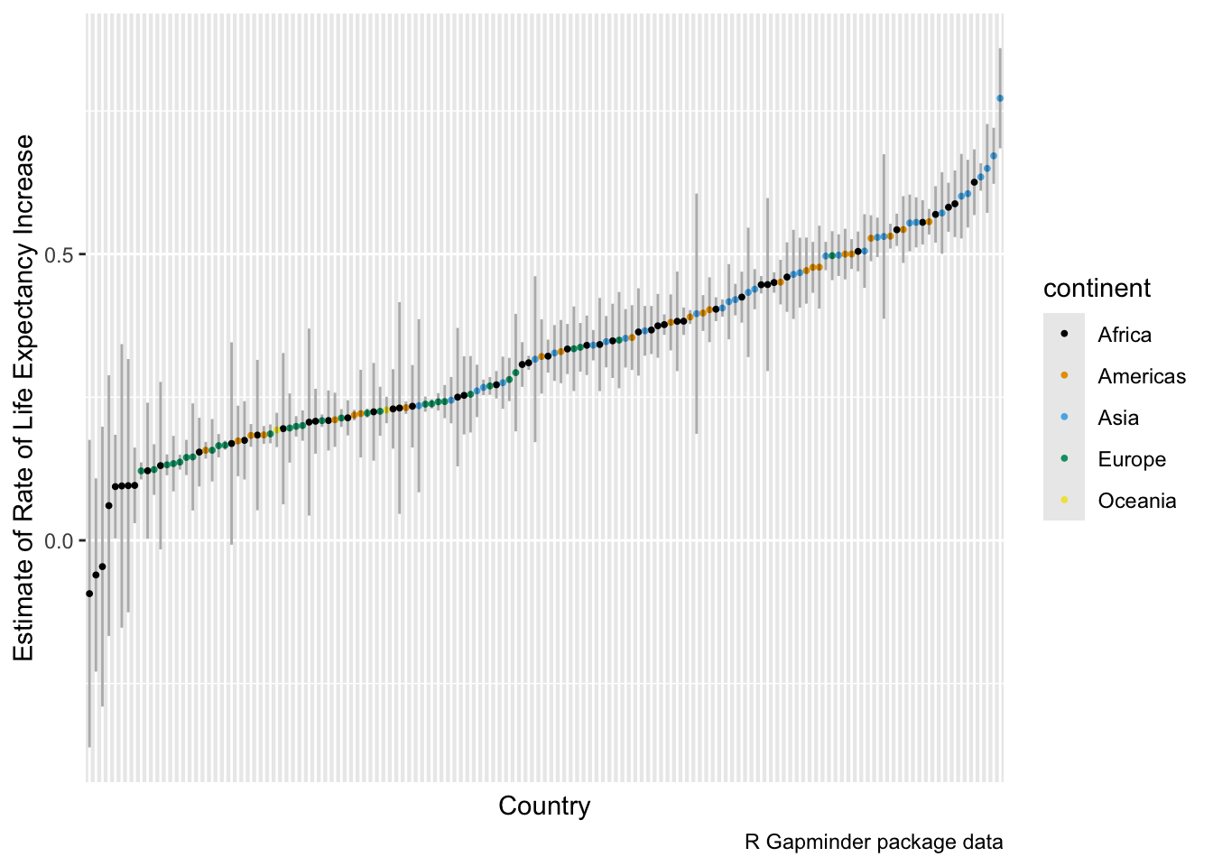
Above, we see there is a lot of curvature and variability not accounted for by the models.
- Unnest the
tidy()output from the linear model fit of log-population on year.- Which countries have seen the greatest increase in population?
- Have any seen a decline?
Show code
unnest(nested_gap_df, tidypop) |>
  ungroup() ->
tpop
head(tpop)

tpop |>
  filter(term == "year") |>
  arrange(estimate) ->
tpop

tpop |>
  select(country, estimate) |>
  head()

tpop |>
  select(country, estimate) |>
  tail()

tpop |>
  mutate(estimate_trans = 2^estimate) |>
  select(country, estimate, estimate_trans, p.value) |>
  arrange(desc(estimate)) ->
tempp
tempp[c(1, 2, nrow(tempp) - 1, nrow(tempp)), ]
Bulgaria has had the slowest growth. Each year, its population stays about the same.(.03% increase)
Kuwait has had the fastest growth, each year having 5% growth (2 ^ 0.0699 = 1.05)
We don’t have any indication here of an overall population decline as all estimates are positive.
What do you notice about the p.values for the lowest two countries?
- Can’t reject a Null Hypothesis of = 0.
13.8.1 Use select() Prior to Unnest to Eliminate Unwanted Columns
If you don’t want to keep all the list columns in a new data frame, select only the columns you want plus the column you want to unnest.
# A tibble: 6 × 7
# Groups:   country, continent [6]
  country     continent data              lmout  tidyout  augmentout glanceout
  <fct>       <fct>     <list>            <list> <list>   <list>     <list>
1 Afghanistan Asia      <tibble [12 × 4]> <lm>   <tibble> <tibble>   <tibble>
2 Albania     Europe    <tibble [12 × 4]> <lm>   <tibble> <tibble>   <tibble>
3 Algeria     Africa    <tibble [12 × 4]> <lm>   <tibble> <tibble>   <tibble>
4 Angola      Africa    <tibble [12 × 4]> <lm>   <tibble> <tibble>   <tibble>
5 Argentina   Americas  <tibble [12 × 4]> <lm>   <tibble> <tibble>   <tibble>
6 Australia Oceania <tibble [12 × 4]> <lm> <tibble> <tibble> <tibble> # A tibble: 6 × 14
country continent r.squared adj.r.squared sigma statistic p.value df
<fct> <fct> <dbl> <dbl> <dbl> <dbl> <dbl> <dbl>
1 Afghanistan Asia 0.948 0.942 1.22 181. 9.84e- 8 1
2 Albania Europe 0.911 0.902 1.98 102. 1.46e- 6 1
3 Algeria Africa 0.985 0.984 1.32 662. 1.81e-10 1
4 Angola Africa 0.888 0.877 1.41 79.1 4.59e- 6 1
5 Argentina Americas 0.996 0.995 0.292 2246. 4.22e-13 1
6 Australia Oceania 0.980 0.978 0.621 481. 8.67e-10 1
# ℹ 6 more variables: logLik <dbl>, AIC <dbl>, BIC <dbl>, deviance <dbl>,
# df.residual <int>, nobs <int>Now we can look at just the models that did not fit well (based on adjusted \(r^2\)).
- Use
geom_jitter()to separate overlaps.
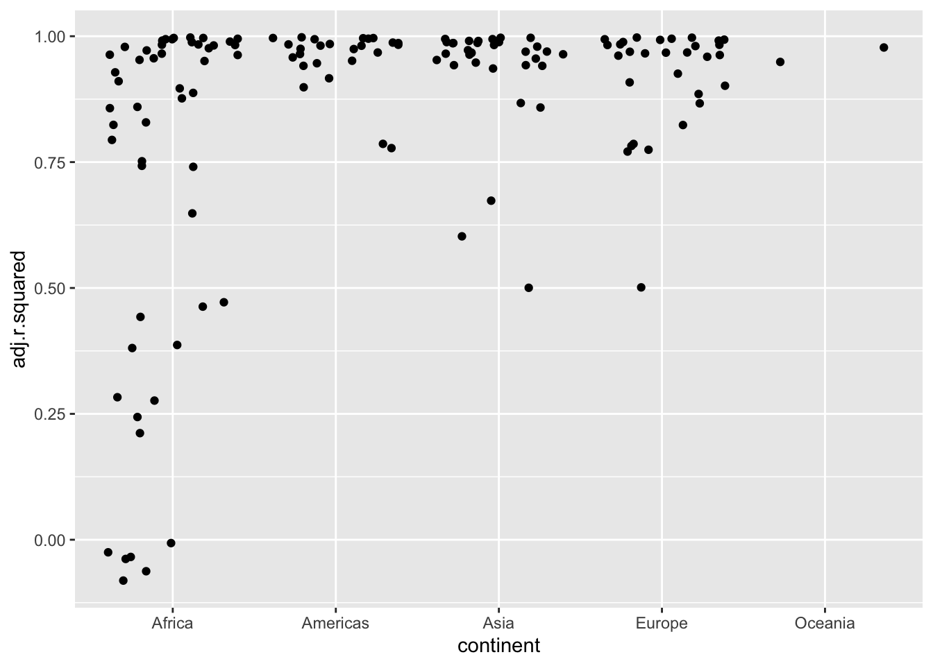
Let’s focus on those with an adjusted \(r^2\) less than .5.
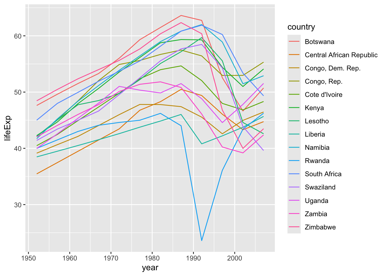
- Rwandan Civil War 1990- 1994
- Effects of HIV and related increases in child mortality
- Botswana had the second highest infection rate in the world at one point.
- https://en.wikipedia.org/wiki/List_of_countries_by_HIV/AIDS_adult_prevalence_rate
13.8.2 Example with mtcars with nest(), map(), and unnest()
Recall we used the split() function on the mtcars dataset to get the regression coefficient estimates for a regression of mpg on wt.
        4         6         8
-5.647025 -2.780106 -2.192438 - Redo this calculation using the
nest()-map()-unnest()workflow we just went through.
13.8.3 Other Uses of List Columns
We’ve seen how list columns can capture output from models to keep with meta-data.
We can also generate list columns that are useful in other ways:
- Output from
str_extract_all()orstr_split()used inside amutate(). - Output from
quantile()withsummarise().
# A tibble: 15 × 3
     cyl     p     q
   <dbl> <dbl> <dbl>
 1     4  0.01  21.4
 2     4  0.25  22.8
 3     4  0.5   26
 4     4  0.75  30.4
 5     4  0.99  33.8
 6     6  0.01  17.8
 7     6  0.25  18.6
 8     6  0.5   19.7
 9     6  0.75  21
10     6  0.99  21.4
11     8  0.01  10.4
12     8  0.25  14.4
13     8  0.5   15.2
14     8  0.75  16.2
15 8 0.99 19.1- Note: if you only want a single value out of a list column element, you can also just use one of the
map*()functions (inside of amutate()) instead ofunnest(), which returns all of the original values.
13.9 The {gganimate} Package for Animating Plots
If you want to create animated visualizations within R (not using vizabi), you can use the {gganimate} package to create graphs that change with one of the variables.
The only thing we need to change is to add frame = year to our ggplot() call and then add transition_states to the plot to create the “gganim” object.
Let’s load the {gganimate}, {ggthemes}, and {gifski} packages.
Let’s recreate a gapminder plot with the frame = year in the aesthetic and some additional formatting to help increase the size of the legend when it gets animated. Save it to a variable p.
gapminder |>
  arrange(desc(pop)) |>
  ggplot(aes(x = gdpPercap, y = lifeExp, frame = year)) +
  geom_point(aes(size = pop, fill = continent), shape = 21) +
  labs(
    x = "Income (GDP / capita)",
    y = "Life expectancy (years)"
  ) +
  scale_x_log10(breaks = 2^(-1:7) * 1000) +
  scale_size(range = c(1, 20), guide = "none") +
  scale_fill_viridis_d(name = "Continent", alpha = .7) +
  guides(fill = guide_legend(override.aes = list(size = 10))) +
  facet_wrap(~continent) +
  theme(
    legend.title = element_text(
      color = "slateblue",
      face = "bold", size = 18
    ),
    legend.text = element_text(size = 15),
    ## Change legend background color
    ## legend.key = element_rect(fill = "lightblue", color = NA),
    ## Change legend key size and key width
    legend.key.size = unit(.5, "cm"),
    legend.key.width = unit(0.5, "cm")
  ) ->
p
p
Add the animation by adding transition_states() to the plot.
- You can also render to HTML and see the animated gif.
- Note the use of {glue} notation below where we are embedding variable names from data frames into text using the {glue} curly operator
{} - The rendering can take a while depending upon the settings.
- You can save as an animated gif file and view in your browser.
The gif renderer is the default.
If you want more control over it playing, you can convert the animated object into a movie in mp4 format.
Saving to mp4 format requires having the ffmpeg software on your system.
- For Windows see How to Install FFmpeg on Windows
- For Mac see Installing FFmpeg on Mac using homebrew. It will take a while to install.
Configuration can be a challenge as updated software creates errors until all elements are updated by the developers.
If ffmpeg is installed properly and does not work through
animate(), you can do it directly in the terminal window using the saved gif file.- Navigate in the terminal window so the working directory is the location of the gif file.
- Enter a command such as:
ffmpeg -i my_gapminder.gif -movflags faststart -pix_fmt yuv420p -vf "scale=trunc(iw/2)*2:trunc(ih/2)*2" my_gapminder.mp4.
You can use external software, e.g., QuickTime or iMovie on a Mac, to add sound as well.
13.10 Using dplyr::nest_by()
The {dplyr} package has an experimental function, nest_by() that is related to group_by() in that it groups the data frame, but it does so explicitly, like tidyr::nest() and converts it into a rowwise data frame.
This means you can operate on each row, one-by-one, which also means, you can operate on each element of the list column, one-by-one, without using purrr::map().
In this section, we will use the penguins data frame in the {palmerpenguins} package to look at another way of working with list columns.
13.10.1 The {palmerpenguins} Package
The {palmerpenguins} package contains data with several observations of anatomical parts of penguins of different species and sexes, at different locations, and across multiple years.
- Load the {tidyverse} and {palmerpenguins} packages.
13.10.2 Clean the Data
Glimpse the penguns data frame.
Rows: 344
Columns: 8
$ species           <fct> Adelie, Adelie, Adelie, Adelie, Adelie, Adelie, Adel…
$ island            <fct> Torgersen, Torgersen, Torgersen, Torgersen, Torgerse…
$ bill_length_mm    <dbl> 39.1, 39.5, 40.3, NA, 36.7, 39.3, 38.9, 39.2, 34.1, …
$ bill_depth_mm     <dbl> 18.7, 17.4, 18.0, NA, 19.3, 20.6, 17.8, 19.6, 18.1, …
$ flipper_length_mm <int> 181, 186, 195, NA, 193, 190, 181, 195, 193, 190, 186…
$ body_mass_g       <int> 3750, 3800, 3250, NA, 3450, 3650, 3625, 4675, 3475, …
$ sex               <fct> male, female, female, NA, female, male, female, male…
$ year              <int> 2007, 2007, 2007, 2007, 2007, 2007, 2007, 2007, 2007…
Remove the rows with NAs for bill_length.
Rows: 342
Columns: 8
$ species           <fct> Adelie, Adelie, Adelie, Adelie, Adelie, Adelie, Adel…
$ island            <fct> Torgersen, Torgersen, Torgersen, Torgersen, Torgerse…
$ bill_length_mm    <dbl> 39.1, 39.5, 40.3, 36.7, 39.3, 38.9, 39.2, 34.1, 42.0…
$ bill_depth_mm     <dbl> 18.7, 17.4, 18.0, 19.3, 20.6, 17.8, 19.6, 18.1, 20.2…
$ flipper_length_mm <int> 181, 186, 195, 193, 190, 181, 195, 193, 190, 186, 18…
$ body_mass_g       <int> 3750, 3800, 3250, 3450, 3650, 3625, 4675, 3475, 4250…
$ sex               <fct> male, female, female, female, male, female, male, NA…
$ year              <int> 2007, 2007, 2007, 2007, 2007, 2007, 2007, 2007, 2007…
The penguins dataset has no unique identifiers for each study group.
- This can be problematic when we have multiple penguins of the same species, island, sex, and year in the dataset.
Use mutate() to add the row number as a unique identifier called studygroupid and use a mutate() argument to position the new column before the first column with a _ in its name.
Rows: 342
Columns: 9
Groups: species, island, sex, year [35]
$ species           <fct> Adelie, Adelie, Adelie, Adelie, Adelie, Adelie, Adel…
$ island            <fct> Torgersen, Torgersen, Torgersen, Torgersen, Torgerse…
$ studygroupid      <int> 1, 1, 2, 3, 2, 4, 3, 1, 2, 3, 4, 5, 4, 5, 6, 7, 6, 8…
$ bill_length_mm    <dbl> 39.1, 39.5, 40.3, 36.7, 39.3, 38.9, 39.2, 34.1, 42.0…
$ bill_depth_mm     <dbl> 18.7, 17.4, 18.0, 19.3, 20.6, 17.8, 19.6, 18.1, 20.2…
$ flipper_length_mm <int> 181, 186, 195, 193, 190, 181, 195, 193, 190, 186, 18…
$ body_mass_g       <int> 3750, 3800, 3250, 3450, 3650, 3625, 4675, 3475, 4250…
$ sex               <fct> male, female, female, female, male, female, male, NA…
$ year              <int> 2007, 2007, 2007, 2007, 2007, 2007, 2007, 2007, 2007…
13.10.3 Create Models across Subsets
The output of summarize() can be literally anything, because {dplyr} allows different column types.
- It can generate summary vectors, data frames, or other objects like models or graphs.
To create a linear model for each species, you could do it like this:
# A tibble: 3 × 2
  species   model
  <fct>     <list>
1 Adelie    <lm>
2 Chinstrap <lm>
3 Gentoo    <lm>
You could also use {broom} to directly summarize the statistics of the models and return them all as nicely integrated data frames without list columns.
# A tibble: 3 × 13
  species   r.squared adj.r.squared sigma statistic  p.value    df logLik   AIC
  <fct>         <dbl>         <dbl> <dbl>     <dbl>    <dbl> <dbl>  <dbl> <dbl>
1 Adelie        0.508         0.498  325.      50.6 1.55e-22     3 -1086. 2181.
2 Chinstrap     0.504         0.481  277.      21.7 8.48e-10     3  -477.  964.
3 Gentoo        0.625         0.615  313.      66.0 3.39e-25     3  -879. 1768.
# ℹ 4 more variables: BIC <dbl>, deviance <dbl>, df.residual <int>, nobs <int>
13.10.4 Nest the Data with nest_by()
It can be useful to apply a common function across all subsets of the data.
For example, to analyze a set of data for each species of penguins, we could group_by() species and then nest() and use rowwise() to create a nested, row-wise, by-species, data frame with a list column.
- The
rowwise()allows you to compute, e.g.,summarize(), on a data frame list column one row-at-a-time (each data frame).
The new function nest_by() provides a more intuitive way to do the same thing:
Rows: 3
Columns: 2
Rowwise: species
$ species <fct> Adelie, Chinstrap, Gentoo
$ data    <list<tibble[,7]>> [<tbl_df[151 x 7]>], [<tbl_df[68 x 7]>], [<tbl_df[123 x 7]>]…
The nested data is stored in a column called data unless you specify a .key= argument.
13.10.5 Graphing across Subsets
Armed with nest_by() and the fact we can summarize or mutate virtually any type of object, we can generate graphs across subsets and store them in a data frame for later use.
Let’s create a scatter plot of bill length and bill depth for our three penguin species:
First, create a generic “helper” function for generating scatter plots using {ggplot2}.
- Use the
{ }(curly-curly or bracket-bracket) operator to differentiate environment variables from data frame variables inside a function where we are passing data frame variables from the environment. - This is related to the data masking that occurs with tidy evaluation.
Let’s nest_by species and add a list-column of plot objects created using the helper function.
Rows: 3
Columns: 3
Rowwise: species
$ species <fct> Adelie, Chinstrap, Gentoo
$ data    <list<tibble[,7]>> [<tbl_df[151 x 7]>], [<tbl_df[68 x 7]>], [<tbl_df[123 x 7]>]…
$ plot    <list> <ggplot2::ggplot>, <ggplot2::ggplot>, <ggplot2::ggplot>
Now we can easily display the different scatter plots to show, for example, that our penguins exemplify Simpson’s Paradox:
First, generate a scatter for entire dataset.
Then, use a for-loop to extract each plot from the list column and assign it a custom name as an object in the global environment.
We now have four plots in the global environment.
Display all four plots nicely using the {patchwork} package to show Palmer penguins are another example of Simpson’s Paradox.
- “The goal of patchwork is to make it ridiculously simple to combine separate ggplots into the same graphic.”
- “As such it tries to solve the same problem as
gridExtra::grid.arrange()andcowplot::plot_gridbut using an API that incites exploration and iteration, and scales to arbitrarily complex layouts.”
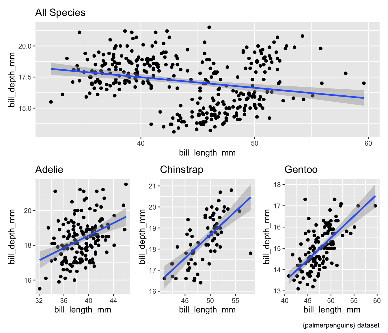
Display all four plots using the quarto layout options.
- See Custom Layouts
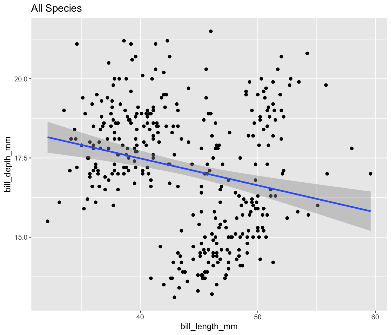
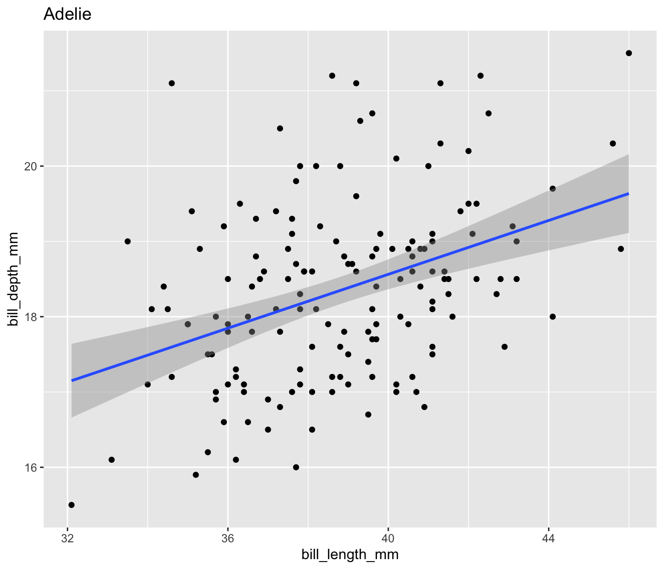
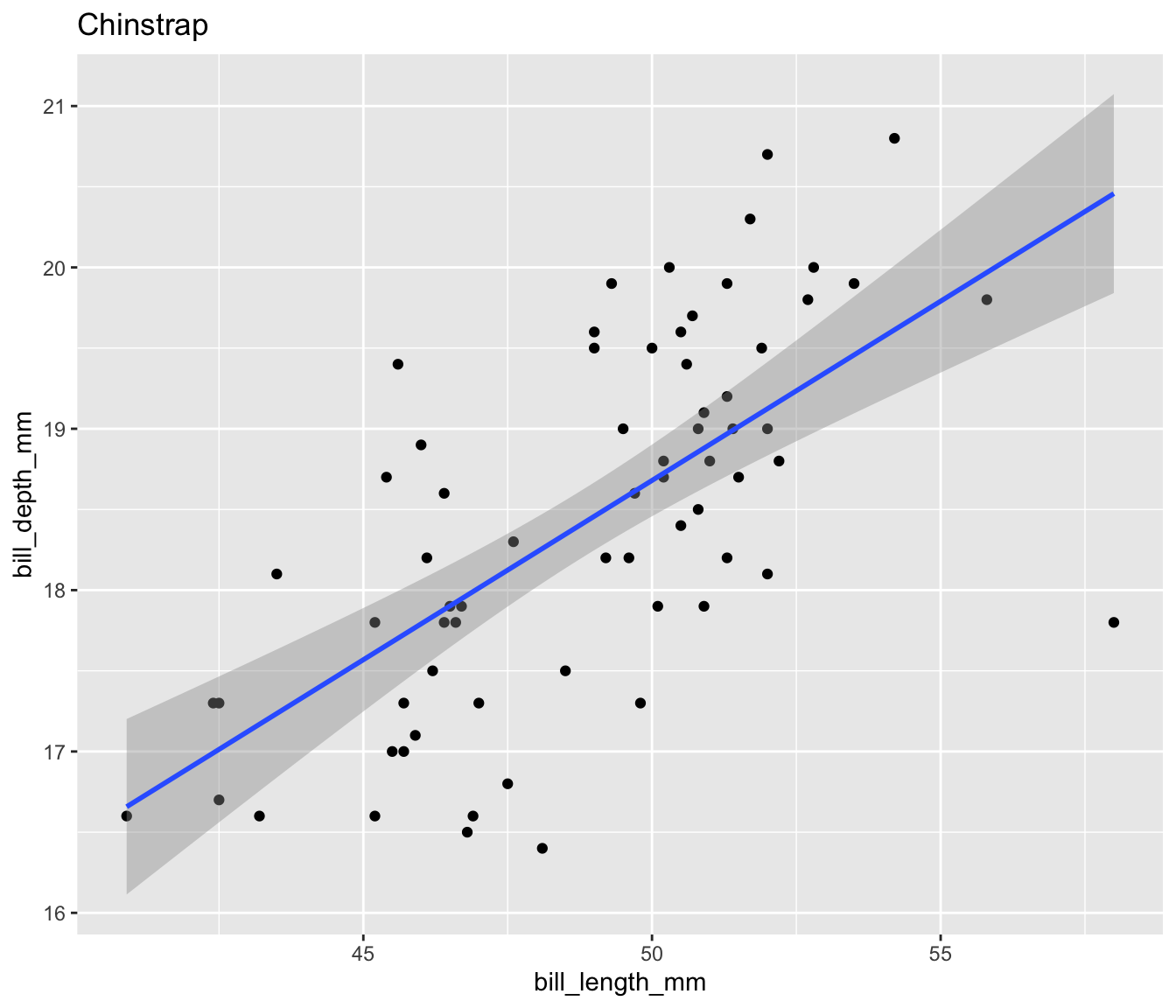
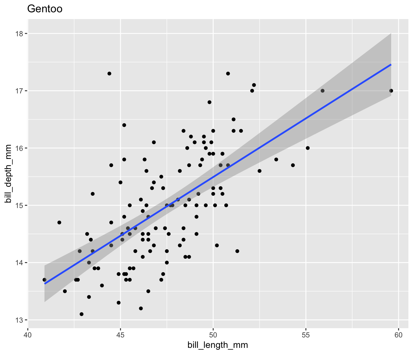
Simpsons Paradox in Palmer Penguins
Both quarto and {patchwork} allow you to create for custom layouts and one might be easier than the other depending upon the requirements of the analysis.