7 Non-Linear Methods
7.1 Regression Splines
We have looked a multiple methods for predicting responses when the true model is linear.
Real-world relationships are often non-linear.
- Using high order polynomials may fit the training data but not do well on the prediction.
Splines are a method for fitting regression trends across a series of segments of the data where you are interested in predicting the response and there is the potential for a non-linear model to do better.
7.1.1 Motivation Example
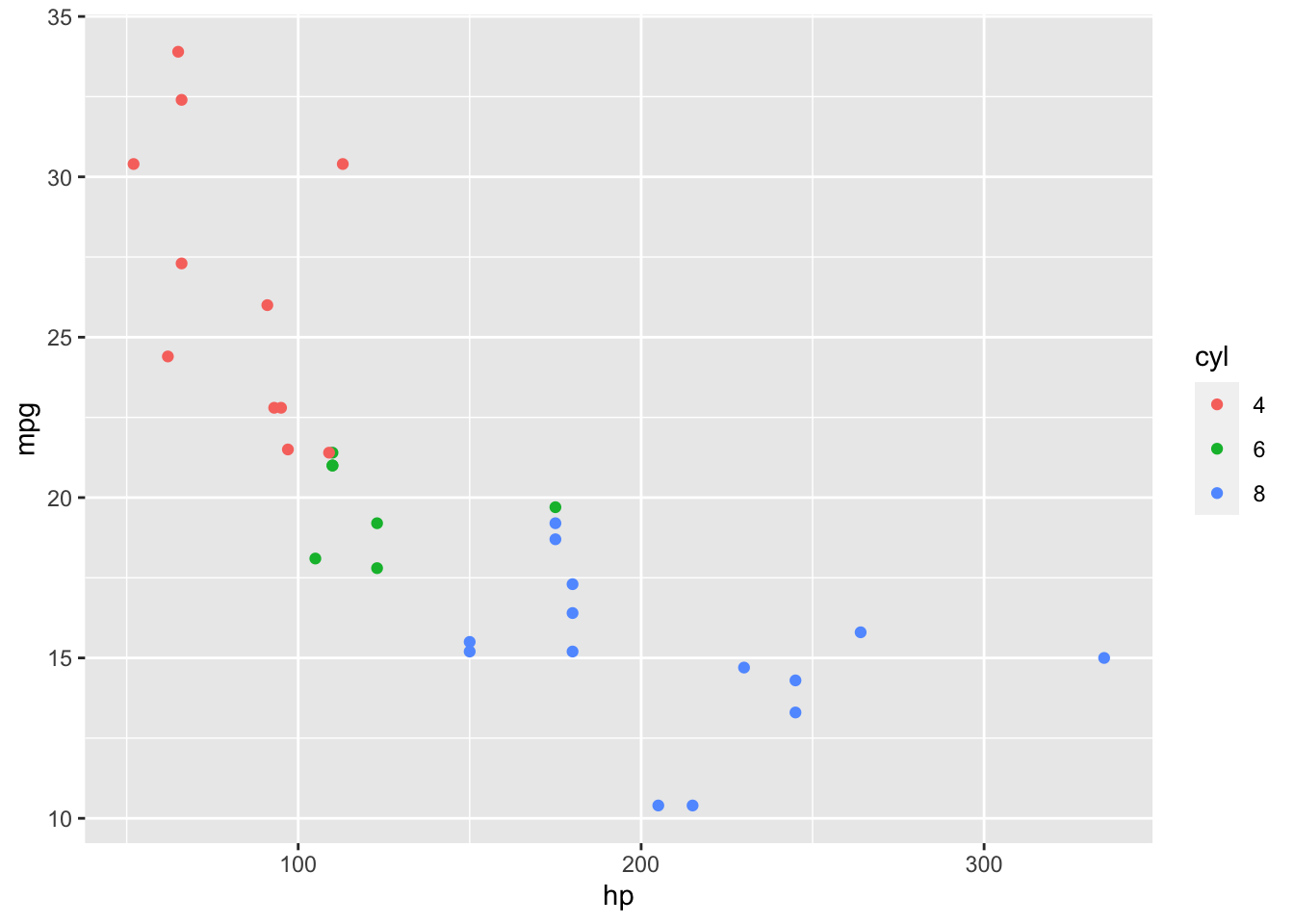
We start with some data
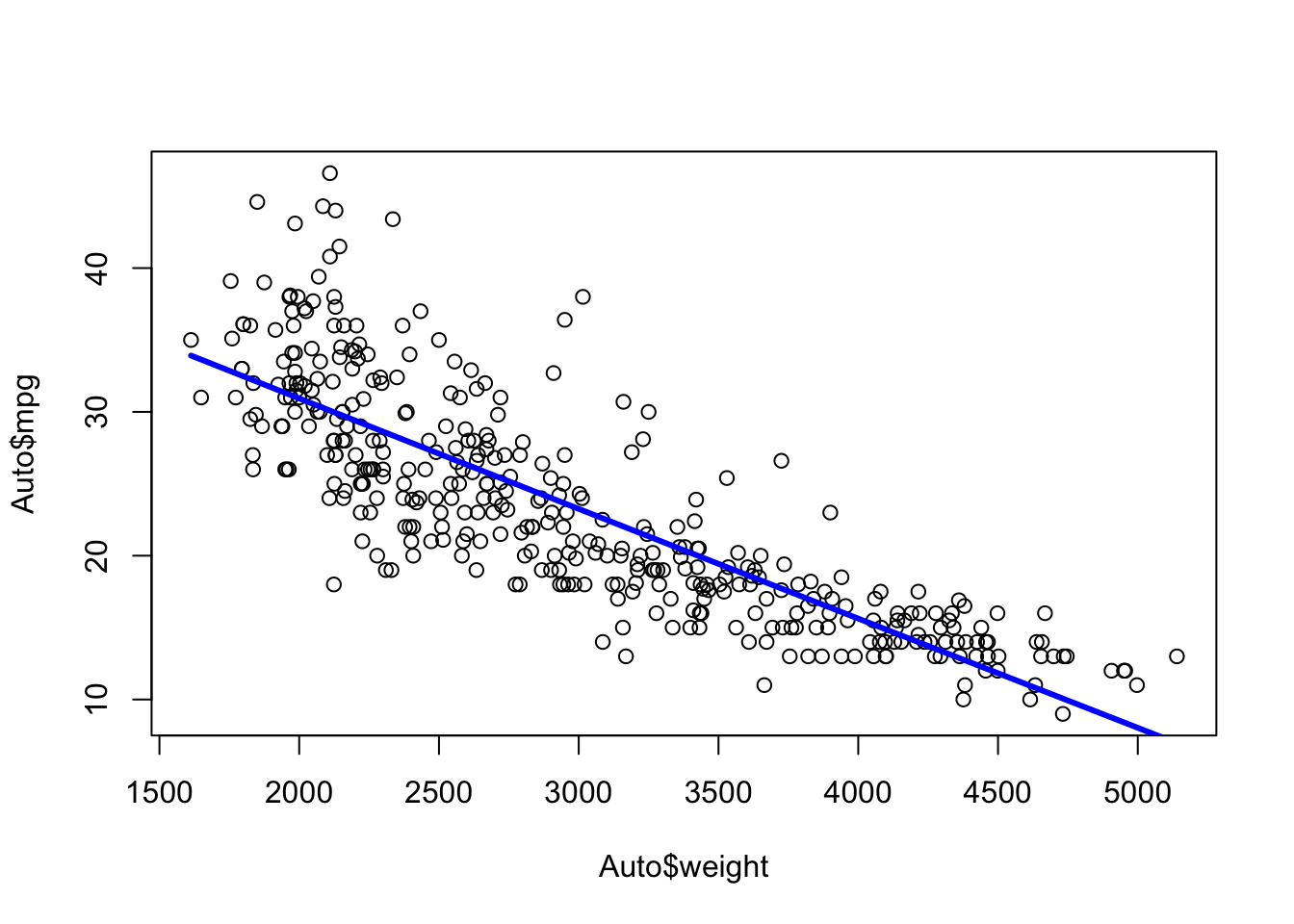
We could fit a linear model.
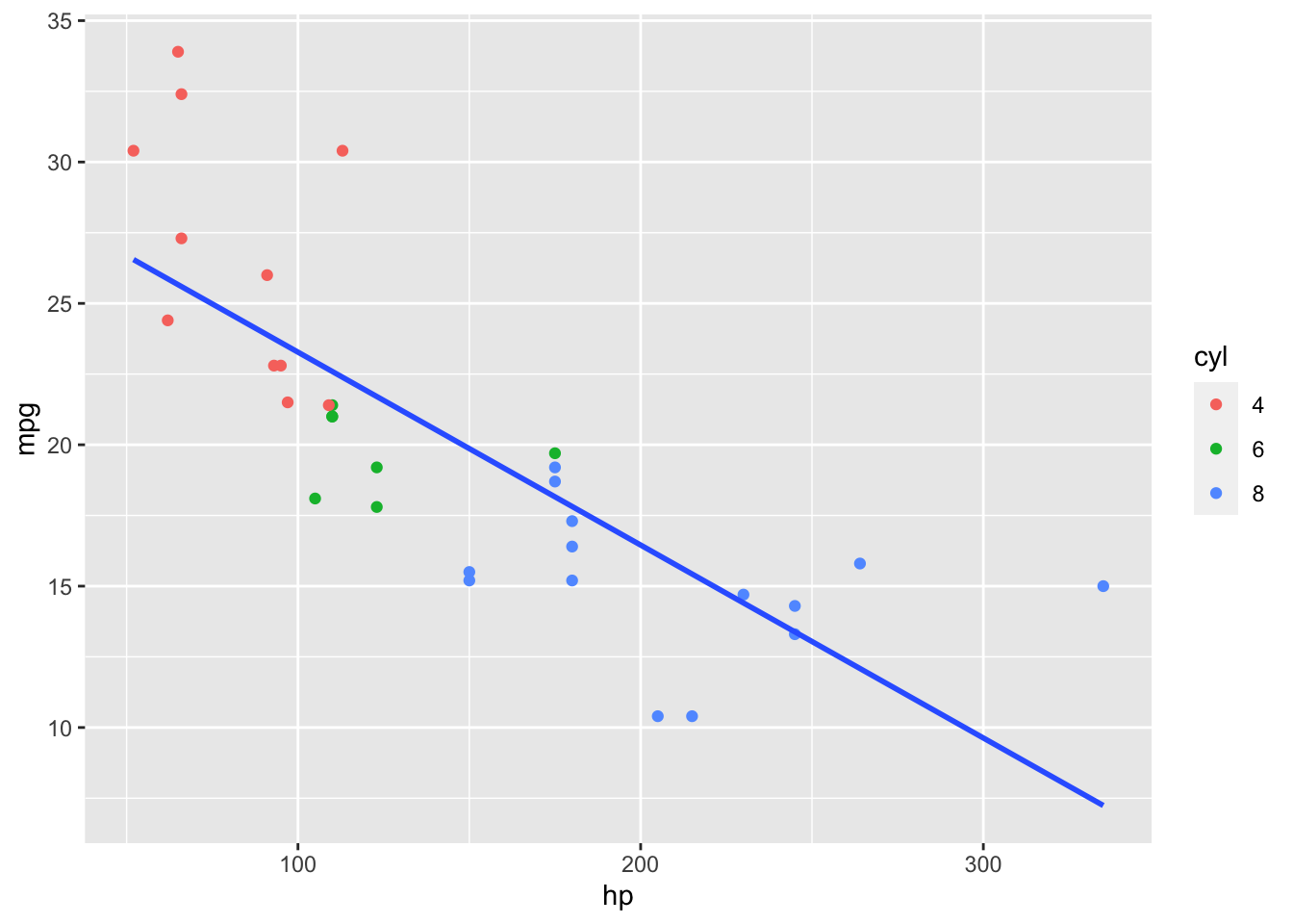
That does not look quite right so we try a non-linear, polynomial model.
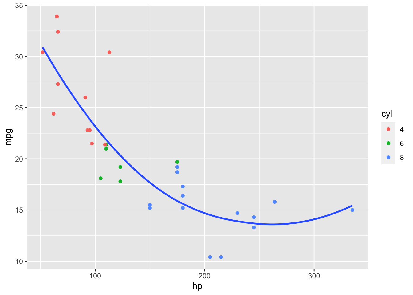
That looks better. However, it makes a key assumption!
It assumes cars of different cylinder types still have the same true relationship between miles per gallon and horsepower.
Not true for the linear model
Also not true for the polynomial model.
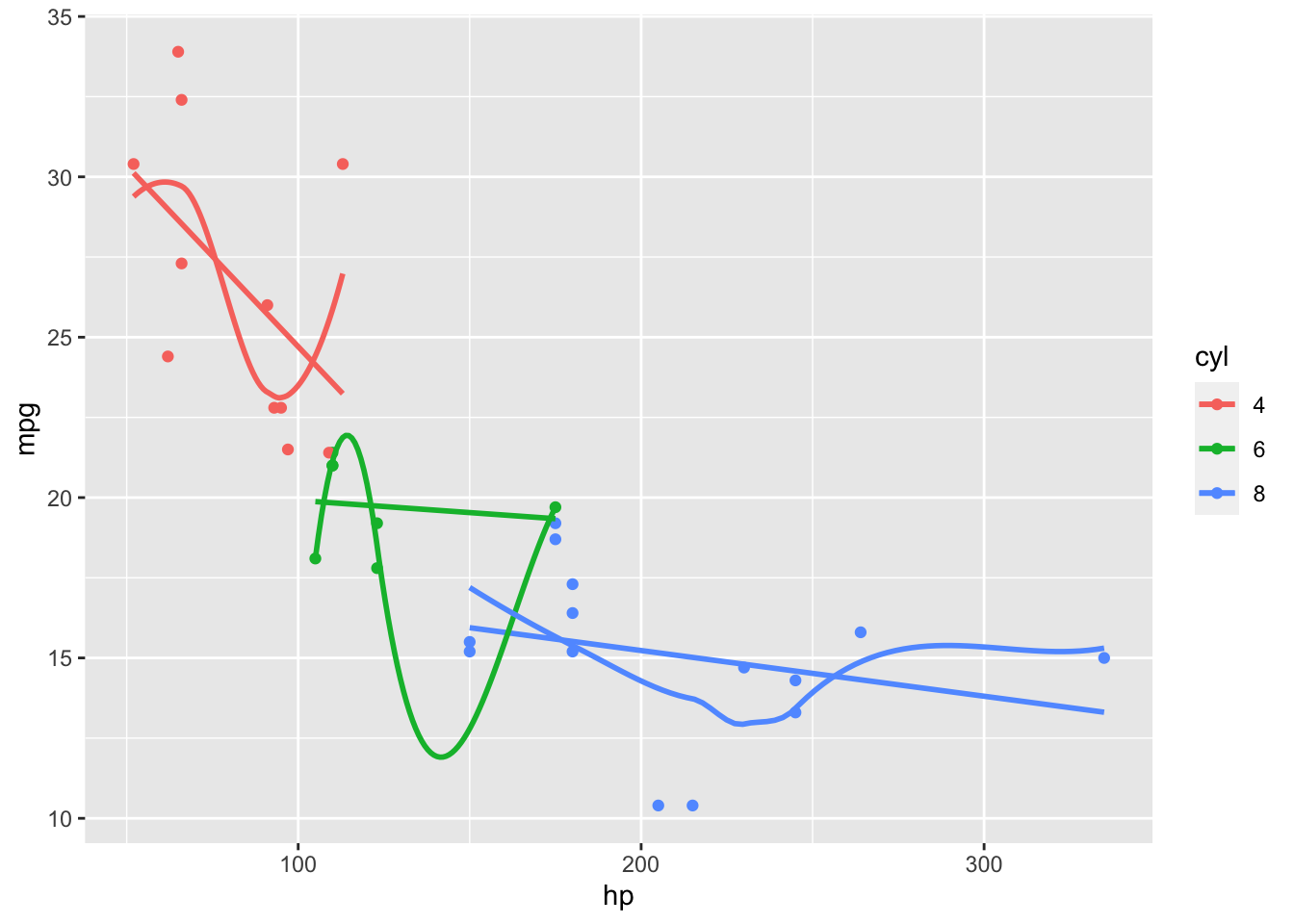
- You notice the models overlap and do not connect.
We would like a model that can capture different trends in different parts of the \(X\) but still connect.
Splines is a method for working in a non-linear world.
7.2 Example in R using the Auto Data Set
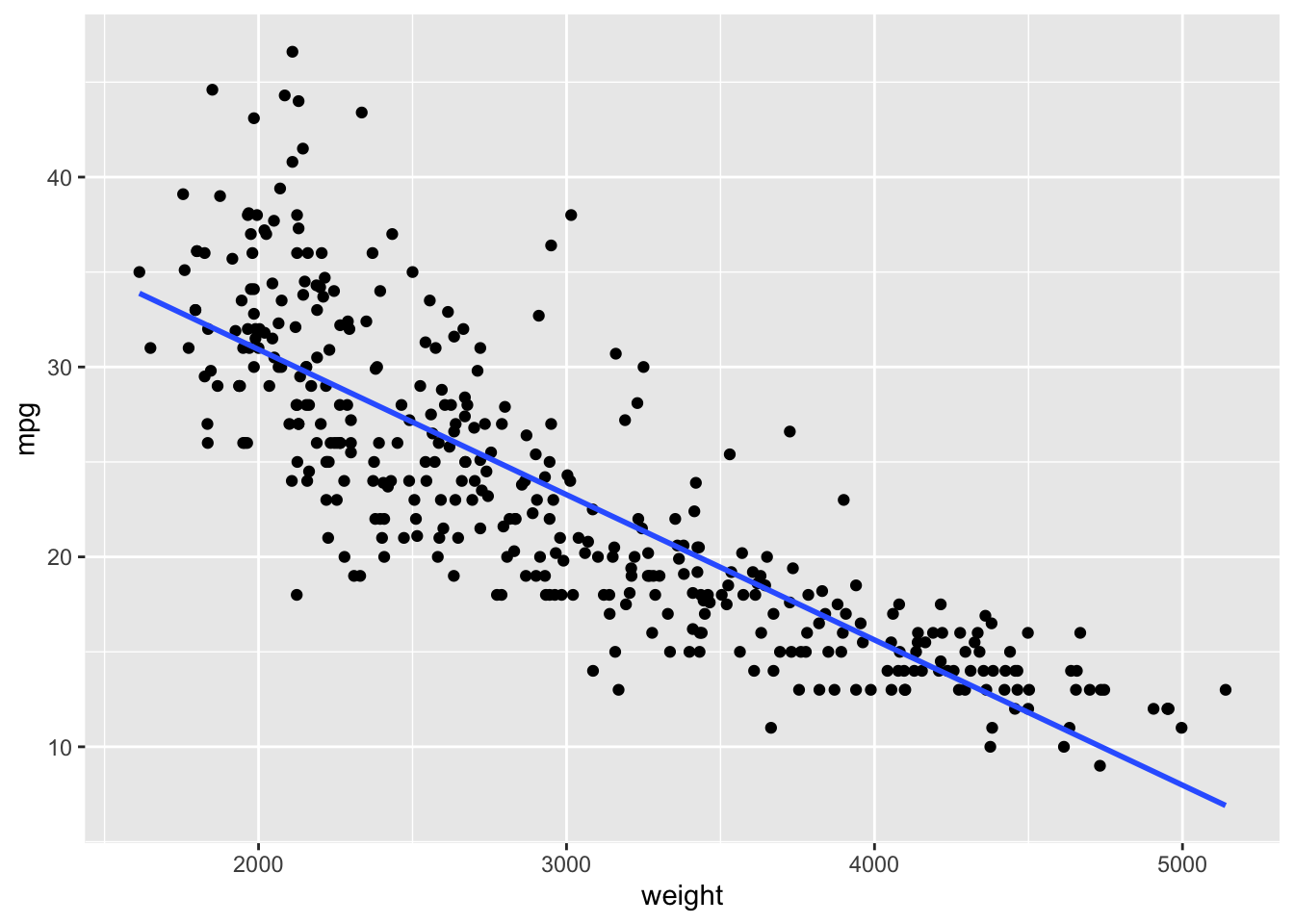
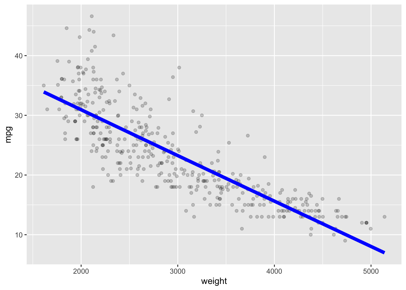
Let’s use the Auto data set from {ISLR2} and fit a linear model for predicting mpg based on weight.
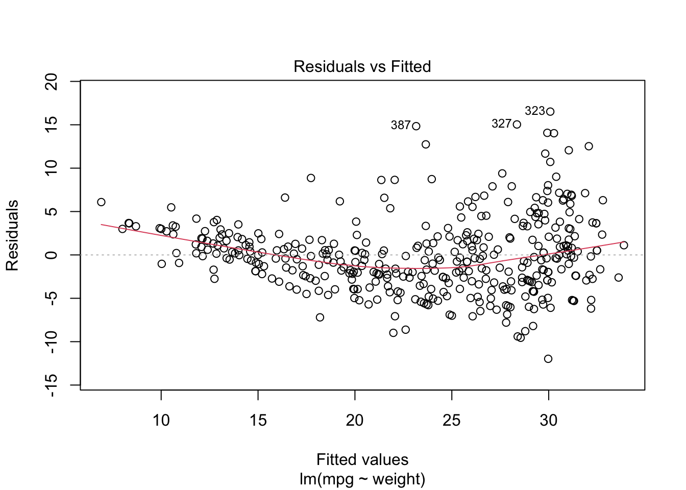
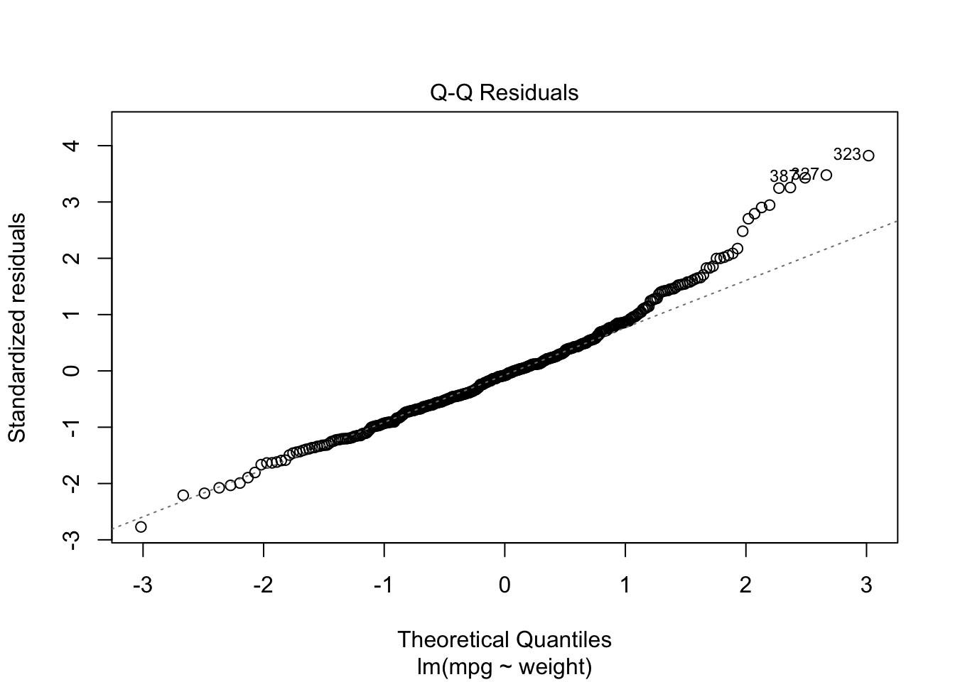
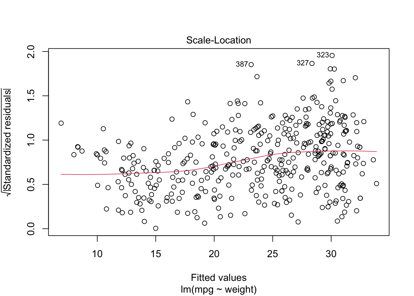
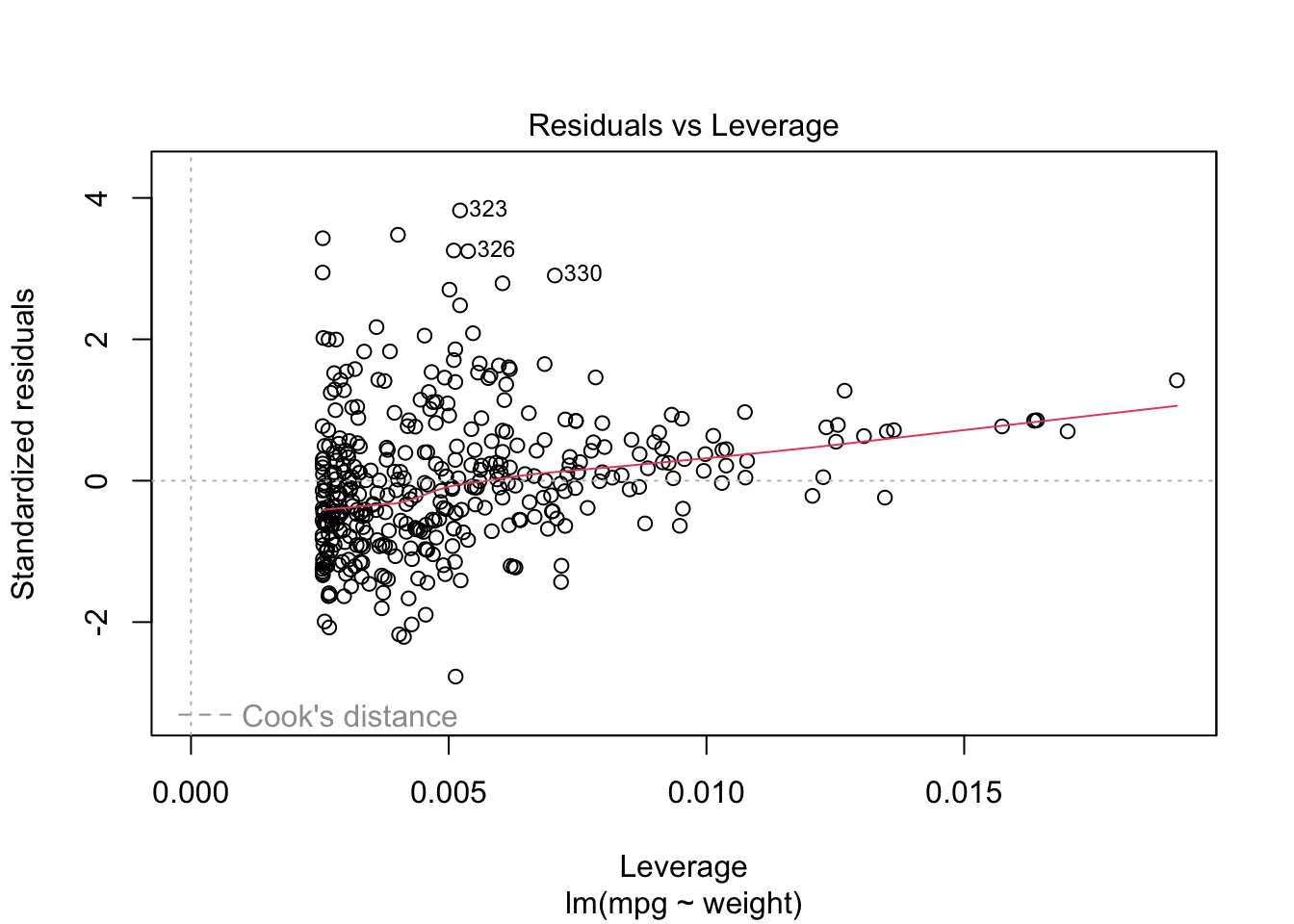
We can see mpg is underestimated for the lower weights and higher weights but tends to be overestimated in the middle.
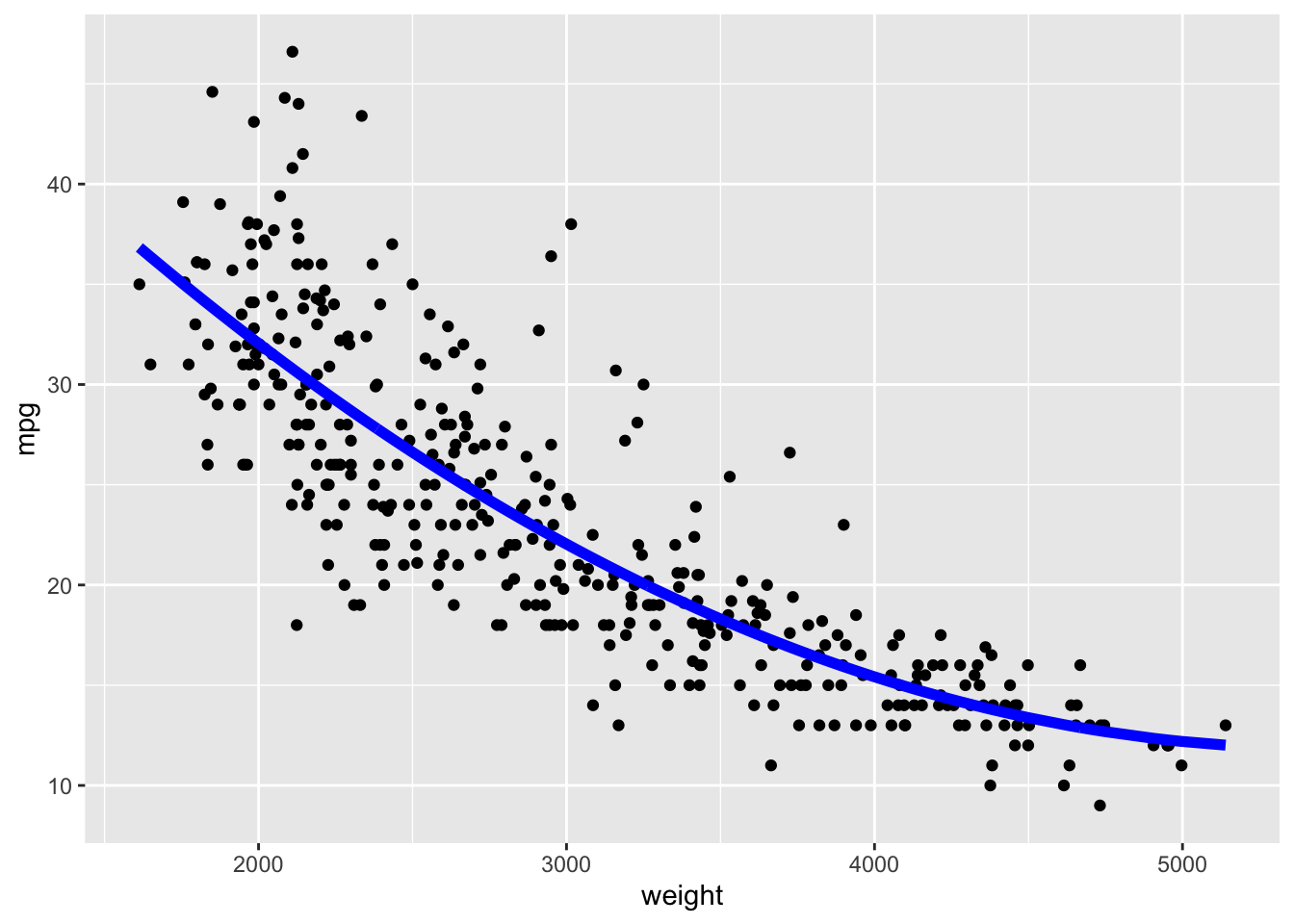
The residuals suggest some curvature.
Let’s fit a quadratic model.
We can run cross validation to see which is better.
- We need to re-run using
glm().
library(boot)
reg <- glm(mpg ~ weight, data = Auto)
quadr <- glm(mpg ~ poly(weight, 2), data = Auto)
summary(quadr)
Call:
glm(formula = mpg ~ poly(weight, 2), data = Auto)
Coefficients:
Estimate Std. Error t value Pr(>|t|)
(Intercept) 23.4459 0.2109 111.151 < 2e-16 ***
poly(weight, 2)1 -128.4436 4.1763 -30.755 < 2e-16 ***
poly(weight, 2)2 23.1589 4.1763 5.545 5.43e-08 ***
---
Signif. codes: 0 '***' 0.001 '**' 0.01 '*' 0.05 '.' 0.1 ' ' 1
(Dispersion parameter for gaussian family taken to be 17.4419)
Null deviance: 23819.0 on 391 degrees of freedom
Residual deviance: 6784.9 on 389 degrees of freedom
AIC: 2238.1
Number of Fisher Scoring iterations: 2- Run the cross validation to get the cross-validated MSE values:
$delta.
[1] 19.08518 19.06371[1] 17.77889 17.75405The quadratic model has lower prediction MSE (delta) so is a better fit.
- The square root of the
delta, is the estimated standard deviation of the predicted values from the cross validation.
[1] 4.368659 4.366201[1] 4.216502 4.213556If we do a cubic model, how will it do?
cubicr <- glm(mpg ~ poly(weight, 3), data = Auto)
set.seed(1234)
cv.glm(Auto, quadr, K = 10)$delta # Quadratic Model[1] 17.77889 17.75405[1] 17.84820 17.81954So quadratic is slightly better than the cubic among those polynomials.
Can we do better by fitting a curve that has more flexibility than we can get with a polynomial?
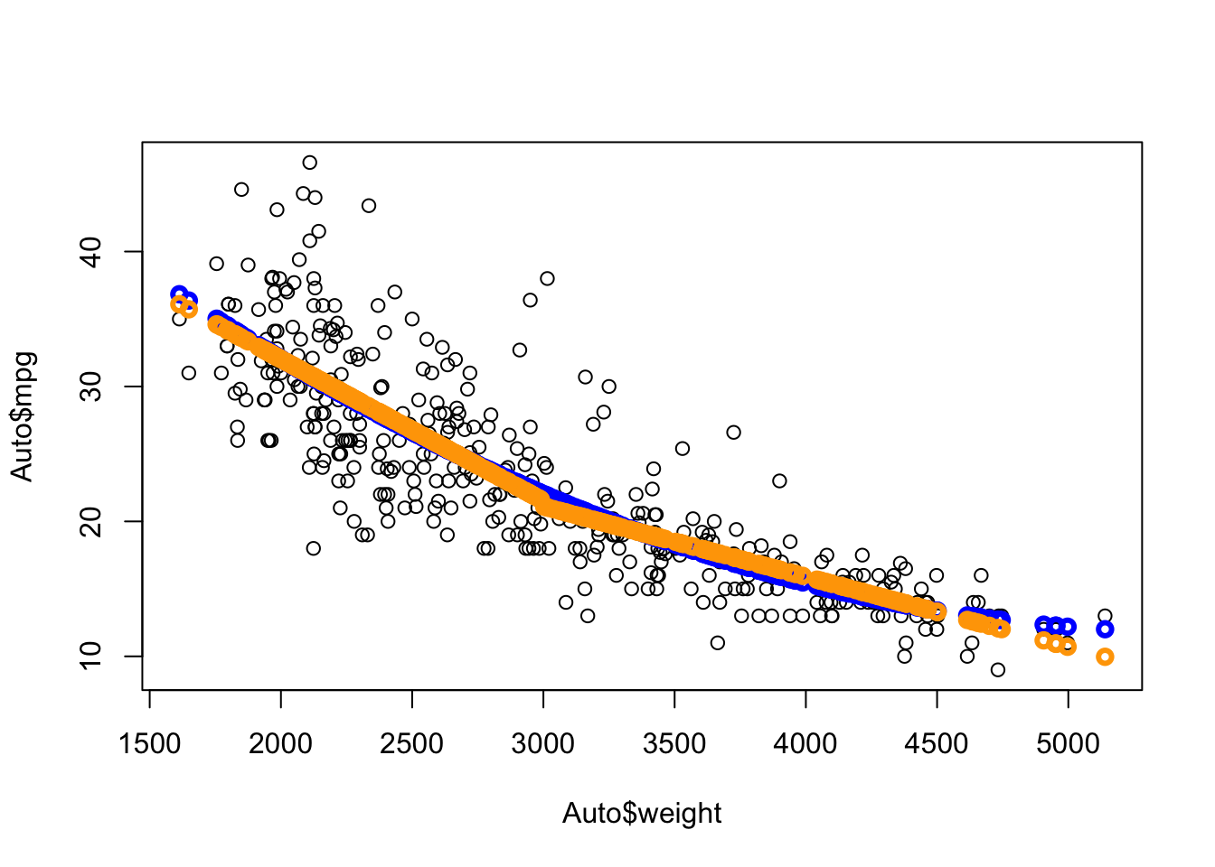
Let’s try splitting the data into heavy and light cars, where the true model might be different.
- Perhaps 3000 Lbs would be a good place to split.
- We can create a dummy variable \(Z\) to fit the model with interactions.
We see we get another curve (orange) that is close yet different.
Show code
quadr <-  lm(mpg ~ poly(weight, 2), data = Auto)
Yhat <-  predict(quadr)
Yhatb <- predict(broken_line)
ggplot(bind_cols(Auto, data.frame(Yhat, Yhatb)), aes(x = weight, y = mpg)) +
geom_point(alpha = .3) +
geom_line(mapping = aes(x = weight, y = Yhat),
color = "blue", linewidth = 1) +
geom_line(mapping = aes(x = weight, y = Yhatb),
color = "orange", linewidth = 2)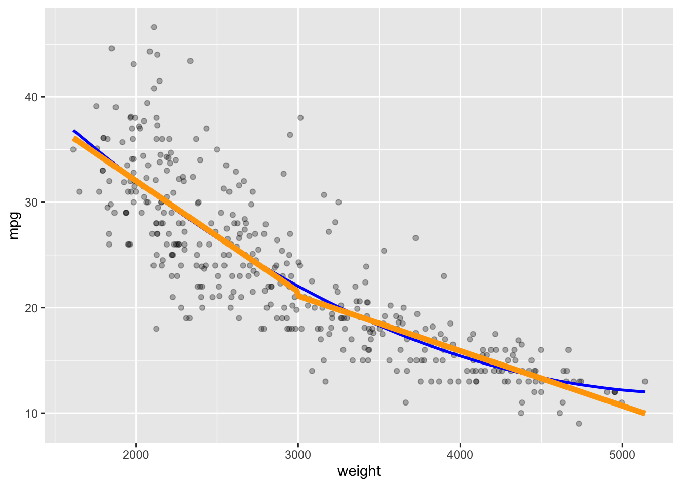
The broken line curve seems to fit like the quadratic but as two separate lines that connect at an angle at weight = 3000.
We can look at the model results using summary().
Call:
lm(formula = mpg ~ weight * Z, data = Auto)

Residuals:
     Min       1Q   Median       3Q      Max
-12.7277  -2.7224  -0.4002   1.9191  16.9687

Coefficients:
               Estimate Std. Error t value Pr(>|t|)
(Intercept)  36.7314461  2.3754853  15.463  < 2e-16 ***
weight       -0.0052073  0.0006152  -8.465 5.33e-16 ***
ZTRUE        16.3135790  3.0608401   5.330 1.67e-07 ***
weight:ZTRUE -0.0052999  0.0010197  -5.197 3.28e-07 ***
---
Signif. codes:  0 '***' 0.001 '**' 0.01 '*' 0.05 '.' 0.1 ' ' 1

Residual standard error: 4.193 on 388 degrees of freedom
Multiple R-squared:  0.7136,    Adjusted R-squared:  0.7114
F-statistic: 322.3 on 3 and 388 DF,  p-value: < 2.2e-16
Since both the Dummy variable and the interaction are significant, that suggests having two different models is a good thing.
However, the break is not smooth, which is atypical in the physical world where things tend to have smooth transitions.
Can we fit non-linear models to each side of the split in such a way that they connect smoothly?
Let’s try using splines.
7.3 Splines
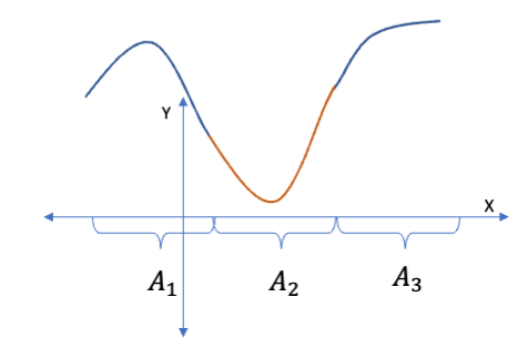
Splines fit separate models to different segments (intervals) of the \(X\) values while connecting them smoothly.
The points where each spline connects to the next is called a knot.
7.3.1 Basis Functions
A generalized form of a regression model involves using a basis function to transform the \(X\) where \(B_j(X)\) is one of a set of transformation functions.
Using the basis functions, we model \(Y\) as a linear combination of the basis functions, e.g., \(Y = \beta_0 + \sum\beta_j B_j(X) + \epsilon\).
Basis functions are fixed and known; we select them ahead of time.
In Linear regression the basis function is just \(x\), so \(B_j(x) = x_j\).
In Polynomial regression, the basis function is powers of \(x\), \(B_j(x) = x^j\).
In Piece-wise Constant Regression, the basis function is an indicator function \(I\) that specifies \(x \in A_j\) where \(A_j\) is the set of of points within interval \(j\), \(B(x) = I_{x \in A_j}\)
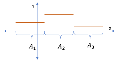
Since the \(Y\) response is a linear combination of the transformed \(X\), we can still use linear regression to estimate the coefficients \(\beta_j\).
Let’s use a basis function to create a piece-wise polynomial regression.
7.3.1.1 B-Splines as Piece-wise Polynomial Regression
B-Splines use a basis function that is a combination of piece-wise and polynomial regression basis functions.
- The B-spline basis function is an indicator function times some smooth function \(g_j(x).\)
\[B_j(x) = I_{x \in A_j}\times g_j(x)\]
- This allows the spline to use different functions in different intervals (segments) of \(x\).
- The points where the functions connect at the boundaries of the intervals are the knots.
7.4 Why are Cubic Splines so Popular?
The most popular polynomial splines are not linear or quadratic, but cubic. Why?
We want to connect two segments with another segment in between with smooth transitions at each knot as seen in Figure 7.1.
- What is required for the connections to be smooth?
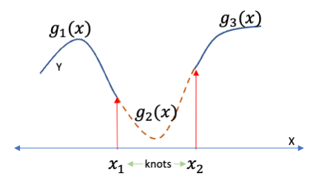
Smoothness can be defined mathematically in terms of constraints or conditions.
- The functions must be continuous (not discontinuous) – so no jumps at a knot.
- The functions for each segment must have the same value at a knot.
- \(g_1(x_1) = g_2(x_1) \text{ and } g_2(x_2) = g_3(x_2)\)
- This ensures no jumps in value.
- The functions must be differentiable, i.e., the first derivative must exist.
- The first derivatives of the functions must be the same at each knot.
- \(g_1'(x_1) = g_2'(x_1) \text{ and } g_2'(x_2) = g_3'(x_2)\)
- This ensures no sharp corners as the slopes are the same.
To fit a spline smoothly, the values and the derivatives of both functions have to match at all knots.
This is a system of four equations that we need to solve to ensure smoothness.
To solve four equations, we must have four unknowns (or four degrees of freedom).
We would like to use a polynomial - so which polynomial function has four coefficients?
- A linear model has two coefficients.
- A quadratic has three.
- A cubic is the minimum degree with four coefficients: \(\beta_0,\, \beta_1,\, \beta_2,\, \beta_3\).
Thus we need at least a cubic polynomial spline to ensure smoothness.
A cubic spline with \(k\) knots, uses 4 + \(k\) degrees of freedom.
7.5 Example in R using the {splines} package
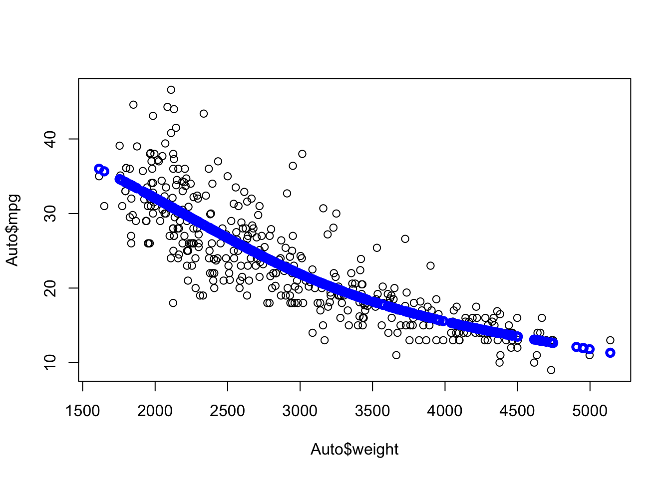
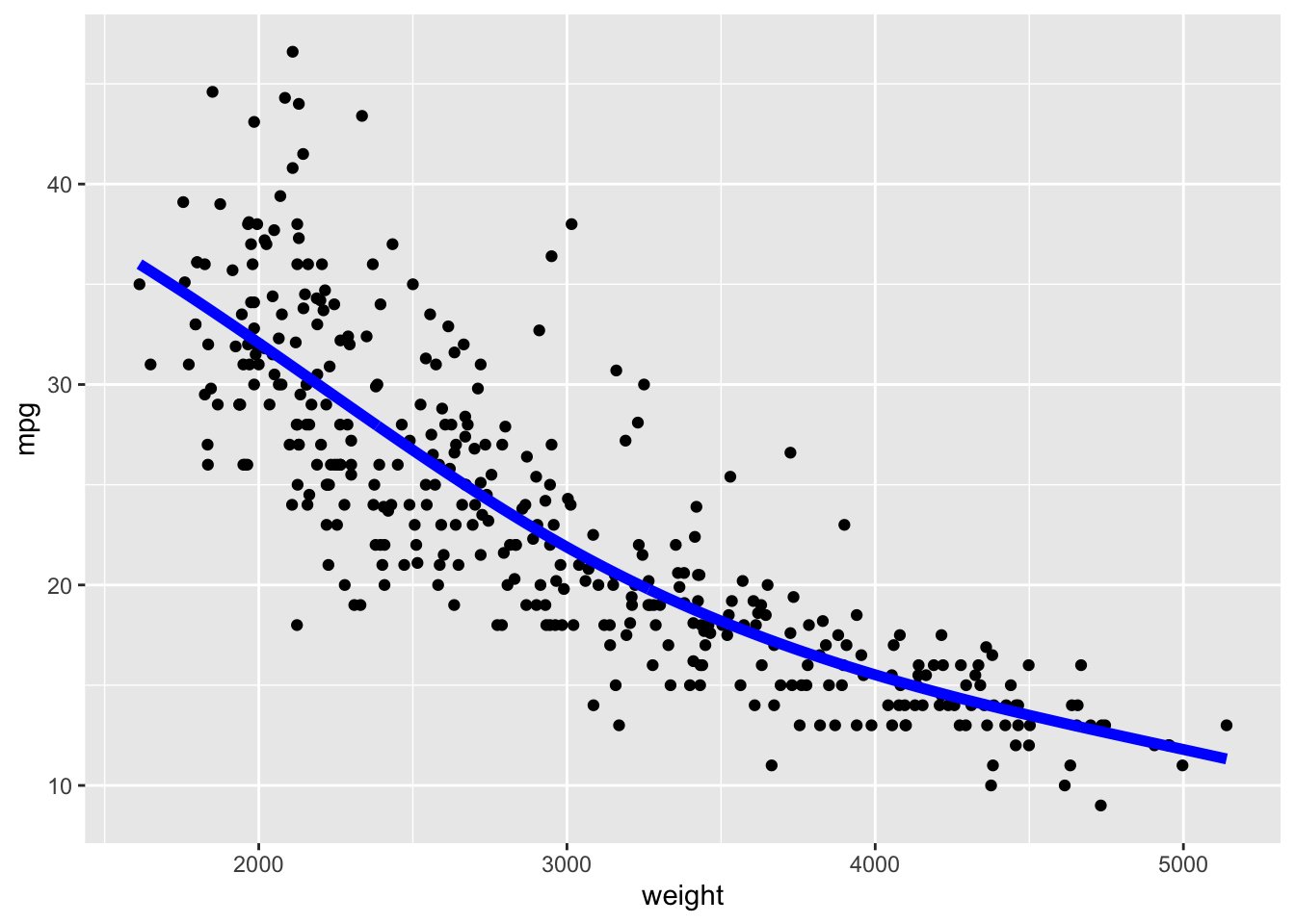
Let’s use the splines::bs() (b-spline) function to calculate some splines.
- We can define the breakpoints for the knots using the
knots=argument.
Note the smoothness of the curve at weight=3000.
We can try more knots
- We will set the knots for now and later we will see how to let R pick them.
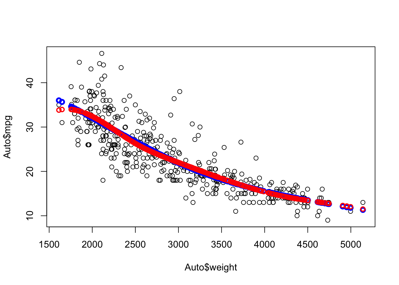
Compare 1 knot at 3000 (blue) with three knots (red) at 2500, 3000, and 4200.
Each segment has its own equation
Which is better?
Let’s use cross validation as before.
reg <- glm(mpg ~ weight, data = Auto)
quadr <- glm(mpg ~ poly(weight, 2), data = Auto)
spline1 <- glm(mpg ~ splines::bs(weight, knots =  3000), data = Auto)
spline3 <- glm(mpg ~  splines::bs(weight, knots = c(2500, 3000, 4200)), data = Auto)
set.seed(1234)
paste(round(cv.glm(Auto, reg, K = 10)$delta[2], 2), "Linear")
[1] "19.06 Linear"[1] "17.75 Quadratic"[1] "17.87 1 knot Spline"[1] "17.98 3 knot Spline"So when we defined the knots, the cubic spline was better than linear or one knot, but not as good as the quadratic polynomial.
7.6 Extensions to Cubic Splines
7.6.1 Natural Splines (NS)
These are an extension of the B-splines where we make an exception for the first and last (left and right) splines.
- These segments can be “dangerous” as they are unbounded on one end, unlike the other segments.
- With a cubic polynomial, they go off to \(- \infty\) and \(+\infty\).
- They can increase very rapidly which can increase the variance of the estimates.
A Natural Spline fits cubic splines in the interior segments and linear fits on the ends.
- This is only two equations in two unknowns at the first and last knot so a linear model is fine.
In R you can use the splines::ns() function to fit a natural spline.
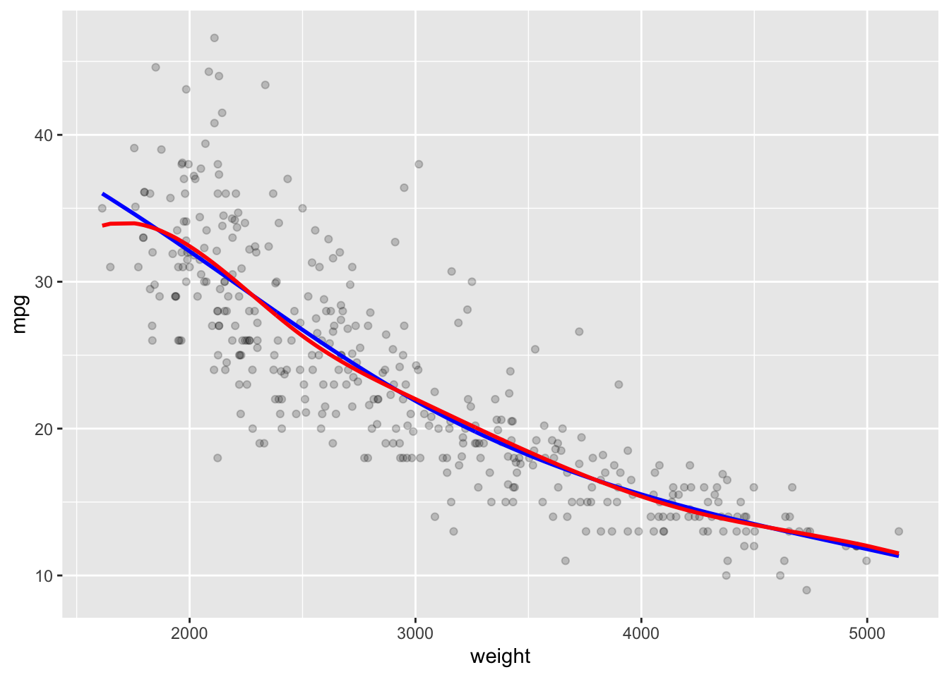
- Here we fit a natural spline with five degrees of freedom.
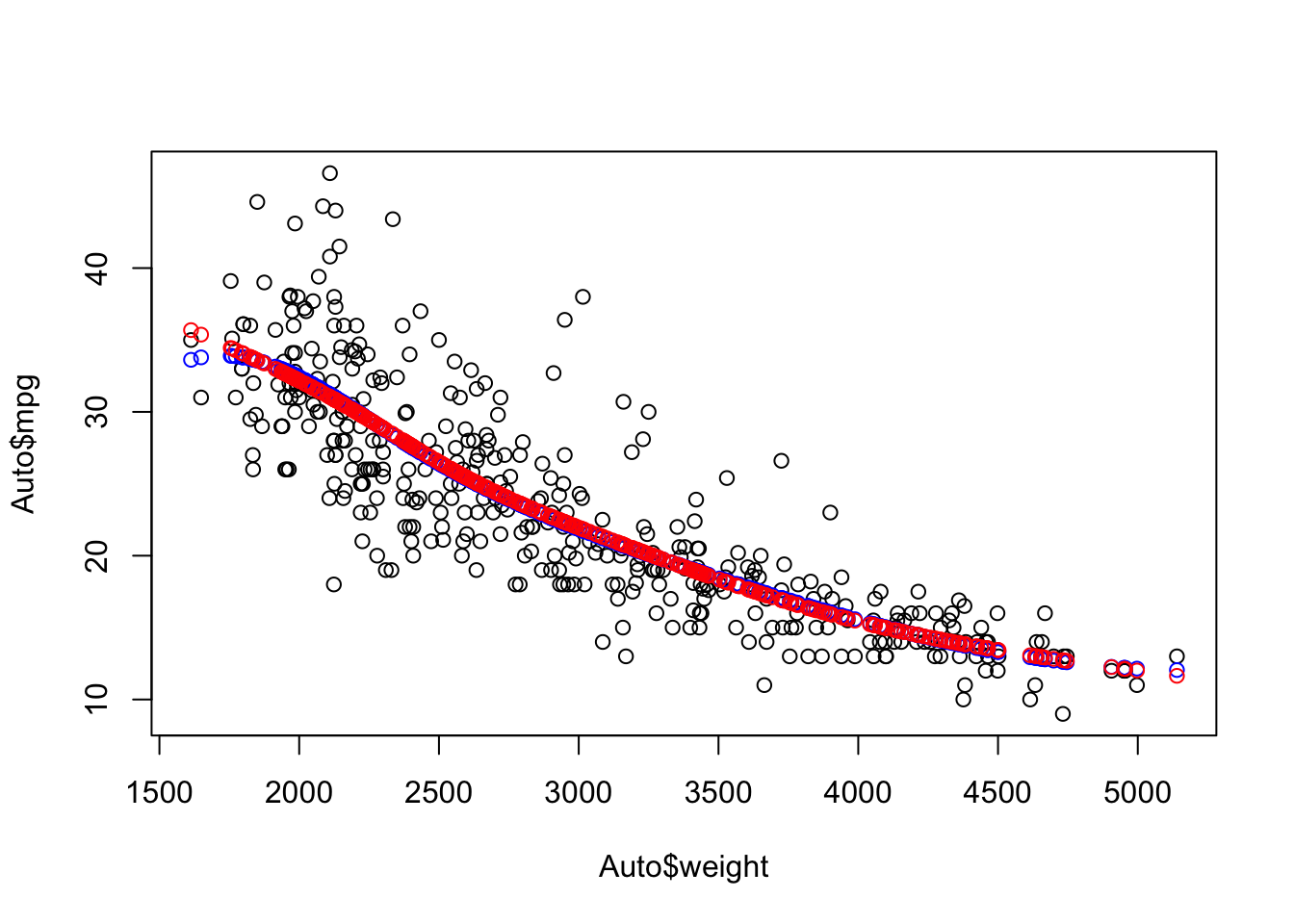
Compare the ends of the b-spline (blue) with the natural spline (red).
Note the fit is the same on the interior but changes to be more linear on the outer segments.
7.6.2 Smoothing Splines
These have similarities with shrinkage methods.
Ridge Regression and Lasso try to reduce the variance of the slope estimates by using a penalty term.
- Ridge: Minimize \(\sum (\hat{y} - y)^2 + \lambda \sum \beta_j^2.\)
- Lasso: Minimize \(\sum (\hat{y} - y)^2 + \lambda \sum |\beta_j|.\)
- The \(\lambda\) terms are the penalty terms.
The goal here is to minimize the Error Sum of Squares subject to ensuring smoothness.
- Smoothing splines do it by including a penalty term with \(\lambda\) times the square of the second derivative of the \(g(x)\) where \(\hat{y}_i = g(x_i)\).
\[\sum (\hat{y} - y)^2 + \lambda\int[g''(x)]^2dx\]
The second derivative measures the amount of change in the first derivative.
- If velocity is the first derivative of position with respect to time, then acceleration is the second derivative, which measures the change in velocity with respect to time.
Penalizing larger second derivatives will drive them to be smaller, which will in turn, reduce the amount of change in the first derivatives between segments.
- Reduces the amount of “wiggle” or flexibility in the spline.
- The integral sums the squared second derivatives across the range of the \(x\) so it produces a single number.
Smoothing splines make a trade off in fit (higher bias) for the sake of more smoothness (lower variance).
Every point can be treated as a knot so measuring the fit depends upon choosing \(\lambda\).
- \(\lambda\) is a tuning parameter we can select through cross validation.
If \(\lambda = 0\) we are back to minimizing the SSErr. This is equivalent to saturated regression (see Section 3.9.0.1) since each \(x_j\) is represented by \(\bar{y}_j\) and \(g(x)\) interpolates across the \(\bar{y}_j\).
- It might not be very smooth, but setting \(\lambda = 0\) means we don’t care much about the smoothness.
On the other extreme, if \(\lambda = \infty\), the only way to minimize is to have all the second derivatives equal to 0 for all \(x\).
- Convex functions have \(g'' >0\). Concave functions have \(g''<0\).
- This means the solution for 0 is a linear function which means linear regression.
Tuning \(\lambda\) allows you to make the trade off between highly flexible saturated regression and restrictive smoothness.
In R, smoothing splines choose the knots automatically once we choose the degrees of freedom budget.
- The algorithm can spend the degrees of freedom budget by deciding 1) whether to create more knots, or 2) fit higher order polynomials in the segments.
7.6.3 Example Smoothing Splines in R
Use the stats::smoothspline() function to fit the spline model and stats::predict(), which uses stats::predict.smooth.spline(), to predict new values.
- Neither x nor y are allowed to containing missing or infinite values.
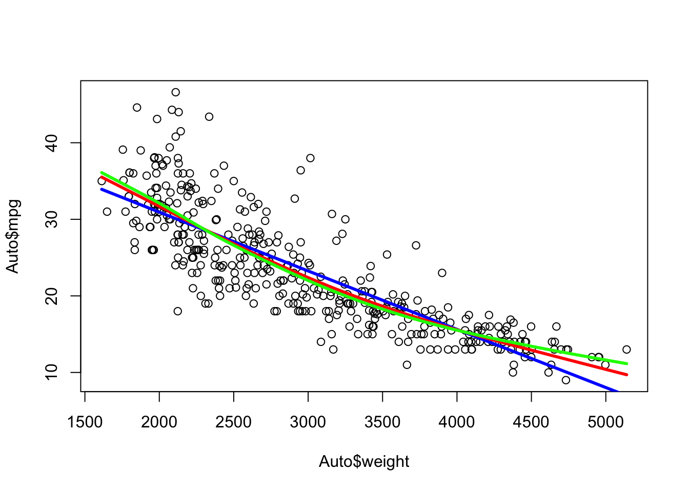
Setting Degrees of Freedom to 2 is equivalent to linear regression.
Note the predictions are a list of \(x\) and \(y\).
The degrees of freedom must be at least 1 but can be fractional.
- Increasing the degrees of freedom makes the spline more flexible.
- Let’s create the splines and fitted values for 3 and 5 degrees of freedom.
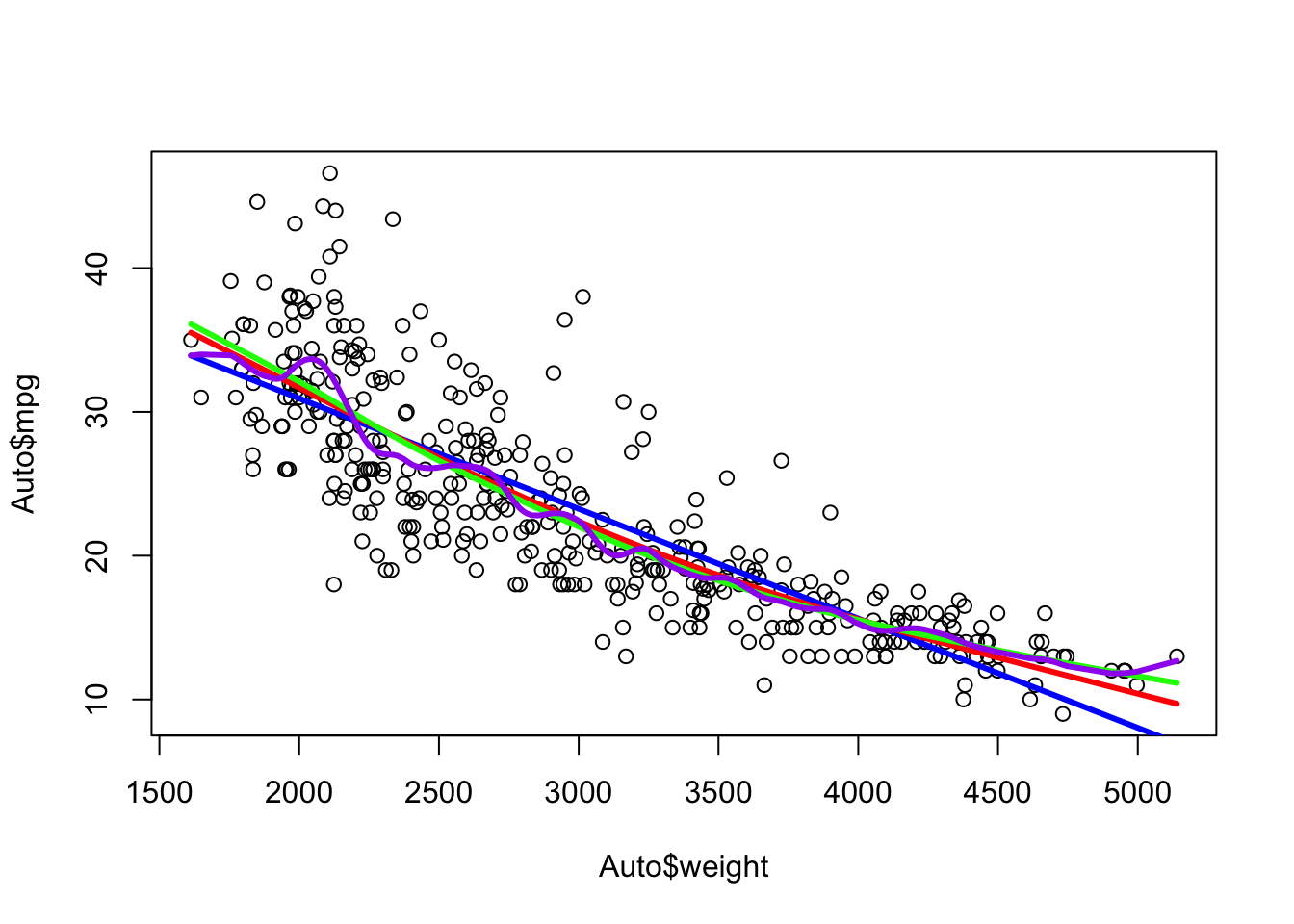
Note the increased flexibility from 2 (blue) to 3 (red) to 5 (green).
Show code
ggplot(Auto, aes(x = weight, y = mpg)) +
  geom_point(alpha = .2) +
  geom_line(data = as.data.frame(Yhat2), mapping = aes(x = x, y = y),
            color = "blue", linewidth = 1) +
  geom_line(data = as.data.frame(Yhat3), mapping = aes(x = x, y = y),
            color = "red", linewidth = 1) +
  geom_line(data = as.data.frame(Yhat5), mapping = aes(x = x, y = y),
color = "green", linewidth = 1) 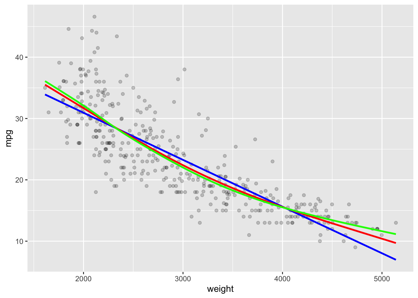
With 5 degrees of freedom it could have generated a 4th degree polynomial. We can see it chose to create segments with knots.
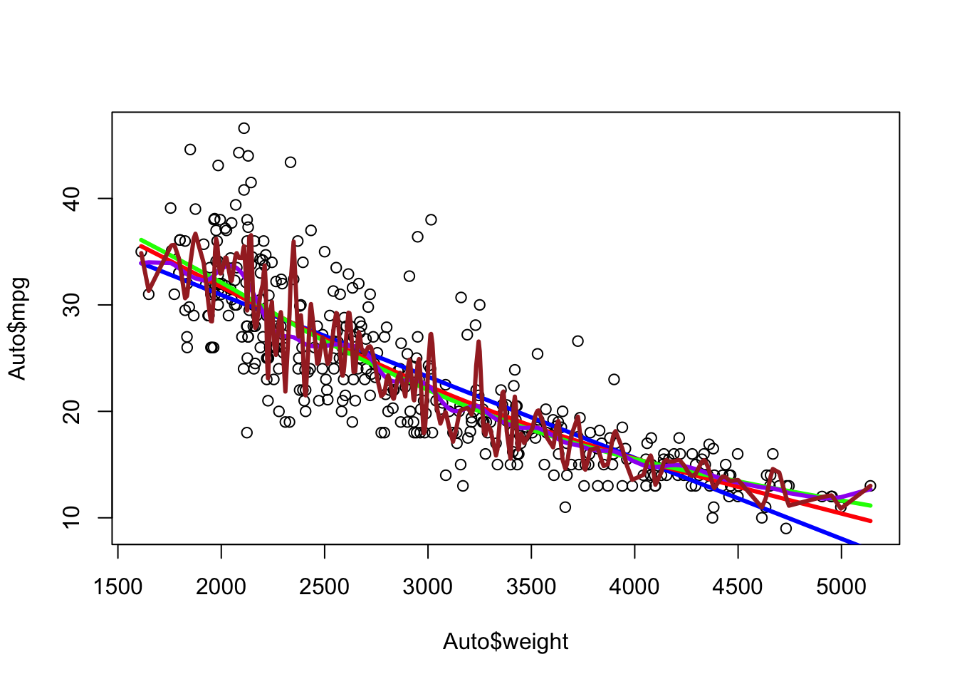
With 25 degrees of freedom it can get quite flexible.
Show code
ggplot(Auto, aes(x = weight, y = mpg)) +
  geom_point(alpha = .2) +
  geom_line(data = as.data.frame(Yhat2), mapping = aes(x = x, y = y),
            color = "blue", linewidth = 1) +
  geom_line(data = as.data.frame(Yhat3), mapping = aes(x = x, y = y),
            color = "red", linewidth = 1) +
  geom_line(data = as.data.frame(Yhat5), mapping = aes(x = x, y = y),
            color = "green", linewidth = 1) +
  geom_line(data = as.data.frame(Yhat25), mapping = aes(x = x, y = y),
            color = "purple", linewidth = 1)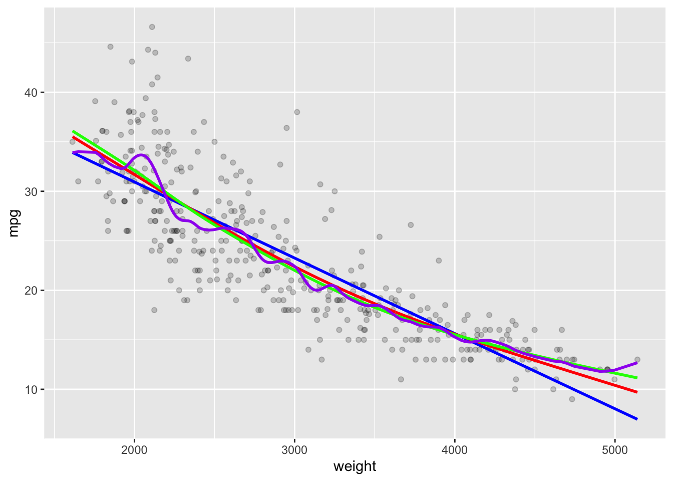
With 225 degrees of freedom it is clearly too flexible.
Show code
ggplot(Auto, aes(x = weight, y = mpg)) +
  geom_point(alpha = .2) +
  geom_line(data = as.data.frame(Yhat2), mapping = aes(x = x, y = y),
            color = "blue", linewidth = 1) +
  geom_line(data = as.data.frame(Yhat3), mapping = aes(x = x, y = y),
            color = "red", linewidth = 1) +
  geom_line(data = as.data.frame(Yhat5), mapping = aes(x = x, y = y),
            color = "green", linewidth = 1) +
  geom_line(data = as.data.frame(Yhat25), mapping = aes(x = x, y = y),
            color = "purple", linewidth = 1) +
    geom_line(data = as.data.frame(Yhat225), mapping = aes(x = x, y = y),
color = "brown", linewidth = 1) 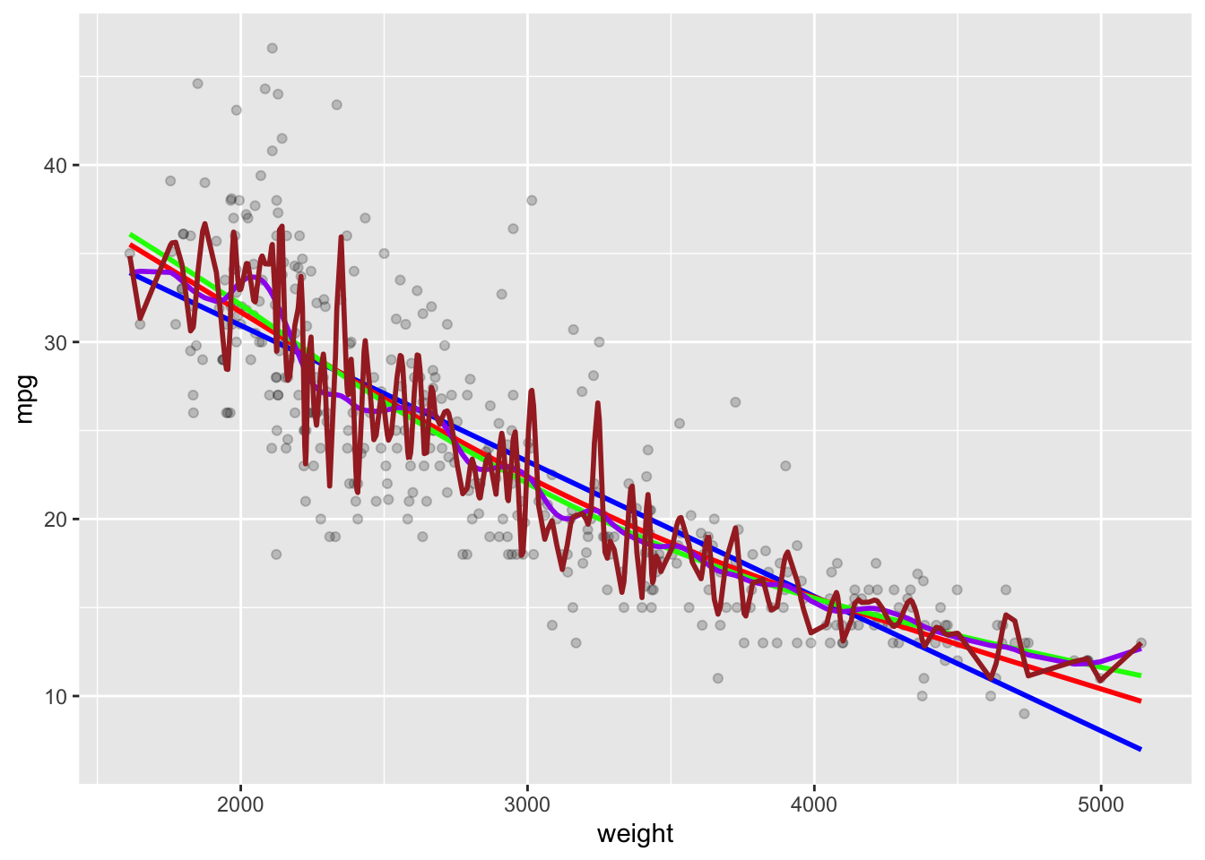
- You could iterate through a series of degrees of freedom to select the best one.
dfs <-  seq(2,20, .01)
cvs <- vector(mode = "numeric", length(dfs))

for (i in seq_along(cvs)) {
  cvs[[i]] <- smooth.spline(Auto$weight, Auto$mpg, df = dfs[[i]])$cv.crit
}

ggplot(data.frame(dfs, cvs), aes(x = dfs, y = cvs)) +
  geom_line()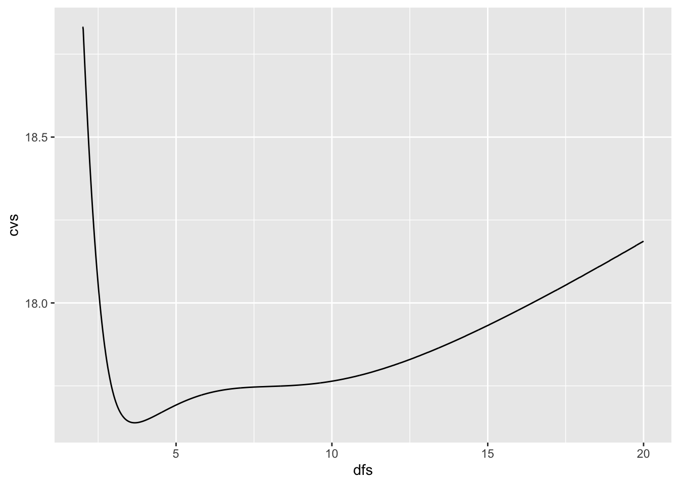
Or, just let the function pick it using generalized cross validation or LOOCV.
[1] 3.674305[1] 10.35561Since duplicate \(x\) values generate a warning with LOOCV, you can eliminate them and try again.
Show code
[1] 3.741745Plot with the GCV Spline model.
Show code
sscv <- smooth.spline(Auto$weight, Auto$mpg)
Yhat1 <- predict(sscv)
ggplot(Auto, aes(x = weight, y = mpg)) +
  geom_point(alpha = .2) +
  geom_line(data = as.data.frame(Yhat1), mapping = aes(x = x, y = y),
            color = "blue", linewidth = 1) +
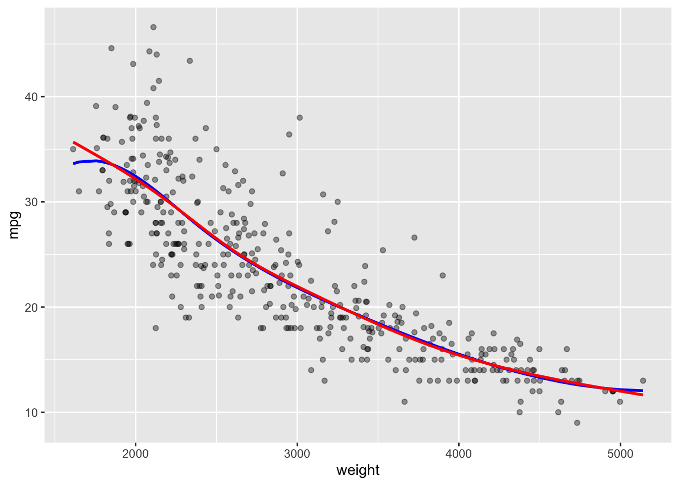
ggtitle(paste("GCV Spline Model with df = ", round(sscv$df,3), " and LOESS smoother in red")) +
  geom_smooth(se = FALSE, lty = 2, color = "red")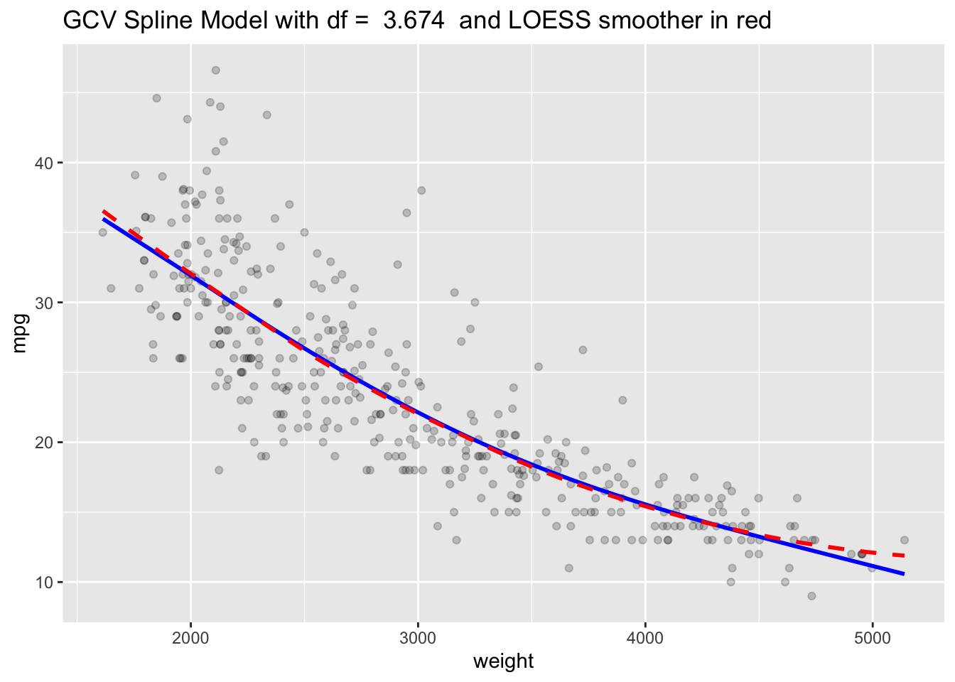
Splines allow you to fit a more flexible model than ordinary linear regression while still allowing you to control the level of flexibility.
You can predict new values and use cross validation to tune parameters and compare performance with various spline models or other methods.
