Show code
Categrical Data, Binary Classification, Logistic Regression, Principal Components Analysis, PCA, k-Means Clustering, Support Vector Machines, SVM, Confusion Matrices
This module teaches some classification methods which are useful for working with response variables that are categorical (factors).
Learning Outcomes
help("stats").When your question of interest involves a categorical response, you must use a classification method.
There are many Classification methods for binary classification (when there are only two levels) or more general approaches for response variable with multiple levels (categories) such as Hair Color.
Consider a dataset containing several variables (columns). Some of the variables are designated as the “response variables” (or “outputs”). You’d like to predict the response variables from the “explanatory variables” (or “inputs”). There are also variables that you didn’t (or couldn’t) measure, which are the “latent variables”.
These distinctions between variable roles are a bit arbitrary, and it can be a bit of a problem to determine which variables should play which role, especially because the same variable can play different roles depending on your research question.
Exploring your data (on the training set, like in Lesson 6) is an important part of determining possible variable roles.
“Machine learning” is a term that you’ve probably heard, perhaps surrounded by a bit of mystery. While there are several different kinds of algorithms that are usually considered “learning”, they are essentially just fancier versions of statistical regression.
As in Lesson 6, careful attention to the train-validation-test process with the data is critical, because modern supervised learning algorithms are extremely flexible.
Many problems in data science involve predicting whether an observation belongs to one of two categories. Examples include:
These are examples of binary classification problems because the outcome has only two possible classes.
Linear regression is generally not appropriate for this setting because predicted values can fall outside the range from 0 to 1. Instead, a common approach is logistic regression, which models the probability that an observation belongs to one of the classes.
The logistic regression model produces estimated probabilities such as:
The predicted probabilities are constrained to remain between 0 and 1 through the use of the logistic (sigmoid) function.
\[P(Y=1)=\frac{1}{1+e^{-(\beta_0+\beta_1x_1+\cdots+\beta_px_p)}} \tag{7.1}\]
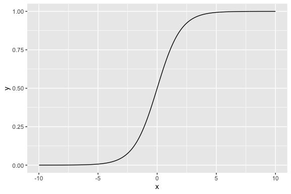
Figure 7.1 shows a plot of a sigmoid function and you can see how with the right parameters, you can convert any number \(x\) to a number \(y\) that is between 0 and 1 like a probability.
Essentially logistic regression allows us to use our data and, instead of predicting a category label directly, then use the sigmoid function to do regression and estimate the probability of membership in a class.
To convert our estimated probabilities into actual classifications, we have to choose a decision threshold.
A common choice is 0.5:
However, the threshold does not need to be fixed at 0.5. Different applications may require different tradeoffs between false positives and false negatives.
For example:
Threshold selection is therefore connected to the costs and risks associated with classification errors.
Binary classification models are commonly evaluated using metrics such as:
These measures help determine how well the model distinguishes between the two classes and whether a chosen threshold is appropriate for the problem being studied.
Suppose we want to predict whether a municipality contains a cultural site based on household and socio-economic characteristics.
In this example, the model estimates the probability that a municipality contains a cultural site using variables such as:
For this example we will not split the data to simplify things so our model may overfit the data and give optimistic performance metrics.
We will use the glm() (general linear model) function from R {stats}.
family = "binomial" is what tells glm() to use logistic regression.read_csv("./data/house_ed_gdp_joined.csv") |>
select(culture_site, Average_size, population, has_computer, university) |>
mutate(culture_site = if_else(culture_site =="has_site", 1, 0)) |>
drop_na() ->
logreg_data
cultural_logit <- glm(culture_site ~ Average_size + population + has_computer +
university, data = logreg_data,
family = "binomial"
)
summary(cultural_logit)
Call:
glm(formula = culture_site ~ Average_size + population + has_computer +
    university, family = "binomial", data = logreg_data)

Coefficients:
               Estimate Std. Error z value Pr(>|z|)
(Intercept)  -5.170e-01  4.095e+00  -0.126   0.8995
Average_size -1.611e+00  1.145e+00  -1.407   0.1596
population    3.121e-05  1.831e-05   1.705   0.0883 .
has_computer  2.380e-02  1.147e-01   0.208   0.8356
university    1.947e-01  1.431e-01   1.361   0.1736
---
Signif. codes:  0 '***' 0.001 '**' 0.01 '*' 0.05 '.' 0.1 ' ' 1

(Dispersion parameter for binomial family taken to be 1)

    Null deviance: 62.226  on 58  degrees of freedom
Residual deviance: 35.581  on 54  degrees of freedom
AIC: 45.581

Number of Fisher Scoring iterations: 6Earlier, the model converted predictors into predicted probabilities:
   1    2    3    4    5    6    7    8    9   10   11   12   13   14   15
0.17 0.07 0.02 0.04 0.02 0.01 0.02 0.02 0.12 0.98 0.10 0.07 0.02 0.03 0.91
To classify municipalities, you eventually choose a threshold such as .5, .4, or even .7.
The ROC curve shows model performance across all possible classification thresholds simultaneously. It plots:
\[\text{Sensitivity} = \text{TPR} = \frac{TP}{TP+FN}\]
\[\text{FPR} = \frac{FP}{FP+TN} = 1 - \text{Specificity}\]
As the classification threshold changes, the balance between sensitivity and false positives also changes.
library(pROC)
# Predicted probabilities
logreg_data <- logreg_data |>
  mutate( pred_prob = predict(cultural_logit, type = "response")
  )

# ROC curve
roc_obj <- roc(response = logreg_data$culture_site,
               predictor = logreg_data$pred_prob
)

# Plot ROC
plot(roc_obj,legacy.axes = TRUE, xlim = c(1, 0), xaxs = "i",main = "ROC Curve")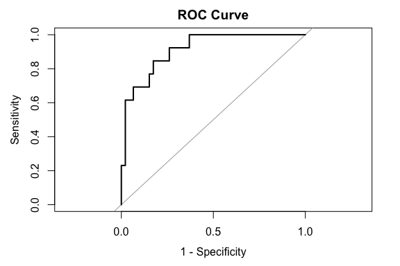
A common summary statistic is the AUC.
This mode has a very high AUC of .91 which indicates that the model can often correctly identify municipalities containing cultural sites without generating excessive false positives.
The ROC curve also illustrates that there is no single universally “correct” classification threshold.
One common strategy is to select the threshold that maximizes the balance between sensitivity and specificity.
  threshold sensitivity specificity
1 0.1512663 0.8461538 0.826087Here, the results suggest a threshold of .15 (far from .5) which achieves a balance of approximately:
A threshold can be lower than .5 for multiple reasons related to the structure of the data.
The threshold is therefore a decision rule, not a probability interpretation.
We’ll now focus our attention on a more sophisticated supervised learning classification technique, called support vector machines (SVMs).
The goal of an SVM is simple: given a table of numerical variables, assign a classification to each observation.
You use the training sample of your data to help the SVM give the correct classification to a set of observations with known classifications.
Once “trained” you can use the SVM to classify other observations that don’t have known classifications.
A given SVM is a rather elaborate algorithm, whose behavior is determined by quite a few numerical “parameters”.
Actually, there are many kinds of SVMs, though they ultimately look about the same to the data scientist from the standpoint of inputs and outputs.
In our train-tuning-test process, the tuning stage, where we select one algorithm without changing it, can be thought of as the training stage for the hyperparameters.
It sounds fancy, but it’s really pretty easy: try a handful of versions of your algorithm, and then pick the best.
It you get an error, you probably do not have the e1071 library installed, and you’ll need kernlab for our dataset. Here is how to fix that:
spam data setThe data we’ll be using for this lesson is kind of amusing
It is a single table, called spam, in which each row corresponds to an email message.
type column that either contains the string “spam” or “nonspam”.You guessed it! We are going to make an email spam filter!
Now it happens that this particular dataset is rather easy to “cheat” because it includes a few oddities in how it was collected.
george and num650, so we’ll deselect these.As we described earlier, we need to create a sampling frame and split our data into training, tuning, and test sets.
set.seed(1234)
raw_data_samplingframe <- spam |>
  select(-george, -num650) |> # Remove the "cheating" columns...
  mutate(snum = sample.int(n(), n()) / n())

training <- raw_data_samplingframe |>
  filter(snum < 0.6) |>
  select(-snum)

tuning <- raw_data_samplingframe |>
  filter(snum >= 0.6, snum < 0.8) |>
  select(-snum)

test <- raw_data_samplingframe |>
  filter(snum >= 0.8) |>
  select(-snum)
You can save these off in CSV files if you like.
In a few places we will want just the input variables. It will be frequently useful to have the correct answers in a separate table as well.
Let’s split these off now:
Let’s start with a quick visualization! Since all the explanatory variables are numerical (they’re normalized word frequencies) and there are quite few of them, principal components analysis (PCA) is a good way to create just two variables that contain most of the information in the data.
Principal Components Analysis (PCA) is a well-established method for reducing the dimensions of the data.
It uses linear algebra to create linear combinations of a set of \(k\) variables into \(k\) Principal Components where each principal component is independent of the others.
The Principal Components are designed so the First principal component captures as much information as possible from one linear combination, then the second captures the most of out what is left, and so on.
Thus the first two principal components are often used in plots as they capture the bulk of the information in just two variables so we can easily plot them.
prcomp() function from the Base R {stats} package.Now we can plot the messages as a scatterplot, and color by type:
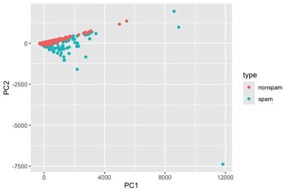
Each message corresponds to a point in this plot.
Clustering with k-means is a kind of “semi”-supervised learning, in that we tell it the number of classes we want.
K-means clustering is a method for separating data into \(k\) clusters or groups (you pick the \(k\)) such the points in each cluster as as similar to each other as possible and as dissimilar to points in any other cluster as much as possible.
K-means is an iterative algorithm.
In the case of spam detection, there are two classes: spam and nonspam. So, here we go!
kmeans() function from the Base R {stats} package.Did k-means correctly identify the spam? We can tell if we make a table comparing the k-means cluster ID (an integer) with the true classes:
Then we can count the number of times we get a match between the two.
We could use table() but I think this looks nicer as a contingency table, so we’ll need to pivot_wider():
              km
training_truth    1    2
       nonspam 1675   31
       spam     946  108
# A tibble: 2 × 3
training_truth `1` `2`
<fct> <int> <int>
1 nonspam 1675 31
2 spam 946 108Have a look at the results closely.
km column) means spam or not, but it’s not very effective.Just as a sanity check, though, you can ask whether k-means is detecting “something” about the spamminess of a message.
And then let’s just run the test:
    Pearson's Chi-squared test with Yates' continuity correction

data:  ct
X-squared = 95.041, df = 1, p-value < 2.2e-16
Well, I got a small \(p\)-value. So k-means detects a statistically significant feature of the spam, but it’s not really conclusive either.
Why did k-means do poorly? Let’s label the PCA plot we made in Step 8 with the k-means clusters instead of the true values:
as.factor() to convert the clusters from numbers to a factor so the legend is correct.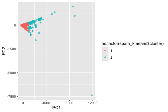
What you should see is that k-means splits the messages into an “inner core” and “outliers”.
Let’s give up on k-means, and switch over to SVM training.
You train an SVM using the svm() function.
svm() function can take two styles of input, though they both do the same thing internally. If you’re interested, you can read the documentation:Here’s the format that the e1071 authors use more frequently in the documentation:
~ is the formula operator again.. on the right side of the ~ means use all the variables.The other option is tidyverse compatible, but you have to split the data into input and output first:
These both do the same thing, so pick whichever you like. I’m going to use the first version in what follows.
The way SVMs work is that they split the space of observations (imagine the PCA plot) into two halves by way of a “separating surface”.
svm(), the hyperparameter is called kernel.There are four kernels supported by e1071:
Since our dataset isn’t too big, it doesn’t hurt to try all of these!
How do we do this? Well, we just repeat with a different kernel:
Note: each of the different kernels have additional hyperparameters in them (like degree, gamma, and the like), that you might need to change in some circumstances. - We don’t need to do that here, but you may have to change them if you don’t get good results on other data…
Now that we’ve trained the SVMs for our data, it’s a good idea to anticipate their performance.
Plotting is perhaps the best way to do this, but plotting in the original data variables is not reasonable.
To that end, we need to transform the training data using PCA, and add back the true classifications (‘spam’ / ‘nonspam’).
OK, let’s plot each SVM. It happens that the trained SVMs made by the svm() function already know how to plot themselves, though this doesn’t use ggplot().
plot() function. Here’s how to do it: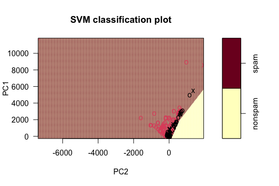
x shapes are the points that are the “support vectors” used to figure out the boundary.If you look closely at this, you can see a line slicing through the plot, separating the spam from the nonspam. It does a pretty good job!
Try this with the other three kernels, changing what evidently needs to be changed.
Which do you think best matches the shape of the true classes?
Now we’re ready to choose the SVM kernel that will serve as our final version! Since our SVMs are already trained, we can just apply them to the new input data.
The way to do this is via the predict() function. It works like this:
   6    8    9   14   20   22   24   28   32   39   45   52   53   55   66   79
spam spam spam spam spam spam spam spam spam spam spam spam spam spam spam spam
  88   97   98  101
spam spam spam spam
Levels: nonspam spam
You should get spammed with some “spam” and “nonspam”! Not very helpful, but it lets us see that the SVM is working.
Let’s use the tibble() function to bundle it all into one big data frame table:
We want to check how many instances we have of where the tuning_truth matches with each of the other four columns: each one is where we correctly identified a message.
The way that we built the tuning_results table is a little annoying, because we really want to do these comparisons systematically.
So, let’s pivot the data longer by reworking the columns:
After this, we check for matches. There are four kinds of these!
tuning_results2 <- tuning_results1 |>
  mutate(
    tp = (tuning_truth == "spam" & value == "spam"), # True positives (SVM got it right!)
    tn = (tuning_truth == "nonspam" & value == "nonspam"), # True negatives (SVM got it right!)
    fp = (tuning_truth == "nonspam" & value == "spam"), # False positive (SVM made a mistake)
    fn = (tuning_truth == "spam" & value == "nonspam")
  ) # False negative (SVM made a mistake)
Count up the occurrences of each of these
A 2x2 confusion matrix shows the performance of a model on a sample of size \(n\) by organizing the \(n\) predictions into each of the four possible outcomes and showing the counts for each outcome.
| Actual \ Predicted | Positive (PP) | Negative (PN) |
|---|---|---|
| Positive (P) | True Positive (TP) count | False Negative (FN) count |
| Negative (N) | False Positive (FP) count | True Negative (TN) count |
With the counts of true/false positives/negatives, there are many possible kinds of scores you can make to determine which SVM kernel works best.
Different disciplines tend to prefer some of these scores over others: medical tests often report sensitivity and specificity, while most deep learning researchers prefer F1 scores.
If you’re curious, have a look at
https://en.wikipedia.org/wiki/Sensitivity_and_specificity
Just using the formulas on that page, we can compute a few of these:
# A tibble: 4 × 11
  name       tp    tn    fp    fn accuracy  sens  spec   ppv    npv    f1
  <chr>   <int> <int> <int> <int>    <dbl> <dbl> <dbl> <dbl>  <dbl> <dbl>
1 linear    346   502    31    41    0.922 0.894 0.942 0.918 0.0755 0.906
2 poly      184   520    13   203    0.765 0.475 0.976 0.934 0.281  0.630
3 radial    346   511    22    41    0.932 0.894 0.959 0.940 0.0743 0.917
4 sigmoid   335   484    49    52    0.890 0.866 0.908 0.872 0.0970 0.869
I noticed that ‘linear’ was the best in my case at least in terms of the accuracy and the F1 score, but it’s awfully close to the ‘radial’ score. This is now a situation where plotting can help, if you like.
Finally, you can repeat with just the svm_linear on the test data!
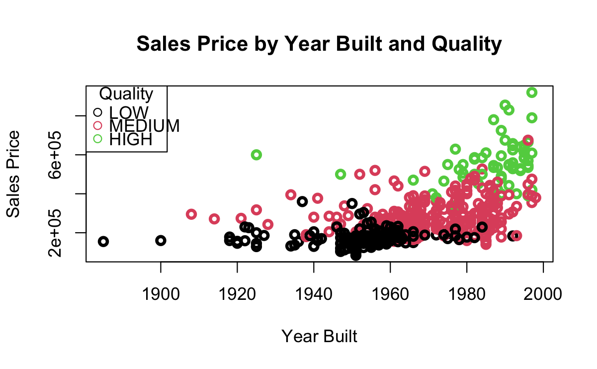
The graphics in Figure 7.2 are from an SVM trained on data about home sales.
We want to classify Home QUALITY a factor with three different levels: LOW, MEDIUM, and HIGH.
Our predictors are SALES PRICE and YEAR_BUILT.
Figure 7.2 (a) show the points overlap so we cannot draw a simple line separating the points.
Figure 7.2 (b) shows the linear kernel.
Figure 7.2 (c) shows the radial kernel.
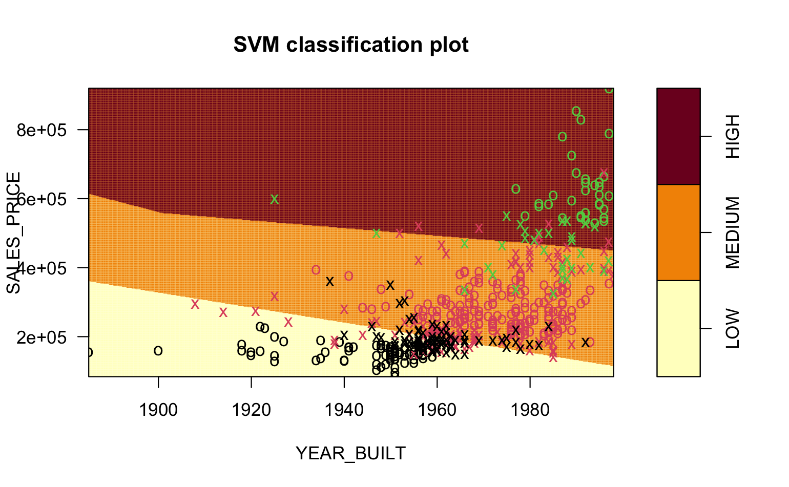
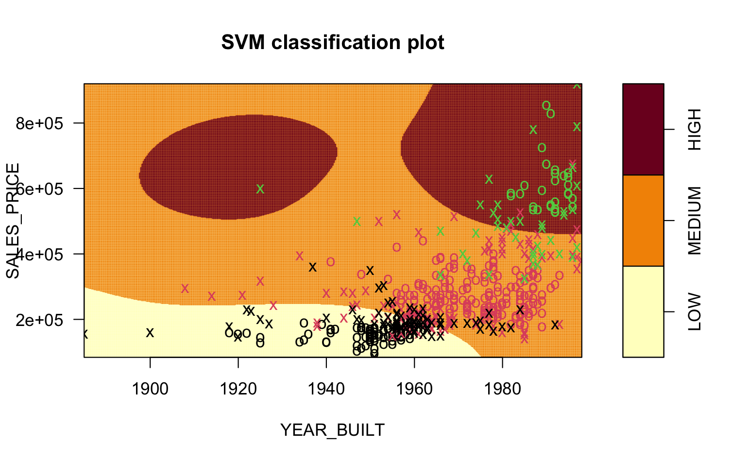
You can see the vastly different shapes of the boundaries for the different regions in the pictures.
It can be challenging to visualize what is happening with the different kernels.
In short, a kernel transforms the data into a higher dimensional space, then fits the best multi-dimensional hyperplane it can, and then projects the result back into the original multi-dimensional space.
This YouTube video provides a nice example for a polynomial kernel.
Classifiers are an important set of methods for working with categorical response variables.
We have examined just a few forms of classifiers as there are many and there are also many packages with different implementations of the methods.
As with Regression methods, there is no “best classifier” as their performance depends on the underlying (hidden) multi-dimensional structure of the data and how well different methods might fit the data without overfitting.
Logistic Regression is popular for binary classification as it is interpretable and runs quickly.
SVM is also quite popular method as it handles multi-class classification, supports multiple kernels,and is computationally efficient.
Both of these methods are common baselines for assessing the performance of more complex classifiers such as neural networks.
Caution: some datasets do not separate well according to the response variables. It’s better if the data separate, but don’t worry if you can’t find a good dataset. The process will “work”, but it might not work well. Be sure to explain your findings; that’s more important than getting good results!
Split your chosen dataset into the three training/tuning/test samples. Save each off each as a CSV file and upload these.
Train at least three SVMs on your training data, being careful to explain which variables are the response and the explanatory variables. Feel free to experiment with different hyperparameters beyond what was done in the worksheet above. The hyperparameters you need might be quite different!
Using your tuning set, select which SVM performs the best… and then…
… determine its performance using the testing set.
Make sure to explain Steps 4 and 5 in comments in your Quarto file!