4 Multivariate Data Analysis
Multivariate Statistics, Scatter Plots, Facetting Plots
4.1 Introduction
This module focuses on the analysis of two or more variables at once: bi-variate or multi-variate data analysis.
Learning Outcomes
- Create bivariate scatterplots and box plots
- Use plot aesthetics to code by additional variables
- Add and interpret linear and non-linear smoothers
4.1.1 References
4.2 Motivation for Multivariate Data Analysis
The last module was on univariate analysis or one variable at a time where we looked at both numerical summaries and plots to understand the data.
Let’s take a quick look at the data from the exercise to motivate why numerical summaries and univariate analysis are not enough.
- Let’s reload the tidyverse package, read in the
yani_lercher.csvfile in thedatafolder (with observations of individuals sex, bmi, and number of daily steps).
- If we use
skimr::skim()on the data everything looks reasonable from a univariate perspective.- You may recall the histograms of each variable looked reasonable as well.
| Name | yani |
| Number of rows | 1786 |
| Number of columns | 4 |
| _______________________ | |
| Column type frequency: | |
| character | 1 |
| numeric | 3 |
| ________________________ | |
| Group variables | None |
Variable type: character
| skim_variable | n_missing | complete_rate | min | max | empty | n_unique | whitespace |
|---|---|---|---|---|---|---|---|
| sex | 0 | 1 | 4 | 6 | 0 | 2 | 0 |
Variable type: numeric
| skim_variable | n_missing | complete_rate | mean | sd | p0 | p25 | p50 | p75 | p100 | hist |
|---|---|---|---|---|---|---|---|---|---|---|
| ID | 0 | 1 | 893.50 | 515.72 | 1 | 447.25 | 893.5 | 1339.75 | 1786 | ▇▇▇▇▇ |
| steps | 0 | 1 | 7434.97 | 3521.58 | 0 | 5301.00 | 7431.0 | 9699.00 | 15000 | ▃▃▇▆▂ |
| bmi | 0 | 1 | 25.29 | 4.90 | 15 | 20.92 | 26.8 | 29.30 | 32 | ▃▂▂▅▇ |
Now let’s do some multivariate analysis
Let’s start with a the correlation between steps and BMI.
- That suggests that the more steps you take, the lower your body mass index, which seems reasonable.
Now let’s plot the relationship between steps and BMI colored by sex.
What do you think??
4.3 Multivariate Data Analysis
Multivariate analysis involves looking at the relationships between two or more variables - the Joint Distribution.
- Are they comparable in scale and range?
- Are they correlated (tend to change in relationship to each other) or are they independent?
- Do they have similar number of observations in the data set (balanced) or are they imbalanced?
We can use both numerical summaries and plots to explore these types of questions.
We use different types of methods and plots based on the class of the variables:
- Numeric and Numeric
- Numeric and Categorical
- Categorical and Categorical.
Let’s continue with the two datasets from the previous module.
4.4 Numerical and Numerical Data
4.4.1 Multivariate Correlation Analysis
Before we plot, let’s review multi-variate correlation analysis.
Correlation analysis provides a simple way to summarize the strength and direction of linear relationships between numeric variables such as education, internet access, household size, GDP, or employment measures.
A correlation matrix gives a compact numerical summary of these relationships where correlation values range from -1 to 1:
- Positive correlations indicate that variables tend to increase together.
- Negative correlations indicate that one variable tends to decrease as the other increases.
- Values near 0 suggest little linear association.
For example, municipalities with higher rates of internet access may also show higher computer ownership, educational attainment, or income-related indicators.
4.4.1.1 Computing Pairwise Correlations
Given a data frame, the cor() function computes a matrix of all the pair-wise comparisons.
                           Average_size has_washing_machine has_internet
Average_size                       1.00               -0.13         0.44
has_washing_machine               -0.13                1.00         0.31
has_internet                       0.44                0.31         1.00
has_computer                      -0.03                0.49         0.52
has_car                            0.12                0.57         0.54
Illiteracy_rate                   -0.07               -0.34        -0.37
primary_lower_secondary            0.18               -0.15         0.05
upper_secondary                   -0.18               -0.06        -0.28
university                        -0.13                0.31         0.17
population                        -0.03                0.31         0.28
general_revenue_per_person        -0.37               -0.06        -0.45
                           has_computer has_car Illiteracy_rate
Average_size                      -0.03    0.12           -0.07
has_washing_machine                0.49    0.57           -0.34
has_internet                       0.52    0.54           -0.37
has_computer                       1.00    0.59           -0.54
has_car                            0.59    1.00           -0.36
Illiteracy_rate                   -0.54   -0.36            1.00
primary_lower_secondary           -0.58   -0.14            0.51
upper_secondary                    0.21   -0.02           -0.44
university                         0.77    0.26           -0.47
population                         0.71    0.30           -0.29
general_revenue_per_person        -0.08   -0.18            0.15
                           primary_lower_secondary upper_secondary university
Average_size                                  0.18           -0.18      -0.13
has_washing_machine                          -0.15           -0.06       0.31
has_internet                                  0.05           -0.28       0.17
has_computer                                 -0.58            0.21       0.77
has_car                                      -0.14           -0.02       0.26
Illiteracy_rate                               0.51           -0.44      -0.47
primary_lower_secondary                       1.00           -0.85      -0.88
upper_secondary                              -0.85            1.00       0.51
university                                   -0.88            0.51       1.00
population                                   -0.52            0.20       0.68
general_revenue_per_person                   -0.14            0.19       0.06
                           population general_revenue_per_person
Average_size                    -0.03                      -0.37
has_washing_machine              0.31                      -0.06
has_internet                     0.28                      -0.45
has_computer                     0.71                      -0.08
has_car                          0.30                      -0.18
Illiteracy_rate                 -0.29                       0.15
primary_lower_secondary         -0.52                      -0.14
upper_secondary                  0.20                       0.19
university                       0.68                       0.06
population                       1.00                      -0.06
general_revenue_per_person -0.06 1.00- The option
pairwise.complete.obsallows correlations to be calculated even when some municipalities have missing values
4.4.1.2 Visualizing Correlations using a Heat Map
Correlation matrices become easier to interpret when visualized as a heat map from the {corrplot} package.
Strong positive correlations appear in one color direction, while strong negative correlations appear in another.
- Note we only need the upper quadrant as the matrix is symmetric across the diagonal where every variable has correlation 1 with itself.
4.4.1.3 Pairwise Relationship Plots
Another useful approach is the scatterplot matrix from the {GGally} package, which shows pairwise relationships between many variables simultaneously.
The benefit of checking the multivariate correlations is that they can indicate which pairs of numeric variables variables might be of interest in plotting.
4.4.2 Scatterplots
Here’s the base R version. Plot a scatterplot of has_internet versus has_computer from house_ed_gdp_joined.
It’s hard to see if there is a relationship between these two variables.
- If we want to add a line of “best fit” we have to create our own linear model (more on those later) and add it to the plot.
- Now we see there does appear to be a generally linear positive relationship between the two such that municipalities with more houses with internet also have more houses with a computer.
- If we were to look at the summary of the linear model we would see that in fact there is a significant relationship but it does not explain much of the variance.
If you want to stack many layers in a base R plot, you need the command par(new=T) to prevent the each layer from removing the previous layer and you have to sync other plot parameters as well.
- Note: `abline() is a special case where it assumes you want it as a second layer, not a new plot.
- Base R plot is fine for quick analytical plots, but for more complex plots or publication-ready plots, most data scientists using R use {ggplot2}!
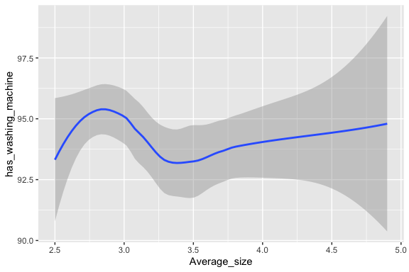
In {ggplot2}, we can make scatter plots with linear and non-linear smoothing lines of fit without having to run a model first.
There are many ways to call the same functions inside tidyverse. Try each of these commands and verify that they are the same.


Arguments inside the ggplot level function apply to all the layers in the same plot.
- If you prefer to use different choices for different layers, put those arguments only in the layers.
- Each
+ (whatever)is a new layer.
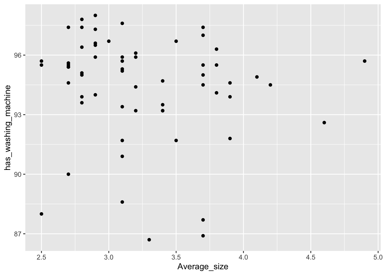
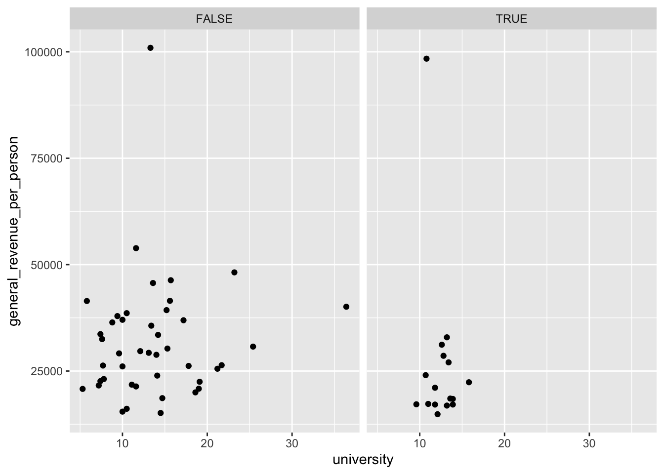
What if we want a scatterplot (numerical vs. numerical) but we wish to color the points by a categorical variable?
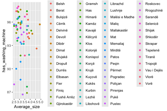
Instead of color, you could choose to change the shape or saturation. Many options are available for the designation of categorical variables.
- Notice the
x =andy =. When you use the named arguments, you can change the default order for the input variables.)
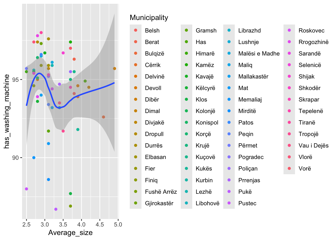
When you add an argument like color or shape in an aes(), the default is to add a legend as we see above. With 61 points, that shrinks the plot quite a bit.
There are a number of “tricks” in plotting to adjust the plot if you really want to see the points and the labels.
- Here we add labels to the points and use {ggrepel} to reduce overlap among the labels while t turning off the legend.
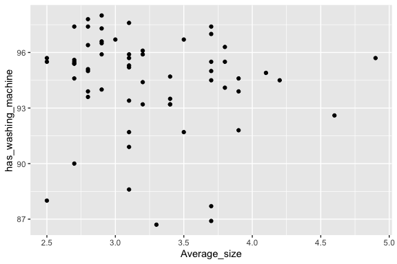
house_ed_gdp_joined |>
  ggplot(aes(x = Average_size, y = has_washing_machine,
             color = Municipality, label = Municipality)) +
  geom_point() +
  #guides(color = guide_legend(ncol = 9)) +   # Set number of columns in legend
  theme(legend.position = "bottom",
        legend.text = element_text(size = 8),     # Shrink legend labels
        legend.title = element_text(size = 9),    # Shrink legend title)
        legend.box = "horizontal",                # Ensures horizontal stacking
        legend.spacing.x = unit(0.5, "cm")
  ) +
  ggrepel::geom_label_repel(size = 2.5, label.size = 0, max.overlaps = 14) +
 theme(legend.position = "NULL")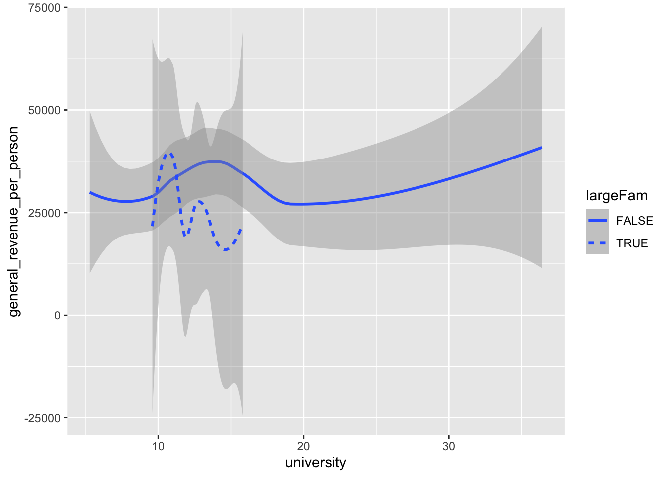
Instead of color, you could choose to change the shape or saturation. Many options are available for the designation of categorical variables.
- Notice the
x =andy =. When you use those, you can change the default order for the input variables.)
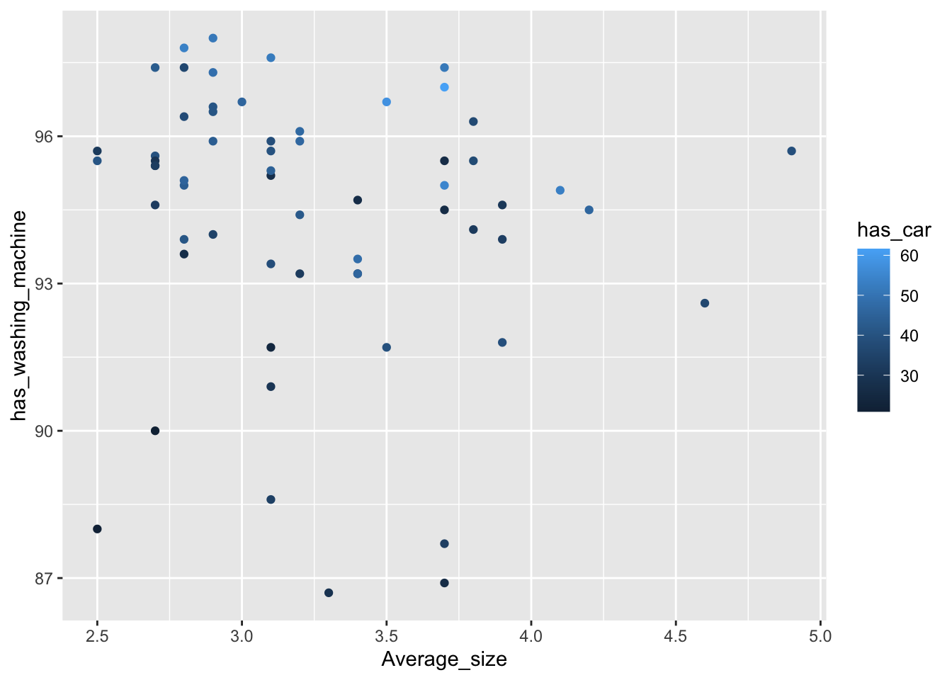
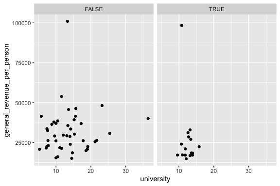
A scatter plot can also be colored based on a numerical variable.
- Here we use
has_carwhich is numeric percentage of households with cars. - instead of different colors we get a range of the same color.
These two plots are grammatically very similar, but one gives a scatter plot with points while the other just shows the Loess curve fitted to the points and its standard errors.
We’ve seen that we can use categorical variables to differentiate numeric points on a scatter plot using color.
We can also put two layers together like this:
Notice how we moved the aes() out of ggplot and split it onto the two layers we wanted. This opens up lots of graphical possibilities!
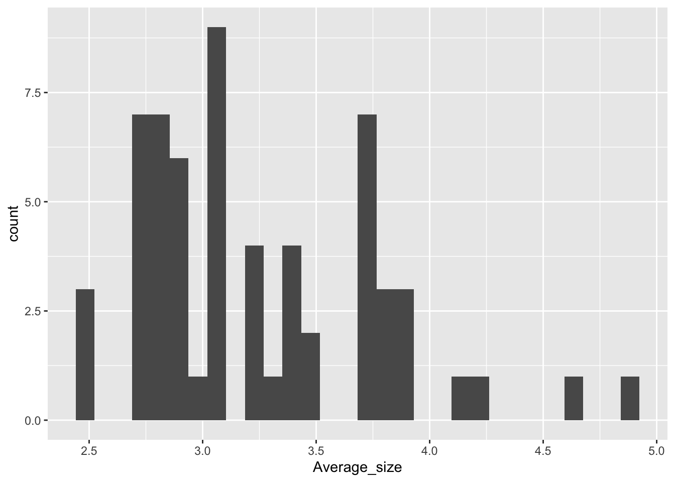
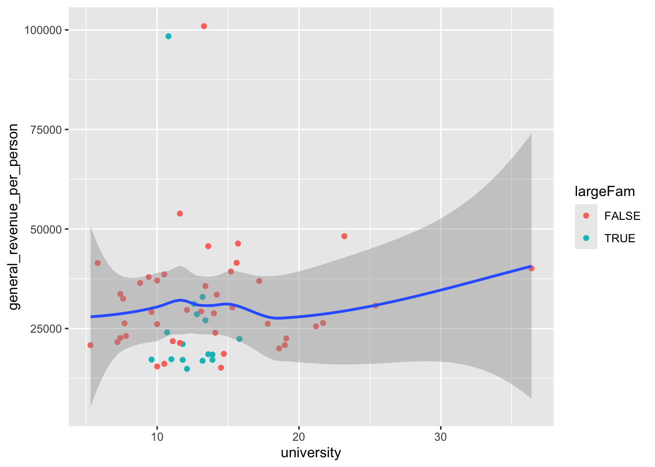
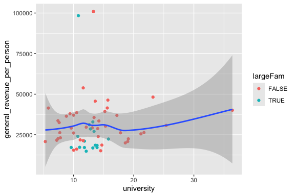
Let’s look at how big families are:
Let’s create a new categorical variable to identify large families
- Base R
- Tidyverse, which is perhaps a bit less error-prone:
- Once again, base R versus tidyverse is a matter of preference. But regardless, we can now use this newly re-coded variable.
Another option is to use different linetypes for different categorical values.
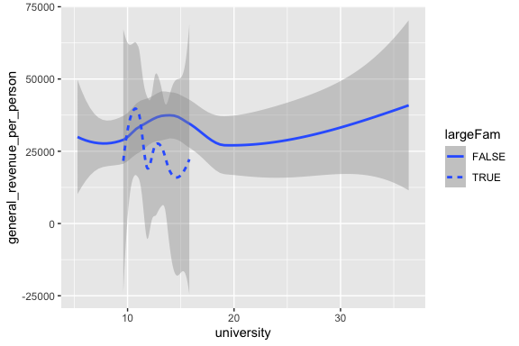
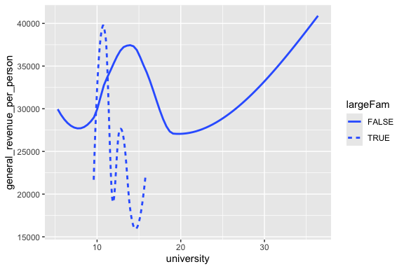
- The option
se = FALSEgets rid of the “standard error” neighborhood around the curve.
The order of the layers does in fact matter!
Invert the last two layers to see what happens!
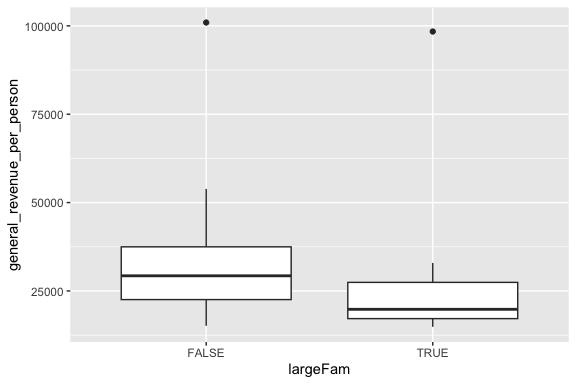
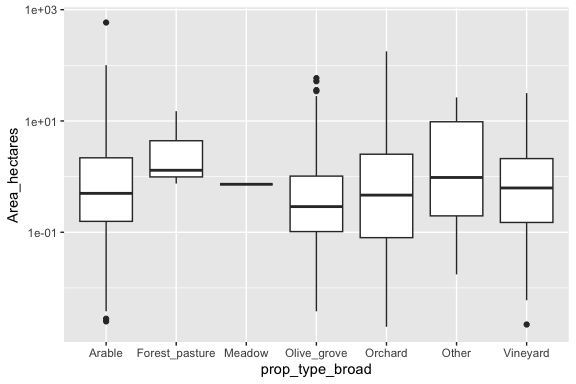
4.5 Numeric and Categorical Data
The most common plot here is the Box Plot. We have seen it before as a summary of a univariate distribution.
When we add a categorical variable to the plot, we are essentially summarizing the distribution for each level of the categorical variable on one plot
We can do for multiple levels of a categorical variable as in the land data.
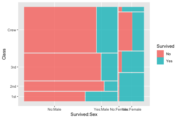
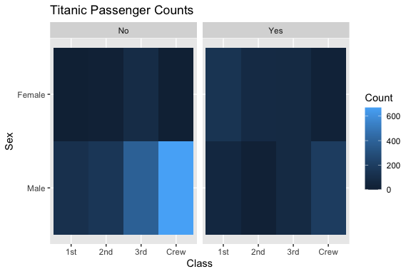
4.6 Categorical and Categorical Data
Categorical and categorical data is about comparing counts across combination of categories.
Two common approaches are Mosaic plots which are like bivariate histograms and Heat Maps.
- Our data does not have a lot of categorical variables so we will use the built in data set about the Titanic sinking.
We need the {ggmosaic} package and have to convert the data set to a data frame.
- Note that
ggmoasic()requires special arguments.
We can use geom_tile() to create a heat map of the counts.
When considering which to use the following might help:
- Mosaic plot: Understanding conditional partitioning and categorical association
- Heat map: Quickly spotting magnitude and patterns
- Stacked bar chart: Comparing proportions directly
4.7 Other ggplot2 Plotting Options
4.7.1 Faceting plots
Rather than just coloring the categories, you could also make several side-by-side plots for each category. In tidyverse, these are called facets. There are options to control how many of these plots will go in a row or column if you need that.
4.7.2 Adding “Scaffolding”
We have done a number of plots for exploratory data analysis where we focused on the content of the plot.
When we want to communicate our findings, we often want to publish or show one or more plots to others. To help them interpret the plots, we often want to add additional elements besides the data.
Edward Tufte’s book The Visual Display of Quantitative Information, remains influential in graphic design. (“The Visual Display of Quantitative Information,” n.d.)
- Alberto Cairo has published several books about visualization design as well.
Tufte refers to elements like axis labels, titles, tick marks, and grid lines as scaffolding; they are necessary for interpreting the data but are not the data themselves.
- These elements should be used sparingly and effectively to avoid clutter and highlight the data.
Tufte distinguishes between:
- Data ink: The ink (or pixels) that represent the core data.
- Non-data ink (scaffolding): Supportive elements like axis lines, tick marks, labels, legends, etc.
Tufte advocates for reducing non-data ink to avoid what he calls the “chartjunk” — visual clutter that detracts from the data.
We want to make it easy for viewers of a graphic to see our interpretation.
- Unnecessary “chartjunk” increases the “noise in the chart” so it reduces the “signal to noise” ratio which is bad.
- As Data Scientists we are always seeking to find the “signal” in the midst of “noisy” data.
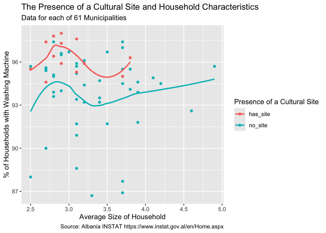
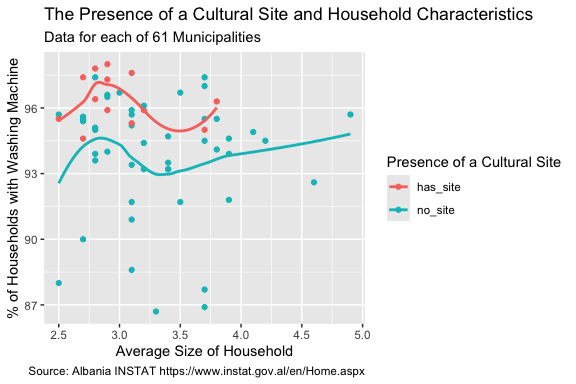
Here is an example of adding labels and titles to a plot to improve its interpretation by others.
- To get the dynamic value of
Municipalities, we can use the {stringr}str_glue()function to insert a variable or calculation into a string, here for the subtitle. - Bu using use code to determine the value, if the data changes, the plot is automatically updated without changing the code.
house_ed_gdp_joined |>
  ggplot(aes(x = Average_size, y = has_washing_machine, color = culture_site)) +
  geom_point() +
  geom_smooth(method = loess, se = FALSE) +
  labs(
    title = "The Presence of a Cultural Site and Household Characteristics",
    subtitle = str_glue("Data for each of {nrow(house_ed_gdp_joined)} Municipalities"),
    caption = "Source: Albania INSTAT https://www.instat.gov.al/en/Home.aspx",
    x = "Average Size of Household",
    y = "% of Households with Washing Machine",
    color = "Presence of a Cultural Site"  # This sets the legend title
  )
4.7.3 Converting to Interactive Plots in HTMLOutput
We can even make this plot interactive in HTML output using the {plotly} package.
- We build the plot in ggplot2 and then pass to
ggploty()to make it interactive - Here we got fancy and added some custom HTML to capture all of the scaffolding for the subtitle.
library(plotly)

p <- house_ed_gdp_joined |>
  ggplot(aes(
    x = Average_size,
    y = has_washing_machine,
    color = culture_site,
    text = str_glue(
      "Municipality: {Municipality}<br>",
      "Avg Household Size: {round(Average_size, 2)}<br>",
      "% with Washing Machine: {round(has_washing_machine, 1)}<br>",
      "Cultural Site: {culture_site}"
    )
  )) +
  geom_point(size = 3) +
  labs(
    title = "The Presence of a Cultural Site and Household Characteristics",
    subtitle = str_glue(
      "Data for each of {nrow(house_ed_gdp_joined)} Municipalities"
    ),
    caption = "Source: Albania INSTAT https://www.instat.gov.al/en/Home.aspx",
    x = "Average Size of Household",
    y = "% of Households with Washing Machine",
    color = "Presence of a Cultural Site"
  )

ggplotly(p, tooltip = "text") |>
  layout(
    title = list(
      text = paste(
        "The Presence of a Cultural Site and Household Characteristics",
        "<br><sup>",
        str_glue("Data for each of {nrow(house_ed_gdp_joined)} Municipalities"),
        "</sup>"
      )
    )
  )
4.7.4 ggplot2 Enables Many Other Options for Analysis
We have looked at just a few of the types of plots in the {ggplot2} package.
Table 4.1 shows the most common geoms used in exploratory data analysis.
| Plot Type | Variable Types | geom_*() Functions |
Description |
|---|---|---|---|
| Univariate | Numeric | geom_histogram() |
Histogram of a numeric variable |
geom_density() |
Smoothed density estimate | ||
geom_boxplot() |
Boxplot of a numeric distribution | ||
geom_violin() |
Violin plot showing distribution shape | ||
| Univariate | Factor | geom_bar() |
Bar chart of counts by category |
geom_col() |
Bar chart with specified heights or summaries | ||
| Bivariate | Numeric vs Numeric | geom_point() |
Scatterplot |
geom_smooth() |
Regression or smooth trend line | ||
geom_line() |
Line plot, often for time series | ||
| Bivariate | Numeric vs Factor | geom_boxplot() |
Compare numeric distributions across groups |
geom_violin() |
Distribution comparison by category | ||
geom_jitter() |
Jittered scatterplot to reduce overplotting | ||
| Bivariate | Factor vs Factor | geom_bar(position = "stack") |
Stacked bar chart |
geom_bar(position = "fill") |
Proportional stacked bar chart | ||
geom_bar(position = "dodge") |
Side-by-side grouped bar chart | ||
geom_tile() |
Heatmap-style display of combinations |
Table 4.2 has a list of additional geoms used for special cases.
| Plot Type | Variable Types | geom_*() Functions |
Description |
|---|---|---|---|
| Univariate | Numeric | geom_freqpoly() |
Line version of a histogram |
geom_dotplot() |
Dot plot of individual observations | ||
geom_rug() |
Marginal tick marks showing raw values | ||
geom_qq() / geom_qq_line() |
Quantile–quantile plot for assessing normality | ||
| Univariate | Factor | geom_point() |
Cleveland dot plot or ordered category comparison |
| Bivariate | Numeric vs Numeric | geom_hex() / geom_bin2d() |
Binned heatmap for dense scatterplots |
geom_text() / geom_label() |
Labels for selected observations | ||
geom_rug() |
Marginal tick marks on scatterplots | ||
geom_abline() |
Reference line such as (y=x) | ||
geom_hline() / geom_vline() |
Horizontal or vertical reference lines | ||
| Bivariate | Numeric vs Factor | geom_point() |
Dot or strip plot by category |
geom_errorbar() |
Error bars around summary estimates | ||
geom_pointrange() |
Point estimate with interval | ||
geom_crossbar() |
Summary statistic with interval band | ||
| Bivariate | Factor vs Factor | geom_count() |
Bubble plot sized by frequency |
geom_mosaic() |
Mosaic plot for contingency tables (ggmosaic) |
As we have seen, there are packages that build on or extend {ggplot2} as well with even more kinds of plots.
- If you search for a kind of plot you want to do, you can usually find a way.
Table 4.3 shows some popular ggplot2 extension or companion packages
| Package | Primary Role | Common Functions / Features | Typical Use Cases |
|---|---|---|---|
ggrepel |
Non-overlapping labels | geom_text_repel(), geom_label_repel() |
Label points in scatterplots without overlap |
gganimate |
Animated graphics | transition_*(), animate() |
Time series animation, evolving data visualizations |
ggthemes |
Additional themes and scales | theme_*() |
Publication-ready themes and styling |
patchwork |
Combine multiple plots | +, plot_layout() |
Multi-panel figure composition |
cowplot |
Plot arrangement and annotation | plot_grid(), draw_plot() |
Publication layouts and aligned figures |
ggpubr |
Publication-oriented helpers | ggarrange(), stat_compare_means() |
Statistical annotations and quick publication plots |
GGally |
Exploratory multivariate graphics | ggpairs() |
Pairwise scatterplot matrices and correlation exploration |
ggridges |
Ridgeline plots | geom_density_ridges() |
Comparing distributions across groups |
ggforce |
Extended geoms and layouts | geom_mark_*(), facet_zoom() |
Advanced annotations and specialized layouts |
ggdist |
Distribution visualizations | stat_halfeye(), stat_slab() |
Bayesian and uncertainty visualization |
ggbeeswarm |
Improved categorical scatterplots | geom_beeswarm(), geom_quasirandom() |
Reduce overplotting while preserving distributions |
ggmosaic |
Mosaic plots | geom_mosaic() |
Visualizing contingency tables |
sf |
Spatial plotting integration | geom_sf() |
Geographic and spatial data visualization |
ggmap |
Background maps and geocoding | get_map(), ggmap() |
Overlaying data on geographic maps |
leaflet* |
Interactive maps | leaflet(), addTiles() |
Interactive web-based spatial visualization |
plotly* |
Interactive ggplot conversion | ggplotly() |
Convert ggplot2 graphics into interactive plots |
treemapify |
Treemap visualizations | geom_treemap() |
Hierarchical area-based displays |
viridis |
Perceptually uniform color scales | scale_fill_viridis_*() |
Accessible and colorblind-friendly palettes |
hrbrthemes |
Modern typography-focused themes | theme_ipsum() |
Clean publication and dashboard styling |
tidytext |
Text visualization integration | reorder_within() |
Text mining and NLP visualizations |
directlabels |
Direct labeling of plot elements | geom_dl() |
Replace legends with direct labels |
geomtextpath |
Text along paths and curves | geom_textpath() |
Label lines directly on plots |
paletteer |
Unified palette access | scale_color_paletteer_*() |
Access palettes from many R packages |
camcorder |
Recording plot changes | gg_record() |
Creating animations from iterative plotting |
* Not technically ggplot2 extension packages in the same sense, but commonly used alongside ggplot2 workflows.
4.8 Summary
Data Visualization, creating graphics or plots, is a core skill in data science to both explore the data to find the signal, as well as to communicate the results to others.
The tidyverse in R (and Seaborn/matplotlib in python) provide many tools for creating interesting and beautiful plots. Enjoy!
4.9 Exercise 04: Multivariate Analysis
Use the same dataset as in the lecture.
- For two numerical variables, plot a scatterplot and line of best fit.
For this same line, print out the summary results. Type into a comment to report whether this linear model is statistically significant at the 95% confidence level. Type out the formula that is the equation of your line of best fit. (Note: use coef to give you the slope and intercept, but look at the graphic to figure out which is which.)
Using tidyverse, plot a scatterplot colored by a categorical variable.
Plot a scatterplot colored by a numerical variable.
(If your data set contains only two numerical variables, you may have to re-use one of the variables used already. This is fine, even though it’s a bit pointless.)
- Layer two plots on top of each other
Suggest using the + twice in the same plot. This could be a scatterplot with a curve on top, but it doesn’t have to be.
- Make some hypotheses
Since the next lesson will discuss statistical tests, pose some hypotheses about relationships between the variables you’ve observed. Write these down in your Quarto notebook, both so that you don’t forget and to help you work things out.