5 Statistical Tests
t-tests, Chi-squared test, Analysis of Variance, ANOVA, Linear Regression
5.1 Introduction
This module focuses on the use of statistical tests in analyzing data.
Learning Outcomes
- Explain the purpose for statistical tests and a Null hypothesis
- Use and interpret the t.test, aov/anova, and lm functions in R
- Generate residual plots in R.
5.1.1 References
- The R Stats Package. See
help("stats").
5.2 Review of Statistical Tests and Evidence
Humans love to see patterns; think about looking at the clouds in the sky or finding the “man in the moon.”
- We do the same thing with data where we see patterns that suggest relationships.
- For example, municipalities with cultural sites may appear to have higher educational attainment, or regions with greater internet access may seem to have higher household income.
- The important question is whether these observed differences reflect a meaningful underlying relationship or whether they could have occurred simply due to random variation in the data.
Statistical tests are designed to help us avoid our confirmation biases by using the data to evaluate the likelihood the perceived patterns are “real” or just us seeing patterns in the randomness of the world.
- R was built by statisticians and comes with a built in {stats} package that has over 600 functions for working with statistical tests!
Common statistical tests include:
- t-tests for comparing the means of two groups
- ANOVA (Analysis of Variance) for comparing means across multiple groups
- F-tests for evaluating whether a regression model or group of variables explains meaningful variation in the outcome
5.2.0.1 Null Hypotheses and Test Statistics
These tests begin with a null hypothesis, which typically represents the idea that no real pattern, difference, or relationship exists.
- The Null is jokingly referred to as the “Dull” hypothesis as it states nothing is happening.
The statistical test then uses the data to calculate a test-statistic to measure how compatible the observed data are with the Null hypothesis
- Each type of test has its own test statistic but all are based on the sample data.
- The key concept is if the Null hypothesis is TRUE, then with a few assumptions, we know the probability distribution of the test statistic so we can calculate how likely is it that we got the calculated value.
5.2.0.2 \(p\)-values and Confidence Intervals
The \(p\)-value is a key component of hypothesis testing. Informally, the \(p\)-value measures how unusual it woudl be to get the value of our test statistic (or one even more extreme) if the null hypothesis were true.
- Smaller p-values indicate stronger evidence against the null hypothesis.
- Larger p-values suggest that the observed pattern could plausibly arise from random variation alone.
A commonly used threshold is 0.05, but this should not be treated as a universal or automatic cutoff.
- It just indicates that we are willing to accept that an event is “significant” if it occurs less frequently than 1 out of 20 times.
Using .05 is one possible balance of statistical risk. Different applications may justify stricter or more flexible standards depending on the consequences of making incorrect decisions. For example:
- Medical research may require extremely strong evidence before approving a treatment.
- Exploratory social science research may tolerate greater uncertainty when identifying possible trends for future study.
We make a choice about whether a result is significant based on the \(p\)-value and other evidence about the data and scenario.
- If the \(p\)-value is low, indicating an unlikely event, we might say there is sufficient evidence to reject the Null Hypothesis.
- If the \(p\)-value is high, indicating a common or likely event, we would say there is insufficient evidence to reject the Null hypothesis. If we were to collect more data, we might be able to reject it.
- That is one reason why sample size is important and we like having more data.

While \(p\)-values summarize evidence against a null hypothesis, confidence intervals provide an estimated range of plausible values for the effect or parameter we are investigating.
- For example, rather than only stating that two municipalities differ in average internet access, a confidence interval estimates how large that difference might reasonably be.
Confidence intervals are often more informative because they emphasize:
- Magnitude of effects
- Direction of effects
- Uncertainty in estimation
A narrow interval suggests greater precision, while a wide interval indicates more uncertainty.
- Given a Null hypothesis that the true value of a parameter is 0, if the confidence interval includes 0, it suggests there is insufficient evidence to reject the Null hypothesis.
- Again, having more data allows us to narrow the confidence intervals.

If you choose to use .05 as a threshold and run 20 different tests, you would expect at least one of them to be “significant”!
- Be sure to think about adjusting for Multiple Comparisons
5.2.1 Types of Errors
Hypothesis testing also involves the possibility of making mistakes.
- A Type I error occurs when we conclude that a relationship or difference exists when it actually does not.
- A Type II error occurs when we fail to detect a real relationship or difference that truly exists.
Reducing one type of error often increases the risk of the other, which is why statistical decision-making always involves tradeoffs rather than absolute certainty.
In practice, statistical tests should be viewed as tools for assessing evidence and uncertainty, not as automatic decision rules. Careful interpretation requires combining statistical results with domain knowledge, data quality assessment, and substantive reasoning about the problem being studied.
Given this background, let’s use the tidyverse to explore the penguins dataset from the previous lessons.
5.3 The t.test: Comparing the Means of Two Numeric Variables
Student’s t.test is useful for determining if two sets of data have the same true mean.
Lets add a new variable, big_penguin based on if a penguin’s mass is > 4,000.
[1] FALSE FALSE TRUE TRUE TRUE TRUE TRUE TRUE TRUE TRUE TRUEAs we saw then, recoding can be done in base R or tidyverse, so it’s good to get a sense for how to do the task in both dialects.
- Let’s use base R this time. Note the “stray” commas below! We are filtering rows, taking ALL columns!
The tidyverse subsetting is a little different. Maybe you’ll like it more… (no tricky commas!)
Although I usually prefer tidyverse, it’s hard to do a clean recoding using tidyverse. Fortunately, whichever way you prefer to filter, it will work.
Let’s plot our data.
Now that we have large and small penguins split this way, a two-sample t-test is easy!
    Welch Two Sample t-test

data:  large$flipper_len and small$flipper_len
t = 20.986, df = 284.55, p-value < 2.2e-16
alternative hypothesis: true difference in means is not equal to 0
95 percent confidence interval:
 19.09548 23.04830
sample estimates:
mean of x mean of y
 211.3895  190.3176
With a \(p\)-value of almost 0, we can reject the Null hypothesis and conclude we have found a statistically significant difference between the two groups. That difference is between 19.1 and 23.0 at a 95% confidence level!
- Of course, we would expect that since we separated the groups based on mass.
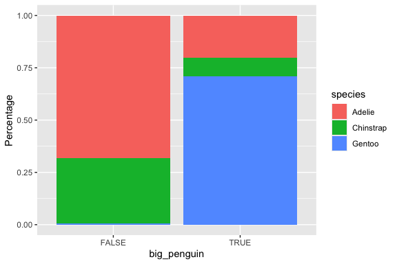
5.4 Chi-squared Test: Comparing Counts of Categorical vs. Categorical
The previous plot raised the question of whether the differences we are seeing in the proportions in the bars is just statistical noise.
Fortunately, we have a test for just this purpose! It’s the chi-square test, and this is how we run it.
        Adelie Chinstrap Gentoo
  FALSE    116        53      1
  TRUE      35        15    122
    Pearson's Chi-squared test

data:  newtable
X-squared = 183.71, df = 2, p-value < 2.2e-16
        Adelie Chinstrap Gentoo
  FALSE    116        53      1
  TRUE      35        15    122
          Adelie Chinstrap   Gentoo
  FALSE 75.05848  33.80117 61.14035
  TRUE  75.94152  34.19883 61.85965
        Adelie Chinstrap Gentoo
  FALSE  75.06      33.8  61.14
  TRUE   75.94      34.2  61.86
If you look at the output from the chisq.test() function, you will see a \(p\)-value. If that \(p\)-value is less than 0.05, we can conclude the differences we see in the ratios in the plot above are statistically significant. Otherwise, we can guess that the differences we are seeing are likely just due to sampling issues and are probably not relevant.
5.5 ANOVA: Comparing Means of Numeric across Categorical Levels
Let’s look at body_mass as the numerical variable and species as categorical.
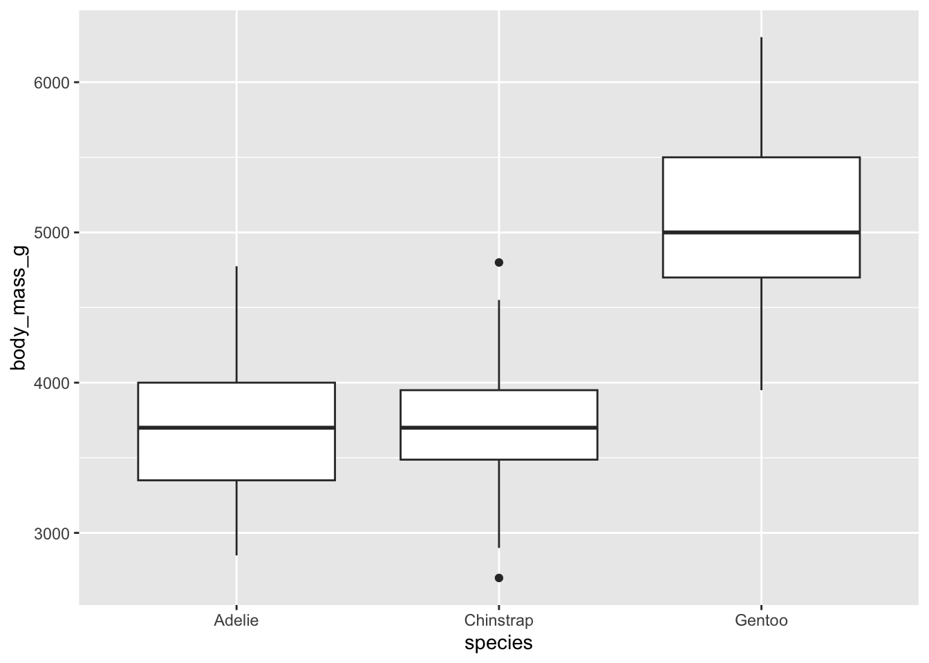
Box plots provide a clear summary of a dataset’s distribution. From a box plot, we can observe:
- The median (central line inside the box),
- The first (Q1) and third (Q3) quartiles (the edges of the box),
- The whiskers, which extend to the smallest and largest values within 1.5 times the interquartile range (IQR = Q3 − Q1),
- Outliers, values beyond the whiskers, are plotted individually as points.
This visualization gives us a good sense of:
- Central tendency (via the median),
- Spread/variability (via the IQR and whiskers),
- Skewness (by checking if the box is symmetric or lopsided, or one whisker is much longer than the other),
- And even kurtosis, if there are more outliers than expected, it may suggest heavier tails.
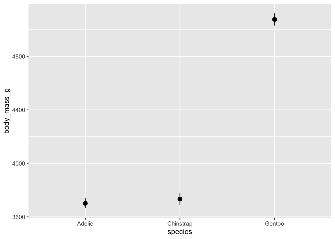
We can make a simpler plot of just the median, min and max if that is of interest.
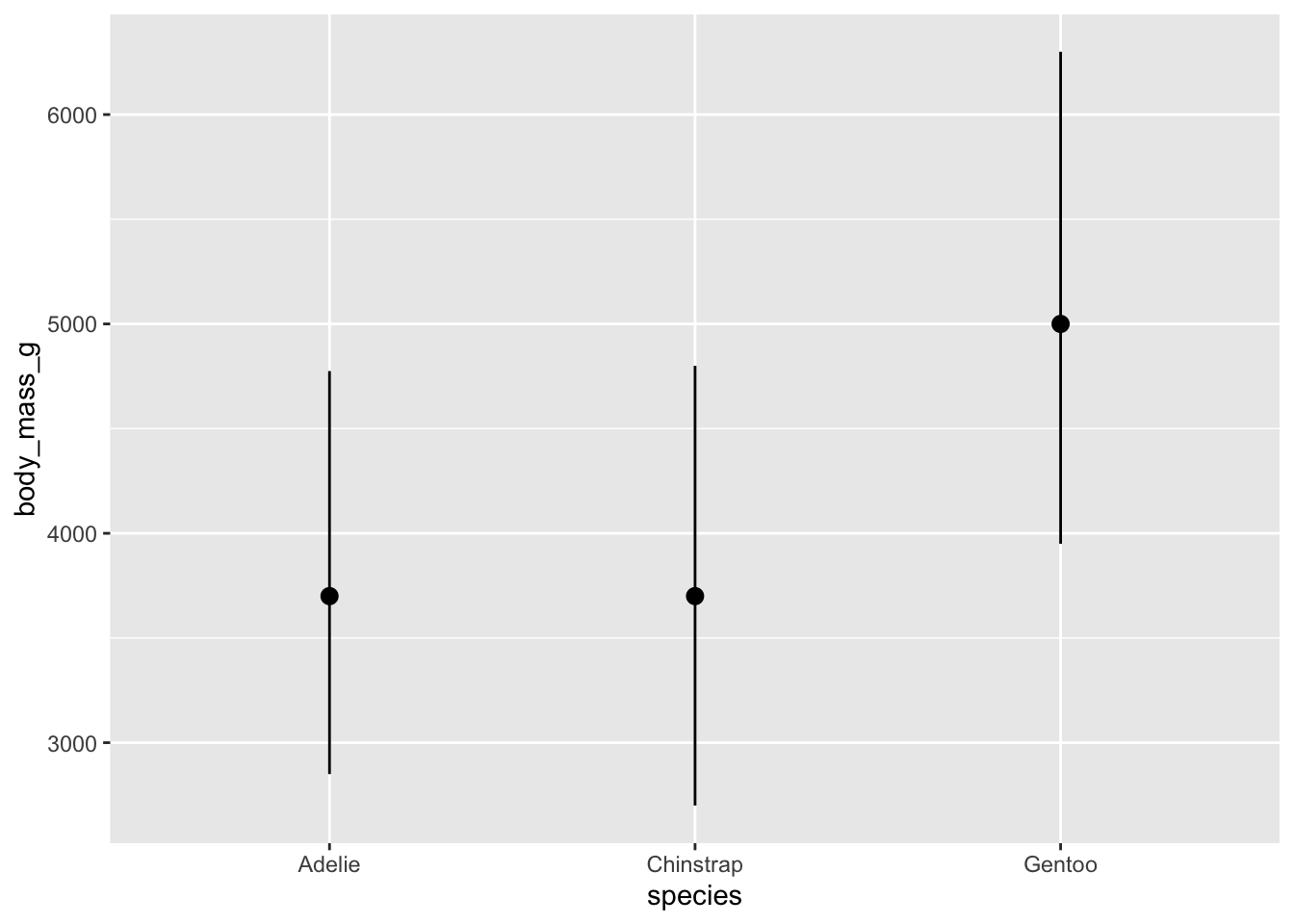
However, these whisker don’t really extend very far. The default length is probably not what you had in mind. We can override these settings like this:
We should see some differences in these bars. One question you ought to be asking is whether or not the differences you are seeing are statistically meaningful. We have a test for this.
It’s either a t-test (if you just have two groups) or ANOVA (for 2 or more groups).
We’ve already used a t-test today. Let’s use ANOVA (ANalysis Of VAriance) this time, because we have three groups.
             Df    Sum Sq  Mean Sq F value Pr(>F)
species       2 146864214 73432107   343.6 <2e-16 ***
Residuals   339  72443483   213698
---
Signif. codes:  0 '***' 0.001 '**' 0.01 '*' 0.05 '.' 0.1 ' ' 1
The results of the ANOVA should tell us whether the differences we see are meaningful.
- If the p-value is less than 0.05, we can say the differences are significant at a 95% confidence level.
- Here the \(p\)-value is essentially 0 so we would almost never get this F-Value (343.6) if the Null hypothesis, all groups have equal means, were true.
The F-test in ANOVA checks whether the means of multiple groups are equal.
- Null Hypothesis (\(H_0\)): All group means are equal (no difference).
- Alternative Hypothesis (\(H_1\)): At least one group mean is different.
The F-statistic is the ratio of:
\[F = \frac{\text{Variance between groups}}{\text{Variance within groups}} \tag{5.1}\]
If the between-group variance is much larger than within-group variance, the F-value is high, suggesting a significant difference.
The distribution of the F-statistic is not symmetrical and depends upon two parameters, the degrees of freedom for the numerator in Equation 5.1 and the degrees of freedom for the denominator in Equation 5.1.
We can see the df in the results from Listing 5.2 and extract these two values from the aov summary object. Then we can plot.
Show code
summary_result <- summary(aov_result)

# Extract degrees of freedom
df1 <- summary_result[[1]][["Df"]][1]  # Between groups
df2 <- summary_result[[1]][["Df"]][2]  # Within groups

# Create data frame for F-distribution
# Observed F-value
observed_f <- 343.6

# Critical F-value at alpha = 0.05
critical_value <- qf(0.95, df1, df2)

# Generate F-distribution data
f_data <- tibble(x = seq(0, max(6, observed_f + 1), length.out = 1000)) %>%
  mutate(density = df(x, df1, df2))

# Plot
ggplot(f_data, aes(x = x, y = density)) +
  geom_line(color = "steelblue", linewidth = 1) +
  geom_vline(xintercept = critical_value, color = "red", linetype = "dashed") +
  geom_vline(xintercept = observed_f, color = "darkgreen", linetype = "dotted") +
  annotate("text", x = critical_value + 0.5, y = max(f_data$density) * 0.9,
           label = "Critical value (α = 0.05)", color = "red", hjust = 0) +
  annotate("text", x = observed_f - 5, y = max(f_data$density) * 0.5,
           label = paste("Observed F =", observed_f), color = "darkgreen", hjust = 1) +
  labs(
    title = paste("F-distribution (df1 =", df1, ", df2 =", df2, ")"),
    x = "F value (log scale)", y = "Density"
  ) +
  theme_minimal() +
  scale_x_log10()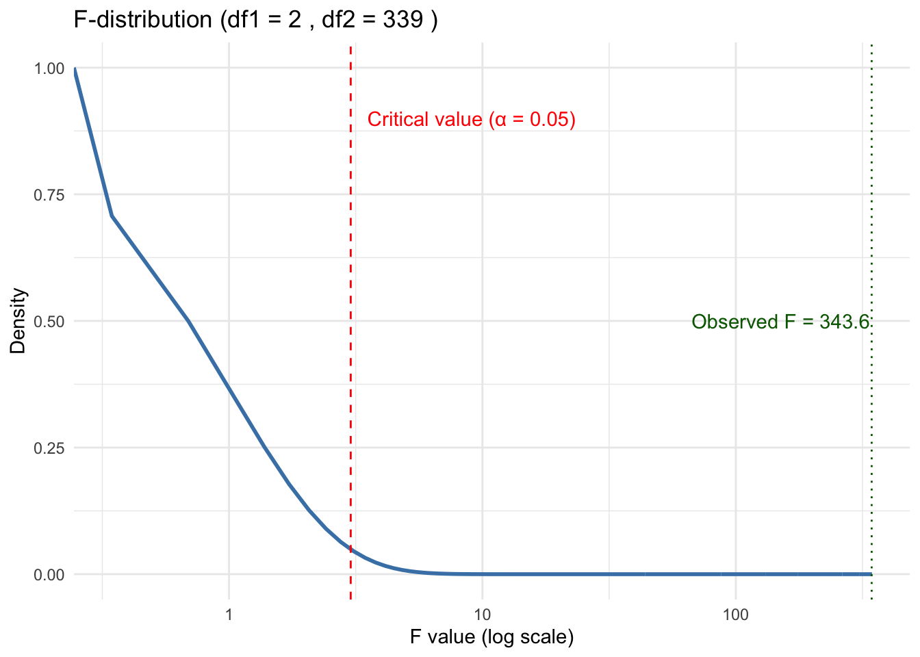
If this happens, we then can move on to Tukey (or Bonferroni) to sort out which groups are actually different from each other.
- It’s pretty clear from the box plot Listing 5.1 which one of these things is not like the other.
- However, we can do another statistical test, Tukey’s HSD (Honestly Significant Difference) test to confirm.
- This is a post-hoc test, performed after, a statistically significant ANOVA result (say, \(p\) < 0.05).
- It compares all pairs of group means and tells you which pairs differ significantly.
  Tukey multiple comparisons of means
    95% family-wise confidence level

Fit: aov(formula = body_mass ~ species, data = mypenguins)

$species
                       diff       lwr       upr     p adj
Chinstrap-Adelie   32.42598 -126.5002  191.3522 0.8806666
Gentoo-Adelie    1375.35401 1243.1786 1507.5294 0.0000000
Gentoo-Chinstrap 1342.92802 1178.4810 1507.3750 0.0000000- These results show no difference between Chinstrap and Adelie and a highly significant difference, \(p\)-value of 0, between Gentoo and the other two species.
5.6 Linear Regression Tests
Let’s revisit the plot of university and general_revenue_per_person to see if there is a relationship between them and if we can use university to “predict” the general_revenue_per_person.
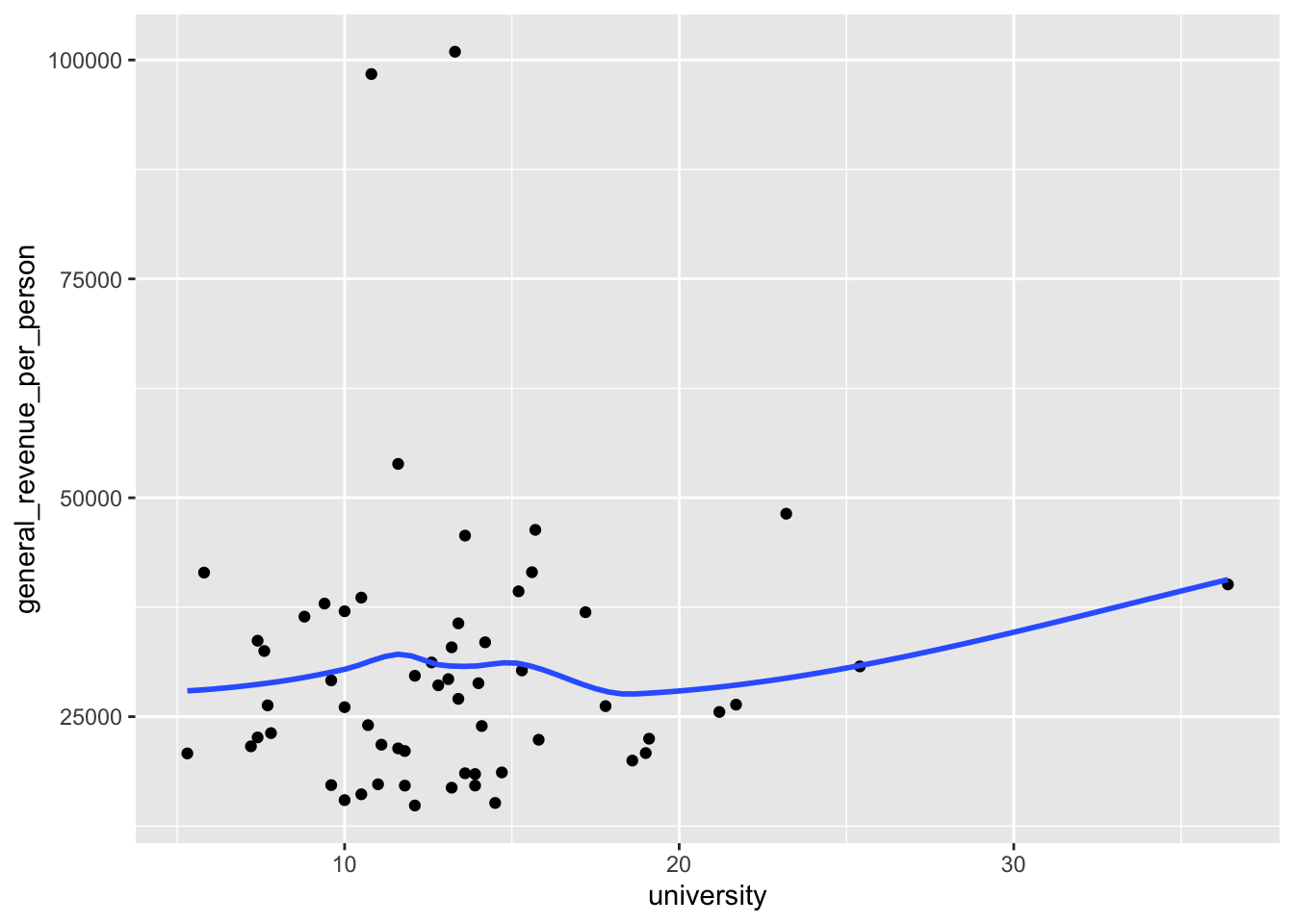
If we convert the smoother to a linear smoother, we see the straight line for a regression model.
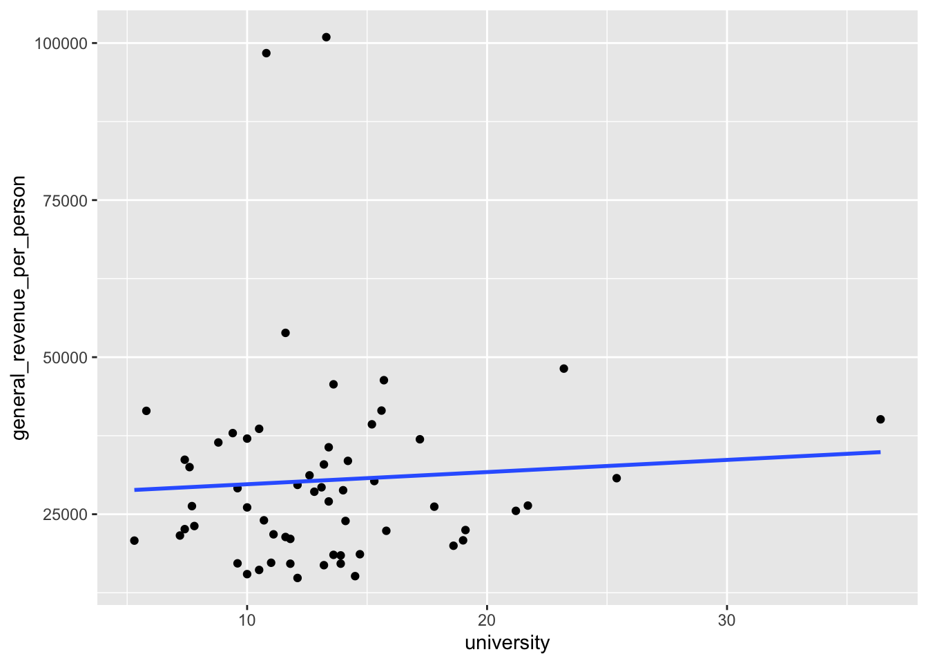
- This regression line points slightly upwards which suggests there could be a positive relationship between the two variables. But is it real?
Let’s run a test!
- Use the
lm()function to create a linear regression model. - We will use the ~ tilde operator (it’s the squiggly line, not a minus sign) to separate the two sides of our model “formula”.
- The left side is the response we are trying to predict and the right side is all of our predictor variables.
The resulting object has class lm which means is is a linear regression model object.
- It has lots of information about the model.
Show the object and we get the basic results.
Call:
lm(formula = general_revenue_per_person ~ university, data = mywk)

Coefficients:
(Intercept)   university
27840.0 193.6 - The coefficients here are the two parameters of the line we saw in Figure 5.1.
- This is known as the “fitted line” and all the predictions are points on this line.
- The intercept is where it crosses the
yaxis and theuniversitycoefficient is the slope of the line. - We interpret that coefficient as saying for every 1 percent increase in
university, thegeneral_revenue_per_personcan be expected to increase by 193.6.
5.6.1 Interpreting the Summary Information on the Coefficients
We can use summary() to get much more information about the model.
- Note that the
summary()function is a generic function that calls special methods for different class objects. Since our model is classlm, the actual function being called issummary.lm()which is what you look for in the help.
Call:
lm(formula = general_revenue_per_person ~ university, data = mywk)

Residuals:
   Min     1Q Median     3Q    Max
-15501  -9052  -3398   5224  70528

Coefficients:
            Estimate Std. Error t value Pr(>|t|)
(Intercept)  27840.0     5883.7   4.732 1.51e-05 ***
university     193.6      411.5   0.470     0.64
---
Signif. codes:  0 '***' 0.001 '**' 0.01 '*' 0.05 '.' 0.1 ' ' 1

Residual standard error: 16150 on 57 degrees of freedom
  (2 observations deleted due to missingness)
Multiple R-squared:  0.003867,  Adjusted R-squared:  -0.01361
F-statistic: 0.2213 on 1 and 57 DF,  p-value: 0.6399
The summary tells us several items of interest.
- The formula used to build the model.
- The Residuals statistics about the differences between the observed response values and the predicted values (i.e., the residuals).
- Coefficient estimates, along with additional diagnostic statistics:
Std. Error: The standard error of the estimate — a measure of how much the estimate would vary if you repeated the experiment.t value: The t-statistic, calculated by dividing the estimate by its standard error.Pr(>|t|): The probability of observing a t-value as extreme as the one calculated, assuming the Null Hypothesis is true. Smaller values indicate stronger evidence against the Null Hypothesis.- For example, a value of 0.05 means there’s a 5% chance of observing such a result under the Null — considered rare enough to reject it.
- A large value like 0.66 suggests the result is common under the Null, providing little reason to reject it.
Signif. codes: A legend showing how significant a result is using , , or .
What is this Null Hypothesis and why does it matter?
The Null Hypothesis is a statement about the “true” value of a coefficient; in linear regression, it’s typically assumed to be 0. Why?
- If the true value is 0, we can use known statistical distributions to compute the probability of observing a non-zero estimate.
- A statistic that is considered unlikely under the Null is called significant.
So we now know enough to determine if any of coefficients are significant.
- The intercept has a \(p\)-value that is close to zero so it is rare. That means we can reject the null hypothesis that the intercept = 0.
- The variable
universityhas a \(p\)-value of .64. That is quite high so this variable is Not significant. There is almost no evidence of a relationship between the two variables.
The top part of the summary() output focuses on the individual coefficients. Each variable in the model formula gets a line of output, which lets us determine which variables are statistically significant and which are not.
5.6.2 Interpreting the Summary Information on the Overall Model
Now, let’s look at the bottom portion of the output. This contains information about the overall model:
- Residual standard error: 16150 on 57 degrees of freedom
- This tells us the standard deviation of the residuals (i.e., the errors between predicted and actual values).
- While the number itself isn’t very informative in isolation, it becomes useful when comparing models.
- The degrees of freedom (df) are more interesting. We had 61 total observations, but 2 were deleted due to missing values. Of the remaining 59, 2 were used for the model (one for the intercept, one for the predictor university). So: \(61 - 2_{\text{missing}} - 2_{\text{model}} = 57 \text{df}\)
(2 observations deleted due to missingness) A note explaining why there’s a drop in degrees of freedom.
Multiple R-squared: 0.003867, Adjusted R-squared: -0.01361
- The
Multiple R-squaredmeasures how much variation in the response variable is explained by the model. A value like 0.90 would be considered strong, but here the value is very low, suggesting the model explains almost none of the variation in the data. - The
Adjusted R-squaredadjusts the multiple R-squared based on the number of predictors in the model. This helps prevent overfitting by penalizing the addition of unnecessary variables. If we kept adding variables, \(R^2\) might increase even if those variables are meaningless so using adjusted \(R^2\) helps counteract that.
- F-statistic: 0.2213 on 1 and 57 DF, p-value: 0.6399
- The F-statistic tests whether the entire model is statistically significant. The Null Hypothesis here is that all coefficients (except the intercept) are zero, in other words, none of the predictors have an effect.
- A small \(p\)-value would give us evidence to reject this Null Hypothesis. But here, the \(p\)-value is 0.6399, which is not rare. We have “insufficient evidence” to conclude that the model explains a meaningful portion of the variation in the response.
- Note that since we only had one variable in the model the F-statistic \(p\)-value is the same as the t-statistic \(p\)-value.
So, our tests tell us that despite the slightly positive slope in Figure 5.1, there is no real relationship. That line is just the result of forcing a line on random variation.
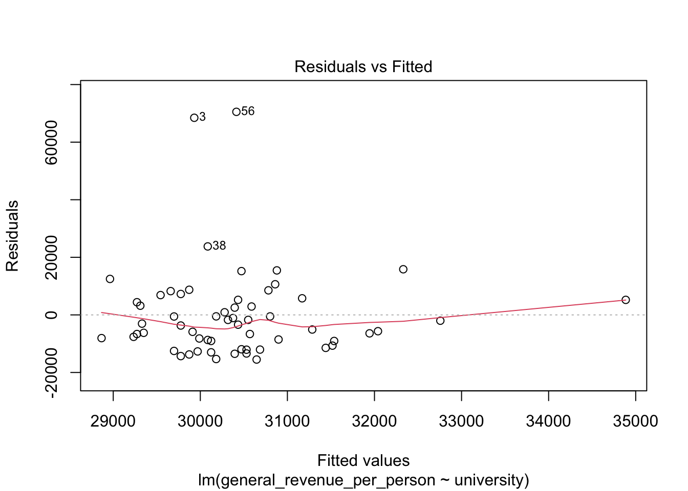
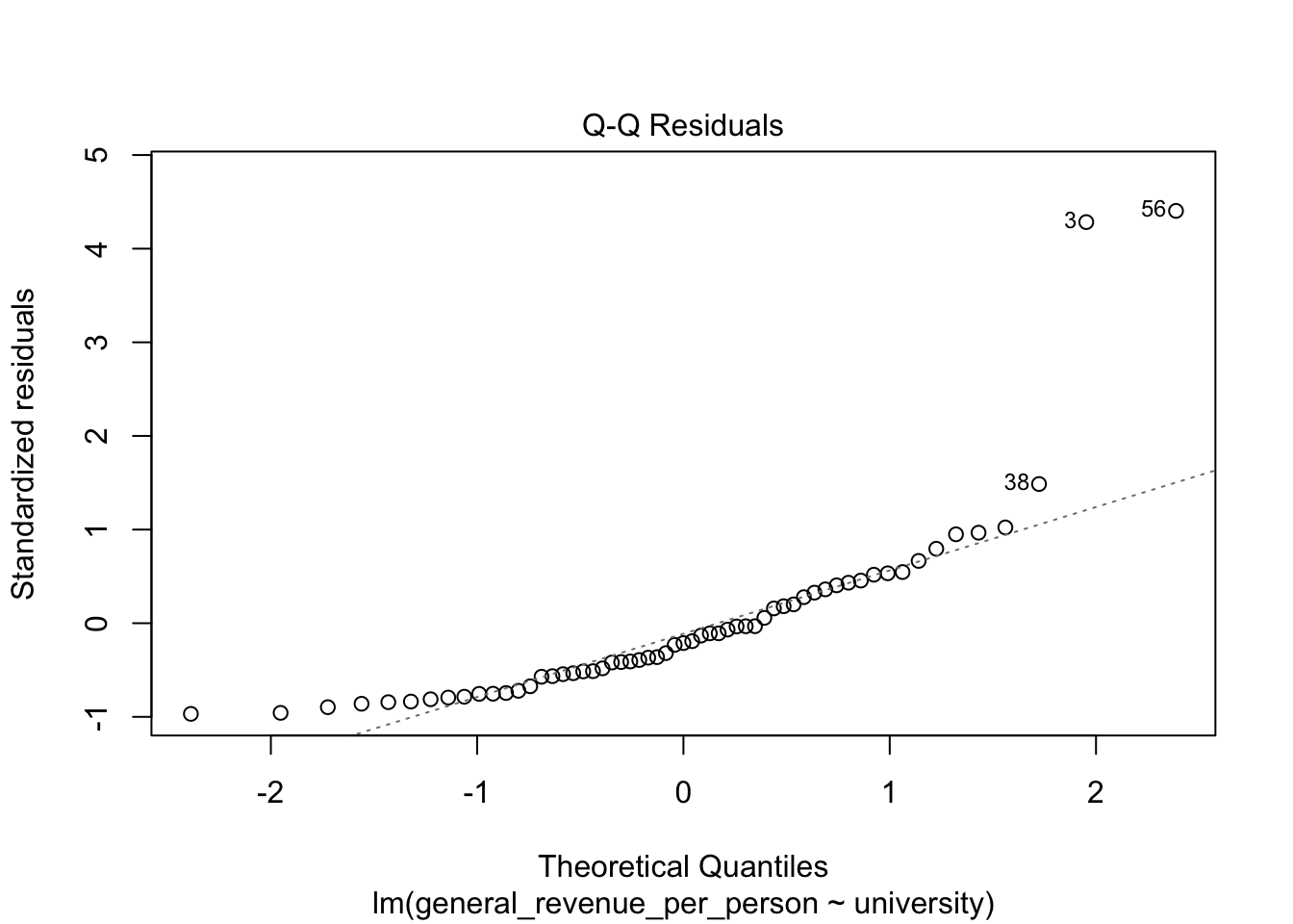
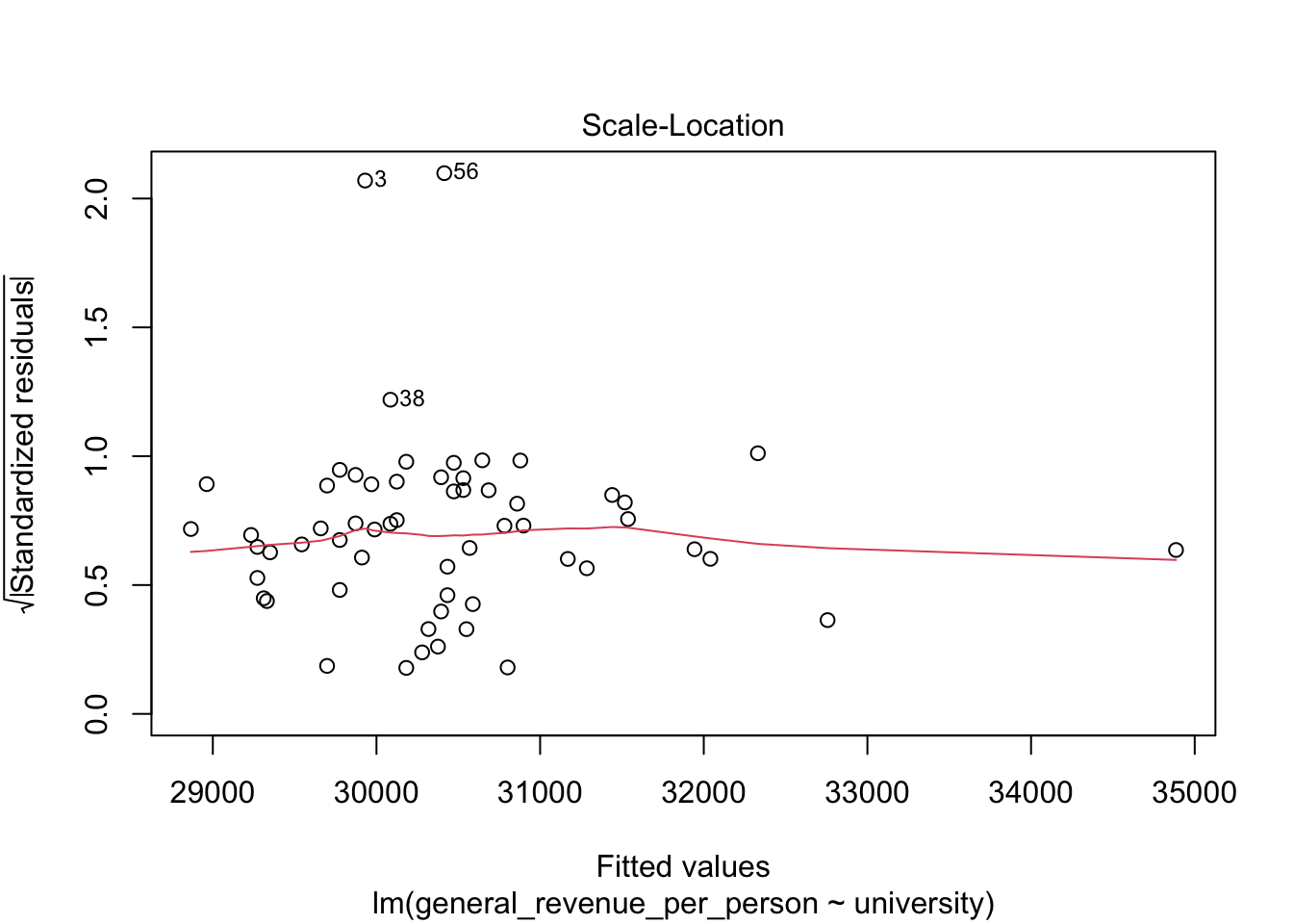
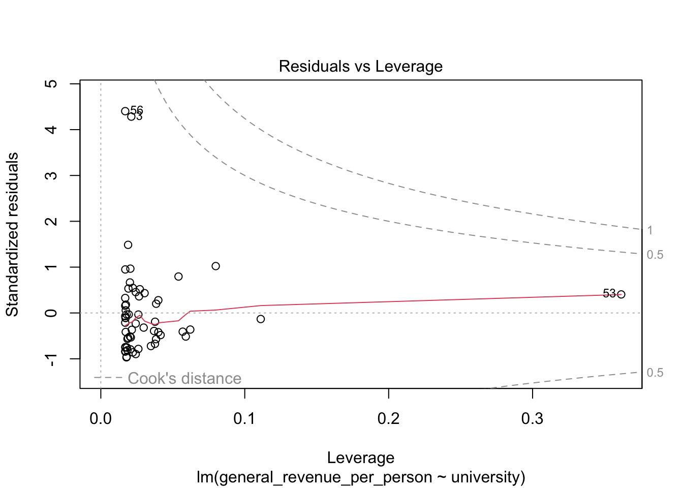
5.6.3 Residual Plots
We won’t discuss these now, but the base R plot function has a special method, plot.lm() for doing quick plots for a liner regression model.
- These plots are designed to help you interpret how well the model fits the data and the statistical assumptions about the data that support generating the \(p\)-values.
5.7 Multivariate Regression Tests
It can be a challenge to plot additional variables in 3, 4, 5 dimensions but it is easy to add them to the model.
Let’s add has_computer and population to see if they help.
Call:
lm(formula = general_revenue_per_person ~ university + has_computer +
    population, data = mywk)

Residuals:
   Min     1Q Median     3Q    Max
-17641  -9919  -3166   5366  67713

Coefficients:
               Estimate Std. Error t value Pr(>|t|)
(Intercept)   2.702e+04  7.360e+03   3.671 0.000548 ***
university    1.051e+03  6.709e+02   1.567 0.122904
has_computer -5.718e+02  4.702e+02  -1.216 0.229107
population   -1.949e-02  3.915e-02  -0.498 0.620585
---
Signif. codes:  0 '***' 0.001 '**' 0.01 '*' 0.05 '.' 0.1 ' ' 1

Residual standard error: 16070 on 55 degrees of freedom
  (2 observations deleted due to missingness)
Multiple R-squared:  0.04914,   Adjusted R-squared:  -0.002723
F-statistic: 0.9475 on 3 and 55 DF,  p-value: 0.4241
The summary now shows multiple lines with the additional variables. Unfortunately, the \(p\)-values are all large.
While the Multiple R-squared has increased, the Adjusted R-squared is actually negative which means adding these variables does nothing to improve the model.
So begins the quest of the data scientist to see if they can find variables to explain a quantity of interest!
5.8 Exercise 05: Statistical Tests
You can continue with the data from the previous two lessons.
- Subsetting
Demonstrate how to create at least two subsets from your main data, by splitting according to either a Boolean condition, or by a categorical variable. (You are not required to recode a variable.)
Demonstrate a t-test using two subsets you created.
Draw a linear (or smooth) fit
Choose two numerical variables for this. Maybe a linear is not a great choice. Why or why not?
- Demonstrate the use of a Chi-Square test based on two of the categorical variables in your data.
You might be inspired by your previous bar plots.
- Try an ANOVA test!
You might be inspired by your previous box plot.