6 Building and Tuning Models
linear model, validation set, training data, validation data, testing data, model selection
6.1 Introduction
This module teaches you some basics of “modeling”, which is the art of making predictions using data. It emphasizes the use of validation sets to separate the data and minimize bias in your model selection.
Learning Outcomes
- Explain the purpose of a validation set with training , validation, and test data.
- Create random samples for validation sets.
- Use Exploratory Data Analysis (EDA) to investigate the training data.
- Use validation sets to tune and compare models.
6.1.1 References
- Modelling Functions that Work with the Pipe, {modelr} Package (Wickham 2023b)
- R for Data Science 1st edition: Modeling (Grolemund and Wickham, n.d.)
- David Delpaiz’s R for Statistical Learning, Chapter 4
6.2 Modeling
This module teaches you some of the basics of “modeling”, which is the art of making predictions using data. The ultimate goal is to produce a mathematical “model” which can reliably predict future observations given some information about the observations to be made. This can be taken to extremes, so George Box’s adage, “All models are wrong, some are useful” is probably good guidance.
You, the data scientist, are a key part of the process and what’s in your mind can impact the outcome. Although it’s obvious that your observation of the data changes your understanding of it, there is a counter-intuitive implication. Once you’ve seen the data, you are no longer in a position to make an unbiased assessment of your model’s performance. While within the confines of this course, your judgment about your own model might not be a problem, it is a severe problem for science generally.
There are essentially two solutions to this problem: (a) peer review and (b) disciplined sequestering of the data. Peer review helps by getting an independent viewpoint on the model and its predictions, and it works well enough if everyone is acting in good faith. Peer review needs at least three people to work properly (you, the reviewer, and someone to act as an intermediary) and it also takes time.
You can get faster results if you have some data to spare. You sequester the part of the data for an independent test that you run after you’re finished building the model. In order for that to work, you have to grab a portion of the data for the final test without seeing it (or working with it). You only get to run one round of testing on it. Repeated testing introduces two new biases, both controlled by you: how much testing data to use before you think you’ve finished and whether the model should be changed to fit the “actual” data.
The effect of these psychological biases on your statistical results can be larger than you might think! Please try to play by the rules! (Not just in this course!)
You are encouraged to read Chapters 22 and 23 of Hadley Wickham’s R for Data Science 1st edition to get a feeling for what we are attempting to do. (Grolemund and Wickham, n.d.)
https://r4ds.had.co.nz/model-intro.html
If you’re interested in something a little more comprehensive to read, try Chapter 4 of David Delpaiz’s R for Statistical Learning:
https://daviddalpiaz.github.io/r4sl/
We’ll follow Hadley Wickham’s plan and will split our data into three samples, according to the following process:
Ground rule: First and foremost: don’t start by looking at the data too closely! That can bias your expectations. You’ll get to look at a part of the data soon enough, so just be patient!
Sampling: Start by sequestering your data into three samples: training, tuning, and test.
- Wickham suggests the following proportions: 60% training, 20% tuning, and 20% test, though these are not ironclad ratios.
- Do not look at the tuning or test sets.
- Fortunately, R can do this sampling in a way that doesn’t give you a look at the data and doesn’t introduce any biases.
Data Exploration: Explore the training sample however you like using the tools you’ve already learned in this course. Make plots, run statistical tests, read the values, etc.
Model generation: Once you’ve gotten a good idea of what the training sample looks like, propose a few “models” that seem to be representative of your training data.
- These take a few variables as “predictors” and the rest as “predicted” variables.
- We’ve already seen linear models using
lm(), clustering models usingkmeans(), and you can predict counts using distributions (like chi-squared).
- Model selection: With your models in hand, you then proceed to whittle them down to the model.
- You now run each of your models against the tuning sample.
- Based on those results, select one model to proceed to the final stage. (Model selection gives you a chance to get rid of any model you are having “second thoughts” about.)
- Wickham says that you can do any plotting or “manual” analysis to help you make your decision.
- I don’t quite know what “manual” means, but a safe rule is that you can’t change the models that you’re trying to decide between.
- Wickham says that you can do any plotting or “manual” analysis to help you make your decision.
- Model confirmation: With your final model in hand, run it against your test sample exactly once. Report the performance of your model on this sample as your official result. If you don’t like the results, it is (sadly) time to get a fresh dataset.
We will work through this process in detail. For your assignment, you’ll use a fresh dataset. (Of course!)
The model selection and confirmation stages probably seem a bit high-stakes, and they really are! Scientific honesty is truly at stake!
However, for this assignment (and this course), please do not feel bad if the results you get are not good.
Modeling is difficult to do well. Just play by the rules and follow the process. Focus on the process, not on results.
Load my sample dataset.
When you do the exercise portion, you’ll use your own personal dataset instead. But use mine for now to see how the tasks work!
As noted above, do not peek at the raw_data! Know that it is tidy, in that each row is an observation and each column is a variable. There are some categorical and some numerical variables. That’s enough for the moment :-)
6.3 Sampling
To break the data into the three samples, we’ll use a filter() command. (It is also possible to use a slice_sample() but that command only gives you one sample easily.)
What do we filter on? Well, we need a random selection of the rows, and want to sequester a certain portion of the data into each sample.
- This is best done if you have a column
snumof uniform random values between 0 and 1.
- Then if you want 60% of your data, you can ask for all the rows whose
snumis less than 0.6.
There are two key ideas in getting a random sample for a validation set.
- You want to use a sampling distribution where every observation has an equal probability of being in the training, tuning, or test data set.
- That suggests using a continuous uniform distribution that looks like Listing 6.1.
Show code
set.seed(123)  # for reproducibility
data <- data.frame(x = runif(10000, min = 0, max = 1))

# Plot using ggplot2
ggplot(data, aes(x = x)) +
  geom_histogram(bins = 25, color = "black", fill = "skyblue",
                 boundary = 0) +
  labs(title = "10K Samples from a Continuous Uniform Distribution U(0,1)",
       subtitle = "True distribution is the Red line",
       x = "Value", y = "Frequency") +
  theme_minimal() +
  xlim(0, 1) +
  annotate("segment", x = 0, xend = 1, y = 400, yend = 400,
           color = "red", size = 1)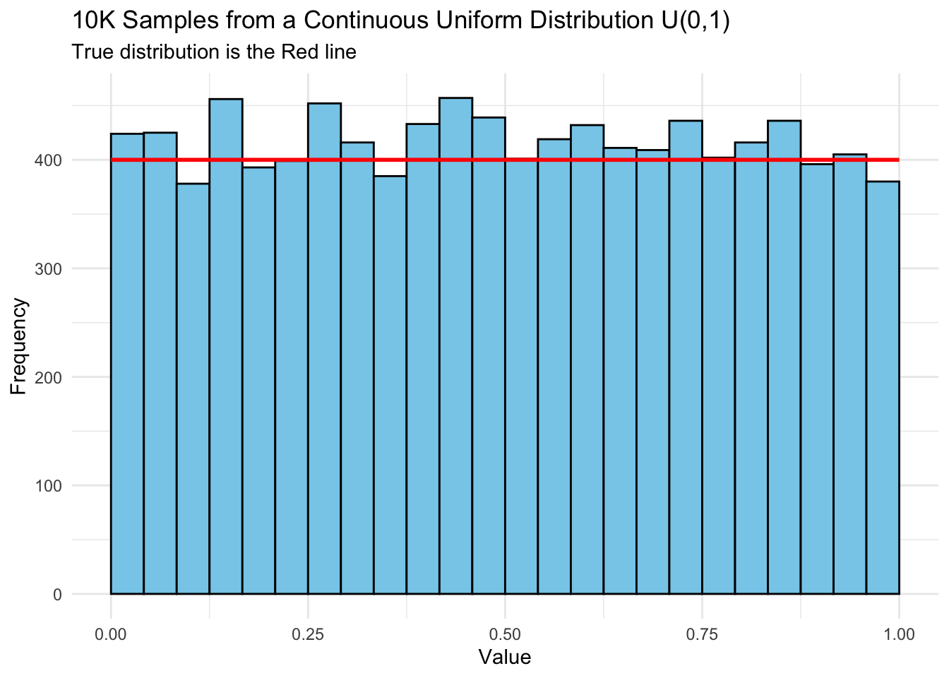
- The second key idea is setting a random number seed to enable reproducibility.
- In R, pseudo-random numbers are generated using deterministic math algorithms to produce a sequence that appears random but is entirely reproducible if the starting point (called a seed) is the same. These are not truly random, but “pseudo-random.”
- The
set.seed()function sets the initial state of R’s random number generator. Using it ensures the same random numbers are generated each time the code runs, which is essential for:- Reproducibility in research and teaching,
- Debugging code consistently, and
- Comparing results across runs or machines.
- Random number generation can differ across operating systems, R versions, or the actual Random number generation algorithms that get called.
- These differences may cause slight variations even with the same seed.
- If it becomes an issue for you, you can try to control some of the variation by specifying the R versions and algorithms. See help for
set.seed().
Preparing a dataset for sampling is called making a “sampling frame”, so let’s set a random number seed and create the sampling frame now:
(The n() function computes the number of rows in the data frame.)
With the sampling frame in hand, it’s easy to filter out the three samples (and get rid of the snum column, since it wasn’t originally present in the data):
Conveniently, you don’t need to look at the data at all to do this!
Let’s save off each of these samples for our later records. (You’ll need to upload your versions of these with your personal data in them when doing the assignment.)
- We’ve used
read_csv()to read the CSV files… and conveniently there is awrite_csv()function as well:
6.4 Data exploration
You are now permitted to explore the training data! You should try a bunch of different things to get an idea of what the training data look like.
Start by just looking at it:
Here’s a comprehensive plot, that is probably too busy.
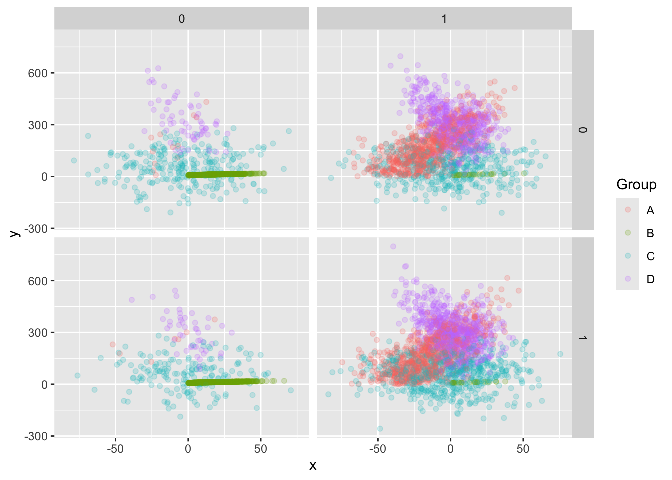
Your R skills are now strong enough that you can modify this command to get some other views of the data that might be helpful.
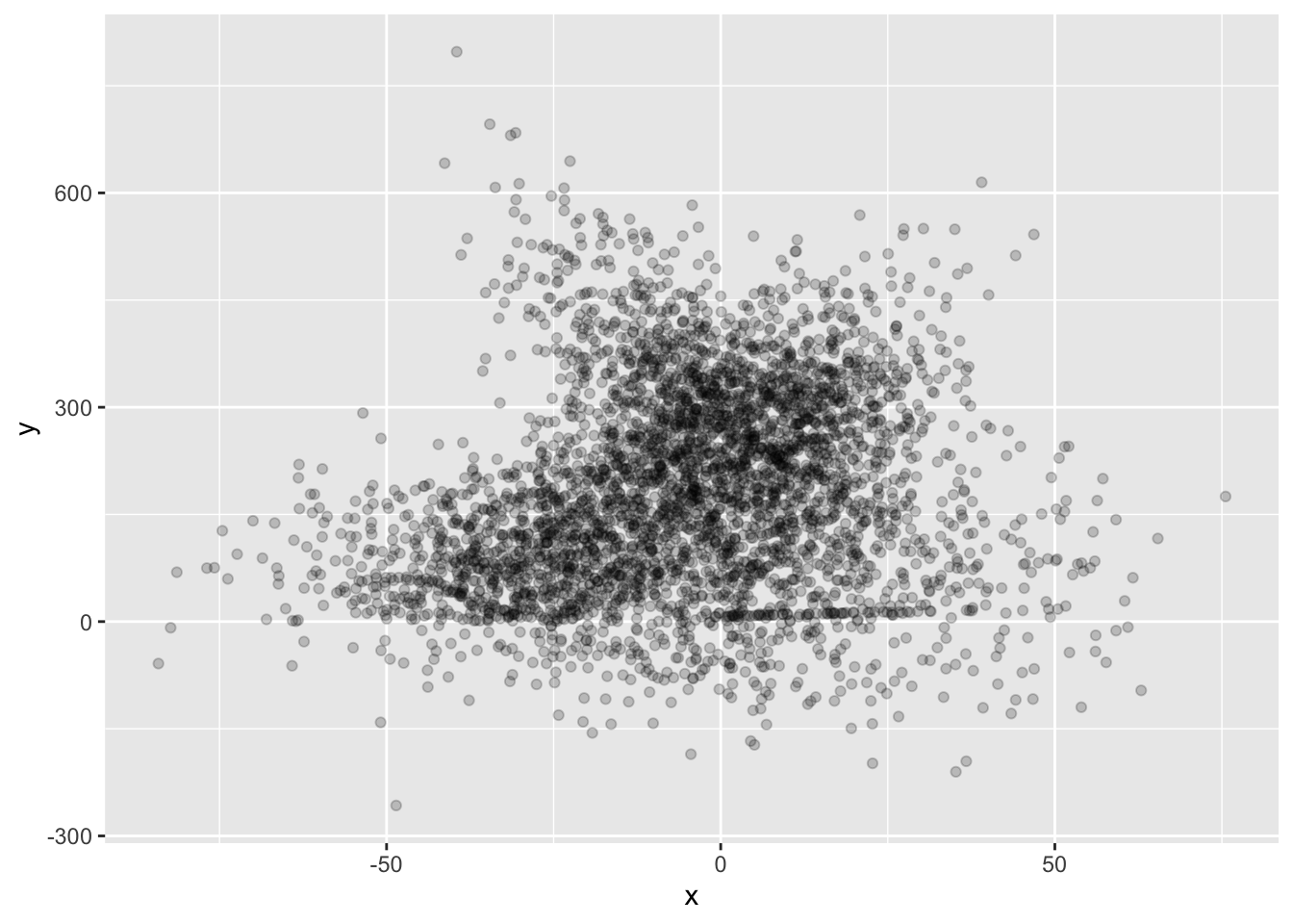
In my sample data, Group B looks rather peculiar. Let’s examine it:

Also, notice that there two other categorical variables in my dataset; maybe worth exploring, right?
Well. Hmm. Sometimes data exploration leads to a dead end… this is likely one of those! 11. You can also deploy some statistical tests. Since there are three categorical variables, you might consider chi-squared on them. Let’s see if the counts are likely to be interesting:
Just look at the output… doesn’t look significant to me, but you can check using chi-squared:
    Chi-squared test for given probabilities

data:  select(count(training, Group), n)
X-squared = 1.7221, df = 3, p-value = 0.632
But some of the other pairs of categorical variables do have some significant interaction, as you can see in the following plot:
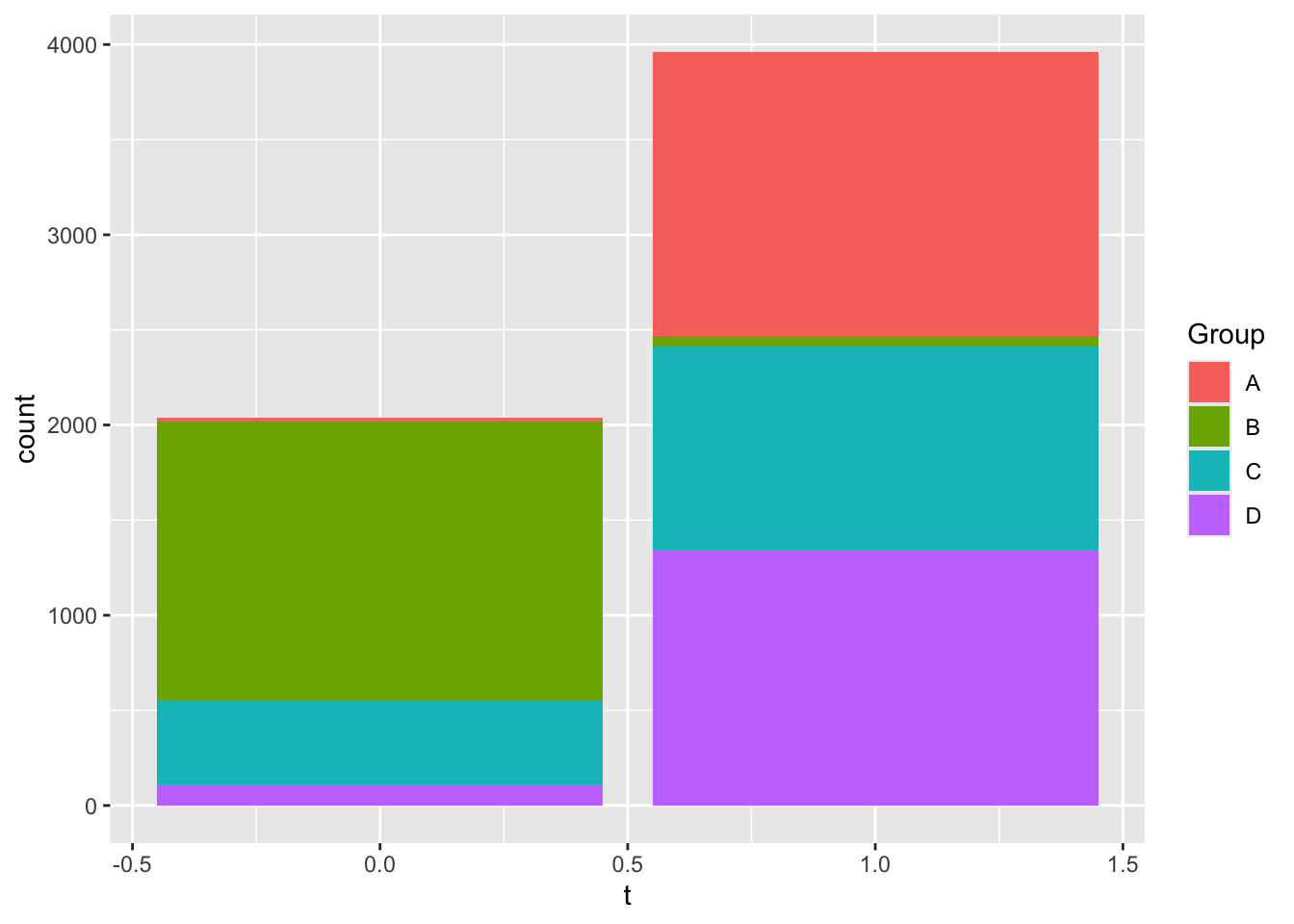
You can check that this is significant with chi-squared:
    Pearson's Chi-squared test

data:  column_to_rownames(pivot_wider(count(training, Group, t), names_from = t,     values_from = n), "Group")
X-squared = 3835.5, df = 3, p-value < 2.2e-16
6.5 Model Generation
At this point, you probably have a few ideas of things that might be going on. Before you try to build a model, you need to identify the variables involved and any filtering you will do first.
In your assignment, you need to select a few variables (columns) to study, and filter a few values of the categorical variables to build some models.
For instance, here are a few possible modeling problems for my dataset, though yours will surely be different:
- A model that predicts
ygivenx, but just for a single value of theGroupcolumn. These will differ substantially for differentGroupvalues. - A model that predicts the value of
tgiven theGroup - A model that predicts the value of
tgiven the value ofs
- A model that predicts
For your assignment, you need to select two such modeling problems and generate two candidate models for each.
In what follows, we’ll look at two candidate models for one modeling problem so that you get the idea of what’s involved.
The modeling problem we’ll look at is a model that predicts y given x for Group “B”. (Note: if you want your two modeling problems to be two separate values of your Group variable, that’s OK.)
To that end, let’s filter out just the Group B rows:
We’re still using the training data, so it’s permitted to plot this to see what’s going on:
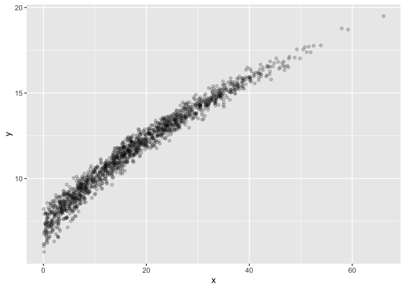
Looks a bit like a noisy curve of some kind… Let’s make one model be the line of best fit.
We want to see how well this model did, so that we can see if there are any possible improvements.
- Since it’s just a line, we could just use the formula for the line to add a column of predictions to our data.
- Actually, the {modelr} library can do this for us, and the same commands work for other models too.
So, to that end, here’s the add_predictions() function, which does just what you might expect:
Now our data has a new column, lfit_y, which has the linear model’s predictions. 17. We can see how well the linear model did by plotting it. Since we want to plot two things on the same axes, we use two aes() commands …
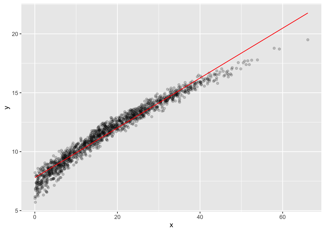
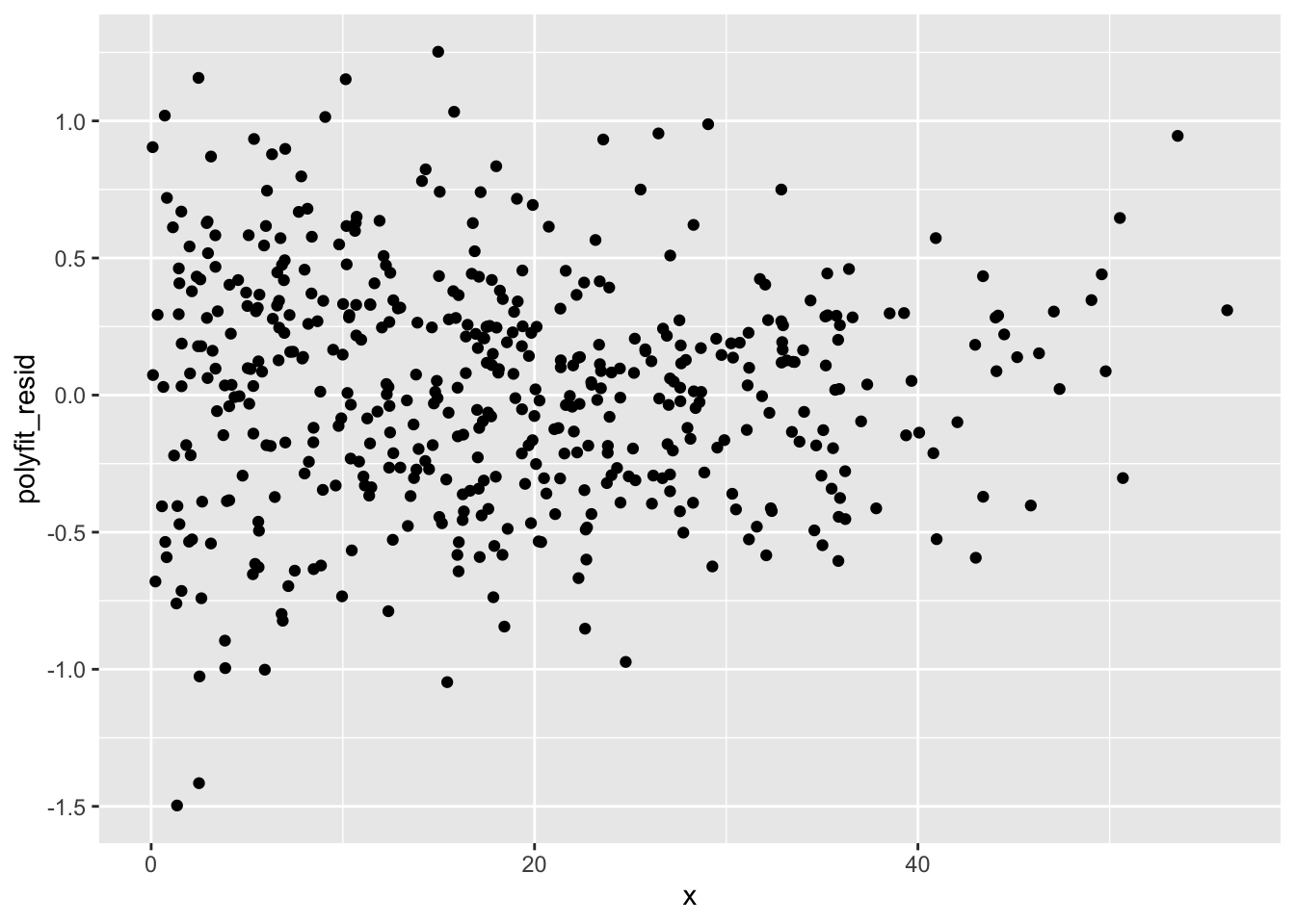
Not too bad… A better check on the model is given by the residuals, which are the differences between the predictions and the actual values. As you might expect, you can use add_residuals() to achieve this goal:
Let’s plot these:
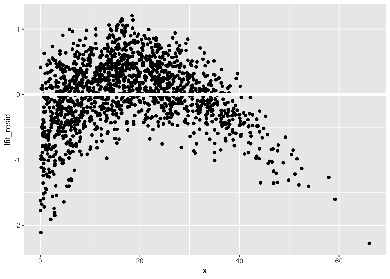
You should see that there’s a definite trend going on! That means that this model isn’t totally perfect, especially near the edges of the range of x values.
In any case, the linear model is our first model, and it’s stored (as a model) in the lfit variable, which we’ll use later.
The curve above looks suspiciously like a polynomial, and modelr knows about polynomials, too. The interface to these models is the same as before, the lm() function, but you give it a different starting formula. In particular, if we suspect that y can be predicted using a polynomial with x, we can say
The 2 in the poly(x,2) is the degree of the polynomial we want to try in our model. Higher degrees, like poly(x,5) give more flexible models, but these come at a bit of a cost: they don’t extrapolate safely. If you’re finding that the residuals don’t behave well, consider a different model. Ask your instructor if you find you’ve run out of options!
The polyfit model works just like the lfit model, at least from the standpoint of how you use it. So go ahead and add residuals and predictions:
Repeat the above using polyfit… You’ll hopefully see that it’s much closer to the data.
6.6 Model selection
Let’s crack open our tuning dataset to help us choose between lfit and polyfit. You’re probably right in guessing that polyfit works better here, but it’s important to verify that is really true. Since everything is organized already, it’s easy to pack everything into a single table:
Notice that even though we made lfit and polyfit using the training data, since the tuning dataset was sampled from the same original data, these two models can be used to make predictions.
With the tuning set loaded and predicted, let’s manually investigate the results. Plotting is probably the best option here:
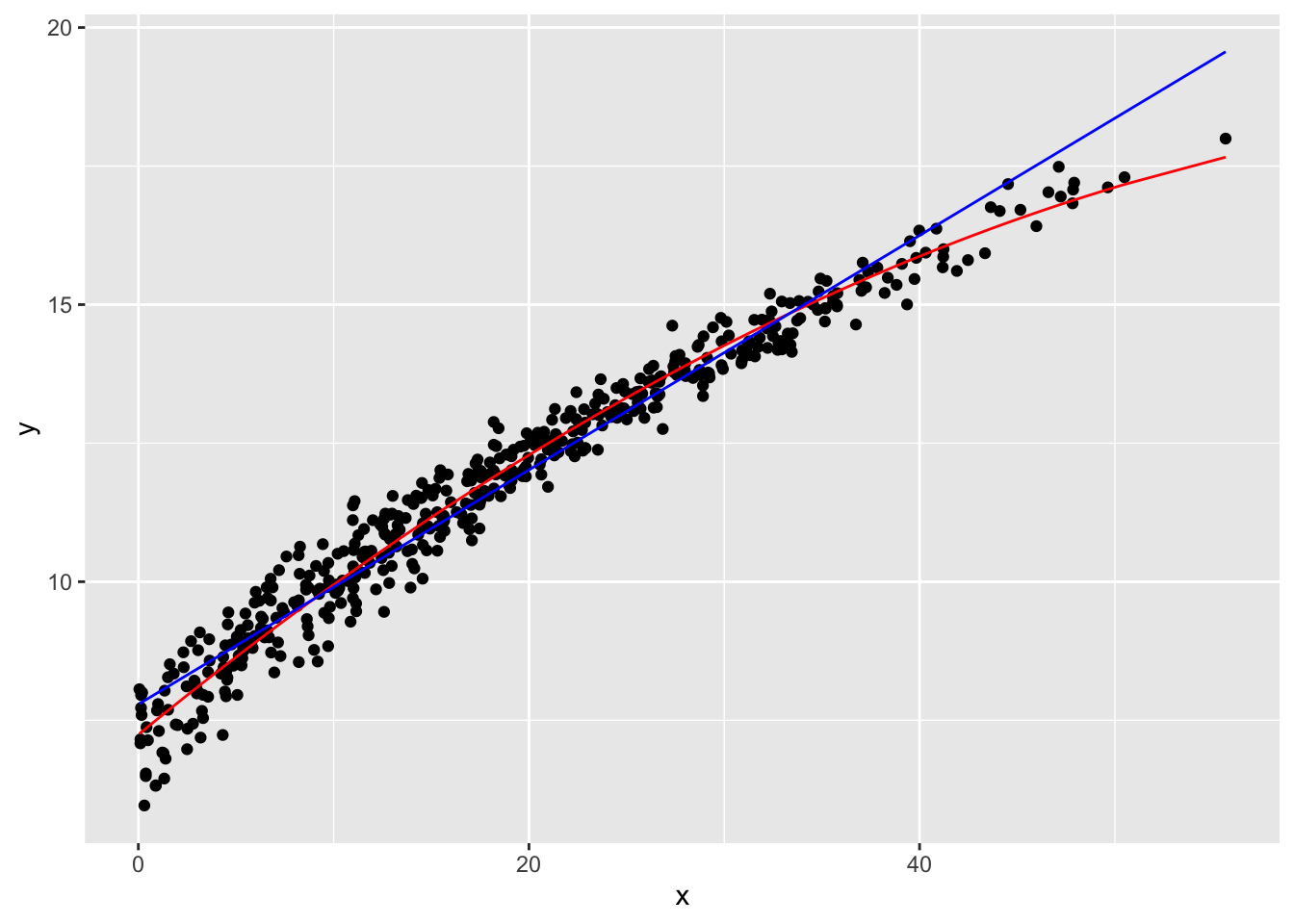
I think the polyfit is indeed the winner, so let’s select it for the final round of testing! You can use a standard residual test if you like, but at least in this case, the plot is pretty conclusive.
6.7 Model testing
We get just one shot at this! The code looks similar to the model selection process, but no edits or selections to the model are now permitted. Furthermore, since we’ve done all our preparation before this point, everything should go smoothly.
Uncork the test data, and make the predictions!
Do visual check of performance:
Given what we’re modeling (a quantitative variable), a histogram of the residuals is probably the most useful measure of the final performance of this model.
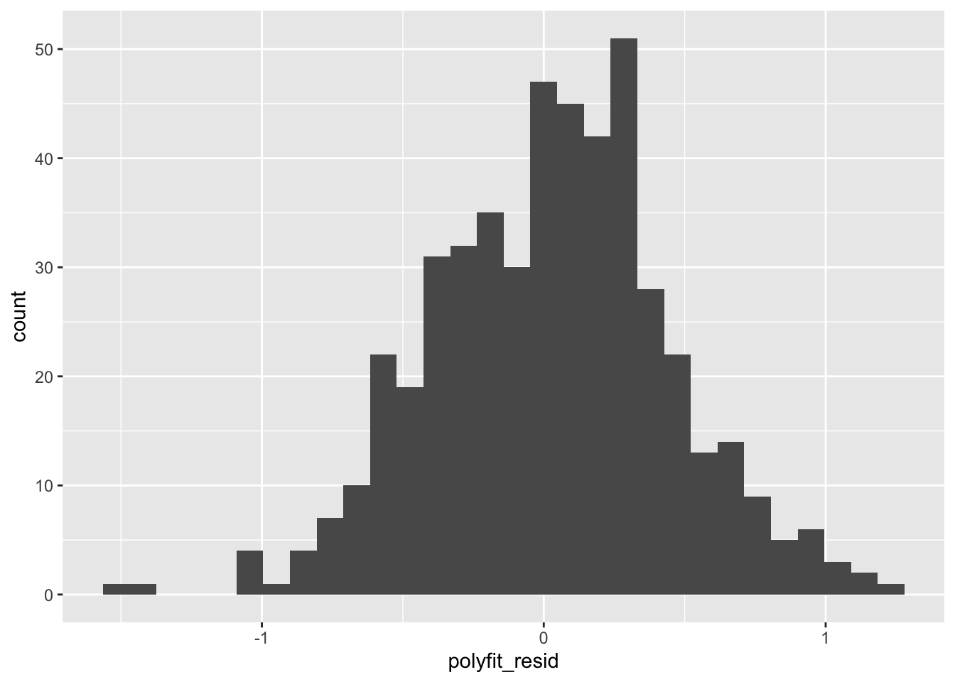
This is the sort of thing that would be included in a report on our model as the “gold standard” measure of its performance.
- We could well have run a similar test earlier in the study we’ve just done, but if we did it during the data exploration or model generation stages, we would likely have been tempted to tweak the model so that it performed better (lower variance in this histogram).
- If we did that with the training data, that’s totally fine. However, reporting the results at that stage would have been misleading, because we were still trying to figure the model out. Claiming those tentative results as final results would have meant that the model isn’t quite as good as advertised, because we were there “helping it along.”
Since we instead sequestered the testing data and didn’t look at it until now, there was no opportunity for us to tweak the model for this specific testing data… so the results are legitimate!
6.8 Exercise
Data for your assignment: Go to the following website (written by one of our colleagues),
Enter a random 6 digit number, and then press SUBMIT. You will be given a set of data on the next page. Please copy the contents of that page into a text file and name it <your number>_ex_8.csv. This is a unique-to-you set of data that you’ll use for your assignment. If you somehow lose this file or end up contaminating your sample (see below), you may get a fresh (new and different) dataset from the website.
Obtain your personal CSV file from the above link
Split your data into the three samples, saving each off as a separate CSV file.
Make at least one scatter plot of some portion of your training set.
Do at least one statistical analysis of your training set (chi-square, ANOVA, or the like). The data contain several categorical and numerical variables.
Select a categorical variable to filter by for your modeling. Notate which you have selected in a comment.
Form two modeling problems based on two values of your selected categorical variable, as we did in Step 13. Filter by these values to obtain two smaller training samples. Select one numerical variable to be the “predicted” variable, and notate this in a comment.
Use one of the analyses discussed (thus far) in the course on your training set to come up with at least two models for your predicted variable in each of the two smaller training samples.
Examples: regression (the lm()) function, which can be linear or with some extra transformations, clusters (kmeans).
You should now have four models: two for each of the values of the categorical variable you selected in Step 5.
- Using the tuning set, compare each of your two pairs of models. Do some manual analysis (plots and/or tables). Explain in a comment which one model you’ll use for the test.
At this point, you should have two models: one for each of the filter values of the categorical variable you selected in Step 5.
- Run the test using the test set! What happened in each of the two cases? Is it a good fit? Why or why not. Explanation here is key, not good performance.