3 Univariate (Single Variable) Analysis
univariate statistics, ggplot2, histograms, barplots, exploratory data analysis
3.1 Introduction
This section focuses on the analysis of individual variables, also called univariate data analysis.
Learning Outcomes
- Generate statistics for variables
- Create univariate plots using the {ggplot2} package
- Customize {ggplot2} plots
- Conduct Exploratory Data Analysis (EDA)
3.1.1 References
3.2 Univariate Data Analysis
Univariate data analysis is about understanding the characteristics of a single variable.
Characteristics of interest could include:
- What type of data is it: quantitative, categorical, text, numeric?
- How many observations are there?
- What is its middle or most common value (mean, median, mode)?
- How varied is the data in terms of its variance/ standard deviation and its range (from the minimum to its maximum.
- What is the shape of its distribution?
Let’s explore the variables in two different data sets
- The
house_ed_gdp_joineddata frame we created earlier which has mostly numeric values. - A new data frame from Open Data Albania with data about Agricultural land called
land_clean.csv. This has some categorical values of interest. - The built in Penguins data set. Enter
?penguinsin the console to read about it.
The tidyverse collection of packages arguably contains the most downloaded R packages today. It was introduced to the R community by Hadley Wickham and others starting in about 2016, and we will make heavy use of it.
However, you also have the basic R functionality. To give you a feel for both the basic R world and the tidyverse world, you will see similar skills demonstrated both ways. You will probably appreciate tidyverse more after seeing the “low tech” graphics!
Let’s start by loading the {tidyverse} package into our global environment and reading in the two data sets into the global environment.
- We use
data()as thepenguinsdata frame is accessible from the {datasets} package that comes with R
3.3 Getting Numerical Attributes
For our first peek at the data, we want to get some numerical summaries.
Here are a few base R commands to look at the data we’re going to use:
[1] 3.242623[1] 39563.95[1] 257442323[1] 16045.01These can be done using tidyverse as well.
# A tibble: 1 × 1
  `mean(Average_size)`
                 <dbl>
1 3.24# A tibble: 1 × 1
`mean(population, na.rm = TRUE)`
<dbl>
1 39564.# A tibble: 1 × 1
`var(general_revenue_per_person, na.rm = TRUE)`
<dbl>
1 257442323.# A tibble: 1 × 1
`sd(general_revenue_per_person, na.rm = TRUE)`
<dbl>
1 16045.# A tibble: 1 × 1
`cor(Average_size, has_washing_machine)`
<dbl>
1 -0.128For the moment, this seems to be considerably more verbose but that is because tidyverse is designed to work with data frames more than individual variables.
- Often tidyverse code is easier to understand and maintain, but it really is a matter of preference.
For quick summaries of the variables in a data frame we can use several options
- The base R
summary()function gives us different statistics based on the class of the variable.- Compare
Municipalitywhich is character withAverage_sizewhich is numeric.
- Compare
    Municipality    culture_site  Average_size   has_washing_machine
 Length   :61    Length   :61    Min.   :2.500   Min.   :86.70
 N.unique :61    N.unique : 2    1st Qu.:2.800   1st Qu.:93.50
 N.blank  : 0    N.blank  : 0    Median :3.100   Median :95.10
 Min.nchar: 3    Min.nchar: 7    Mean   :3.243   Mean   :94.41
 Max.nchar:14    Max.nchar: 8    3rd Qu.:3.700   3rd Qu.:95.90
                                 Max.   :4.900   Max.   :98.00

  has_internet    has_computer      has_car      Illiteracy_rate
 Min.   :27.70   Min.   : 5.80   Min.   :20.90   Min.   :1.200
 1st Qu.:52.80   1st Qu.:12.20   1st Qu.:31.50   1st Qu.:2.300
 Median :70.60   Median :14.90   Median :38.70   Median :2.600
 Mean   :65.83   Mean   :17.16   Mean   :38.57   Mean   :2.836
 3rd Qu.:78.10   3rd Qu.:20.40   3rd Qu.:45.40   3rd Qu.:3.000
 Max.   :87.20   Max.   :49.30   Max.   :61.60   Max.   :7.500

 primary_lower_secondary upper_secondary   university     population
 Min.   :25.00           Min.   :24.70   Min.   : 5.3   Min.   :  1843
 1st Qu.:48.30           1st Qu.:30.10   1st Qu.:10.5   1st Qu.: 11082
 Median :53.40           Median :32.80   Median :12.9   Median : 19261
 Mean   :52.68           Mean   :33.23   Mean   :13.3   Mean   : 39564
 3rd Qu.:57.80           3rd Qu.:36.10   3rd Qu.:14.7   3rd Qu.: 32741
 Max.   :68.90           Max.   :46.00   Max.   :36.4   Max.   :598176
                                                        NAs    :2
 general_revenue_per_person
 Min.   : 14856
 1st Qu.: 20960
 Median : 26377
 Mean   : 30425
 3rd Qu.: 36042
 Max.   :100942
NAs :2 - Tidyverse
dplyr::glimpse().- This provides a look at size of the data frame, the variables, their class, and as many values as fit across the page.
- Note: during cleaning a new variable was created,
prop_tyhpe_broadto align the many variants ofProperty_typeinto fewer categories. - Looking at the unique values of
Property_typeshow many variations in spelling, capitalization and abbreviation common in human-generated data.
Rows: 7,369
Columns: 9
$ County_Region   <chr> "Berat", "Berat", "Berat", "Berat", "Berat", "Berat", …
$ Municipality    <chr> "Berat", "Berat", "Berat", "Berat", "Berat", "Berat", …
$ muni_ascii      <chr> "berat", "berat", "berat", "berat", "berat", "berat", …
$ Property_type   <chr> "Ullishte", "Vresht", "Vresht", "Are", "Are", "Vresht"…
$ prop_type_broad <chr> "Olive_grove", "Vineyard", "Vineyard", "Arable", "Arab…
$ Area_hectares   <dbl> 0.2550, 0.0925, 2.1100, 0.3125, 0.4400, 0.1300, 0.2200…
$ Regestry_area   <dbl> 2550, 925, 21100, 3125, 4400, 1300, 2200, 675, 1775, 9…
$ Land_quality    <chr> "8", "6", "6", "6", "6", "6", "8", "8", "8", NA, NA, N…
$ Ownership <chr> NA, NA, NA, NA, NA, NA, NA, NA, NA, NA, NA, NA, NA, NA… [1] "Ullishte" "Vresht" "Are" "Pemtore"
[5] "pemtore" "Toke Are" "Vreshte" "Pemtare"
[9] "Pemtar" "LEDH" NA "Are+Truall"
[13] "are" "truall" "Are+truall" "ullishte"
[17] "Vresht/Pemtore" "Are truall" "Pemtore/are" "Vresht+truall"
[21] "vresht" "ARE" "PEMTORE" "ULLISHTE"
[25] "Are+ truall" "Truall/Are" "Kanal/are" "Rruge/are"
[29] "Rruge /Are" "Rruge/Are" "Are/Are" "Livadh/Are"
[33] "Pemtor" "Pemt." "Livadh" "Pemt"
[37] "are+truall" "Pemetore" "Arre" "shkemb"
[41] "Peme" "Ullisht" "Rruge +kanal" "pemetore"
[45] "vreshte" "rruge" "Pemetor" "3"
[49] "kullot" "ledh" "Truall / Are" "shkembore"
[53] "gurishte" "pyll" [1] "Olive_grove" "Vineyard" "Arable" "Orchard"
[5] "Other" "Meadow" "Forest_pasture"- The {skimr} package
skim()which groups several different summaries include a simple histogram (scroll right)
| Name | house_ed_gdp_joined |
| Number of rows | 61 |
| Number of columns | 13 |
| _______________________ | |
| Column type frequency: | |
| character | 2 |
| numeric | 11 |
| ________________________ | |
| Group variables | None |
Variable type: character
| skim_variable | n_missing | complete_rate | min | max | empty | n_unique | whitespace |
|---|---|---|---|---|---|---|---|
| Municipality | 0 | 1 | 3 | 14 | 0 | 61 | 0 |
| culture_site | 0 | 1 | 7 | 8 | 0 | 2 | 0 |
Variable type: numeric
| skim_variable | n_missing | complete_rate | mean | sd | p0 | p25 | p50 | p75 | p100 | hist |
|---|---|---|---|---|---|---|---|---|---|---|
| Average_size | 0 | 1.00 | 3.24 | 0.52 | 2.5 | 2.8 | 3.1 | 3.7 | 4.9 | ▇▆▅▁▁ |
| has_washing_machine | 0 | 1.00 | 94.41 | 2.67 | 86.7 | 93.5 | 95.1 | 95.9 | 98.0 | ▂▁▂▇▅ |
| has_internet | 0 | 1.00 | 65.83 | 16.00 | 27.7 | 52.8 | 70.6 | 78.1 | 87.2 | ▂▂▃▆▇ |
| has_computer | 0 | 1.00 | 17.16 | 7.58 | 5.8 | 12.2 | 14.9 | 20.4 | 49.3 | ▇▆▃▁▁ |
| has_car | 0 | 1.00 | 38.57 | 9.35 | 20.9 | 31.5 | 38.7 | 45.4 | 61.6 | ▅▇▇▅▂ |
| Illiteracy_rate | 0 | 1.00 | 2.84 | 1.07 | 1.2 | 2.3 | 2.6 | 3.0 | 7.5 | ▆▇▁▁▁ |
| primary_lower_secondary | 0 | 1.00 | 52.68 | 8.23 | 25.0 | 48.3 | 53.4 | 57.8 | 68.9 | ▁▂▅▇▃ |
| upper_secondary | 0 | 1.00 | 33.23 | 4.49 | 24.7 | 30.1 | 32.8 | 36.1 | 46.0 | ▃▇▆▂▁ |
| university | 0 | 1.00 | 13.30 | 5.08 | 5.3 | 10.5 | 12.9 | 14.7 | 36.4 | ▆▇▂▁▁ |
| population | 2 | 0.97 | 39563.95 | 80223.57 | 1843.0 | 11081.5 | 19261.0 | 32741.0 | 598176.0 | ▇▁▁▁▁ |
| general_revenue_per_person | 2 | 0.97 | 30424.88 | 16045.01 | 14856.0 | 20960.5 | 26377.0 | 36041.5 | 100942.0 | ▇▃▁▁▁ |
3.4 The ggplot2 Package
The {ggplot2} package is the primary tidyverse package for creating plots.
- The “gg” in ggplot2 stands for the Grammar of Graphics, a framework developed by Leland Wilkinson for describing statistical graphics as combinations of independent components.
- Rather than thinking of a plot as a single chart type (e.g., “scatter plot” or “bar chart”), the Grammar of Graphics treats a visualization as a layered mapping between data and visual representations.
- Hadley Wickham used the GG framework for developing ggplot2 to help users make quick, useful, and extensible graphics.
In ggplot2, plots are built incrementally by combining layers with +. Each layer corresponds to a conceptual part of the grammar and is implemented through specific functions.
A typical ggplot2 plot starts with the function ggplot() followed by several key components implemented using functions:
- Data: the dataset being visualized e.g.,
ggplot(data = mpg). - Aesthetics (
aes()): mappings from variables to visual properties such as x-position, y-position, color, size, or shape, e.g.,aes(x = displ, y = hwy, color = class). - Geometries (
geom_*()): the geometric objects used to display observations, e.g.,geom_point(),geom_histogram(), orgeom_bar()` and many others. - Statistical transformations (
stat_*()): computations performed before drawing the plot to know how to draw it, e.g.,stat_smooth- Many geoms have default statistical transformations built in. For example,
geom_histogram()automatically bins data usingstat_bin().
- Many geoms have default statistical transformations built in. For example,
- Scales (
scale_*()): control how data values map to visual properties and how axes or legends appear.- Scales can affect breaks, labels, colors, transformations, and legend formatting.
- Coordinate systems (
coord_*()): define how the plot is projected into space, e.g.,coord_flip()orcoord_cartesian() - Faceting (
facet_*()): splits the data into multiple panels (plots) based on one or more variables, e.g.,facet_wrap(~ class)orfacet_grid(~ class). - Themes (
theme_*()): control non-data visual elements such as fonts, backgrounds, grids, and spacing - the scaffolding of the plot
Many of these have default settings so you do not have to include them in every plot; at a minimum you need the data, the aesthetics, and a geom.
- If you wish to see the various geoms or stats in RStudio, type
geomand wait there at the end of them(orstatand wait at the end of thet). A menu should appear to guide you through the information you seek. To explore a specific geom or stat, type?gemo_bar(etc).
Here are two examples: a minimal plot and one with more custom settings.
ggplot(mpg, aes(x = displ, y = hwy)) +
geom_point()
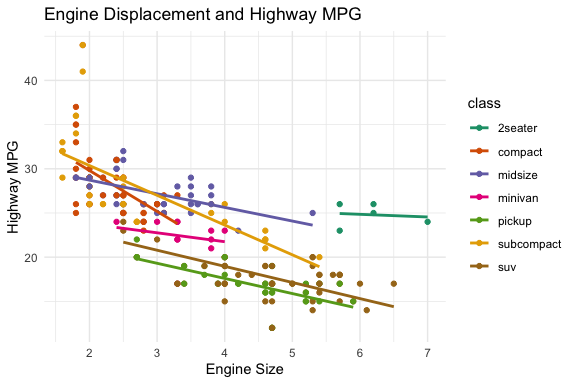
ggplot(mpg, aes(x = displ, y = hwy, color = class)) +
geom_point() +
stat_smooth(method = lm, se = FALSE) +
scale_color_brewer(palette = "Dark2") +
labs(
title = "Engine Displacement and Highway MPG",
x = "Engine Size",
y = "Highway MPG"
) +
theme_minimal()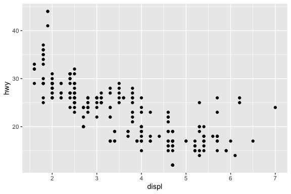
- Each of the functions has multiple arguments (most with default values) to help you customize the plot to what you want.
- There are also multiple extension packages based on {ggplot2} to add even more capabilities,, e.g., {ggrepel}, {ggmosaic}, {gganimate}, and {patchwork}.
3.5 Visualizing a Variable’s Sample Distribution
Now that we have seen some summary statistics about our variables, we want to explore what the distribution looks like.
- The shape of the distribution is often important for determining how well the data set meets certain assumptions for statistical tests or how we can align it with known probability distributions.
We can plot the shape of the distribution for a quantitative variable using histograms, density plots, or box plots.
- Histograms break up the values into a fixed number of evenly-sized bins based on the range of the variable and count how many observations are in each bin..
- Density plots also break up the values but smooth the counts in each bin into a smooth curve.
- Box Plots are a summary plot that highlight key statistics of the variables sample distribution.
We can plot the counts for a categorical variable by counting the observations in each category and using a bar plot to show them as the height of each bar.
- Unlike histograms where the bins are sorted numerically, the bars on a bar chart can be sorted in different ways based on the intent for the plot.
To a human, histograms and bar plots can look similar, but to a computer, it’s a significant difference.
- So, when talking to a computer (or to a statistician), you must be careful not to confuse the two.
3.5.1 Plotting Continuous Variables
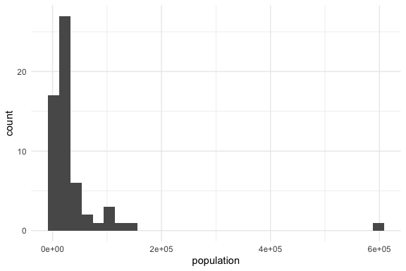
Let’s compare the base R plot and the tidyverse plot for a histogram of house_ed_gdp_joined$population.
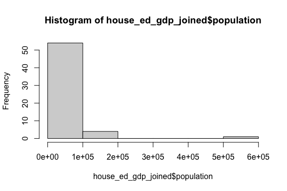
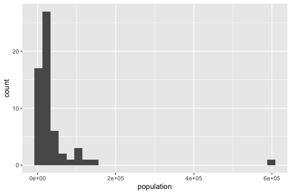
- They both show the general shape of the distribution to include the presence of extreme values on the right end making this a highly skewed distribution.
- However, the base R plot chose a smaller number of wider bins compared to the ggplot2 plot which hides some of the variability on the left end.
- You can choose different numbers of bins or different bin sizes by adding the argument inside the
geom_histogram()function.
- You can choose different numbers of bins or different bin sizes by adding the argument inside the
- They each choose different titles based on their inputs.
Let’s compare the tidyverse histogram versus a density plot.
- We can add a theme to change the look of the plot.
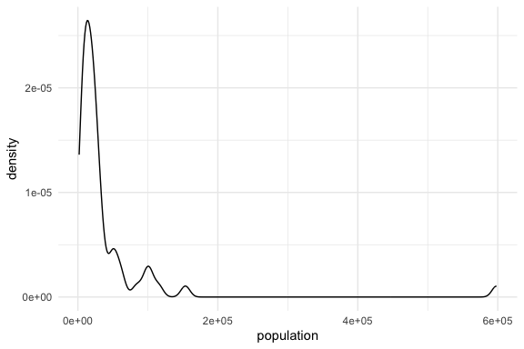
- They both show the general shape of the distribution to include the presence of extreme values on the right.
- The density plot might smooths out the differences and can be adjusted for different levels of smoothing.
- While the X axis values are the same, the Y axis values are different with the histogram using counts and the density using
- In short, they are conveying the same information but in slightly different ways and depending on the intent, one may be better than the other.
Finally, lets look at two versions of a univariate box plot which is a summary of the distribution.
- The box plot shows several key values that allow you to interpret the shape of the distribution.
- The line in the middle is at the value of the sample median
- The top and bottom lines of the box (the hinges) are at the 25th and 75th percentiles
- The distance between then is the Inter-Quartile Range (IQR)
- The lines (or whiskers) extend to the larges values above or below the box but no more than \(1.5 \times \text{IQR}\) from the hinge line.
- If there are observations more extreme than the whiskers, they are shown as individual points.
- The box plot on the right is the same data and plot, but the Y axis has been rescaled to be a logarithmic scale.
- This helps to reduce the skewness of the distribution
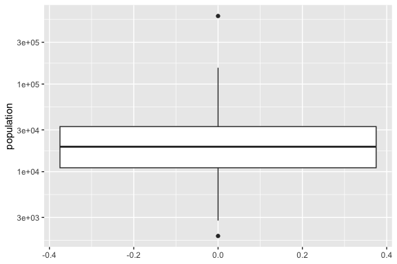
- The plot on the left is hard to read because the distribution is so skewed, it shrinks the box to being relatively small.
- The plot on the right shows that the log of the population is much more symmetric in shape as the median is in the middle of the box and there are single extreme values both above and below.
- Note that the values on the Y axis are the actual values of the population, but that are arranged logarithmic and not linearly like in the plot on the left.
- Using a log scale is quite common when working with skewed distributions such as associated with populations, financial data, or word counts in text data.
- One caveat with the box plot is it tells you nothing about how many observations are used to make the plot. Just two observations can create a box plot (which will not be very meaningful)
Note: this code also shows that you can assign a plot a name so you can reuse it to add more layers without having to repeat all the code.
- This makes it much faster to make additional plots while maintaining consistency.
We will see box plots again as they are very useful for plotting and comparing multiple distributions at once.
3.5.2 Plotting Categorical Variables
3.5.2.1 Bar Plots
Let’s compare the base R and the tidyverse versions of a bar plot of land$prop_type_broad.
You can see that this does the job, but it is not very inspiring, not every category is labeled, and we had to generate the counts on our own.
- Even if you were to take the time to give it better axis labels, it would still look basically the way it does right now.
So, let’s use tidyverse to get two versions of a bar plot:
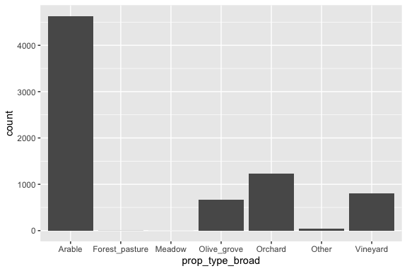
Notice that either geom_bar or stat_count returns the same bar plot and we now have default titles for each axis.
3.5.2.2 Pie charts (round relative frequency histograms)
Some people like to see pie charts (though they can be misleading as they are measures of area)
The usual pie chart can be drawn in Base R as follows and makes use of the same table() command to get the counts we already saw for Base R for bar plots.
A tidyverse pie chart looks quite different and is more customizable. But, it takes many more steps. Here, we follow the instructions from: https://www.tutorialspoint.com/ggplot2/ggplot2_pie_charts.htm and add some labels.
df <- as.data.frame(counts)
colnames(df) <- c("Land Type", "freq")
df <- df |>
  mutate(
    `Land Type` = factor(`Land Type`, levels = `Land Type`),
    percent = freq / sum(freq) * 100,
    label = paste0(round(percent, 1), "%"),
    ypos = cumsum(freq) - freq / 2
  )
pie <- ggplot(df, aes(x = "", y = freq, fill = `Land Type`)) +
  geom_bar(width = 1, stat = "identity") +
  #  theme(axis.line = element_blank(), plot.title = element_text(hjust = 0.5)) +
  labs(
    fill = "Land Type", x = NULL, y = NULL,
    title = "Pie Chart", caption = "Land for Rent Data: Albania Open Data"
  )

pie # Look at pie now! After all that effort, it's not even a pie yet!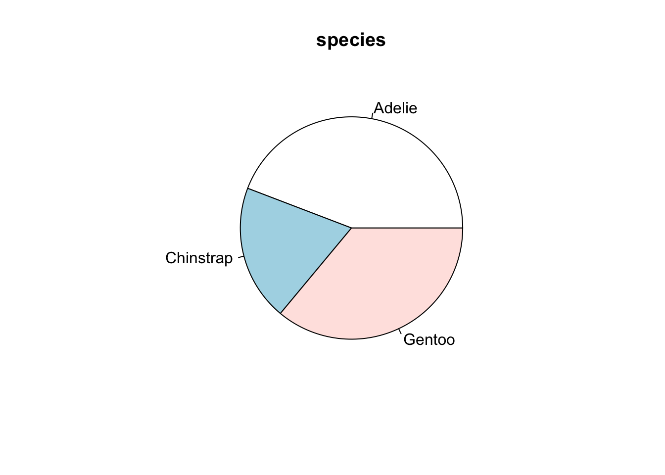

3.6 Exploratory Data Analysis (EDA)
Exploratory Data Analysis refers to what data scientists do when they are trying to understand the data set in relation to the question they are trying to answer.
- No preconceived ideas, no hypotheses, no focus other than trying to figure out what they have to work with and what might need to be changed.
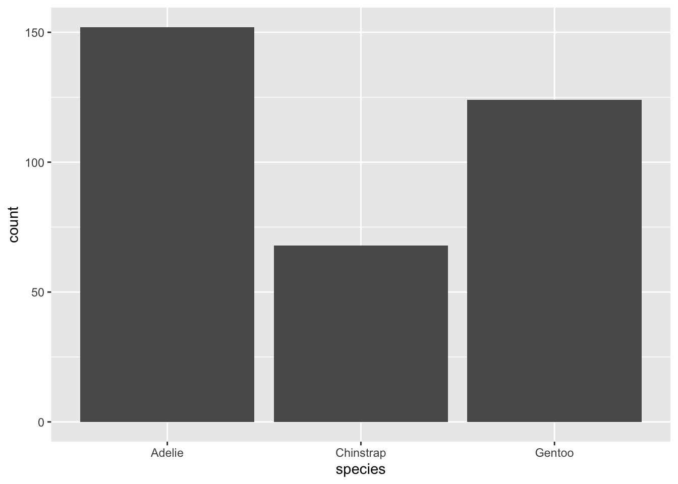
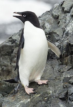
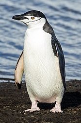
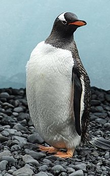
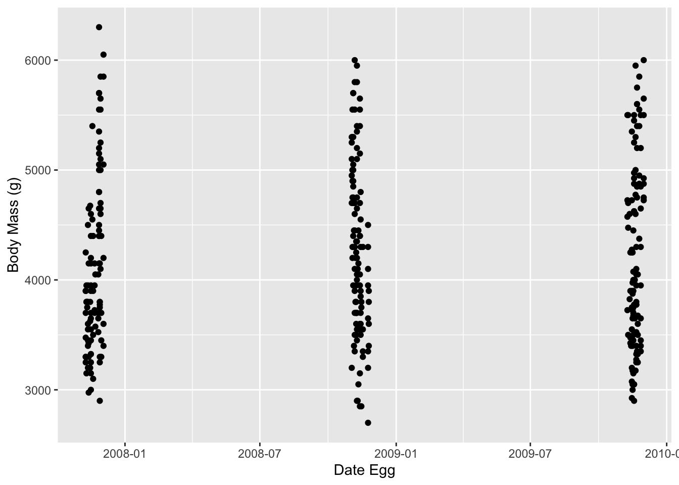
Let’s switch over to the penguins! The dataset contains observations of various types of penguins near the Palmer Station in Antarctica.
Let’s get a summary and glimpse the data
      species          island       bill_len        bill_dep
 Adelie   :152   Biscoe   :168   Min.   :32.10   Min.   :13.10
 Chinstrap: 68   Dream    :124   1st Qu.:39.23   1st Qu.:15.60
 Gentoo   :124   Torgersen: 52   Median :44.45   Median :17.30
                                 Mean   :43.92   Mean   :17.15
                                 3rd Qu.:48.50   3rd Qu.:18.70
                                 Max.   :59.60   Max.   :21.50
                                 NAs    :2       NAs    :2
  flipper_len      body_mass        sex           year
 Min.   :172.0   Min.   :2700   female:165   Min.   :2007
 1st Qu.:190.0   1st Qu.:3550   male  :168   1st Qu.:2007
 Median :197.0   Median :4050   NAs   : 11   Median :2008
 Mean   :200.9   Mean   :4202                Mean   :2008
 3rd Qu.:213.0   3rd Qu.:4750                3rd Qu.:2009
 Max.   :231.0   Max.   :6300                Max.   :2009
NAs :2 NAs :2 Rows: 344
Columns: 8
$ species <fct> Adelie, Adelie, Adelie, Adelie, Adelie, Adelie, Adelie, Ad…
$ island <fct> Torgersen, Torgersen, Torgersen, Torgersen, Torgersen, Tor…
$ bill_len <dbl> 39.1, 39.5, 40.3, NA, 36.7, 39.3, 38.9, 39.2, 34.1, 42.0, …
$ bill_dep <dbl> 18.7, 17.4, 18.0, NA, 19.3, 20.6, 17.8, 19.6, 18.1, 20.2, …
$ flipper_len <int> 181, 186, 195, NA, 193, 190, 181, 195, 193, 190, 186, 180,…
$ body_mass <int> 3750, 3800, 3250, NA, 3450, 3650, 3625, 4675, 3475, 4250, …
$ sex <fct> male, female, female, NA, female, male, female, male, NA, …
$ year <int> 2007, 2007, 2007, 2007, 2007, 2007, 2007, 2007, 2007, 2007…- We can see several of the measurements have
NAvalues and thespecies,islandandsexvariables have class factor. Theyearhas class integer instead of date.
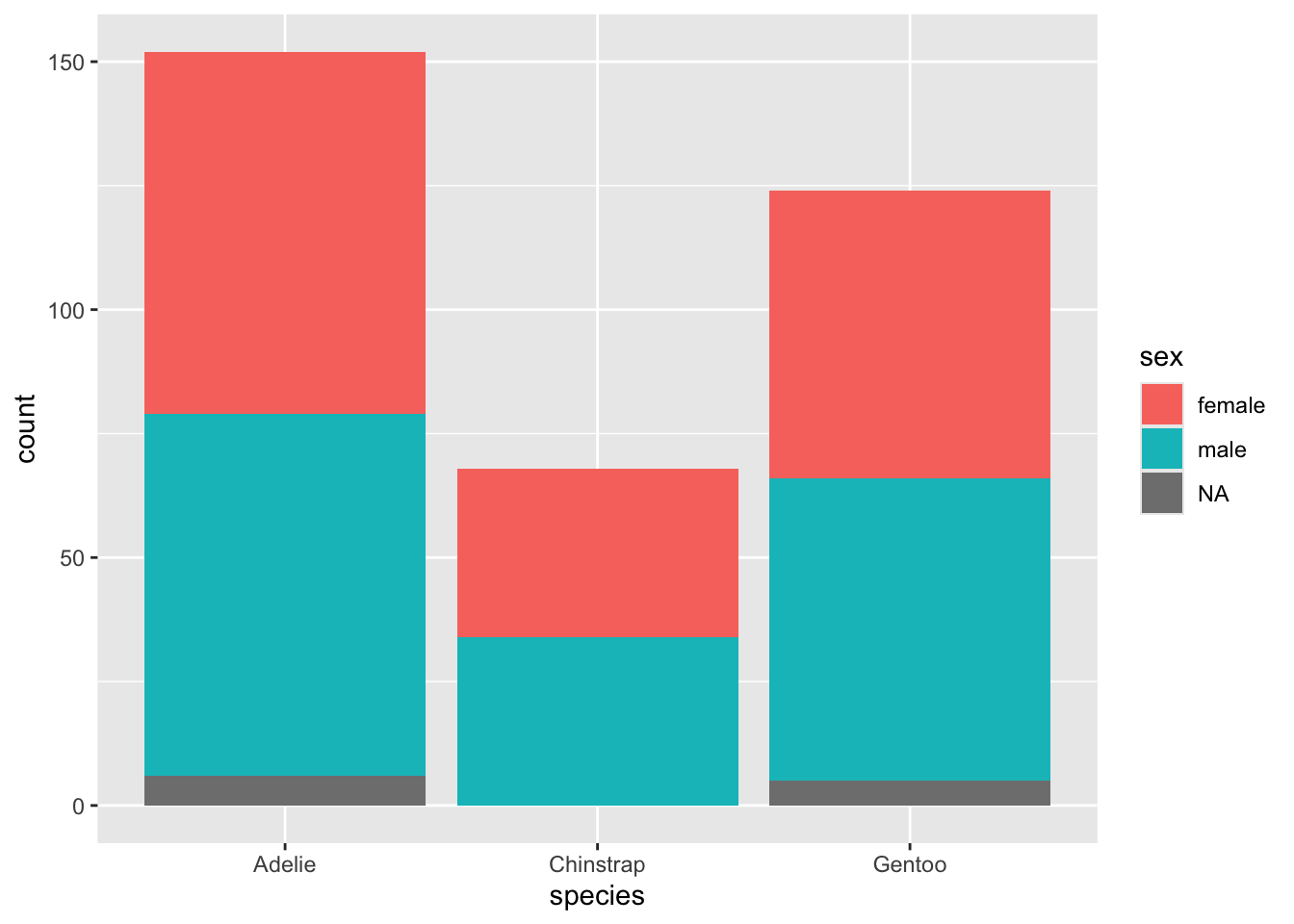
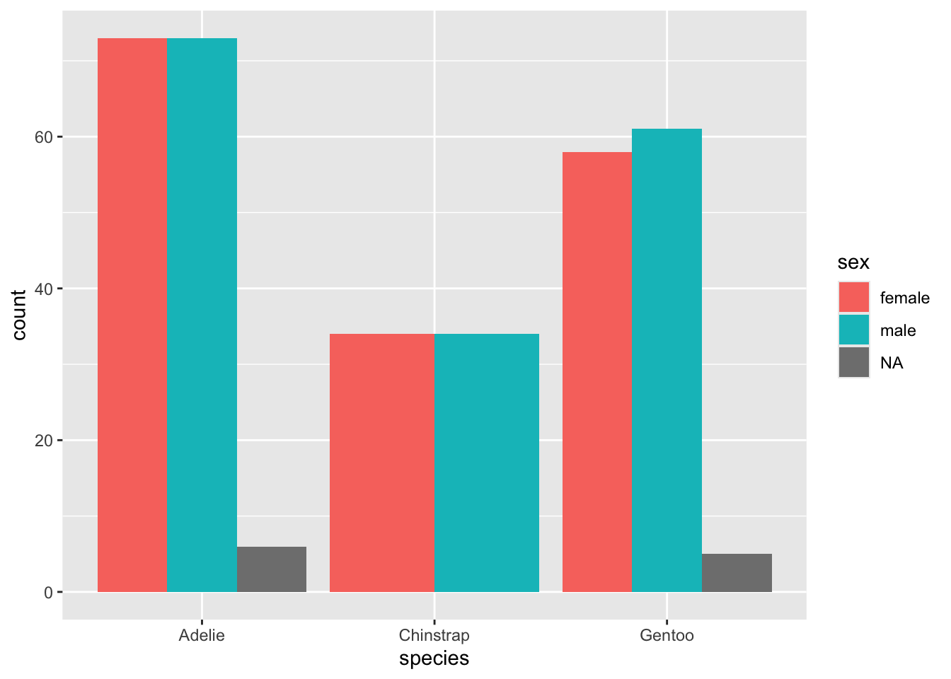
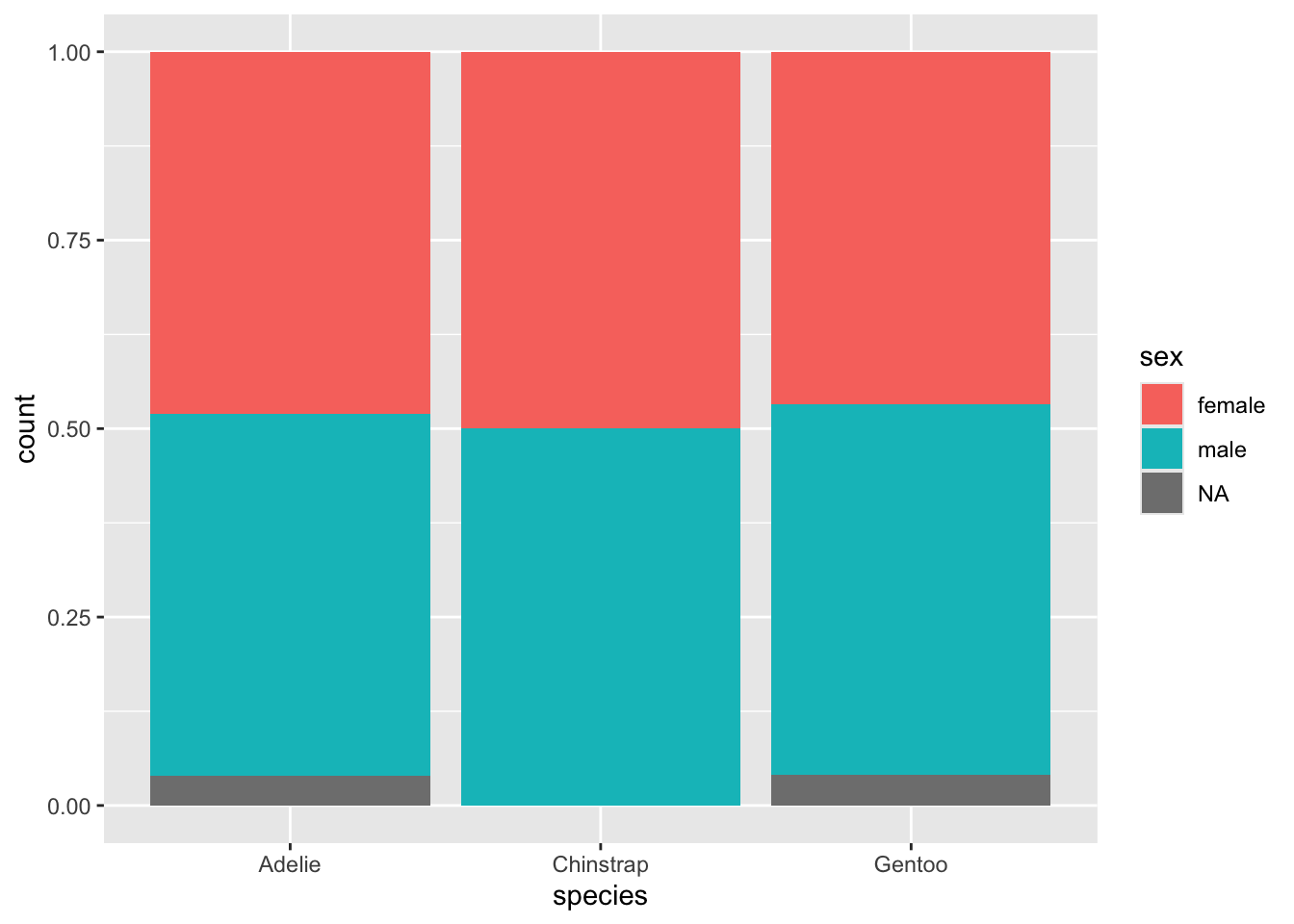
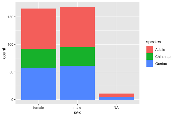
Let’s plot the counts for each species and then for each sex.
- We can see that there are different numbers of observations for each species but male and female are pretty balanced.
What if we want to see the counts for each species by sex? This is leading us into multi-variate analysis
- We can use the fill aesthetic to explore another categorical variable within your categories.
- We can choose which variable we want as primary and which as fill.
Perhaps you wish to line up all the categories by their subcategories, each in individual bars; change position argument.
Or, perhaps you prefer to weight each of your primary categories to 100% so you can visually see if the proportions of the second category are roughly the same or not.
3.6.1 Comparing Distributions by Sex
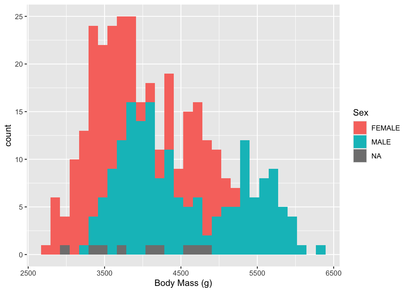
Let’s get a histogram of the body mass observations by sex (noting that there may be multiple observations from each bird as it grows)
- The NAs eill get in the way so let’s get rid of them for each variable with
drop_na().
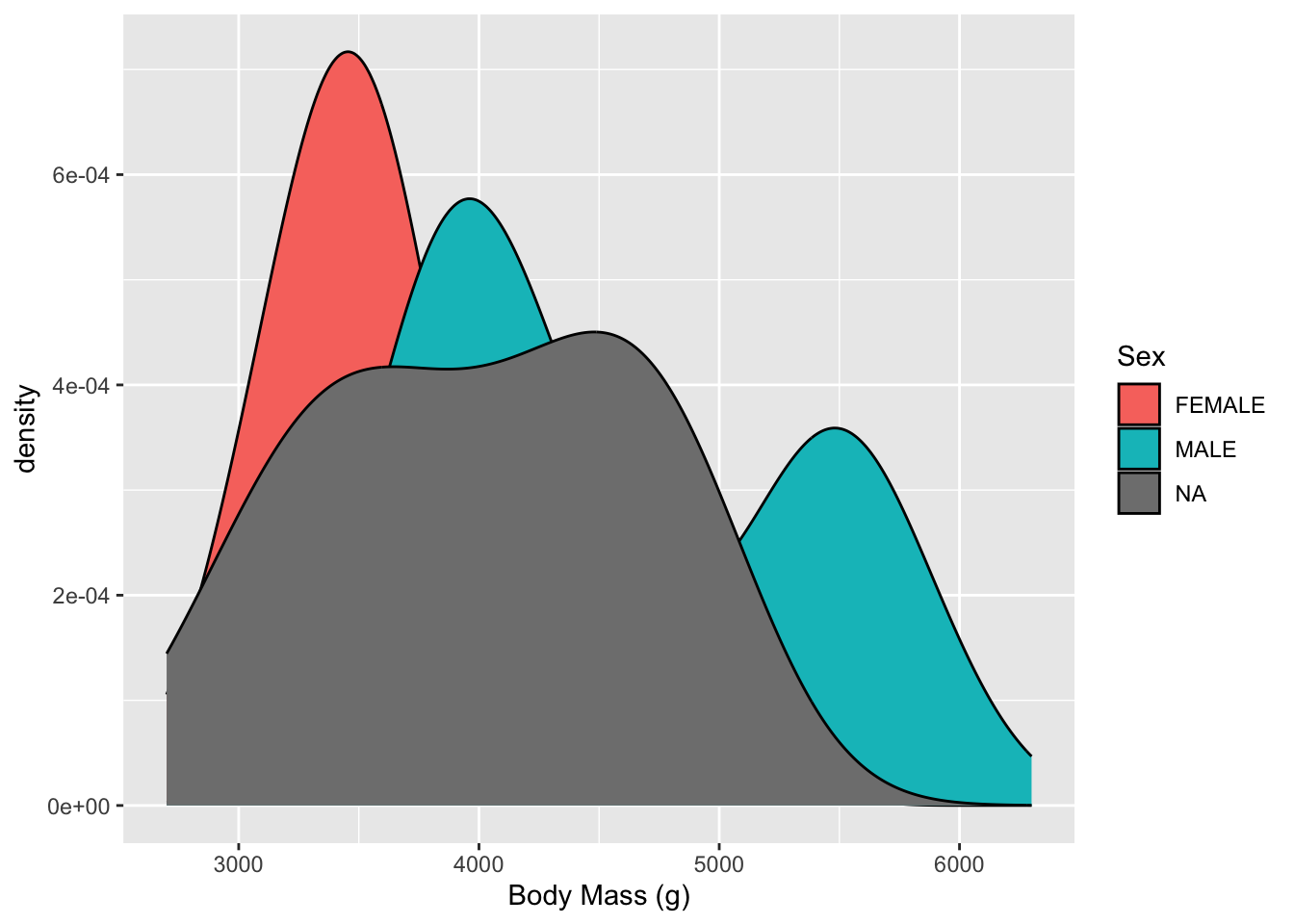
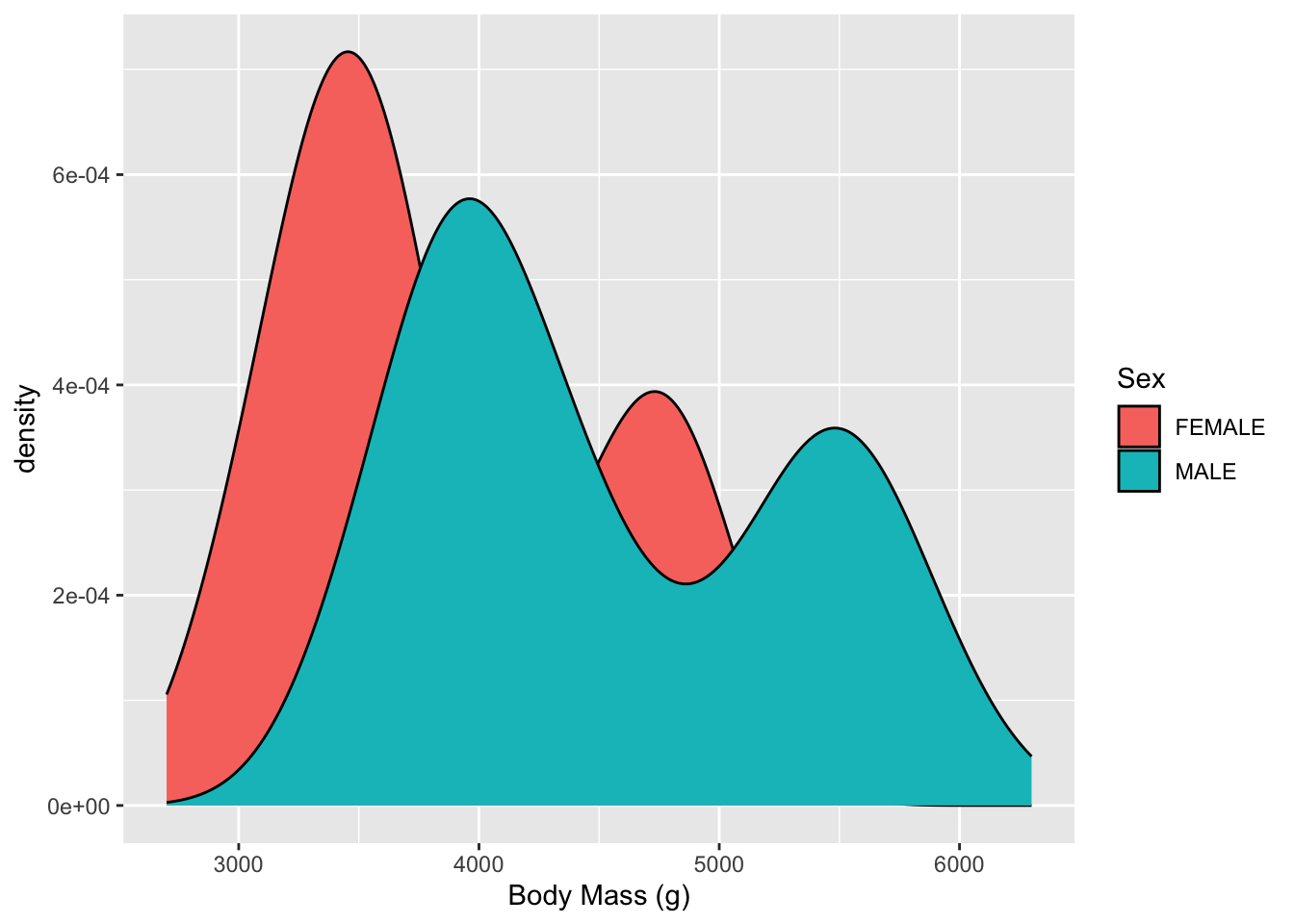
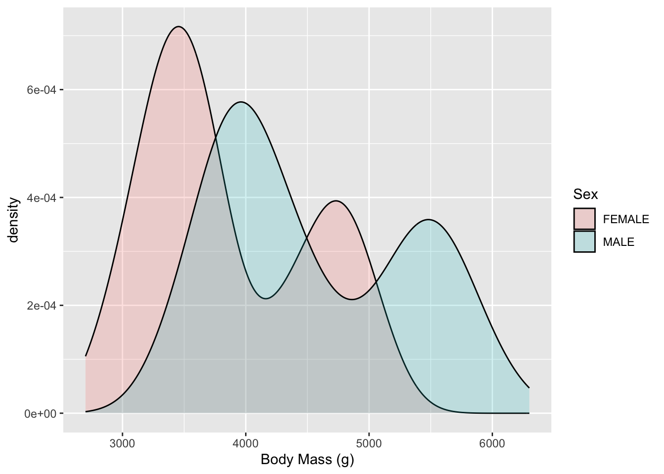
Another view is a Density plot. This is a smoothed version of the histogram.

- Now we can’t see everything so let’s adjust
alphato increase the transparency (decrease the opaqueness)
- Now we can see both Males and Females have two humped plots or what we call Bimodal (the mode is the most common value).
- This suggests the distributions for each sex are actually a mixture of two different kinds of makes and females.
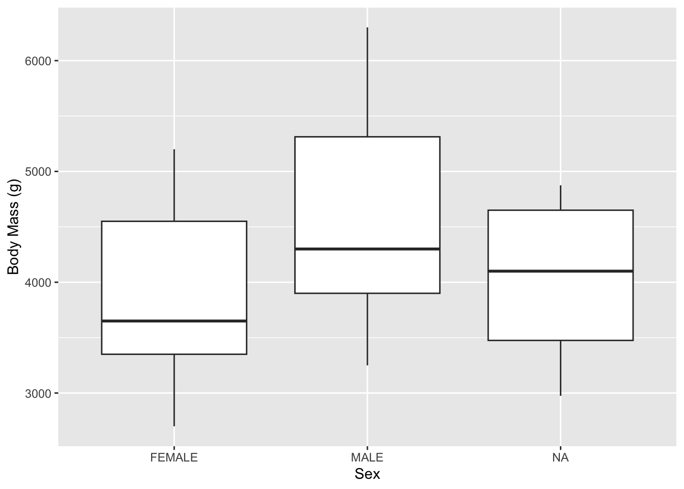
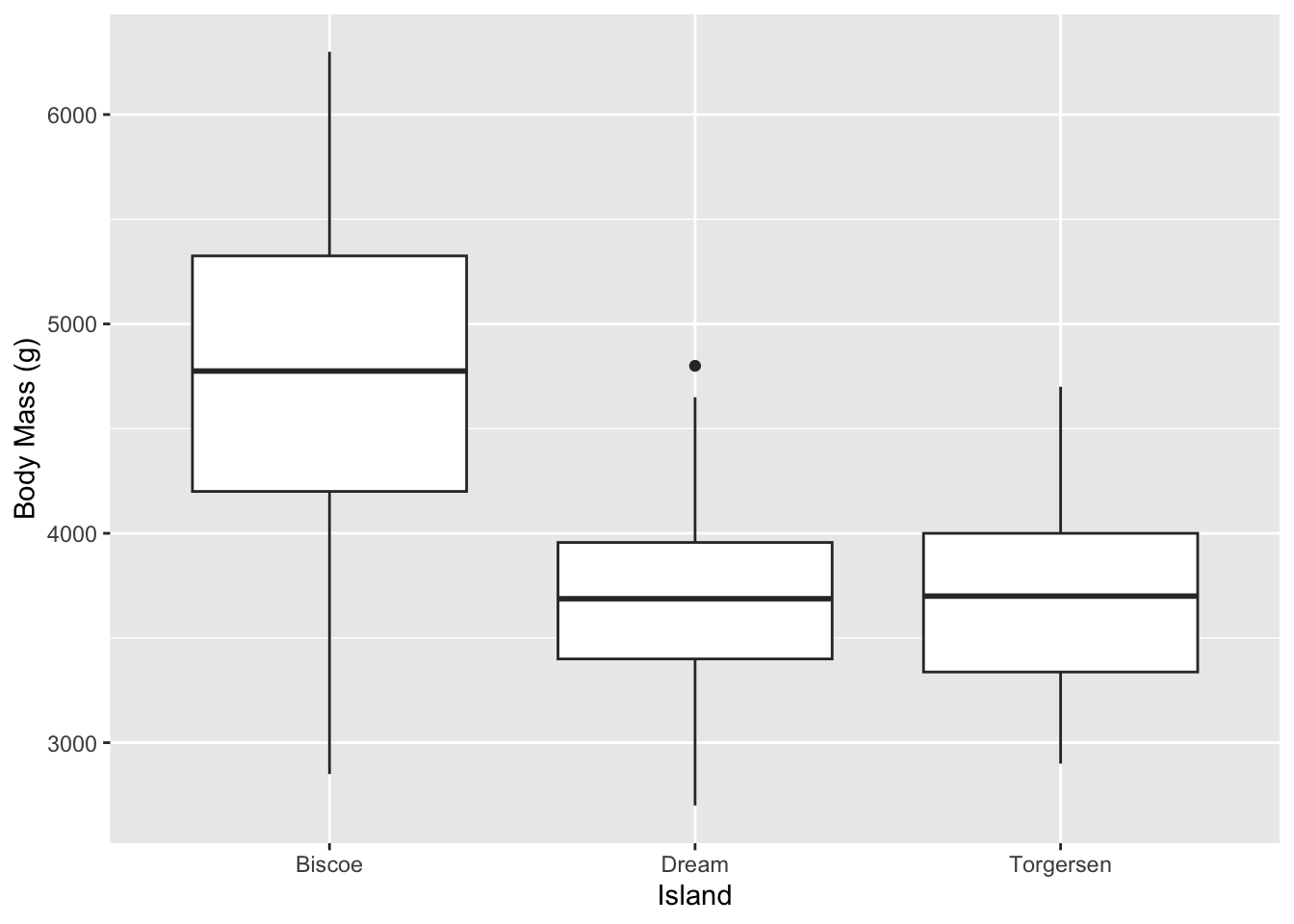
But maybe that is too busy of a plot. We can clean that up by using other geom_ choices. For instance, here is a classic box plot where we look at summaries of the individual distributions for each sex:
Notice that the aes() which selects which variables are involved is a little different between the above two commands as we are now mapping two variables to positions on the plot, not a position and a fill value.
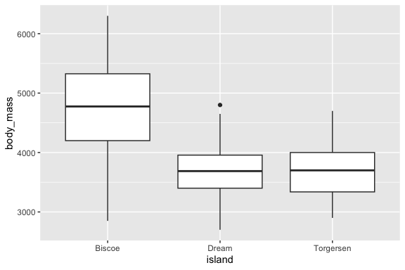
Now if you set the notch = TRUE argument in geom_boxplot() you will some notches appear.

- As the help for the
geom_boxplot()notchargument says, “Notches are used to compare groups; if the notches of two boxes do not overlap, this suggests that the medians are significantly different. - So the penguins on Biscoe have different median mass than on the other islands
As discussed before. the box plot does not tell us how many observations are in each plot.
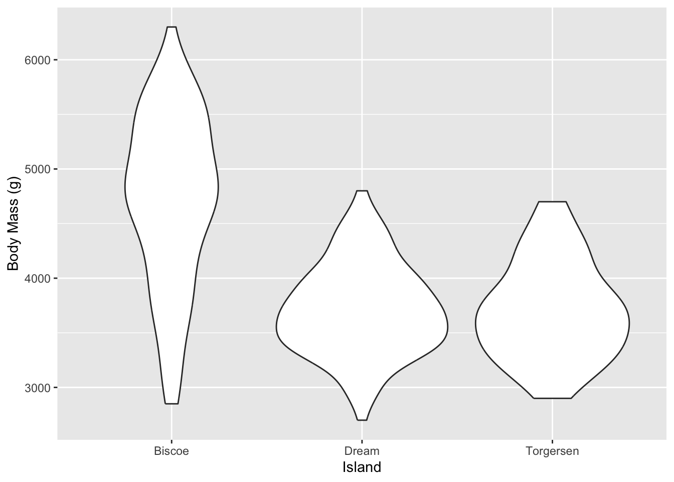
- A variant that gives us some idea is the Violin plot as it combines the box plot with the histogram density plot.
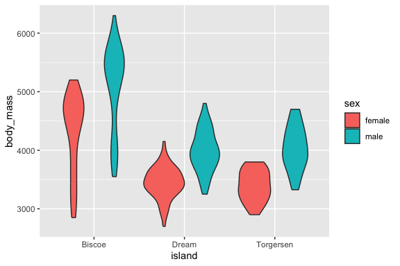
- Now we can see three variables at once.
- Note: the males are generally heaver than the females on every island and but the different species have different shaped distributions of observations based on weight.
Although we’ll work with scatter plots more next lesson, here’s a taste of what you can do when exploring the data:
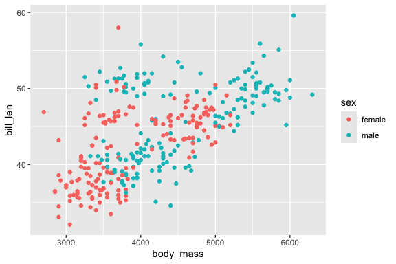
This seems to suggest that bigger penguins of both sexes generally have longer bills.
3.7 Exercise 03: Univariate Analysis
In this exercise you will explore a dataset focused on individual variables using univariate tools: descriptive statistics and basic plots. The dataset is a sample of health measurements from by work by Yani and Lercher.
- Feel free to use Help function by searching for function names in the help pane or using
?function_namein the console.
3.7.1 Load the Packages and Read in the Data
Library the {tidyverse} package.
Read in the yani_lercher.csv from the data/ folder and assign the resulting data frame the name yani.
- Be sure to use the relative path “data/yani_lercher.csv” to access the data file.
glimpse()the data frame.
Rows: 1,786
Columns: 4
$ ID    <dbl> 1, 2, 3, 4, 5, 6, 7, 8, 9, 10, 11, 12, 13, 14, 15, 16, 17, 18, 1…
$ steps <dbl> 15000, 15000, 15000, 14861, 14861, 14861, 14861, 14699, 14699, 1…
$ bmi   <dbl> 16.9, 16.9, 17.0, 17.2, 17.2, 16.8, 16.8, 17.3, 16.8, 20.5, 20.6…
$ sex   <chr> "male", "male", "female", "female", "female", "male", "male", "m…
3.7.2 Classify the Variables
List all four columns (bmi, steps, sex, id) and classify each one as:
- Numerical (continuous or discrete)
- Categorical (nominal, ordinal, or binary)
Write your classification here as a short bullet list.
3.7.3 Generate Descriptive Statistics
Create a summary of the data frame and calculate the variance and standard deviation for numeric variables:
- There are multiple ways to do this.
       ID             steps            bmi               sex
 Min.   :   1.0   Min.   :    0   Min.   :15.00   Length   :1786
 1st Qu.: 447.2   1st Qu.: 5301   1st Qu.:20.93   N.unique :   2
 Median : 893.5   Median : 7431   Median :26.80   N.blank  :   0
 Mean   : 893.5   Mean   : 7435   Mean   :25.29   Min.nchar:   4
 3rd Qu.:1339.8   3rd Qu.: 9699   3rd Qu.:29.30   Max.nchar:   6
Max. :1786.0 Max. :15000 Max. :32.00 [1] 24.03905[1] 4.902963 steps
steps 12401511[1] 3521.578# A tibble: 1 × 6
ID_var ID_standard_dev steps_var steps_standard_dev bmi_var bmi_standard_dev
<dbl> <dbl> <dbl> <dbl> <dbl> <dbl>
1 265965. 516. 12401511. 3522. 24.0 4.903.7.4 Create Histograms for Continuous/Quantitative Data
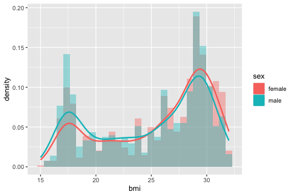
Use ggplot with geom_histogram() to create a histogram of bmi.
- Experiment with changing the value of
geom_histogram()argumentbins= 30.
- Then set the
aes()argumentfill = sexto see how the two groups overlap. - Then set
geom_histogram()argumentposition = "dodge".
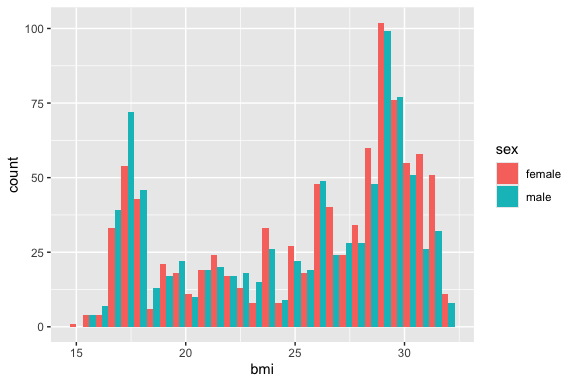
Repeat for steps.
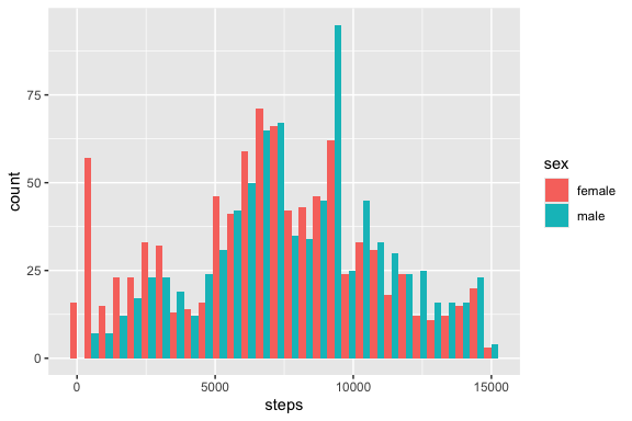
Comment: describe the shape of each distribution (symmetric, skewed, bimodal?).
3.7.5 Create Bar charts for Discrete/Categorical/Qualitative Data
Make a bar chart showing the count of observations for each category of sex.
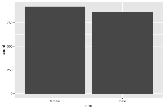
Comment: is the dataset balanced between the two groups?
3.7.6 Create a New Variable (Feature) for Bar Charts
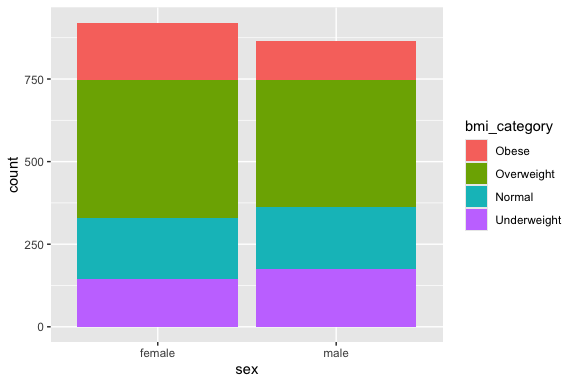
Use case_when() to create a bmi_category variable, e.g. Underweight < 18.5, Normal 18.5–24.9, Overweight 25–29.9, Obese ≥ 30) and save the updated data frame
Create a bar chart with fill = bmi_category to show the proportional breakdown of bmi_categorywithin each sex group on a single plot.
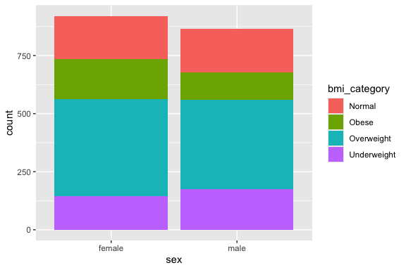
Convert bmi_category to a factor with the order Obese, Overweight, Normal, and Underweight and redo the plot.
3.7.7 Create a Layered Histogram and Density Plot
Add geom_density() on top of geom_histogram() for bmi.
- This one is a little tricky as you have to use
after_stat()to rescale the heights (y axis values) for the histogram after calculating the the density plot.
3.7.8 Summary
In the space below, write 3–5 sentences summarizing what you found most interesting about this dataset.
Write your summary here.